iterable_dropdown 2.0.5  iterable_dropdown: ^2.0.5 copied to clipboard
A Flutter dropdown that works on iterable instead of lists. It also has multi select functionality
A dropdown that works with all iterables instead of just lists. It has multiselect features for selecting multiple items as well.
This dropdown stays performant because it consumes any Iterable instead of forcing you to copy the data into Lists, and it uses ListView.builder so only the options currently visible on screen are ever built and kept in memory.
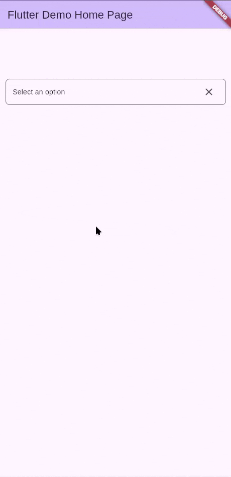
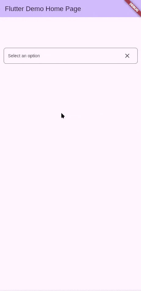
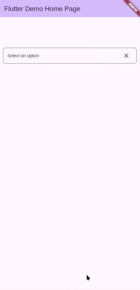
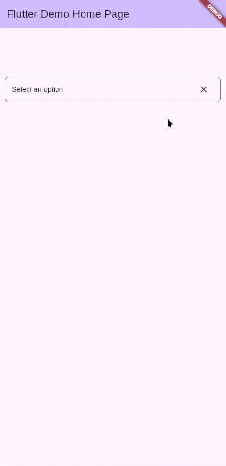
Screenshots #
[Custom Decoration]
| Single Select | Single Select with Search | Multi Select | Multi Select with Search |
|---|---|---|---|
 |
 |
 |
 |
Features #
Use this package in your Flutter app to:
- select multiple items in dropdowns
- use iterables in a dropdown
- Have a more beautiful dropdown
- Keep huge data sources responsive by only building the visible options through
ListView.builder - Provide custom first/last options via
CustomItemsthat can act as headers or buttons
Platform Support #
| Platform | Supported |
|---|---|
| Android | ✅ |
| iOS | ✅ |
| Web | ✅ |
| Windows | ✅ |
| MacOS | ✅ |
| Linux | ✅ |
Getting started #
Add the package to your Flutter app
flutter pub add iterable_dropdown
Import the package where you want to use it
import 'package:iterable_dropdown/iterable_dropdown.dart';
Usage #
Directly use the component
@override
Widget build(BuildContext context) {
  return IterableDropdown<String>.builder(
    controller: _dropdownController,
    items: items,
    itemBuilder: (_, _, item, selected, toggleSelection) {
      return ListTile(
        key: ValueKey(item.key),
        title: Text(item.label),
        onTap: toggleSelection,
        trailing: selected
            ? Icon(Icons.check_circle_outline_rounded)
            : Icon(Icons.circle_outlined),
        selected: selected,
        selectedColor: Colors.black,
        selectedTileColor: Colors.deepPurple.shade100,
      );
    },
    selectionMode: SelectionMode.multi,
  );
}
You can also open or close the dropdown programmatically by interacting with the controller.
_dropdownController.openDropdown() // show overlay
_dropdownController.closeDropdown() // hide overlay
Custom Items (Pinned Rows) #
Use the customItems parameter when you need pinned widgets before or after the generated options. These widgets never get filtered or selected, which makes them perfect for headers, dividers, or persistent actions. For instance, a customer selector can expose an Add new customer row at the top that launches a creation flow.
@override
Widget build(BuildContext context) {
  return IterableDropdown<Customer>.builder(
    controller: _customerController,
    items: customers,
    itemBuilder: (context, index, item, selected, toggleSelection) => ListTile(
      title: Text(item.label),
      trailing: selected ? const Icon(Icons.check_circle_outline) : null,
      onTap: toggleSelection,
    ),
    customItems: CustomItems(
      start: ListTile(
        leading: const Icon(Icons.add),
        title: const Text('Add new customer'),
        onTap: _createCustomer,
      ),
      end: TextButton(
        onPressed: _showAdvancedFilters,
        child: const Text('Show all customers'),
      ),
    ),
  );
}
Those boundary widgets stay visible regardless of what the user types into the search box and cannot be selected, so they are ideal for headers or CTA rows.
Upcoming Features #
Grouping options #
Options can be grouped by a certain field or a combination of fields. The same label can appear twice if they are in separate groups. This will present hierarchy to the options.
Network Builder #
Options will be fetched using a future, most probably through an API. The Future will be called only once.
The dropdown will be in a state of loading until the options are fetched.
Additional information #
You can contribute to this package via the Github Repo. Check out the Contribution Page for reference.
Metadata
Publisher
unverified uploader
Weekly Downloads
Metadata
A Flutter dropdown that works on iterable instead of lists. It also has multi select functionality
Repository (GitHub)
View/report issues
Topics
#dropdown #multiselect #iterable #multiple
License
 unknown (license)