flutter_nav_toggle 1.1.0  flutter_nav_toggle: ^1.1.0 copied to clipboard
A dual-mode navigation toggle widget that smoothly morphs between sidebar and tab bar layouts with clip-path animations.
flutter_nav_toggle #
A dual-mode navigation widget for Flutter that smoothly morphs between sidebar, icon rail, and tab bar layouts with clip-path animations.
Installation #
Add flutter_nav_toggle to your pubspec.yaml:
dependencies:
  flutter_nav_toggle: ^1.1.0
Then run:
flutter pub get
Features #
- Three navigation modes — sidebar, icon rail, and tab bar with smooth animated transitions
- Morphing toggle button — cursor-tracking directional arrows with branding support (logo + label), powered by
morphing_button - Badge support — per-item badge counts with automatic aggregation on parent items
- Header branding —
NavHeaderwith logo, title, and subtitle merged into the toggle button - Page transitions —
.withPages()constructor with fade, slide, and fadeThrough transitions viaAnimatedSwitcher - Keyboard shortcuts — press
Tto toggle navigation mode - Hierarchical items — expand/collapse in sidebar, overlay dropdowns in tab bar
- Status panel — CPU/MEM/DISK progress bars with color-coded thresholds
- User info — avatar panel with optional
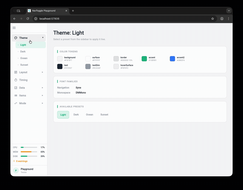
onTapcallback and hover feedback - 4 built-in themes — Light, Dark, Ocean, Sunset (or build your own with
NavToggleTheme.copyWith) - Fully configurable — dimensions, durations, easing curves, colors, fonts, border radii
- Accessibility — respects
MediaQuery.disableAnimations
Quick Start #
import 'package:flutter_nav_toggle/flutter_nav_toggle.dart';

NavToggleScaffold(
  items: [
    NavItem(id: 'home', label: 'Home', icon: Icons.home_outlined),
    NavItem(id: 'settings', label: 'Settings', icon: Icons.settings_outlined, badge: 3),
  ],
  header: NavHeader(
    logo: Icon(Icons.dashboard, size: 24),
    title: 'My App',
  ),
  onItemSelected: (id) => print('Selected: $id'),
  child: Center(child: Text('Content')),
)
Hierarchical Items #
NavItem(
  id: 'products',
  label: 'Products',
  icon: Icons.inventory_outlined,
  children: [
    NavItem(id: 'electronics', label: 'Electronics', icon: Icons.devices_outlined),
    NavItem(id: 'clothing', label: 'Clothing', icon: Icons.checkroom_outlined),
  ],
)
Parents expand/collapse in sidebar mode and open overlay dropdowns in tab bar mode.
Page Transitions #
Use .withPages() to let the scaffold manage content switching with animated transitions:
NavToggleScaffold.withPages(
  items: items,
  pages: {
    'home': HomePage(),
    'settings': SettingsPage(),
  },
  pageTransitionType: PageTransitionType.fadeThrough,
  showPageHeader: true,
  enableKeyboardShortcuts: true,
)
Available transition types: fade, slideHorizontal, fadeThrough.
Theming #
// Use a built-in preset
NavToggleScaffold(
  theme: const NavToggleTheme.ocean(),
  // ...
)

// Or customize
NavToggleScaffold(
  theme: const NavToggleTheme.dark().copyWith(
    sidebarWidth: 260,
    accent: Color(0xFFFF6B6B),
    collapseDuration: Duration(milliseconds: 300),
  ),
  // ...
)
Available presets: NavToggleTheme() (light), .dark(), .ocean(), .sunset()
System Status & User Info #
NavToggleScaffold(
  systemStatus: SystemStatus(cpu: 0.42, memory: 0.67, disk: 0.55, warnings: 3),
  userInfo: UserInfo(name: 'Alice', role: 'Admin', onTap: () => print('User tapped')),
  // ...
)
Status displays as progress bars (sidebar) or compact chips (tab bar). User info shows as an avatar panel (sidebar) or chip (tab bar).
Run the Playground #
cd example
flutter run -d chrome
The example app is an interactive playground that lets you tweak every property live.
Metadata
Publisher
unverified uploader
Weekly Downloads
Metadata
A dual-mode navigation toggle widget that smoothly morphs between sidebar and tab bar layouts with clip-path animations.
Repository (GitHub)
View/report issues
License
 unknown (license)
Dependencies
flutter, morphing_button, provider