morphing_button 0.1.3  morphing_button: ^0.1.3 copied to clipboard
A Flutter package providing morphing button widgets with smooth directional arrow animations that respond to cursor position.
Morphing Button #
A Flutter package providing morphing button widgets with smooth directional arrow animations that respond to cursor position, plus a navigation toggle widget family for sidebar/rail/tab layouts.
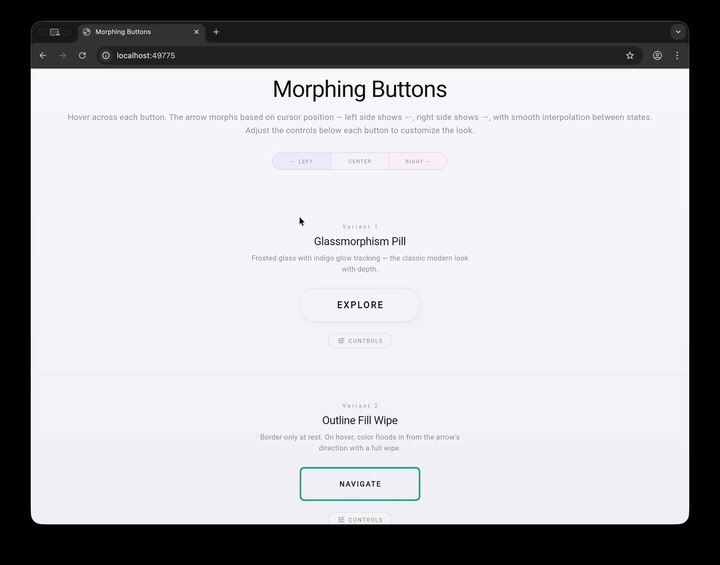
Hover across each button — the arrow morphs based on where your cursor is. Left side shows ←, right side shows →, with smooth interpolation between states.
Features #
- Cursor-aware animation — arrow direction and visual effects respond to horizontal cursor position in real time
- Smooth interpolation — all transitions use per-frame exponential ease-out for fluid motion
- Touch support — drag across buttons on mobile/tablet to see the same morphing effect
- 4 built-in variants — each with a distinct visual personality
- NavToggleButton — navigation toggle with 3 rendering modes (sidebar, icon rail, tab bar)
- Enabled state — disable any button to suppress hover and tap interactions
- Configurable split-tap — adjust the left/right tap zone boundary with
splitRatio - MorphingButtonTheme —
InheritedWidgetfor setting defaults across a subtree - Fully configurable — font size, padding, letter spacing, arrow size, and variant-specific properties are all adjustable
Widget Families #
Morphing Buttons #
| # | Name | Style |
|---|---|---|
| 1 | Glassmorphism Pill | Frosted glass with indigo glow tracking |
| 2 | Outline Fill Wipe | Border-only at rest, color floods in on hover |
| 3 | Soft Shadow Float | White card that lifts with colored shadow |
| 4 | Underline Editorial | Typography-first with sweeping underline |
ModeToggleButton #
A split/collapse toggle with optional branding support:
| State | Description |
|---|---|
| Split | Two hover zones with directional arrows; icon + label + hamburger |
| CollapsedRight | Full width, single tap zone; icon + label + morphed icon |
| CollapsedLeft | Icon-only width; shows branding icon, monogram, or hamburger fallback |
NavToggle #
| Mode | Description |
|---|---|
| Sidebar | Full-width item with icon + label that fades when narrow |
| Icon Rail | Centered icon with tooltip and selection highlight |
| Tab Bar | Icon + optional label with bottom indicator |
Getting Started #
Add the dependency to your pubspec.yaml:
dependencies:
  morphing_button:
    git:
      url: https://github.com/user/morphing_button.git
Then import and use:
import 'package:morphing_button/morphing_button.dart';

// Simple usage
GlassPillButton(label: 'EXPLORE')

// With configuration
OutlineFillButton(
  label: 'NAVIGATE',
  borderRadius: 8,
  borderWidth: 2,
  fillOpacity: 0.9,
  fontSize: 14,
  onTap: () => print('tapped'),
)
Usage #
GlassPillButton #
GlassPillButton(
  label: 'EXPLORE',
  fontSize: 13,
  letterSpacing: 2.5,
  horizontalPadding: 52,
  verticalPadding: 16,
  arrowSize: 10,
  arrowStrokeWidth: 2.0,
  onTap: () {},
)
OutlineFillButton #
OutlineFillButton(
  label: 'NAVIGATE',
  borderRadius: 0,       // square corners by default
  borderWidth: 2,
  fillOpacity: 0.92,     // color fill wipe opacity
  fontSize: 13,
  letterSpacing: 2,
  onTap: () {},
)
SoftShadowButton #
SoftShadowButton(
  label: 'DISCOVER',
  shadowBlur: 28,        // colored shadow blur radius
  elevation: 2,          // hover lift amount
  fontSize: 14,
  letterSpacing: 1.5,
  onTap: () {},
)
UnderlineMinimalButton #
UnderlineMinimalButton(
  label: 'CONTINUE',
  underlineHeight: 1.5,  // underline thickness
  fontSize: 13,
  letterSpacing: 3,
  onTap: () {},
)
NavToggleButton #
NavToggleButton(
  currentWidth: 220,           // driven by your scaffold/layout
  mode: NavToggleMode.sidebar, // sidebar | iconRail | tabBar
  icon: Icons.home,
  label: 'Home',
  isSelected: true,
  onTap: () {},
)
ModeToggleButton #
ModeToggleButton(
  state: ModeToggleState.split,
  icon: Icon(Icons.dashboard, size: 24),  // optional branding icon
  label: 'Playground',                     // optional label text
  expandedWidth: 220,
  collapsedWidth: 52,
  onLeftTap: () => print('collapse left'),
  onRightTap: () => print('collapse right'),
  onTap: () => print('expand back to split'),
)
When icon or label is provided, the layout shifts to show branding on the left and the hamburger icon on the right. In collapsedLeft mode:
- With icon — the icon is centered in the collapsed rail
- With label only — a circled monogram (first character) is shown
- Neither — falls back to the existing hamburger/morphed icon
Set showModeIcon: false to hide the hamburger/morph icon entirely — useful when the branding icon already communicates the button's purpose.
Enabled State & Split Ratio #
All buttons support enabled and splitRatio:
GlassPillButton(
  label: 'DISABLED',
  enabled: false,       // suppresses hover and tap
)

OutlineFillButton(
  label: 'CUSTOM SPLIT',
  splitRatio: 0.3,      // left zone = 30%, right zone = 70%
  onLeftTap: () => print('left'),
  onRightTap: () => print('right'),
)
MorphingButtonTheme #
Wrap buttons in a MorphingButtonTheme to set defaults for a subtree:
MorphingButtonTheme(
  data: MorphingButtonThemeData(
    accentColor: Colors.teal,
    fontSize: 16,
    arrowSize: 12,
  ),
  child: Column(
    children: [
      GlassPillButton(label: 'THEMED'),   // inherits teal accent, 16px font
      OutlineFillButton(label: 'THEMED'),  // same theme defaults
    ],
  ),
)
Resolution order: widget parameter > MorphingButtonTheme.of(context) > hardcoded default.
Shared Parameters #
All morphing button variants inherit these from MorphingButtonBase:
| Parameter | Type | Default | Description |
|---|---|---|---|
label |
String |
required | Button text |
icon |
Widget? |
null |
Optional icon widget |
onTap |
VoidCallback? |
null |
Tap callback (any position) |
onLeftTap |
VoidCallback? |
null |
Left zone tap callback |
onRightTap |
VoidCallback? |
null |
Right zone tap callback |
enabled |
bool |
true |
Whether the button responds to input |
splitRatio |
double |
0.5 |
Left/right tap zone split point |
accentColor |
Color? |
null |
Primary accent color |
textColor |
Color? |
null |
Label text color |
fontSize |
double |
13 |
Label font size |
letterSpacing |
double |
2 |
Label letter spacing |
horizontalPadding |
double |
48 |
Horizontal padding |
verticalPadding |
double |
16 |
Vertical padding |
arrowSize |
double |
8 |
Arrow head size |
arrowStrokeWidth |
double |
2.5 |
Arrow line thickness |
Note: Some variants override these defaults (e.g., GlassPillButton uses
letterSpacing: 2.5by default).
Architecture #
HoverTracker<T> mixin
        │
HoverButtonBase (abstract — hover, tap, enabled, splitRatio)
├── MorphingButtonBase (label, icon, typography, arrow config)
│   ├── GlassPillButton
│   ├── OutlineFillButton
│   ├── SoftShadowButton
│   └── UnderlineMinimalButton
│
├── ModeToggleButton (split/collapse toggle with branding support)
│
└── NavToggleBase (currentWidth, mode, isSelected, icon, label)
    └── NavToggleButton (3-mode rendering)

MorphingButtonTheme (InheritedWidget for theming)
How It Works #
Each button tracks the cursor's horizontal position as a ratio (0.0–1.0) across the widget. Two smoothly animated values drive the visuals:
- ratio — cursor X position, smoothly interpolated per frame
- presence — 0.0 when not hovered, 1.0 when hovered, smoothly animated
A dirFromRatio() function maps the ratio to a directional value with a dead zone in the center:
- Left third → arrow points left
- Center third → neutral (no arrow)
- Right third → arrow points right
Running the Example #
cd example
flutter run -d macos   # or chrome, windows, linux
The example app is an interactive playground where you can hover over each variant, toggle enabled state, adjust split ratio, switch NavToggle modes, and tweak all parameters with live controls.
License #
MIT License — see LICENSE for details.
Metadata
Publisher
unverified uploader
Weekly Downloads
Metadata
A Flutter package providing morphing button widgets with smooth directional arrow animations that respond to cursor position.
Repository (GitHub)
View/report issues
Topics
#widget #button #animation #ui
Documentation
License
 MIT (license)