circular_time_range_picker 0.1.1  circular_time_range_picker: ^0.1.1 copied to clipboard
A customizable circular time range picker widget for Flutter applications.
circular_time_range_picker #
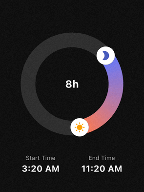
A highly customizable circular time range picker for Flutter. Perfect for use cases like sleep tracking, focus sessions, or scheduling, where users select a start and end time on a 24-hour clock face.
Features #
- 24h Circular Selection: Intuitive 360-degree time range picking.
- Flexible Interaction:
- Drag the start handle to adjust the beginning.
- Drag the end handle to adjust the end.
- Drag the entire arc to shift the whole time range at once.
- Smart Snapping: Fully configurable
minuteInterval(e.g., 5, 10, 15, 30 min) with multiple snapping strategies (round,floor,ceil). - Highly Customizable UI:
- Support for Gradients on the range arc.
- Use Custom Widgets (Icons, Images) as handles.
- Adjustable stroke width, track colors, and handle sizes.
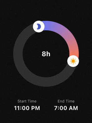
- Midnight Logic: Automatically calculates durations that cross the midnight threshold (e.g., 23:00 to 07:00).
Getting started #
Add the package to your pubspec.yaml:
dependencies:
  circular_time_range_picker: ^0.1.0
Import it in your Dart code:
import 'package:circular_time_range_picker/circular_time_range_picker.dart';
Usage #
Simple Example #
The most basic implementation requires an initialValue and an onChanged callback.
CircularTimeRangePicker(
  initialValue: const TimeRangeValue(
    start: TimeOfDay(hour: 22, minute: 0),
    end: TimeOfDay(hour: 6, minute: 0),
  ),
  onChanged: (newRange) {
    print("New Duration: ${newRange.duration.inHours} hours");
  },
)
Advanced Styling & Snapping #
You can use TimePickerStyle and SnapStrategy to match your app's design and UX requirements.
CircularTimeRangePicker(
  initialValue: _myRange,
  size: const Size(280, 280),
  minuteInterval: 15,
  snapStrategy: SnapStrategy.round,
  style: TimePickerStyle(
    trackColor: Colors.white10,
    rangeGradient: [Colors.indigoAccent, Colors.deepOrangeAccent],
    strokeWidth: 40,
    handlerRadius: 22,
    startHandlerWidget: const Icon(Icons.bed, color: Colors.indigo, size: 24),
    endHandlerWidget: const Icon(Icons.sunny, color: Colors.orange, size: 24),
  ),
  onChanged: (range) => setState(() => _myRange = range),
)
API Reference #
CircularTimeRangePicker #
CircularTimeRangePicker({
  Key? key,
  Size size = const Size(250, 250),
  required TimeRangeValue initialValue,
  TimePickerStyle style = const TimePickerStyle(),
  required void Function(TimeRangeValue) onChanged,
  int minuteInterval = 10,
  SnapStrategy snapStrategy = SnapStrategy.round,
})
initialValue: initial start/endTimeOfDay.onChanged: called whenever the user drags a handle or arc.minuteInterval:- “snap step” in minutes (e.g.
1,5,10,15,30,60). - Any
int >= 1is allowed, but divisors of 60 (1, 5, 10, 12, 15, 20, 30, 60) are recommended.
- “snap step” in minutes (e.g.
snapStrategy(SnapStrategy):SnapStrategy.round– snap to the nearest interval (default)SnapStrategy.floor– always snap downSnapStrategy.ceil– always snap upSnapStrategy.none– no snapping (in this caseminuteIntervalis ignored)
Internally, both:
- the displayed times and
- the handle positions (angles)
are snapped according to these settings, so the UI and values stay perfectly in sync.
TimeRangeValue #
class TimeRangeValue {
  final TimeOfDay start;
  final TimeOfDay end;

  const TimeRangeValue({required this.start, required this.end});

  Duration get duration;
}
start/end: 24‑hour times.duration:- Computed as the forward difference from
starttoend. - Handles ranges that cross midnight (e.g.
23:00 → 07:00= 8 hours).
- Computed as the forward difference from
TimePickerStyle #
class TimePickerStyle {
  final Color trackColor;
  final List<Color> rangeGradient;
  final double strokeWidth;
  final double handlerRadius;
  final Color handlerColor;
  final Widget? startHandlerWidget;
  final Widget? endHandlerWidget;

  const TimePickerStyle({
    this.trackColor = Colors.white10,
    this.rangeGradient = const [Colors.indigoAccent, Colors.deepOrangeAccent],
    this.strokeWidth = 30.0,
    this.handlerRadius = 18.0,
    this.handlerColor = Colors.white,
    this.startHandlerWidget,
    this.endHandlerWidget,
  });
}
trackColor: background ring color.rangeGradient: gradient along the active arc (start → end).strokeWidth: thickness of the ring.handlerRadius/handlerColor:- base circular handlers drawn by the painter.
startHandlerWidget/endHandlerWidget:- Optional custom widgets rendered on top of the handles, positioned so that their centers sit exactly on the ring.
Example:
style: TimePickerStyle(
  trackColor: const Color(0xFFEEEEEE),
  rangeGradient: const [Colors.blue, Colors.lightBlueAccent],
  strokeWidth: 40,
  handlerRadius: 20,
  handlerColor: Colors.white,
  startHandlerWidget: const Icon(Icons.bed, color: Colors.white),
  endHandlerWidget: const Icon(Icons.sunny, color: Colors.white),
),
FAQ #
Q: How do I display the total duration in the center?
A: Wrap the CircularTimeRangePicker in a Stack and place a Text widget in the center. Since the picker's center is transparent, the text will be visible.
Q: Does it support 12-hour or 24-hour formats?
A: The picker always operates on a 24-hour logic (full circle), but you can format the output TimeOfDay to 12h or 24h format in your UI using timeOfDay.format(context).
License #
This package is distributed under the MIT License. See LICENSE for details.
Metadata
Publisher
unverified uploader
Weekly Downloads
Metadata
A customizable circular time range picker widget for Flutter applications.
Repository (GitHub)
View/report issues
Documentation
License
 MIT (license)