pulsing_border

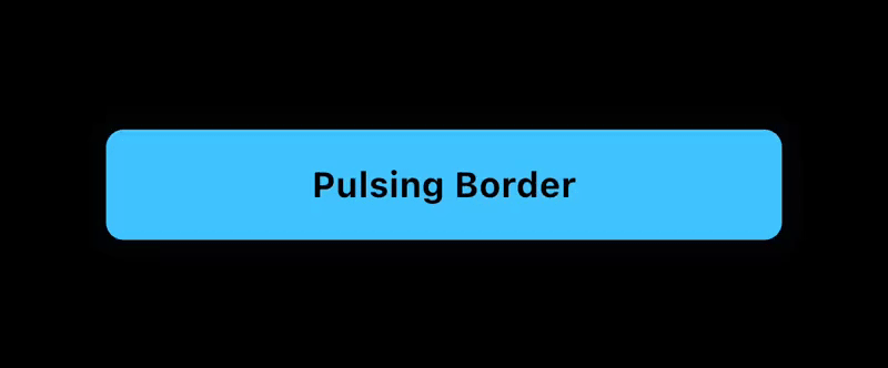
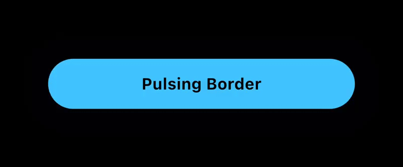
The Pulsing Border package for Flutter adds a configurable pulsing border around any widget. Useful for grabbing a users attention to a button or other container.
Features
The PulsingBorder widget allows you to add an attention-grabbing animation around a button or other container.
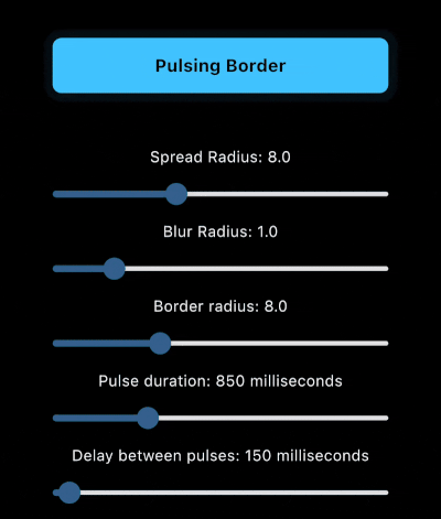
- Customizable: configure the color, border radius, animation duration, delay duration, and border properties such as spread and blur radius.
- Controllable: An optional
PulsingBorderControllerallows you to start and stop the animation when you choose to.
Example App
The example app includes sliders to visually preview the changes to each parameter.
Installation
To add the Pulsing Border package into your Flutter project, add the following dependency to your pubspec.yaml file:
dependencies:
  pulsing_border: ^1.0.0
After updating your pubspec.yaml, run the following command in your terminal:
flutter pub get
Usage
PulsingBorder Widget
The PulsingBorder widget allows you to add a configurable pulsing animation around a widget. Example:
PulsingBorder(
  color: Colors.lightBlueAccent,
  borderRadius: borderRadius,
  spreadRadius: spreadRadius,
  blurRadius: blurRadius,
  pulseDuration: pulseDuration,
  pulseDelay: delayBetweenPulses,
  controller: controller,
  child: YourChildWidget(),
)
Documentation
PulsingBorder Widget properties
| Property | Type | Description |
|---|---|---|
color |
Color | Pulse border color Required. |
borderRadius |
double | The border radius of the pulsing border. Required. |
spreadRadius |
double | The spread radius of the pulsing border. Default is 8. |
blurRadius |
double | The blurRadius of the pulsing border. Default is 1. |
pulseDuration |
Duration | The duration of the pulsing animation for one iteration. Default is 850ms. |
pulseDelay |
Duration | The duration of the delay between the end of the animation and the start of the next animation. Default is 150ms. |
controller |
PulsingBorderController? | The optional controller that allows you to start/stop the pulsing animation. If no controller is provided, the pulsing animation will be active indefinitely. |
child |
Widget | The child of the pulsing border. Normally a button or container that is a Rectangle or RoundedRectangle shape. Required. |
PulsingBorderController
The PulsingBorderController is a ValueNotifier<bool> and can be listened to via a ValueListenableBuilder or other methods to listen to the state of the pulsing animation.
When creating the controller, you can define whether the initial state has pulsing on or off.
Example:
PulsingBorderController controller = PulsingBorderController(isPulsing: true);
To listen to pulsing state changes, here is an example ValueListenableBuilder:
ValueListenableBuilder(
  valueListenable: controller,
  builder: (context, isPulsing, child) {
    return Text(
      isPulsing ? 'Stop Pulsing' : 'Start Pulsing',
      style: TextStyle(
        fontSize: 16,
        fontWeight: FontWeight.bold,
        color: Colors.black,
      ),
    );
  },
),
To toggle pulsing on and off, simply call:
controller.togglePulsing();
License
This project is licensed under the MIT License - see the LICENSE file for details.
Libraries
- A Flutter package for adding a pulsing border animation around a widget.