pulsing_border 1.0.1  pulsing_border: ^1.0.1 copied to clipboard
 lampe.io
A Flutter package for adding a pulsing border around a widget.
pulsing_border #

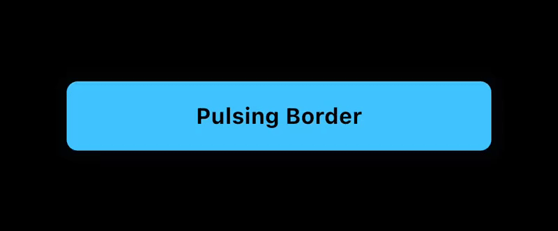
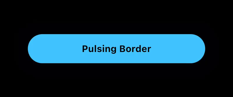
The Pulsing Border package for Flutter adds a configurable pulsing border around any widget. Useful for grabbing a users attention to a button or other container.
Features #
The PulsingBorder widget allows you to add an attention-grabbing animation around a button or other container.
- Customizable: configure the color, border radius, animation duration, delay duration, and border properties such as spread and blur radius.
- Controllable: An optional
PulsingBorderControllerallows you to start and stop the animation when you choose to.
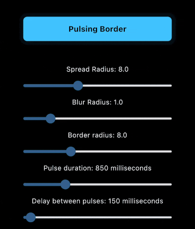
Example App #
The example app includes sliders to visually preview the changes to each parameter.
Installation #
To add the Pulsing Border package into your Flutter project, add the following dependency to your pubspec.yaml file:
dependencies:
  pulsing_border: ^1.0.0
After updating your pubspec.yaml, run the following command in your terminal:
flutter pub get
Usage #
PulsingBorder Widget #
The PulsingBorder widget allows you to add a configurable pulsing animation around a widget. Example:
PulsingBorder(
  color: Colors.lightBlueAccent,
  borderRadius: borderRadius,
  spreadRadius: spreadRadius,
  blurRadius: blurRadius,
  pulseDuration: pulseDuration,
  pulseDelay: delayBetweenPulses,
  controller: controller,
  child: YourChildWidget(),
)
Documentation #
PulsingBorder Widget properties #
| Property | Type | Description |
|---|---|---|
color |
Color | Pulse border color Required. |
borderRadius |
double | The border radius of the pulsing border. Required. |
spreadRadius |
double | The spread radius of the pulsing border. Default is 8. |
blurRadius |
double | The blurRadius of the pulsing border. Default is 1. |
pulseDuration |
Duration | The duration of the pulsing animation for one iteration. Default is 850ms. |
pulseDelay |
Duration | The duration of the delay between the end of the animation and the start of the next animation. Default is 150ms. |
controller |
PulsingBorderController? | The optional controller that allows you to start/stop the pulsing animation. If no controller is provided, the pulsing animation will be active indefinitely. |
child |
Widget | The child of the pulsing border. Normally a button or container that is a Rectangle or RoundedRectangle shape. Required. |
PulsingBorderController #
The PulsingBorderController is a ValueNotifier<bool> and can be listened to via a ValueListenableBuilder or other methods to listen to the state of the pulsing animation.
When creating the controller, you can define whether the initial state has pulsing on or off.
Example:
PulsingBorderController controller = PulsingBorderController(isPulsing: true);
To listen to pulsing state changes, here is an example ValueListenableBuilder:
ValueListenableBuilder(
  valueListenable: controller,
  builder: (context, isPulsing, child) {
    return Text(
      isPulsing ? 'Stop Pulsing' : 'Start Pulsing',
      style: TextStyle(
        fontSize: 16,
        fontWeight: FontWeight.bold,
        color: Colors.black,
      ),
    );
  },
),
To toggle pulsing on and off, simply call:
controller.togglePulsing();
License #
This project is licensed under the MIT License - see the LICENSE file for details.
Metadata
Publisher
Weekly Downloads
Metadata
A Flutter package for adding a pulsing border around a widget.
Repository (GitHub)
View/report issues
Contributing
Documentation
License
 MIT (license)