pill_widget
A customizable pill/chip widget for Flutter with inline editing support and extensive styling options. Display labels with optional editable values in a sleek pill-shaped container.
Features
- Display a label-only pill or a label with an editable value
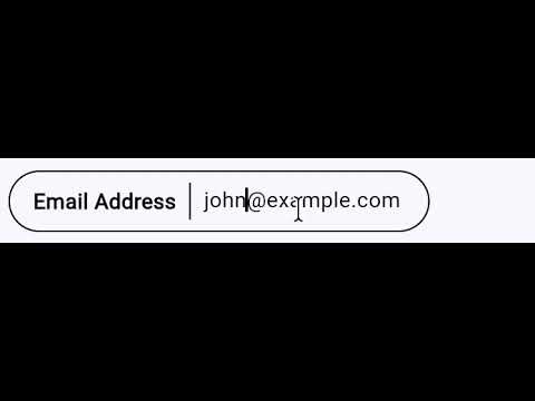
- Inline editing with tap-to-edit functionality
- Widget support for
labelandvalue— pass aStringor anyWidget leadingandtrailingwidget slots for icons, badges, etc.- Comprehensive styling with
PillStyle - 8 predefined color presets via
PillStyles - Read-only mode with
editableparameter - Editable pills are content-width
- Expandable mode for long text with
expandableparameter - Selectable state with
selectedand optional check icon - Tap handling with
onTapcallback - Clean pill-shaped design
- Lightweight with no external dependencies
Screenshots
Basic Pills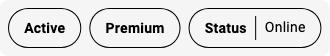 |
Editable Pills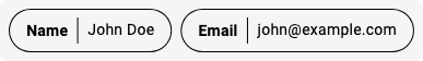 |
Styled Pills |
Styled Pills with Values |
Custom Styles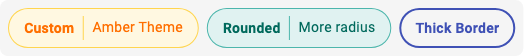 |
Read-only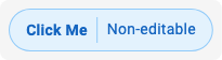 |
Selectable Pills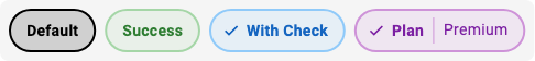 |
Expandable Pills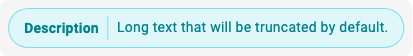 |
Custom Widget Content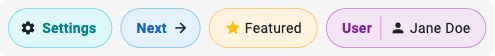 |
Videos
Editable Pill: Dynamic Width during editing
Expandable Pill: Expanding and Collapsing

Installation
Add this to your package's pubspec.yaml file:
dependencies:
  pill_widget: ^0.1.0
Then run:
flutter pub get
Usage
Basic Label-Only Pill
import 'package:pill_widget/pill_widget.dart';

Pill(label: 'Status')
Pill with Value
Pill(
  label: 'Name',
  value: 'John Doe',
)
Editable Pill
Pill(
  label: 'Name',
  value: _name,
  onValueChanged: (newValue) {
    setState(() {
      _name = newValue;
    });
  },
)
Styled Pills (Using Presets)
// Use predefined color presets
Pill(label: 'Info', style: PillStyles.info)
Pill(label: 'Success', style: PillStyles.success)
Pill(label: 'Warning', style: PillStyles.warning)
Pill(label: 'Error', style: PillStyles.error)
Pill(label: 'Special', style: PillStyles.special)
Pill(label: 'Neutral', style: PillStyles.neutral)
Pill(label: 'Muted', style: PillStyles.muted)
Pill(label: 'Date', style: PillStyles.date)
Custom Styling
Pill(
  label: 'Custom',
  value: 'Styled',
  style: PillStyle(
    backgroundColor: Colors.amber.shade50,
    borderColor: Colors.amber.shade300,
    labelColor: Colors.amber.shade900,
    borderRadius: 32,
    borderWidth: 2.0,
  ),
)
Read-Only Pill with Tap Handler
Pill(
  label: 'Click Me',
  value: 'Non-editable',
  editable: false,
  style: PillStyles.info,
  onTap: () {
    print('Pill tapped!');
  },
)
Selectable Pill
Pill(
  label: 'Option',
  selected: _isSelected,
  showCheckIcon: true,
  style: PillStyles.info,
  onTap: () => setState(() => _isSelected = !_isSelected),
)
Expandable Pill
Pill(
  label: 'Description',
  value: 'Long text that will be truncated...',
  expandable: true,
)
Pill with Leading/Trailing Widgets
Pill(
  label: 'Settings',
  leading: Icon(Icons.settings, size: 16),
  style: PillStyles.neutral,
)

Pill(
  label: 'Next',
  trailing: Icon(Icons.arrow_forward, size: 16),
  style: PillStyles.info,
)
Pill with Widget Label or Value
// Widget as label
Pill(
  label: Row(
    mainAxisSize: MainAxisSize.min,
    children: [
      Icon(Icons.star, size: 16, color: Colors.amber),
      SizedBox(width: 4),
      Text('Featured'),
    ],
  ),
)

// Widget as value
Pill(
  label: 'User',
  value: Row(
    mainAxisSize: MainAxisSize.min,
    children: [
      Icon(Icons.person, size: 16),
      SizedBox(width: 4),
      Text('Jane Doe'),
    ],
  ),
)
API Reference
Pill
| Property | Type | Description |
|---|---|---|
label |
String or Widget |
Required. The label displayed on the left side of the pill. |
value |
String?, Widget? |
Optional. The value displayed on the right side. When null, only the label is shown. When a Widget, editing is disabled. |
leading |
Widget? |
Optional. A widget rendered before the label inside the pill border. |
trailing |
Widget? |
Optional. A widget rendered after the value (or label) inside the pill border. |
onValueChanged |
ValueChanged<String>? |
Optional. Callback fired when the value is changed through inline editing. |
style |
PillStyle? |
Optional. Style configuration for customizing appearance. |
editable |
bool |
Whether the value can be edited (only applies to String values). Defaults to true. |
expandable |
bool |
Whether the pill expands on tap. Defaults to false. |
selected |
bool |
Whether the pill is in a selected state. Defaults to false. |
showCheckIcon |
bool |
Whether to show a check icon when selected. Defaults to false. |
onTap |
VoidCallback? |
Optional. Callback fired when the pill is tapped. |
PillStyle
| Property | Type | Default | Description |
|---|---|---|---|
backgroundColor |
Color? |
transparent | Background color of the pill. |
borderColor |
Color? |
black | Border color of the pill. |
labelColor |
Color? |
black | Color of the label text. |
valueColor |
Color? |
labelColor | Color of the value text. |
dividerColor |
Color? |
borderColor | Color of the divider between label and value. |
borderWidth |
double? |
1.0 | Width of the border. |
borderRadius |
double? |
24.0 | Border radius of the pill. |
labelFontWeight |
FontWeight? |
bold | Font weight of the label. |
valueFontWeight |
FontWeight? |
normal | Font weight of the value. |
fontSize |
double? |
theme default | Font size for text. |
selectedBackgroundColor |
Color? |
borderColor at 15% opacity | Background color when selected. |
selectedBorderColor |
Color? |
borderColor | Border color when selected. |
selectedBorderWidth |
double? |
2.0 | Border width when selected. |
PillStyles (Presets)
| Style | Description |
|---|---|
PillStyles.defaultStyle |
Black border on transparent background |
PillStyles.info |
Blue theme for informational content |
PillStyles.success |
Green theme for positive states |
PillStyles.warning |
Orange theme for warnings |
PillStyles.error |
Red theme for errors |
PillStyles.special |
Purple theme for highlighted content |
PillStyles.neutral |
Cyan theme for secondary content |
PillStyles.muted |
Grey theme for disabled content |
PillStyles.date |
Pink theme for temporal content |
Migration from 0.0.x
The 0.1.0 release is fully backward compatible. Existing code will continue to work without changes. The new style, editable, and onTap parameters are optional additions.
License
MIT License - see the LICENSE file for details.