pill_widget 1.2.3  pill_widget: ^1.2.3 copied to clipboard
 goruv.com
A customizable pill/chip widget for Flutter with inline editing support. Display labels with optional editable values in a sleek pill-shaped container.
pill_widget #
A customizable pill/chip widget for Flutter with inline editing support and extensive styling options. Display labels with optional editable values in a sleek pill-shaped container.
Features #
- Display a label-only pill or a label with an editable value
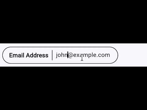
- Inline editing with tap-to-edit functionality
- Widget support for
labelandvalue— pass aStringor anyWidget leadingandtrailingwidget slots for icons, badges, etc.- Comprehensive styling with
PillStyle - 8 predefined color presets via
PillStyles - Read-only mode with
editableparameter - Editable pills are content-width
- Expandable mode for long text with
expandableparameter - Selectable state with
selectedand optional check icon - Tap handling with
onTapcallback - Clean pill-shaped design
- Lightweight with no external dependencies
Screenshots #
Basic Pills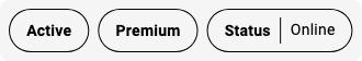 |
Editable Pills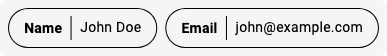 |
Styled Pills |
Styled Pills with Values |
Custom Styles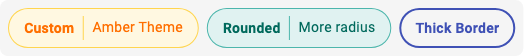 |
Read-only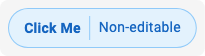 |
Selectable Pills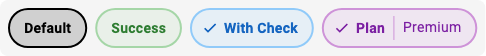 |
Expandable Pills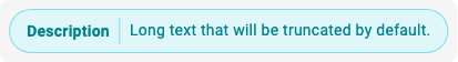 |
Custom Widget Content |
Videos #
Editable Pill: Dynamic Width during editing #
Expandable Pill: Expanding and Collapsing #

Installation #
Add this to your package's pubspec.yaml file:
dependencies:
  pill_widget: ^0.1.0
Then run:
flutter pub get
Usage #
Basic Label-Only Pill #
import 'package:pill_widget/pill_widget.dart';

Pill(label: 'Status')
Pill with Value #
Pill(
  label: 'Name',
  value: 'John Doe',
)
Editable Pill #
Pill(
  label: 'Name',
  value: _name,
  onValueChanged: (newValue) {
    setState(() {
      _name = newValue;
    });
  },
)
Styled Pills (Using Presets) #
// Use predefined color presets
Pill(label: 'Info', style: PillStyles.info)
Pill(label: 'Success', style: PillStyles.success)
Pill(label: 'Warning', style: PillStyles.warning)
Pill(label: 'Error', style: PillStyles.error)
Pill(label: 'Special', style: PillStyles.special)
Pill(label: 'Neutral', style: PillStyles.neutral)
Pill(label: 'Muted', style: PillStyles.muted)
Pill(label: 'Date', style: PillStyles.date)
Custom Styling #
Pill(
  label: 'Custom',
  value: 'Styled',
  style: PillStyle(
    backgroundColor: Colors.amber.shade50,
    borderColor: Colors.amber.shade300,
    labelColor: Colors.amber.shade900,
    borderRadius: 32,
    borderWidth: 2.0,
  ),
)
Read-Only Pill with Tap Handler #
Pill(
  label: 'Click Me',
  value: 'Non-editable',
  editable: false,
  style: PillStyles.info,
  onTap: () {
    print('Pill tapped!');
  },
)
Selectable Pill #
Pill(
  label: 'Option',
  selected: _isSelected,
  showCheckIcon: true,
  style: PillStyles.info,
  onTap: () => setState(() => _isSelected = !_isSelected),
)
Expandable Pill #
Pill(
  label: 'Description',
  value: 'Long text that will be truncated...',
  expandable: true,
)
Pill with Leading/Trailing Widgets #
Pill(
  label: 'Settings',
  leading: Icon(Icons.settings, size: 16),
  style: PillStyles.neutral,
)

Pill(
  label: 'Next',
  trailing: Icon(Icons.arrow_forward, size: 16),
  style: PillStyles.info,
)
Pill with Widget Label or Value #
// Widget as label
Pill(
  label: Row(
    mainAxisSize: MainAxisSize.min,
    children: [
      Icon(Icons.star, size: 16, color: Colors.amber),
      SizedBox(width: 4),
      Text('Featured'),
    ],
  ),
)

// Widget as value
Pill(
  label: 'User',
  value: Row(
    mainAxisSize: MainAxisSize.min,
    children: [
      Icon(Icons.person, size: 16),
      SizedBox(width: 4),
      Text('Jane Doe'),
    ],
  ),
)
API Reference #
Pill #
| Property | Type | Description |
|---|---|---|
label |
String or Widget |
Required. The label displayed on the left side of the pill. |
value |
String?, Widget? |
Optional. The value displayed on the right side. When null, only the label is shown. When a Widget, editing is disabled. |
leading |
Widget? |
Optional. A widget rendered before the label inside the pill border. |
trailing |
Widget? |
Optional. A widget rendered after the value (or label) inside the pill border. |
onValueChanged |
ValueChanged<String>? |
Optional. Callback fired when the value is changed through inline editing. |
style |
PillStyle? |
Optional. Style configuration for customizing appearance. |
editable |
bool |
Whether the value can be edited (only applies to String values). Defaults to true. |
expandable |
bool |
Whether the pill expands on tap. Defaults to false. |
selected |
bool |
Whether the pill is in a selected state. Defaults to false. |
showCheckIcon |
bool |
Whether to show a check icon when selected. Defaults to false. |
onTap |
VoidCallback? |
Optional. Callback fired when the pill is tapped. |
PillStyle #
| Property | Type | Default | Description |
|---|---|---|---|
backgroundColor |
Color? |
transparent | Background color of the pill. |
borderColor |
Color? |
black | Border color of the pill. |
labelColor |
Color? |
black | Color of the label text. |
valueColor |
Color? |
labelColor | Color of the value text. |
dividerColor |
Color? |
borderColor | Color of the divider between label and value. |
borderWidth |
double? |
1.0 | Width of the border. |
borderRadius |
double? |
24.0 | Border radius of the pill. |
labelFontWeight |
FontWeight? |
bold | Font weight of the label. |
valueFontWeight |
FontWeight? |
normal | Font weight of the value. |
fontSize |
double? |
theme default | Font size for text. |
selectedBackgroundColor |
Color? |
borderColor at 15% opacity | Background color when selected. |
selectedBorderColor |
Color? |
borderColor | Border color when selected. |
selectedBorderWidth |
double? |
2.0 | Border width when selected. |
PillStyles (Presets) #
| Style | Description |
|---|---|
PillStyles.defaultStyle |
Black border on transparent background |
PillStyles.info |
Blue theme for informational content |
PillStyles.success |
Green theme for positive states |
PillStyles.warning |
Orange theme for warnings |
PillStyles.error |
Red theme for errors |
PillStyles.special |
Purple theme for highlighted content |
PillStyles.neutral |
Cyan theme for secondary content |
PillStyles.muted |
Grey theme for disabled content |
PillStyles.date |
Pink theme for temporal content |
Migration from 0.0.x #
The 0.1.0 release is fully backward compatible. Existing code will continue to work without changes. The new style, editable, and onTap parameters are optional additions.
License #
MIT License - see the LICENSE file for details.
Metadata
Publisher
Weekly Downloads
Metadata
A customizable pill/chip widget for Flutter with inline editing support. Display labels with optional editable values in a sleek pill-shaped container.
Repository (GitHub)
View/report issues
Documentation
License
 MIT (license)