Flutter BoundingBox Widget
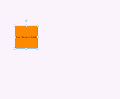
The BoundingBox is a custom Flutter widget that allows you to drag, resize, and rotate any widget with a bounding box overlay. It's useful for building design tools, image editors, diagram creators, and other interactive visual UIs.
✨ Features
- Move (drag) any widget freely on the screen.
- Resize from 8 handles (top, bottom, sides, and corners).
- Rotate via a draggable rotate handle.
- Customizable handle appearance, stroke color, stroke width, etc.
- Optional custom widgets for resize and rotate handles.
- Optionally disable the interactive functionality.
🧩 Constructor Parameters
BoundingBox({
  required Widget Function(Size size, Offset position, double rotation) builder,
  required Offset initialPosition,
  required Size initialSize,
  double? initialRotation,
  bool enable = true,
  double? handleResizeSize,
  double? handleRotateSize,
  Color? handleResizeBackgroundColor,
  Color? handleResizeStrokeColor,
  Color? handleRotateBackgroundColor,
  Color? handleRotateStrokeColor,
  Color? strokeColor,
  double? strokeWidth,
  double? handleResizeStrokeWidth,
  double? handleRotateStrokeWidth,
  Widget? rotateIcon,
  Widget? customHandleResize,
  Widget? customHandleRotate,
  double? handleRotatePosition,
  BoxDecoration? customDecoration,
})
📌 Required
-
builder: A function that takes the currentSize,Position,Rotationand returns a widget. -
initialPosition: Starting position of the bounding box. -
initialSize: Starting size of the widget.
🧪 Example Usage
import 'package:bounding_box/bounding_box.dart';
import 'package:flutter/material.dart';

void main() {
  runApp(const MyApp());
}

class MyApp extends StatelessWidget {
  const MyApp({super.key});

  @override
  Widget build(BuildContext context) {
    return MaterialApp(
      title: 'Flutter BoundingBox Demo',
      theme: ThemeData(
        colorScheme: ColorScheme.fromSeed(seedColor: Colors.deepPurple),
      ),
      home: BoundingBox(
        initialSize: const Size(150, 150),
        initialPosition: const Offset(150, 200),
        builder: (size, position, rotation) {
          return Container(
            width: size.width,
            height: size.height,
            color: Colors.orange,
            alignment: Alignment.center,
            child: const Text("Drag / Resize / Rotate"),
          );
        },
      ),
    );
  }
}
📐 Visual Handle Layout
Handles are placed in 8 positions:
topLeft      topCenter      topRight

centerLeft                 centerRight

bottomLeft  bottomCenter  bottomRight
A rotate handle is positioned above topCenter.
🚫 Disabling Interactions
You can disable all interactions using:
enable: false
This will render only the widget without any interactive overlay.
🧠 Final Thoughts
This BoundingBox widget offers a lightweight and extensible way to add draggable, resizable, and rotatable components in Flutter, perfect for design apps, whiteboard tools, diagramming editors, and more.