vertical_timeline_widget 0.0.7  vertical_timeline_widget: ^0.0.7 copied to clipboard
 divyanshdev.tech
A customizable Timeline widget for Flutter to display chronological data with time information, titles, and visual indicators.
vertical_timeline_widget #
A customizable Timeline widget for Flutter to display chronological data with time information, titles, and visual indicators.
Features #
- 📅 Display chronological events with time, title, and content
- 🎨 Customizable colors per timeline entry
- ⚙️ Flexible theming via
TimelineThemeandTimelineThemeData - 📏 Configurable spacing, dot size, connector thickness
- 🔄 Circular or square indicator dots
- 📝 Custom text styles for time, title, and content
Screenshots #
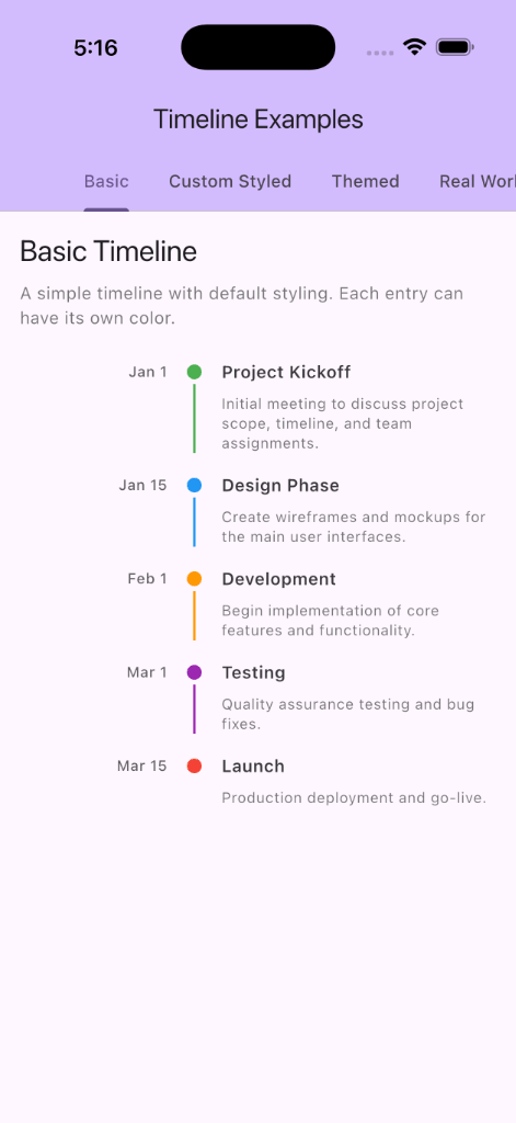
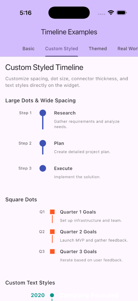
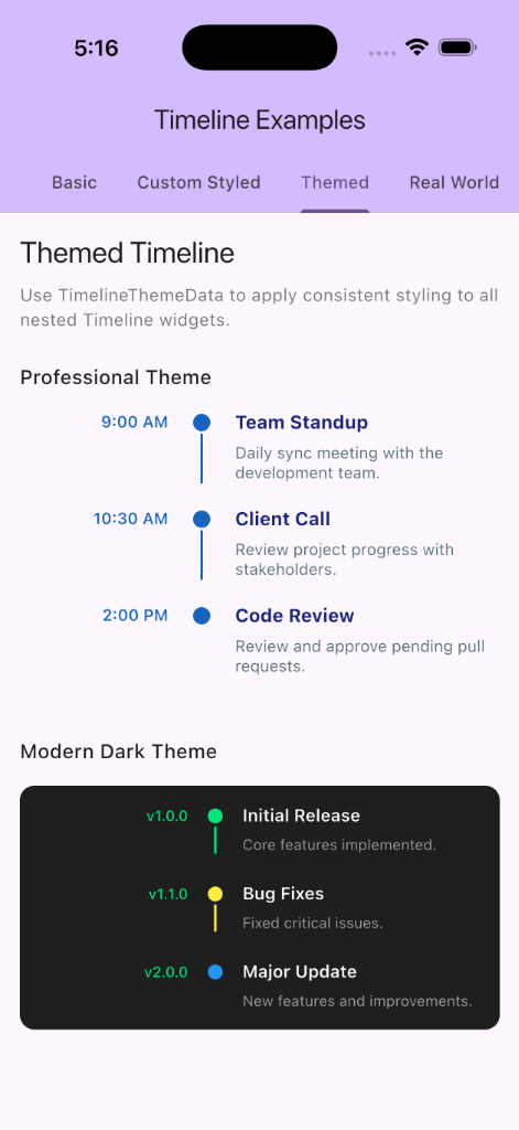
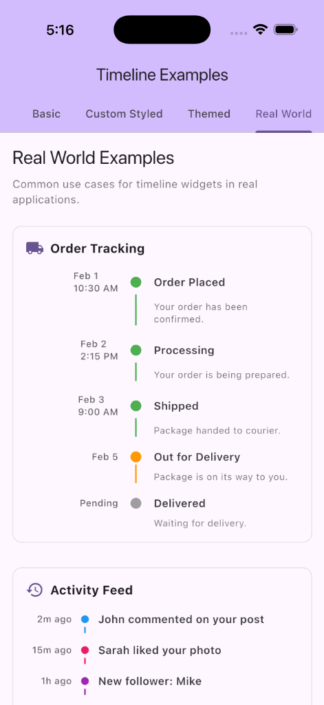
Timeline Widget #
Steps Widget #

VerticalStepper Widget #
Installation #
Add this to your package's pubspec.yaml file:
dependencies:
  vertical_timeline_widget: ^0.0.7
Usage #
Basic Usage #
import 'package:flutter/material.dart';
import 'package:vertical_timeline_widget/vertical_timeline_widget.dart';

Timeline(
  data: [
    TimelineData(
      time: Text('9:00 AM'),
      title: Text('Morning Standup'),
      content: Text('Daily team sync to discuss progress and blockers.'),
      color: Colors.green,
    ),
    TimelineData(
      time: Text('2:00 PM'),
      title: Text('Code Review'),
      content: Text('Review pull requests and provide feedback.'),
      color: Colors.blue,
    ),
  ],
);
With Custom Styling #
You can customize individual timeline properties directly:
Timeline(
  spacing: 20.0,
  dotSize: 16.0,
  rowGap: 24.0,
  color: Colors.purple,
  timeConstraints: BoxConstraints(minWidth: 80, maxWidth: 120),
  data: [
    TimelineData(
      time: Text('Jan 1'),
      title: Text('Project Kickoff'),
      content: Text('Initial meeting to discuss project scope.'),
    ),
    // More entries...
  ],
);
Using Theme #
Wrap your widget tree with TimelineThemeData to apply consistent styling:
TimelineThemeData(
  theme: TimelineTheme(
    dotSize: 16,
    spacing: 20,
    rowGap: 24,
    color: Colors.teal,
    useCircularDots: true,
    timeTextStyle: TextStyle(
      fontWeight: FontWeight.bold,
      fontSize: 14,
      color: Colors.teal,
    ),
    titleTextStyle: TextStyle(
      fontWeight: FontWeight.w700,
      fontSize: 16,
    ),
    contentTextStyle: TextStyle(
      fontSize: 14,
      color: Colors.grey[600],
    ),
  ),
  child: Timeline(
    data: [
      TimelineData(
        time: Text('9:00 AM'),
        title: Text('Morning Standup'),
        content: Text('Daily sync with the team.'),
      ),
      // More entries...
    ],
  ),
);
API Reference #
Timeline #
The main widget for displaying a vertical timeline.
| Property | Type | Description |
|---|---|---|
data |
List<TimelineData> |
Required. List of timeline entries to display |
timeConstraints |
BoxConstraints? |
Width constraints for the time column |
spacing |
double? |
Horizontal spacing between columns |
dotSize |
double? |
Size of indicator dots |
connectorThickness |
double? |
Thickness of connector lines |
color |
Color? |
Default color for indicators |
rowGap |
double? |
Vertical spacing between rows |
timeTextStyle |
TextStyle? |
Text style for time text |
titleTextStyle |
TextStyle? |
Text style for title text |
contentTextStyle |
TextStyle? |
Text style for content text |
useCircularDots |
bool? |
Use circular (true) or square (false) dots |
TimelineData #
Data model for individual timeline entries.
| Property | Type | Description |
|---|---|---|
time |
Widget |
Required. Widget displaying the time/timestamp |
title |
Widget |
Required. Widget displaying the title |
content |
Widget? |
Optional. Widget with additional details |
color |
Color? |
Optional. Custom color for this entry |
TimelineTheme #
Theme configuration for Timeline widgets.
| Property | Type | Description |
|---|---|---|
timeConstraints |
BoxConstraints? |
Default time column constraints |
spacing |
double? |
Default horizontal spacing |
dotSize |
double? |
Default dot size |
connectorThickness |
double? |
Default connector thickness |
color |
Color? |
Default indicator color |
rowGap |
double? |
Default vertical spacing |
timeTextStyle |
TextStyle? |
Default time text style |
titleTextStyle |
TextStyle? |
Default title text style |
contentTextStyle |
TextStyle? |
Default content text style |
useCircularDots |
bool |
Use circular dots (default: true) |
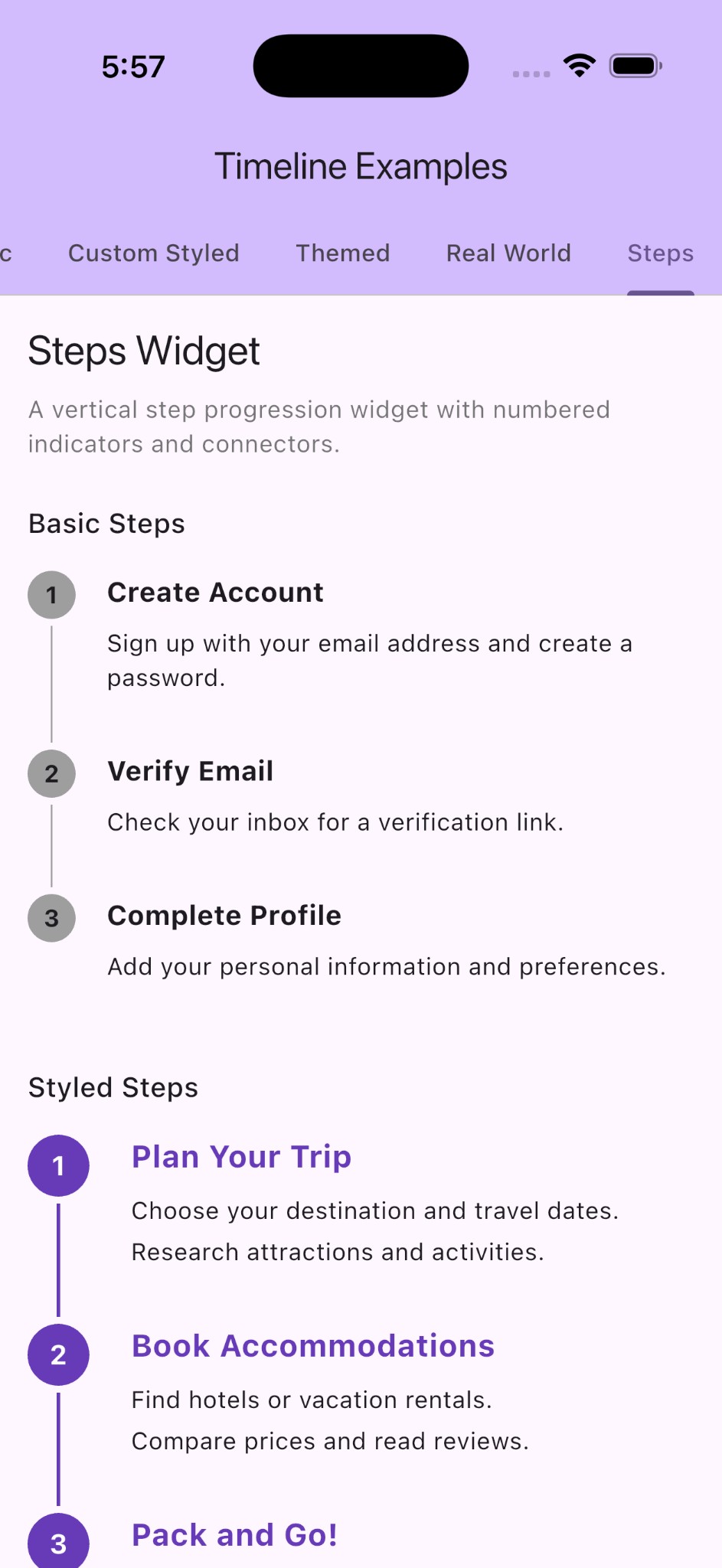
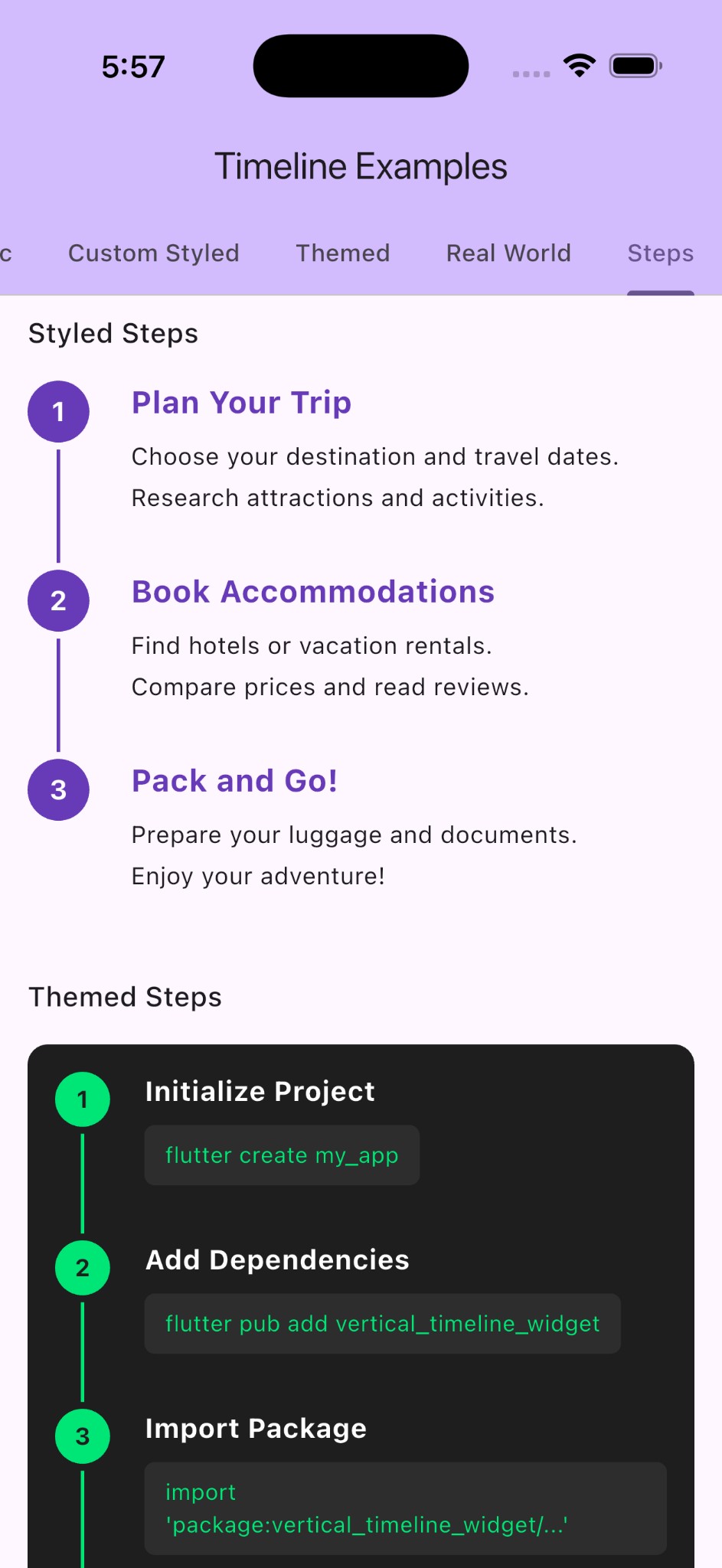
Steps #
A vertical step progression widget with numbered indicators and connectors. Ideal for showing progress through multi-step processes, tutorials, or workflows.
Steps(
  children: [
    StepItem(
      title: Text('Create Account'),
      content: [Text('Sign up with your email address')],
    ),
    StepItem(
      title: Text('Verify Email'),
      content: [Text('Check your inbox for verification')],
    ),
    StepItem(
      title: Text('Complete Profile'),
      content: [Text('Add your personal information')],
    ),
  ],
)
| Property | Type | Description |
|---|---|---|
children |
List<Widget> |
Required. List of step content widgets |
indicatorSize |
double? |
Diameter of the step indicator circle |
spacing |
double? |
Gap between the indicator and content |
indicatorColor |
Color? |
Color of the indicator and connector |
connectorThickness |
double? |
Thickness of the connector line |
numberTextStyle |
TextStyle? |
Text style for the step number |
bottomPadding |
double |
Bottom padding for each step (default: 32.0) |
StepItem #
A helper widget for step content, displaying a title and content items.
| Property | Type | Description |
|---|---|---|
title |
Widget |
Required. The title of the step |
content |
List<Widget> |
Required. Content widgets under the title |
titleStyle |
TextStyle? |
Text style for the title |
spacing |
double |
Spacing between title and content (default: 8.0) |
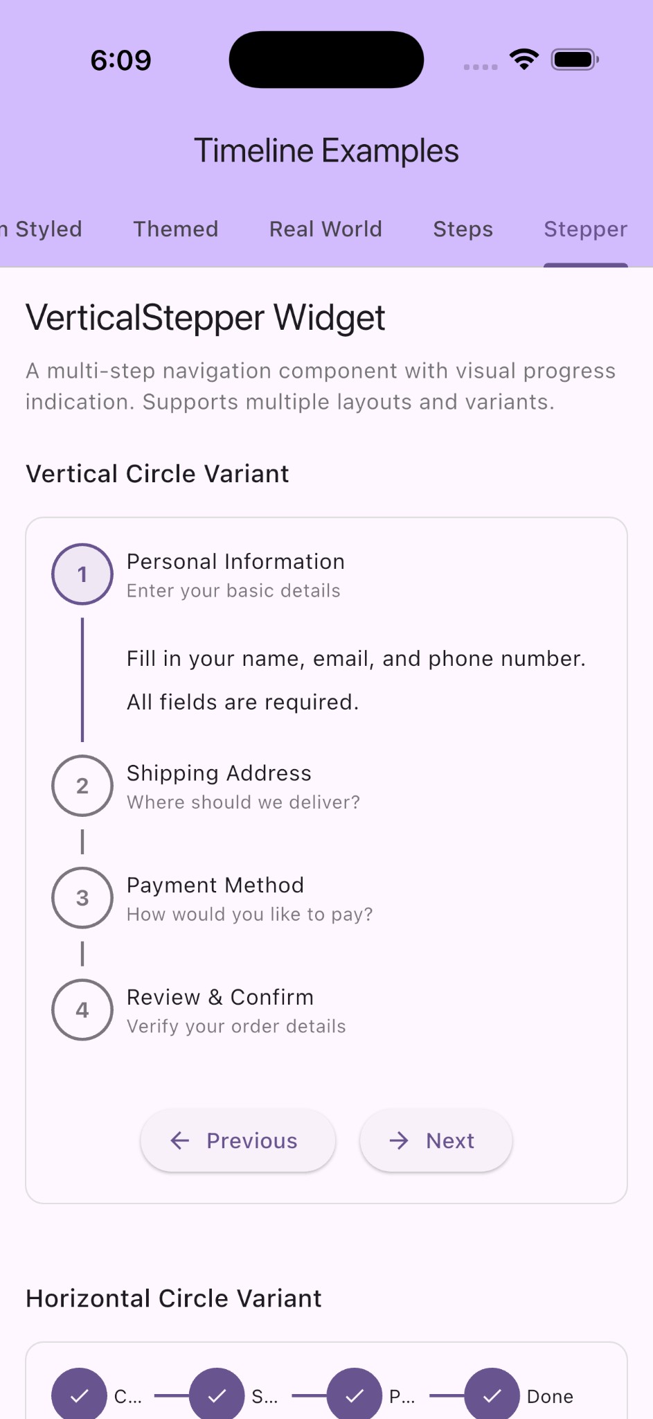
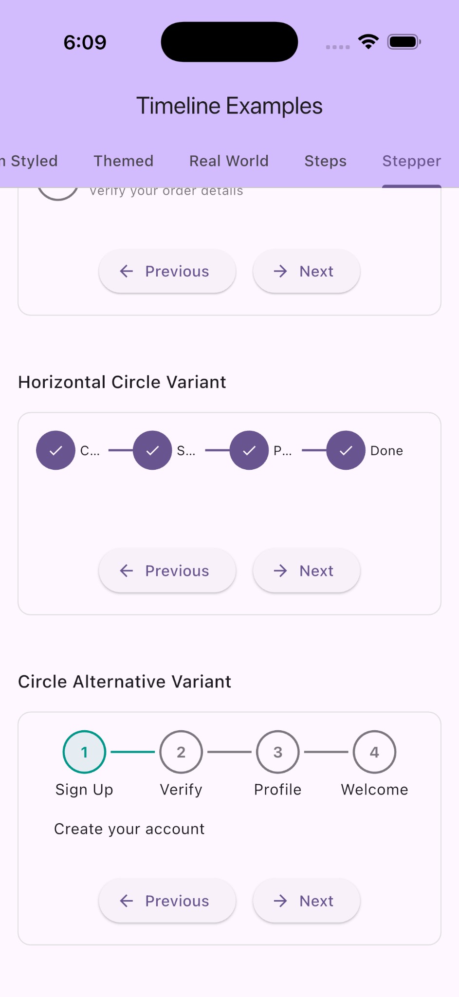
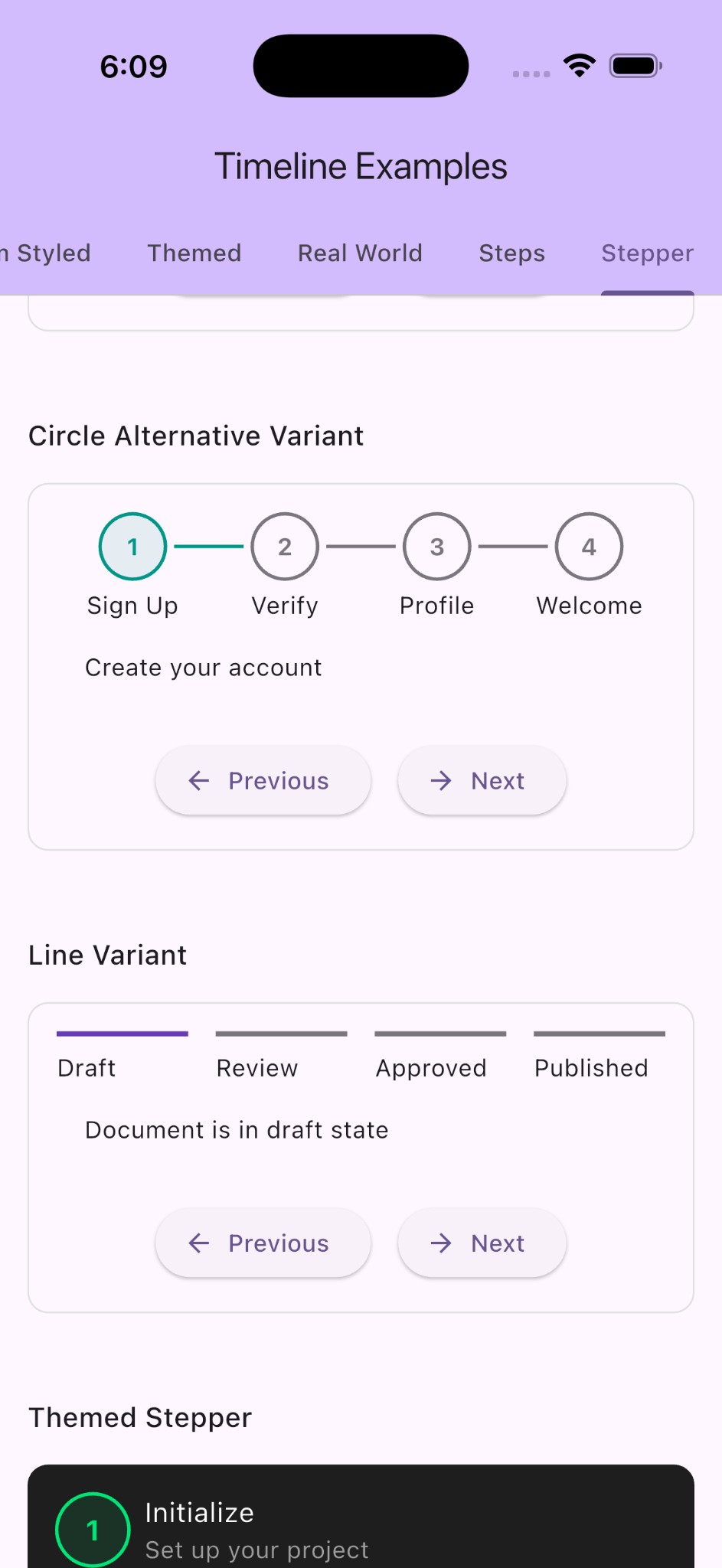
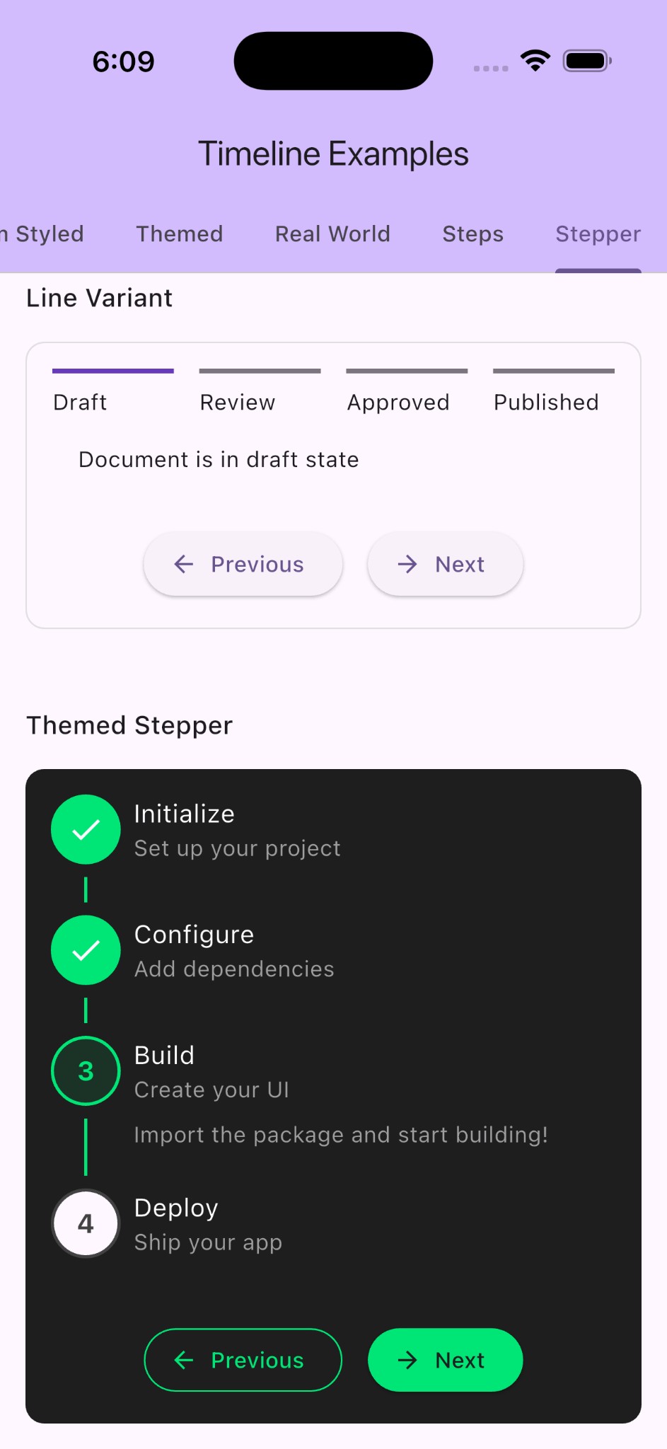
VerticalStepper #
A multi-step navigation component with visual progress indication. Supports both horizontal and vertical layouts with customizable visual styles.
final controller = StepperController();

VerticalStepper(
  controller: controller,
  direction: Axis.vertical,
  variant: StepVariant.circle,
  size: StepSize.medium,
  steps: [
    StepData(
      title: Text('Personal Info'),
      contentBuilder: (context) => PersonalInfoForm(),
    ),
    StepData(
      title: Text('Address'),
      contentBuilder: (context) => AddressForm(),
    ),
    StepData(
      title: Text('Confirmation'),
      contentBuilder: (context) => ConfirmationView(),
    ),
  ],
)
| Property | Type | Description |
|---|---|---|
controller |
StepperController |
Required. Controller for managing stepper state |
steps |
List<StepData> |
Required. List of steps to display |
direction |
Axis? |
Layout direction (horizontal or vertical) |
size |
StepSize? |
Size variant (small, medium, large) |
variant |
StepVariant? |
Visual variant (circle, circleAlt, line) |
activeColor |
Color? |
Color for active/completed steps |
inactiveColor |
Color? |
Color for inactive/pending steps |
errorColor |
Color? |
Color for failed steps |
StepperController #
Controller for managing stepper state and navigation.
| Method | Description |
|---|---|
nextStep() |
Advances to the next step |
previousStep() |
Returns to the previous step |
jumpToStep(int) |
Jumps directly to the specified step |
setStatus(int, StepState?) |
Sets or clears the state of a specific step |
StepData #
Data model for individual stepper steps.
| Property | Type | Description |
|---|---|---|
title |
Widget |
Required. The title widget for this step |
subtitle |
Widget? |
Optional subtitle below the title |
contentBuilder |
WidgetBuilder? |
Builder for step content shown when active |
icon |
Widget? |
Custom icon for the step indicator |
License #
This project is licensed under the MIT License.
Metadata
Publisher
Weekly Downloads
Metadata
A customizable Timeline widget for Flutter to display chronological data with time information, titles, and visual indicators.
Repository (GitHub)
View/report issues
Documentation
License
 MIT (license)