tooltip_pro 0.0.8  tooltip_pro: ^0.0.8 copied to clipboard
A powerful and flexible Flutter package for creating highly customizable tooltips with rich content, shadows, blurs, and precise positioning control.
Tooltip Pro #
A powerful and flexible tooltip package for Flutter that goes beyond simple text. Create beautiful, highly customizable tooltips with rich content, shadows, blurs, and precise control over positioning and styling.
🚀 See it in action: Used in NutriScan
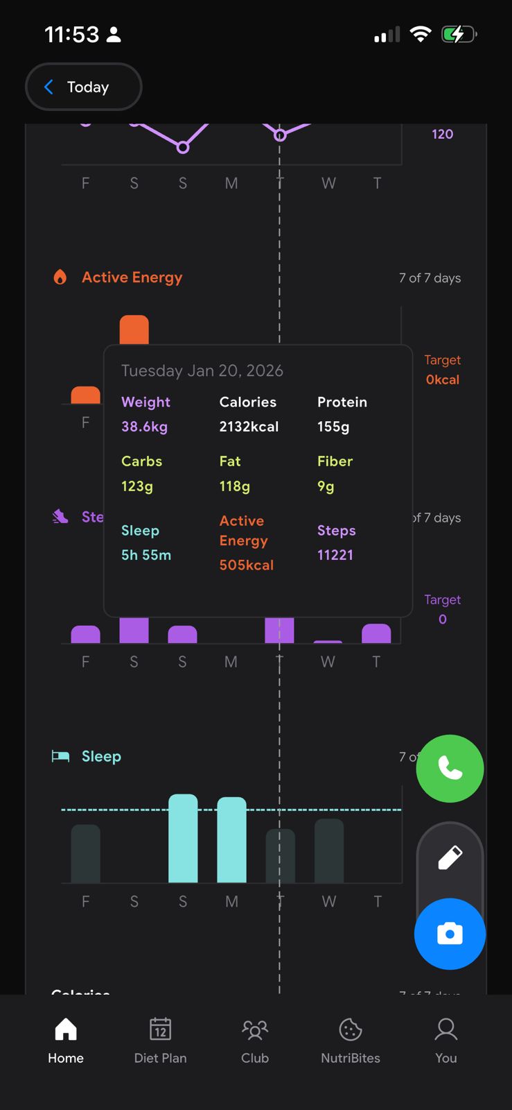 |
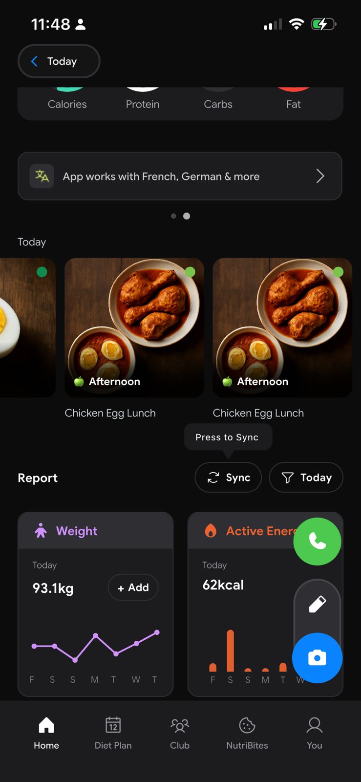 |
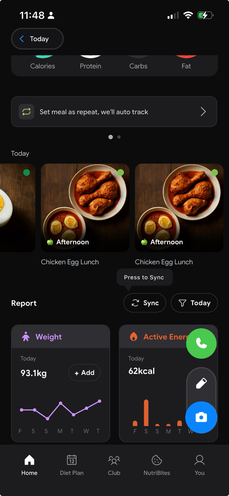 |
Features #
- ✨ Rich Content Support: Create tooltips with titles, descriptions, icons, or any custom widget.
- 📍 Flexible Positioning: Position tooltips TOP, BOTTOM, LEFT, or RIGHT of the target.
- 👆 Tap Position: Option to show the tooltip exactly where the user tapped (
showAtTapPosition). - 🏹 Advanced Arrow Control:
- Directions:
left,right,center,none, orcustom. - Full sizing control:
width,height, andoffset.
- Directions:
- 🎨 Premium Styling:
- Borders: Color, width, and radius.
- Shadows: Color, elevation, and blur.
- Glassmorphism: Built-in background blur support.
- 🏭 Factory Constructors: Built-in
minimal,rich, anderrorfactories for quick and beautiful presets. - ⏳ Auto-dismiss: Configurable auto-dismiss timer.
Getting started #
Add tooltip_pro to your pubspec.yaml:
dependencies:
  tooltip_pro: ^0.0.5
Usage #
1. Basic Usage #
Wrap any widget with TooltipPro.
TooltipPro(
  tooltipContent: const Text("Hello World!", style: TextStyle(color: Colors.white)),
  tooltipColor: Colors.black,
  child: const Icon(Icons.info),
)
2. Factory Constructors #
Quickly create styled tooltips without manual configuration.
Minimal (Text only)
TooltipPro.minimal(
  text: "Copied!",
  child: const Icon(Icons.copy),
)
Rich (Title + Description + Icon)
TooltipPro.rich(
  title: "Feature Unlocked",
  description: "You can now access premium features.",
  icon: Icons.star,
  child: const Icon(Icons.new_releases),
)
Error (Alert style)
TooltipPro.error(
  message: "Failed to connect.",
  child: const Icon(Icons.error),
)
3. Advanced Customization #
🏹 Arrow Configuration
Control the arrow's existence, position, and size.
TooltipPro(
  // Remove the arrow entirely
  arrowDirection: TooltipArrowDirection.none,

  // OR Custom arrow sizing
  arrowWidth: 20.0,
  arrowHeight: 15.0,

  // OR Custom position (0.0 = left/top edge, 1.0 = right/bottom edge)
  arrowDirection: TooltipArrowDirection.custom,
  customArrowOffset: 0.2, // 20% from the start

  child: MyWidget(),
)
📍 Tap Position
Show the tooltip at the exact coordinates where the user touched the widget.
TooltipPro(
  showAtTapPosition: true, // <--- User's touch point determines tooltip position
  child: Container(
    height: 200,
    width: 200,
    color: Colors.grey,
  ),
)
🎨 Border & Shadows
Create premium looking UI elements.
TooltipPro(
  border: TooltipBorderConfig(
    enabled: true,
    color: Colors.blueAccent,
    width: 2.0,
    radius: 12.0,
  ),
  shadow: TooltipShadowConfig(
    enabled: true,
    color: Colors.blue.withOpacity(0.3),
    blurRadius: 15,
    elevation: 8,
  ),
  child: MyWidget(),
)
4. Builders #
For dynamic content generation.
TooltipPro(
  tooltipContentBuilder: (context, hideTooltip) {
    return Column(
      mainAxisSize: MainAxisSize.min,
      children: [
        const Text("Dynamic Content"),
        ElevatedButton(
          onPressed: hideTooltip, // Close programmatically
          child: const Text("Close"),
        )
      ],
    );
  },
  child: MyWidget(),
)
API Reference #
TooltipPro Properties #
| Property | Type | Default | Use Case |
|---|---|---|---|
child |
Widget |
required | The widget that triggers the tooltip on tap. |
direction |
TooltipDirection |
top |
top, bottom, left, right. Overall position relative to child. |
arrowDirection |
TooltipArrowDirection |
center |
center, start, end, none, custom. Position of the arrow on the tooltip bubble. |
showAtTapPosition |
bool |
false |
If true, tooltip appears exactly where you tapped, ignoring direction slightly to align with touch. |
customArrowOffset |
double |
0.5 |
Used when arrowDirection is custom. 0.0 to 1.0. |
arrowWidth |
double |
12.0 |
Width of the arrow base. |
arrowHeight |
double |
10.0 |
Height (length) of the arrow. |
tooltipHeight |
double |
50.0 |
Fixed height of the tooltip. |
tooltipWidth |
double |
50.0 |
Fixed width of the tooltip. |
spacing |
double |
10.0 |
Gap between the target widget and the tooltip. |
autoDismiss |
Duration? |
3s |
How long before it disappears. Set null to disable. |
onPressed |
VoidCallback? |
null |
Additional callback when target is tapped. |
border |
TooltipBorderConfig |
const |
Configure border color, width, radius. |
shadow |
TooltipShadowConfig |
const |
Configure elevation and shadow color. |
blur |
TooltipBlurConfig |
const |
Configure background blur (glassmorphism). |
Configuration Classes #
TooltipBorderConfig
TooltipBorderConfig({
  bool enabled = false,
  Color color = Colors.transparent,
  double width = 1.0,
  double radius = 8.0,
})
TooltipShadowConfig
TooltipShadowConfig({
  bool enabled = false,
  Color? color,
  double elevation = 4.0,
  double blurRadius = 4.0,
})
TooltipBlurConfig
TooltipBlurConfig({
  bool enabled = false,
  double sigma = 5.0,
  Color? color,       // Tint logic
  bool includeChild = false,
})
Metadata
Publisher
unverified uploader
Weekly Downloads
Metadata
A powerful and flexible Flutter package for creating highly customizable tooltips with rich content, shadows, blurs, and precise positioning control.
Repository (GitHub)
View/report issues
Documentation
License
 MIT (license)