story_progress_indicator 1.1.2  story_progress_indicator: ^1.1.2 copied to clipboard
 qasimerror.com
A zero-dependency Flutter package providing a Stories-style segmented progress indicator. Highly customizable, responsive, and driven by a single progress value for use with PageView, timed stories, o [...]
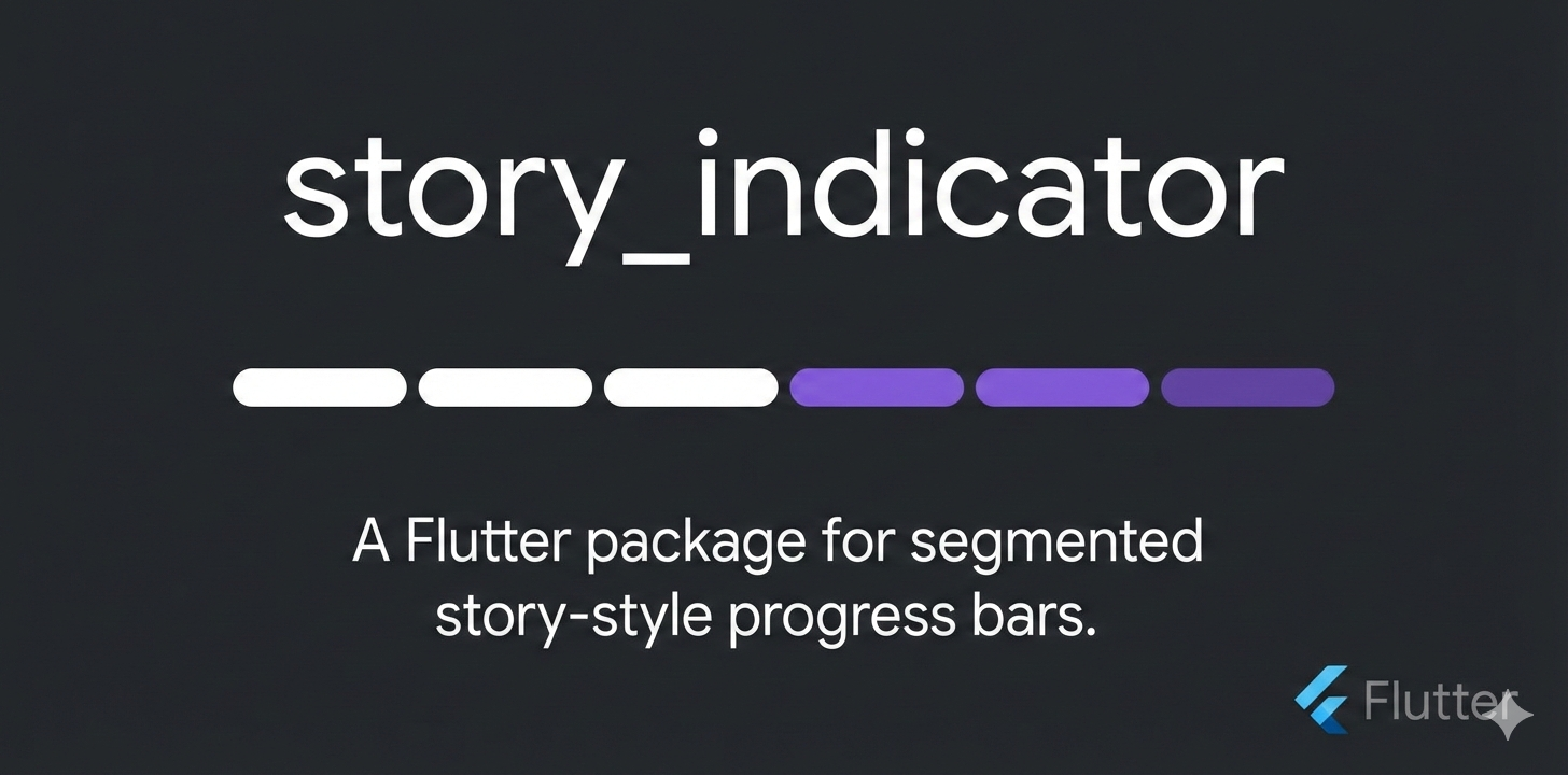
story_progress_indicator #

Screenshots #
| Screenshot | Demo |
|---|---|
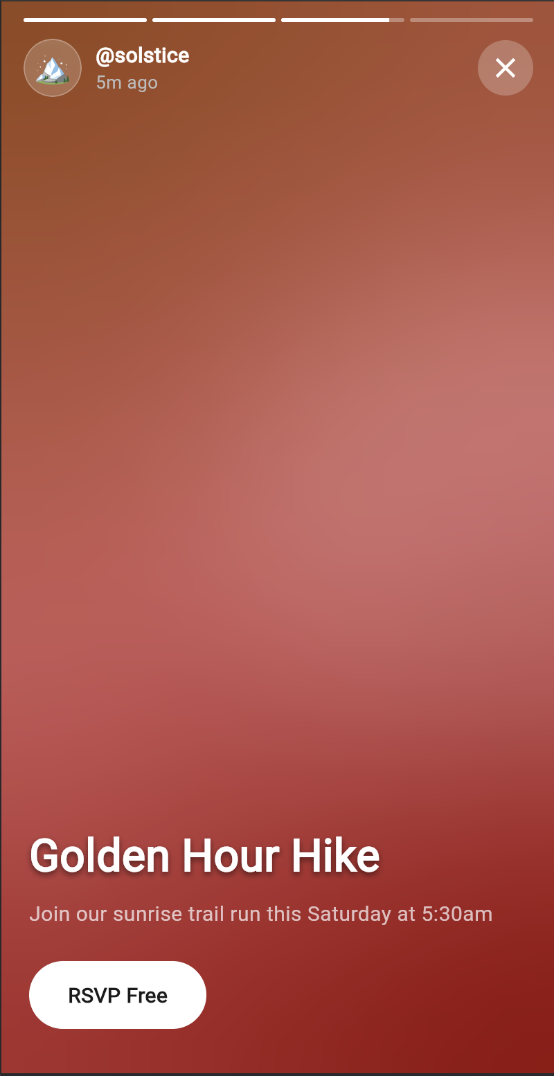 |
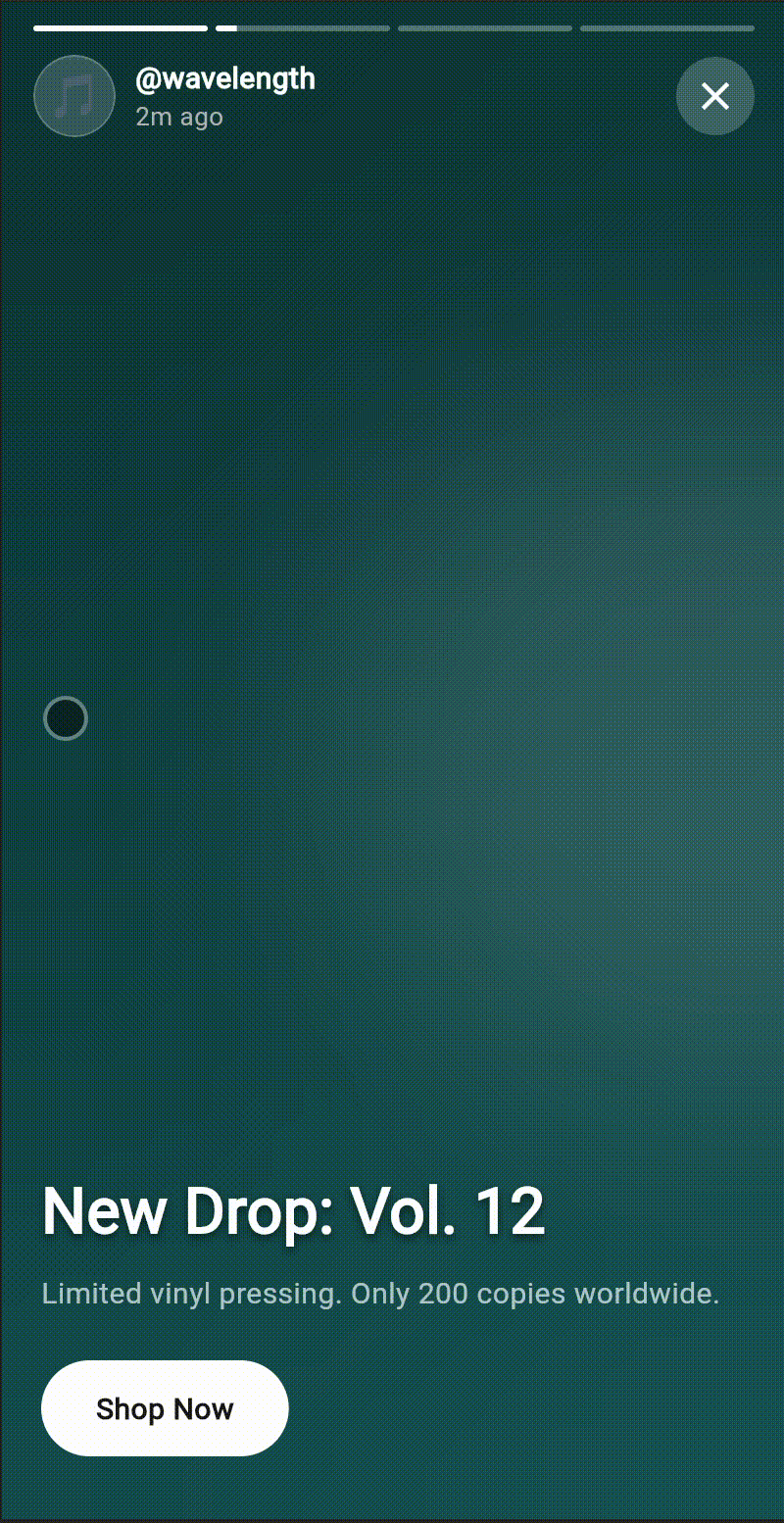 |
A zero-dependency Flutter package that provides a Stories-style segmented progress indicator: multiple segments that fill over time or in response to swipes, ideal for story UIs, onboarding, or any step-by-step content.
What it does #
- Renders a row of segments whose fill is controlled by a single progress value (e.g.
0.0→count, with fractional values supported). - Stays generic: no app-specific code, routing, or design system. You drive progress from a
PageView,AnimationController, or any state. - Highly customizable via constructor parameters (colors, height, gap, radius).
- Performant: no internal animation or
setStateinside segments; the parent owns progress and triggers rebuilds.
Features #
- Zero external dependencies — Flutter/Dart only
- Full-width responsive layout via
LayoutBuilder - Fractional progress for smooth timed fill (e.g. 2.3 = two full segments + 30% of the third)
- Customizable height, gap, track color, fill color, and corner radius
StatelessWidget; parent controls progress for surgical rebuilds- Assertions for invalid parameters (
count > 0,progress >= 0, etc.) - pub.dev ready: dartdoc, tests, example app
Installation #
Add to your pubspec.yaml:
dependencies:
  story_progress_indicator: ^1.1.0
Then run:
flutter pub get
Quick start #
import 'package:story_progress_indicator/story_indicator.dart';

// In your build method:
StoryIndicator(
  count: 4,
  progress: 2.5, // two full segments + half of the third
  height: 4.0,
  gap: 4.0,
)
Drive progress from your state (e.g. currentPage + animationController.value for a timed, swipeable story bar).
Full API reference #
| Parameter | Type | Default | Description |
|---|---|---|---|
count |
int |
required | Number of segments. |
progress |
double |
required | Current progress in segment units (0 → count); fractional values allowed. |
height |
double |
4.0 |
Segment height in logical pixels. |
gap |
double |
4.0 |
Gap between segments in logical pixels. |
trackColor |
Color |
Color(0x33FFFFFF) |
Unfilled track color. |
fillColor |
Color |
Color(0xFFFFFFFF) |
Filled portion color. |
radius |
BorderRadius |
BorderRadius.all(Radius.circular(100)) |
Corner radius for each segment. |
Assertions: count > 0, progress >= 0.0, height > 0, gap >= 0. Violations throw in debug.
Progress logic #
progressis a floating-point value from0.0tocount.- Integer part: how many segments are fully filled. Example:
progress == 2.3→ segments 0 and 1 are full. - Fractional part: how much the “current” segment (index
floor(progress)) is filled. Example:2.3→ segment 2 is 30% filled. - Formula per segment at
index:index < floor(progress)→ fill = 1.0index == floor(progress)→ fill = fractional part (clamped 0–1)index > floor(progress)→ fill = 0.0
So one progress value defines the entire bar; no animation or state inside the widget.
Example app #
A full demo (timed segments + PageView swipe) is in the example folder. Run it with:
cd example && flutter run
License #
MIT. See LICENSE for details.
Metadata
Publisher
Weekly Downloads
Metadata
A zero-dependency Flutter package providing a Stories-style segmented progress indicator. Highly customizable, responsive, and driven by a single progress value for use with PageView, timed stories, or swipeable content.
Repository (GitHub)
View/report issues
Topics
#stories #indicator #progress #animation #ui
Documentation
License
 MIT (license)