stacked_trio_carousel 1.1.0  stacked_trio_carousel: ^1.1.0 copied to clipboard
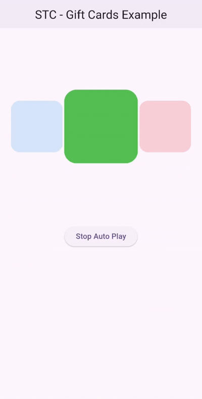
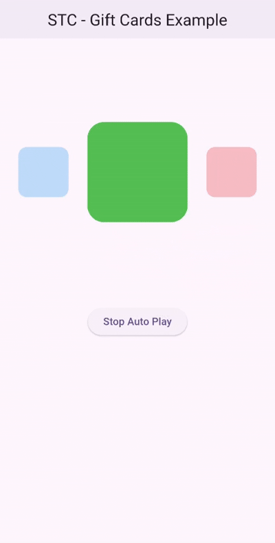
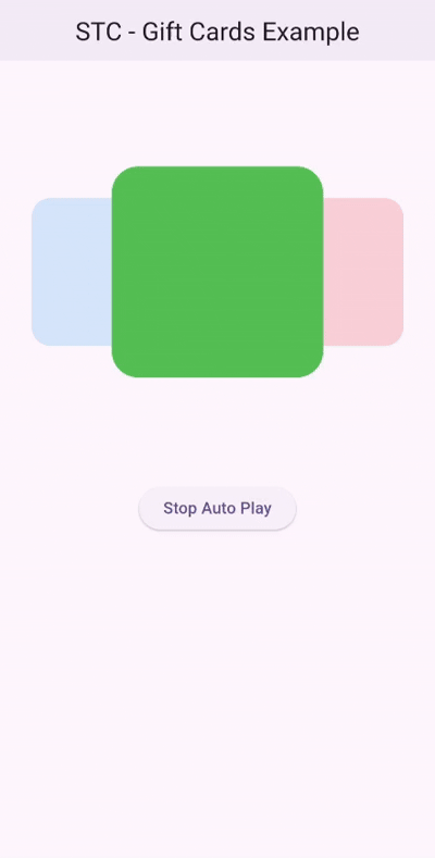
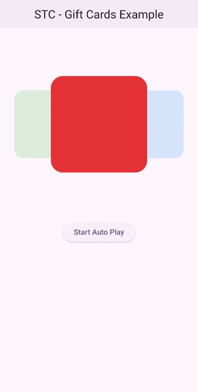
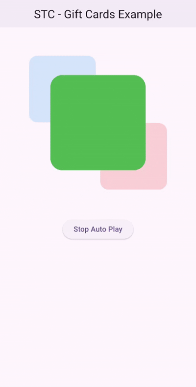
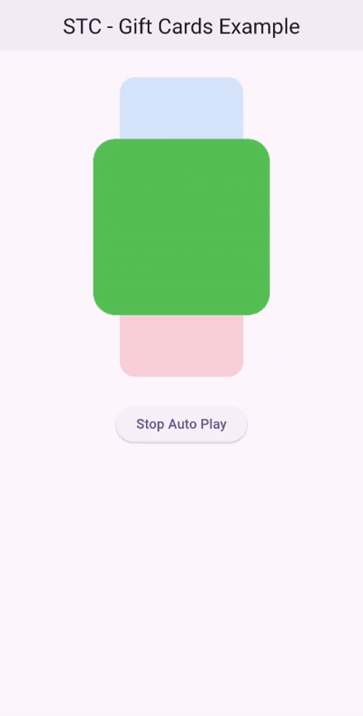
A flutter package provides a visually engaging card carousel with a stacked layout of three cards.
Stacked Trio Carousel #
Stacked Trio Carousel is a Flutter package that provides a visually engaging card carousel with a stacked layout of three cards.
Features #
The carousel features one prominent card in the foreground and two cards in the background, making it perfect for showcasing content in a layered and dynamic way. With built-in animations and customizable properties, users can swipe through the cards or enable automatic transitions for a smooth and interactive experience.

🆕 What's New #
✨ New #
- Added the Reveal Back Cards feature for a more user-friendly experience
- Introduced
SwipingDirectionto support RTL and LTR animations
🛠 Improvements #
- Improved user-driven animation to support both forward and backward motion
- Improved animation smoothness
- Reduced rebuilds for better performance
- Added support for vertical padding
Getting Started #
To use this package, add stacked_trio_carousel as a dependency in your pubspec.yaml file. For example:
dependencies:
  stacked_trio_carousel: ^1.1.0
Usage #
Specify the background, and set the width and height of the cards.
Make sure to specify the height and width of the carousel so it behaves properly when used inside a Column, Row, or ListView.
final List _color = [Colors.red, Colors.green, Colors.blue];
@override
  Widget build(BuildContext context) {
    return Scaffold(
      appBar: AppBar(
        backgroundColor: Theme.of(context).colorScheme.inversePrimary,
        title: Text(widget.title),
      ),
      body: Column(
        children: [
          StackedTrioCarousel(
            height: 400,
            width: MediaQuery.of(context).size.width,
            background: Container(),
            params: StackedTrioCarouselParams(cardHeight: 200, cardWidth: 200),
            routeObserver: routeObserver,
            controller: _carouselController,
            onTap: (index) {
              Navigator.push(
                context,
                MaterialPageRoute(builder: (context) => const SecondScreen()),
              );
            },
            children: _color
                .map(
                  (color) => Container(
                    decoration: BoxDecoration(
                      color: color,
                      borderRadius: BorderRadius.circular(25),
                    ),
                  ),
                )
                .toList(),
          ),
          ElevatedButton(
            onPressed: () {
              _carouselController.autoPlay
                  ? _carouselController.stopAutoPlay()
                  : _carouselController.startAutoPlay();
              setState(() {});
            },
            child: Text(
              _carouselController.autoPlay ? "Stop Auto Play" : "Start Auto Play",
              style: const TextStyle(color: Colors.black),
            ),
          ),
        ],
      ),
    );
  }
Change the Width and Height #
You can modify the dimensions of the cards by changing the cardHeight and cardWidth properties.
StackedTrioCarouselParams(
  cardHeight: 150,
  cardWidth: 150,
)
Add Padding #
To apply padding to the background cards, use the padding property.
StackedTrioCarouselParams(
  cardHeight: 150,
  cardWidth: 150,
  padding: const EdgeInsets.symmetric(horizontal: 10),
)

Change Scale and Minimum Opacity #
The scaleRatio and minimumOpacity properties affect the background cards only.
StackedTrioCarouselParams(
  cardHeight: 150,
  cardWidth: 150,
  padding: const EdgeInsets.symmetric(horizontal: 10),
  scaleRatio: 0.2,
  minimumOpacity: 0.1,
)
Add a Controller #
late StackedTrioCarouselController _carouselController;

@override
void initState() {
    _carouselController = StackedTrioCarouselController(tickerProvider: this);
    super.initState();
}
controller: _carouselController,
Change Animation speed #
You can modify the animation speed and the delay between animations.
_carouselController = StackedTrioCarouselController(
    tickerProvider: this,
    animationspeed: const speed(milliseconds: 200),
    autoPlayInterval: const speed(seconds: 1),
);

Change Animation Direction #
You can use the swipingDirection parameter in the StackedTrioCarouselController constructor to change the animation direction.
SwipingDirection.rtlfor right-to-leftSwipingDirection.ltrfor left-to-right
_carouselController = StackedTrioCarouselController(
    tickerProvider: this,
    animationspeed: const speed(milliseconds: 200),
    autoPlayInterval: const speed(seconds: 1),
    swipingDirection: .rtl,
);
Manual Swiping #
Manual swiping is supported:
Reveal Back Layer Cards #
You can interact with the back layer cards by tapping on them to bring them to the front.
Note: The onTap parameter is only triggered when tapping the front card.

Stop Automatic Animation #
To stop the automatic animation, set autoPlay to false.
_carouselController = StackedTrioCarouselController(
    tickerProvider: this,
    animationspeed: const speed(milliseconds: 200),
    autoPlayInterval: const speed(seconds: 1),
    autoPlay: false
);
You can also use the startAutoPlay and stopAutoPlay functions
ElevatedButton(
    onPressed: () {
        _carouselController.autoPlay ? _carouselController.stopAutoPlay() : _carouselController.startAutoPlay();
        setState(() {});
    },
    child: Text(
        _carouselController.autoPlay ? "Stop Auto Play" : "Start Auto Play",
        style: const TextStyle(color: Colors.black),
    ),
)
Dynamic Angle #
StackedTrioCarouselParams(
    cardHeight: 200,
    cardWidth: 200,
    angle: pi / 4,
  ),
StackedTrioCarouselParams(
    cardHeight: 200,
    cardWidth: 200,
    angle: pi / 2,
  ),
Contributors #
Example #
For a full example, check out the example page.
Metadata
Publisher
unverified uploader
Weekly Downloads
Metadata
A flutter package provides a visually engaging card carousel with a stacked layout of three cards.
Repository (GitHub)
View/report issues
License
 unknown (license)