simple_grid 0.0.4  simple_grid: ^0.0.4 copied to clipboard
 gepcode.com
A dynamic grid inspired by boostrap, you can use it to describe your grid layout. This package purely using mediaquery, don't worry about the render.
simple_grid #
Inspired by bootstrap , This is dynamic grid layout that you can use Like a bootstrap grid, but the size following material UI break points. But, don't to worry you can customize your break point like here. This package purely using mediaquery, don't worry about the render.
Explanation #
There are 3 classes that you have to now, these are:
SpGridis the container of grid, more information hereSpGridItemis the children ofSpGrid, more information hereSpGridSizeis the class that you can declare the maximum of the screen size, more information here
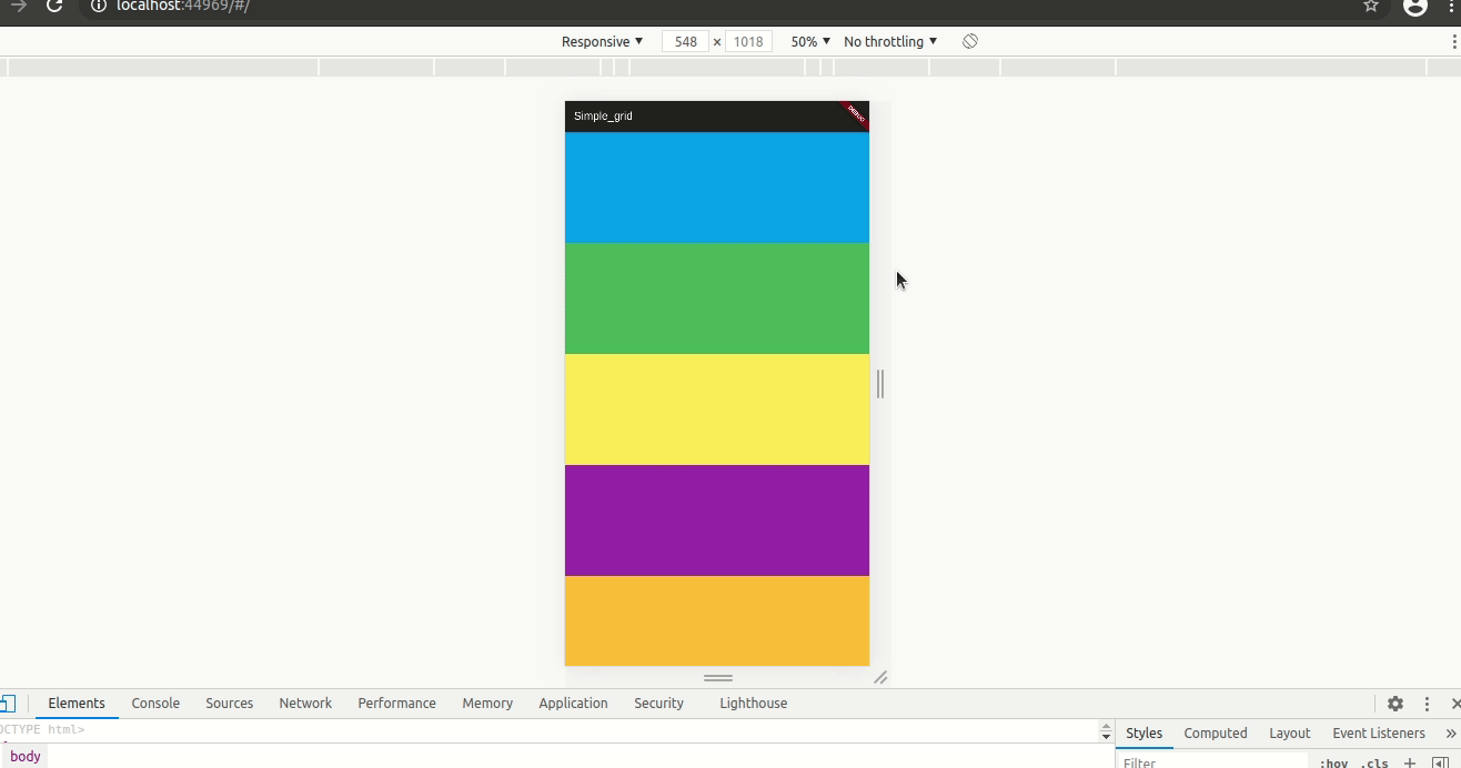
Example #
SpGrid(width: MediaQuery.of(context).size.width, children: [
  SpGridItem(
    xs: 12,
    sm: 6,
    md: 4,
    lg: 3,
    child: Container(
      color: Colors.blue,
      height: 200,
    ),
  ),
  SpGridItem(
    xs: 12,
    sm: 6,
    md: 4,
    lg: 3,
    child: Container(
      color: Colors.green,
      height: 200,
    ),
  ),
  SpGridItem(
    xs: 12,
    sm: 6,
    md: 4,
    lg: 3,
    child: Container(
      color: Colors.yellow,
      height: 200,
    ),
  ),
  SpGridItem(
    xs: 12,
    sm: 6,
    md: 4,
    lg: 3,
    child: Container(
      color: Colors.purple,
      height: 200,
    ),
  ),
]);
Customize Break Point #
SpGrid(
  width: MediaQuery.of(context).size.width,
  gridSize: SpGridSize(xs: 0, sm: 500, md: 768, lg: 980, xl: 1200),
  children:[],
)
Metadata
79
likes
0
points
191
downloads
Publisher
Weekly Downloads
Metadata
A dynamic grid inspired by boostrap, you can use it to describe your grid layout. This package purely using mediaquery, don't worry about the render.
Repository (GitHub)
View/report issues
License
 unknown (license)