semicircular_stage_progress 1.0.4  semicircular_stage_progress: ^1.0.4 copied to clipboard
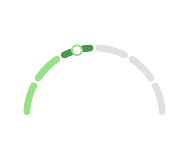
A customizable Flutter widget to display a semicircular stage progress indicator with configurable arcs, colors, and dots.
Semicircular Stage Progress Indicator #

A beautiful, customizable Flutter widget that visualizes progress through multiple stages using an elegant semicircular arc design. Perfect for onboarding flows, delivery tracking, multi-step forms, and any sequential process visualization.
✨ Features #
- 🎨 Fully Customizable - Colors, arc thickness, padding, and typography
- 🔘 Animated Indicator - Optional dot indicator for current stage with smooth animations
- 📏 Gap Control - Adjustable spacing between arc segments for clean aesthetics
- 📄 Dynamic Text Support - Customizable stage and status text below the semicircle
- ⚡ High Performance - Lightweight implementation using Flutter's
CustomPainter - 🎯 Responsive Design - Adapts to different screen sizes and orientations
🚀 Getting Started #
Installation #
Add this to your package's pubspec.yaml file:
dependencies:
  semicircular_stage_progress: ^1.0.4
Then run:
flutter pub get
Import #
import 'package:semicircular_stage_progress/semicircular_stage_progress.dart';
📖 Usage Examples #
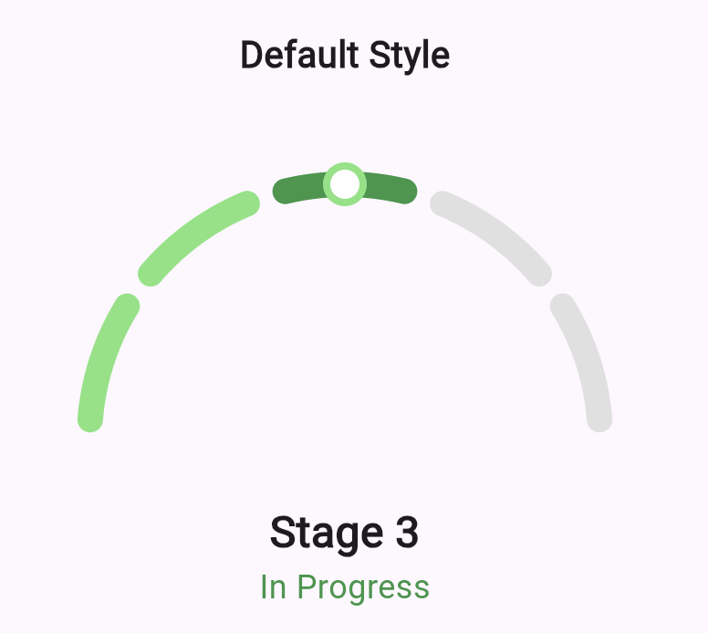
Basic Implementation #
@override
Widget build(BuildContext context) {
  return Scaffold(
    body: Center(
      child: SemicircularStageProgress(
        totalStages: 6,
        currentStage: 3,
      ),
    ),
  );
}
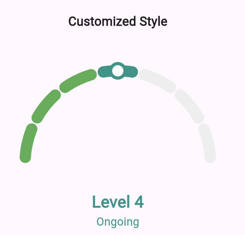
Advanced Customization #
SemicircularStageProgress(
  totalStages: 8,
  currentStage: 5,
  completedColor: Colors.green,
  currentColor: Colors.greenAccent,
  futureColor: Colors.grey[300],
  arcWidth: 16,
  gapFactor: 0.7,
  stageText: 'Step 5 of 8',
  statusText: 'Processing your request...',
  stageTextStyle: TextStyle(
    fontSize: 24,
    fontWeight: FontWeight.bold,
    color: Colors.green,
  ),
  statusTextStyle: TextStyle(
    fontSize: 16,
    color: Colors.grey[600],
  ),
)
Minimal Design #
SemicircularStageProgress(
  totalStages: 4,
  currentStage: 1,
  showCurrentIndicator: false,
  stageText: null,
  statusText: null,
  arcWidth: 12,
  completedColor: Colors.blue,
  currentColor: Colors.blueAccent,
)
🎛️ API Reference #
Required Parameters #
| Parameter | Type | Description |
|---|---|---|
totalStages |
int |
Total number of stages in the progress flow |
currentStage |
int |
Current active stage (1-based indexing) |
Customization Parameters #
Layout & Sizing
| Parameter | Type | Default | Description |
|---|---|---|---|
width |
double? |
300 |
Widget width |
height |
double? |
200 |
Widget height |
arcWidth |
double? |
14 |
Thickness of arc segments |
padding |
double? |
10 |
Padding around the semicircle |
gapFactor |
double? |
0.75 |
Gap ratio between arcs (0.0 to 1.0) |
Colors
| Parameter | Type | Default | Description |
|---|---|---|---|
completedColor |
Color? |
Color(0xff7FE47E) |
Color for completed stages |
currentColor |
Color? |
Color(0xff309646) |
Color for current stage |
futureColor |
Color? |
Colors.grey.shade300 |
Color for future stages |
Indicator
| Parameter | Type | Default | Description |
|---|---|---|---|
showCurrentIndicator |
bool? |
true |
Show/hide the current stage indicator dot |
indicatorOuterSize |
double? |
12 |
Outer indicator circle size |
indicatorInnerSize |
double? |
8 |
Inner indicator circle size |
indicatorOuterColor |
Color? |
Same as completedColor |
Outer indicator color |
indicatorInnerColor |
Color? |
Colors.white |
Inner indicator color |
Text & Typography
| Parameter | Type | Default | Description |
|---|---|---|---|
stageText |
String? |
'Stage $currentStage' |
Main text below the arc |
stageTextStyle |
TextStyle? |
Bold, 24px | Style for stage text |
statusText |
String? |
Auto-generated | Secondary status message |
statusTextStyle |
TextStyle? |
18px | Style for status text |
textSpacing |
double? |
20 |
Space between arc and text |
🎨 Theming Examples #
Material Design Theme #
SemicircularStageProgress(
totalStages: 5,
currentStage: 3,
completedColor: Theme.of(context).primaryColor,
currentColor: Theme.of(context).primaryColorDark,
futureColor: Theme.of(context).dividerColor,
stageTextStyle: Theme.of(context).textTheme.headlineSmall,
statusTextStyle: Theme.of(context).textTheme.bodyMedium,
)
Purple Gradient Theme #
SemicircularStageProgress(
totalStages: 6,
currentStage: 4,
completedColor: Colors.purple,
currentColor: Colors.deepPurple,
futureColor: Colors.purple.withOpacity(0.2),
arcWidth: 18,
indicatorOuterColor: Colors.deepPurple,
stageText: 'Almost There!',
statusText: 'Just 2 more steps',
)
💡 Use Cases #
- Onboarding Flows - Guide users through app setup
- Checkout Process - E-commerce purchase steps
- Form Wizards - Multi-step form completion
- Delivery Tracking - Package delivery status
- Course Progress - Educational content progression
- Registration Process - Account creation steps
🤝 Contributing #
We welcome contributions! Here's how you can help:
- Fork the repository
- Create a feature branch (
git checkout -b feature/amazing-feature) - Commit your changes (
git commit -m 'Add amazing feature') - Push to the branch (
git push origin feature/amazing-feature) - Open a Pull Request
Development Setup #
git clone https://github.com/karanrana097/semicircular_stage_progress.git
cd semicircular_stage_progress
flutter pub get
flutter test
📄 License #
This project is licensed under the MIT License - see the LICENSE file for details.
MIT License

Copyright (c) 2024 Karan Rana

Permission is hereby granted, free of charge, to any person obtaining a copy
of this software and associated documentation files (the "Software"), to deal
in the Software without restriction, including without limitation the rights
to use, copy, modify, merge, publish, distribute, sublicense, and/or sell
copies of the Software, and to permit persons to whom the Software is
furnished to do so, subject to the following conditions:

The above copyright notice and this permission notice shall be included in all
copies or substantial portions of the Software.

THE SOFTWARE IS PROVIDED "AS IS", WITHOUT WARRANTY OF ANY KIND, EXPRESS OR
IMPLIED, INCLUDING BUT NOT LIMITED TO THE WARRANTIES OF MERCHANTABILITY,
FITNESS FOR A PARTICULAR PURPOSE AND NONINFRINGEMENT. IN NO EVENT SHALL THE
AUTHORS OR COPYRIGHT HOLDERS BE LIABLE FOR ANY CLAIM, DAMAGES OR OTHER
LIABILITY, WHETHER IN AN ACTION OF CONTRACT, TORT OR OTHERWISE, ARISING FROM,
OUT OF OR IN CONNECTION WITH THE SOFTWARE OR THE USE OR OTHER DEALINGS IN THE
SOFTWARE.
📞 Support #
- 🐛 Bug Reports: GitHub Issues
- 💡 Feature Requests: GitHub Discussions
- 📧 Contact: Open an issue for questions or suggestions
🌟 Show Your Support #
If this package helped you, please ⭐ star the repository and consider:
- 👍 Liking the package on pub.dev
- 🐦 Sharing on social media
- 📝 Writing a blog post about your implementation
Made with ❤️ by Karan Rana
Happy Coding! 🚀
Metadata
Publisher
unverified uploader
Weekly Downloads
Metadata
A customizable Flutter widget to display a semicircular stage progress indicator with configurable arcs, colors, and dots.
Repository (GitHub)
View/report issues
Documentation
License
 GPL-3.0 (license)