responsive_sheet 1.1.1  responsive_sheet: ^1.1.1 copied to clipboard
Responsive Sheet for Flutter apps that adapts seamlessly to Desktop, Tablet, and Mobile, providing a flexible and customizable modal experience.
🧩 Responsive Sheet #
A powerful and flexible responsive bottom sheet for Flutter that adapts automatically between modal, side sheet, and dialog modes — depending on the screen size.
It’s designed for apps that need a seamless experience across mobile, tablet, and desktop platforms.
You can check Live Web Example in here [Live Example]
You can also check how to use it on youtube video [Video Explanation]
🚀 Features #
✅ Automatically adapts between bottom sheet, side sheet, or dialog
✅ Fully customizable style (margin, radius, background)
✅ Support for state preservation
✅ Nested sheet support
✅ Return results from sheet
✅ Easy to integrate with a single function
📦 Installation #
Add dependency to your pubspec.yaml:
dependencies:
  responsive_sheet: ^latest
Then run:
flutter pub get
🧱 Basic Usage #
import 'package:flutter/material.dart';
import 'package:responsive_sheet/responsive_sheet.dart';

Future<void> showMySheet(BuildContext context) async {
  final result = await showResponsiveBottomSheet(
    context,
    builder: (context, type) => const MySheetContent(),
  );

  if (context.mounted && result != null) {
    ScaffoldMessenger.of(context).showSnackBar(
      SnackBar(content: Text('Result: $result')),
    );
  }
}
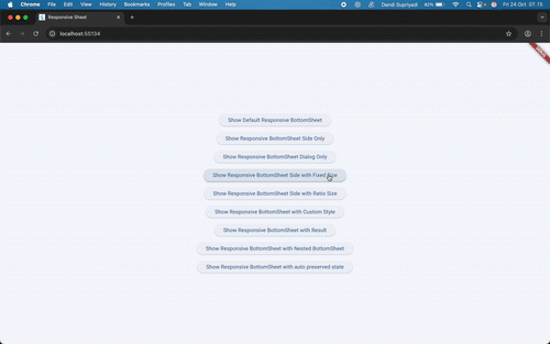
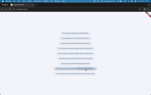
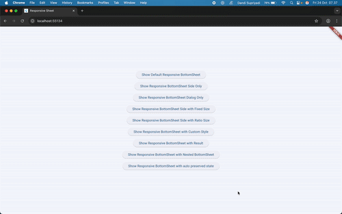
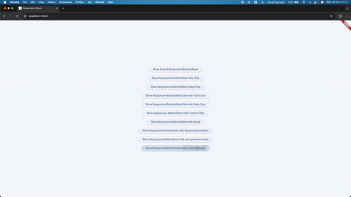
🧩 Example Preview #
Below are several use cases showing how ResponsiveSheet adapts automatically depending on device type and configuration.
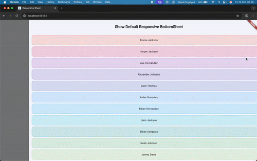
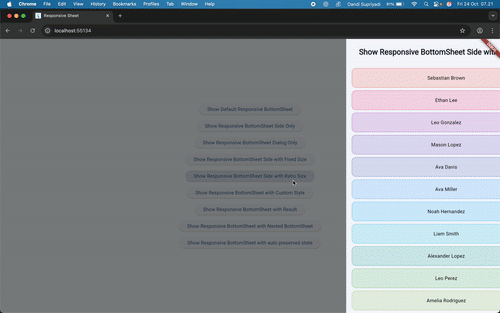
🧱 Default Responsive Sheet #
showResponsiveBottomSheet(
  context,
  builder: (context, type) => BottomSheetExampleOne(
    title: "Show Default Responsive BottomSheet",
  ),
);
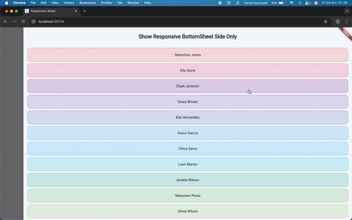
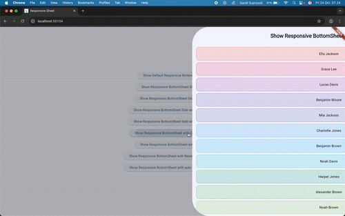
🪟 Side Sheet Only #
showResponsiveBottomSheet(
  context,
  typeBuilder: (_) => ResponsiveSheetType.side,
  builder: (context, type) => BottomSheetExampleOne(
    title: "Show Responsive BottomSheet Side Only",
  ),
);
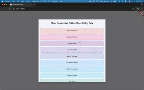
🖼️ Dialog Only #
showResponsiveBottomSheet(
  context,
  typeBuilder: (_) => ResponsiveSheetType.dialog,
  builder: (context, type) => SizedBox(
    width: 670,
    child: BottomSheetExampleOne(
      title: "Show Responsive BottomSheet Dialog Only",
    ),
  ),
);
⚙️ Fixed Size #
showResponsiveBottomSheet(
  context,
  typeBuilder: (_) => ResponsiveSheetType.side,
  builder: (context, type) => SizedBox(
    width: 300,
    child: BottomSheetExampleOne(
      title: "Show Responsive BottomSheet Side with Fixed Size",
    ),
  ),
);
⚙️ Fixed Ratio Size #
showResponsiveBottomSheet(
  context,
  typeBuilder: (_) => ResponsiveSheetType.side,
  builder: (context, type) => SizedBox(
    width: MediaQuery.sizeOf(context).width * 0.4,
    child: BottomSheetExampleOne(
      title: "Show Responsive BottomSheet Side with Ratio Size",
    ),
  ),
);
you can also make size responsive to media query like this
showResponsiveBottomSheet(
  context,
  typeBuilder: (_) => ResponsiveSheetType.side,
  builder: (context, type) => SizedBox(
    width: context.responsiveValues(
      desktop: MediaQuery.sizeOf(context).width * 0.4,
      tablet: MediaQuery.sizeOf(context).width * 0.6,
      mobile: MediaQuery.sizeOf(context).width * 0.8,
    ),
    child: BottomSheetExampleOne(
      title: "Show Responsive BottomSheet Side with Ratio Size",
    ),
  ),
);
⚙️ Custom Style #
showResponsiveBottomSheet(
  context,
  styleBuilder: (context, type) {
    return context.responsiveValues(
      desktop: ResponsiveSheetStyle(
        margin: 300,
        borderRadius: BorderRadius.circular(72),
      ),
      tablet: ResponsiveSheetStyle(
        margin: 100,
        borderRadius: BorderRadius.circular(48),
      ),
      mobile: ResponsiveSheetStyle(
        margin: 90,
        borderRadius: BorderRadius.circular(24),
      ),
    );
  },
  builder: (context, type) => BottomSheetExampleOne(
    title: "Show Responsive BottomSheet with Custom Style",
  ),
);
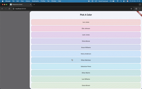
🔁 With Result #
final result = await showResponsiveBottomSheet(
  context,
  builder: (context, type) => BottomSheetExampleOne(
    title: "Pick a color",
  ),
);

if (context.mounted && result != null) {
  ScaffoldMessenger.of(context)
      .showSnackBar(SnackBar(content: Text("Result: $result")));
}
🧩 Nested Sheets #
showResponsiveBottomSheet(
  context,
  builder: (context, type) => BottomSheetExampleThree(),
);
♻️ Preserve State Automatically #
showResponsiveBottomSheet(
  context,
  builder: (context, type) => BottomSheetExampleTwo(),
);
♻️ Customize Widget for Each Type #
showResponsiveBottomSheet(
  context,
  builder: (context, type) => BottomSheetExampleFour(
    title: "Show Responsive BottomSheet with Custom Widget",
    type: type,
  ),
);
🧠 Responsive Logic #
Internally, ResponsiveSheet will choose sheet type automatically:
- Mobile: Bottom sheet
- Tablet: Side sheet
- Desktop: Dialog
You can override this by providing a custom typeBuilder.
🎨 Custom Styling with styleBuilder #
The styleBuilder parameter allows you to define custom visual styles for each sheet type (side, dialog, or sheet).
You can adjust the margin, border radius, and elevation dynamically.
Using the builder, you can even manage different styles per type / screen size for more refined responsiveness.
📸 Example App #
You can try all use cases by running the included example:
cd example
flutter run
🧑💻 Contributing #
Contributions, issues, and feature requests are welcome!
Feel free to open a pull request.
Metadata
Publisher
unverified uploader
Weekly Downloads
Metadata
Responsive Sheet for Flutter apps that adapts seamlessly to Desktop, Tablet, and Mobile, providing a flexible and customizable modal experience.
Repository (GitHub)
View/report issues
Documentation
License
 MIT (license)