radial_charts 0.2.2  radial_charts: ^0.2.2 copied to clipboard
Flutter widgets for radial rating charts and rounded donut charts with customizable legends, emoji support, and smooth animations.
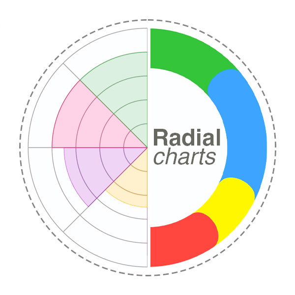 Radial Charts #
A collection of customizable radial chart widgets for Flutter — RadialRatingChart and RoundedDonutChart. Display ratings and data across multiple categories with variable radius segments, smooth Bezier-curved donut charts, customizable legends, and emoji support.

Features #
✨ Variable Radius Segments - Each category's segment radius represents its rating value
🍩 Rounded Donut Chart - Donut chart with smooth, rounded segment edges using Bezier curves
🎨 Highly Customizable - Colors, grid levels, opacity, borders, center text, and more
📦 Predefined Categories - Life balance, skills, product features templates with emojis
📊 Unified Legend System - Shared legend architecture with three styles (circle, rectangle, roundedRectangle)
😀 Emoji Support - Add emojis to categories and display them in legends
🚀 Zero Dependencies - Pure Flutter implementation using CustomPainter
⚡ Performance Optimized - Efficient rendering with smooth animations
Demo #
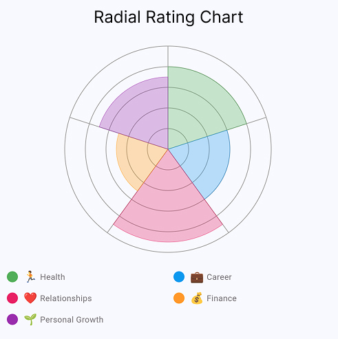
Radial Rating Chart Interactive rating chart with customizable categories, legends, and emoji support |
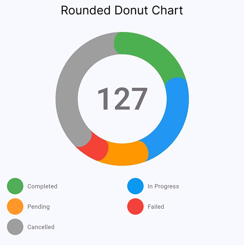
Rounded Donut Chart Smooth rounded edges with Bezier curves, center text, and flexible legend styles |
💡 Want to explore all settings interactively? Run the example app — it includes sliders, color pickers, and live preview for every chart parameter.
Installation #
Add this to your package's pubspec.yaml file:
dependencies:
  radial_charts: ^0.2.2
Then run:
flutter pub get
Usage #
Basic Example #
import 'package:flutter/material.dart';
import 'package:radial_charts/radial_charts.dart';

RadialRatingChart(
  data: [
    CategoryData(
      category: ChartCategory(
        id: 'health',
        name: 'Health',
        color: Colors.green,
        emoji: '🏃',
      ),
      rating: 8,
    ),
    CategoryData(
      category: ChartCategory(
        id: 'career',
        name: 'Career',
        color: Colors.blue,
        emoji: '💼',
      ),
      rating: 6,
    ),
    CategoryData(
      category: ChartCategory(
        id: 'relationships',
        name: 'Relationships',
        color: Colors.pink,
        emoji: '❤️',
      ),
      rating: 9,
    ),
  ],
  config: ChartConfig(size: 300),
  showLegend: true,
)
With Custom Configuration #
RadialRatingChart(
  data: yourCategoryData,
  config: ChartConfig(
    size: 320,
    maxRating: 10,
    minRating: 1,
    gridLevels: 10,
    gridColor: Colors.grey.withOpacity(0.3),
    segmentOpacity: 0.7,
    showSegmentBorders: true,
  ),
  showLegend: true,
  legendColumns: 2,
)
Using Predefined Categories #
The package includes predefined category sets for common use cases:
// Life Balance
RadialRatingChart(
  data: DefaultCategories.lifeBalance
      .map((cat) => CategoryData(category: cat, rating: 7))
      .toList(),
)

// Skills Assessment
RadialRatingChart(
  data: DefaultCategories.skills
      .map((cat) => CategoryData(category: cat, rating: 8))
      .toList(),
)

// Product Features
RadialRatingChart(
  data: DefaultCategories.productFeatures
      .map((cat) => CategoryData(category: cat, rating: 6))
      .toList(),
)
Rounded Donut Chart #
The RoundedDonutChart widget displays data as a donut chart with smooth, rounded edges between segments.
Key Features #
- Smooth Bezier Curve Transitions - Elegant rounded edges between segments instead of sharp corners
- Configurable Center Text - Display totals or custom text in the center with automatic calculation
- Three Legend Styles - Choose between circle, rectangle, or roundedRectangle indicators
- Empty State Visualization - Graceful display when no data is available
- Single Segment Support - Smart handling of charts with just one segment
- Emoji Support - Add emojis to segment labels for visual clarity
Basic Example #
import 'package:flutter/material.dart';
import 'package:radial_charts/radial_charts.dart';

RoundedDonutChart(
  data: [
    DonutSegmentData(
      id: 'completed',
      value: 45,
      color: Colors.green,
      label: 'Completed',
    ),
    DonutSegmentData(
      id: 'pending',
      value: 30,
      color: Colors.orange,
      label: 'Pending',
    ),
    DonutSegmentData(
      id: 'failed',
      value: 25,
      color: Colors.red,
      label: 'Failed',
    ),
  ],
  showCenterText: true,
  centerTextBuilder: (total) => '${total.toInt()}',
  showLegend: true,
  legendStyle: LegendStyle.roundedRectangle,
  showCountInLegend: true,
)
With Custom Configuration #
RoundedDonutChart(
  data: yourSegmentData,
  config: DonutChartConfig(
    size: 270,
    outerRadius: 135,
    innerRadius: 100,
    startAngle: -math.pi / 2,
    sortSegmentsById: true,
  ),
  // Center text options
  centerText: '100',  // Or use centerTextBuilder for dynamic text
  centerTextStyle: TextStyle(
    fontSize: 72,
    fontWeight: FontWeight.w600,
    color: Colors.grey,
  ),
  showCenterText: true,
  // Legend options
  showLegend: true,
  legendStyle: LegendStyle.roundedRectangle, // or circle, rectangle
  legendColumns: 2,
  legendIndicatorSize: Size(33, 28),
  showCountInLegend: true,
)
Legend Styles #
The RoundedDonutChart supports three legend styles:
LegendStyle.circle- Circular indicators (similar to RadialRatingChart)LegendStyle.rectangle- Square indicators with sharp cornersLegendStyle.roundedRectangle- Rounded rectangle indicators with optional count badges (default)
API Reference #
RadialRatingChart #
Main widget for displaying the chart.
| Property | Type | Default | Description |
|---|---|---|---|
data |
List<CategoryData> |
required | List of category data to display |
config |
ChartConfig? |
ChartConfig() |
Configuration for chart appearance |
showLegend |
bool |
false |
Whether to show legend |
showRatingInLegend |
bool |
false |
Show rating values inside legend indicators |
legendColumns |
int |
2 |
Number of columns in legend |
legendSpacing |
double |
8.0 |
Spacing between legend items |
legendIndicatorSize |
double |
16.0 |
Size of color indicator |
legendTextStyle |
TextStyle? |
null |
Text style for legend labels |
legendRatingStyle |
TextStyle? |
null |
Text style for rating values in legend |
ChartCategory #
Represents a category in the chart.
| Property | Type | Required | Description |
|---|---|---|---|
id |
String |
✅ | Unique identifier |
name |
String |
✅ | Display name |
color |
Color |
✅ | Segment color |
emoji |
String? |
❌ | Optional emoji/icon |
description |
String? |
❌ | Optional description |
CategoryData #
Combines a category with its rating value.
| Property | Type | Description |
|---|---|---|
category |
ChartCategory |
The category being rated |
rating |
double |
Rating value (typically 1-10) |
ChartConfig #
Configuration for chart appearance.
| Property | Type | Default | Description |
|---|---|---|---|
size |
double |
280.0 |
Chart size (width & height) |
maxRating |
int |
10 |
Maximum rating value |
minRating |
int |
0 |
Minimum rating value |
gridLevels |
int |
10 |
Number of concentric circles |
gridColor |
Color |
Color(0x4D000000) |
Grid line color |
gridStrokeWidth |
double |
1.0 |
Grid line width |
segmentOpacity |
double |
0.7 |
Segment opacity (0.0-1.0) |
showSegmentBorders |
bool |
true |
Show segment borders |
segmentBorderColor |
Color? |
null |
Border color (auto if null) |
segmentBorderWidth |
double |
0.5 |
Border width |
startAngle |
double |
-π/2 |
Start angle in radians |
sortCategoriesById |
bool |
true |
Sort categories by ID |
RoundedDonutChart #
Main widget for displaying the rounded donut chart.
| Property | Type | Default | Description |
|---|---|---|---|
data |
List<DonutSegmentData> |
required | List of segment data to display |
config |
DonutChartConfig? |
DonutChartConfig() |
Configuration for chart appearance |
centerText |
String? |
null |
Static text to display in center |
centerTextBuilder |
String Function(double)? |
null |
Function to generate center text from total |
centerTextStyle |
TextStyle? |
default style | Text style for center text |
showCenterText |
bool |
true |
Whether to show center text |
showLegend |
bool |
false |
Whether to show legend |
legendStyle |
LegendStyle |
roundedRectangle |
Visual style of legend indicators |
legendColumns |
int |
2 |
Number of columns in legend |
legendIndicatorSize |
Size |
Size(33, 28) |
Size of legend color indicators |
showCountInLegend |
bool |
true |
Show count values in indicators |
legendSpacing |
double |
8.0 |
Spacing between legend items |
legendTextStyle |
TextStyle? |
null |
Text style for legend labels |
legendCountStyle |
TextStyle? |
null |
Text style for legend counts |
DonutSegmentData #
Represents a segment (slice) in the donut chart.
| Property | Type | Required | Description |
|---|---|---|---|
id |
String |
✅ | Unique identifier |
value |
double |
✅ | Numerical value (segment size) |
color |
Color |
✅ | Segment color |
label |
String |
✅ | Display label |
description |
String? |
❌ | Optional description |
metadata |
Map<String, dynamic>? |
❌ | Optional metadata |
DonutChartConfig #
Configuration for donut chart appearance.
| Property | Type | Default | Description |
|---|---|---|---|
size |
double |
270.0 |
Chart size (width & height) |
outerRadius |
double |
135.0 |
Outer radius of donut ring |
innerRadius |
double |
100.0 |
Inner radius (creates center hole) |
startAngle |
double |
-π/2 |
Start angle in radians |
sortSegmentsById |
bool |
true |
Sort segments by ID |
emptyStateColor |
Color |
Color(0x4DBCB5C0) |
Background color for empty state |
emptyStateBorderColor |
Color |
Color(0xFFE0E0E0) |
Border color for empty state |
emptyStateBorderWidth |
double |
2.0 |
Border width for empty state |
LegendStyle #
Enum defining legend indicator styles.
circle- Circular indicatorsrectangle- Rectangular indicators with sharp cornersroundedRectangle- Rectangular indicators with rounded corners
Examples #
Check out the example folder for complete examples including:
- Life Balance Assessment
- Skills Proficiency Chart
- Product Features Rating
- Custom Data Visualization
Run the example:
cd example
flutter run
Use Cases #
📊 Life Balance Wheels - Track satisfaction across life areas
💼 Skills Assessment - Visualize competency levels
⭐ Product Reviews - Display multi-dimensional ratings
📈 Performance Metrics - Show KPIs across categories
🎯 Goal Tracking - Monitor progress in different areas
📝 Survey Results - Present multi-category survey data
How It Works #
Radial Rating Chart #
A variation of a pie chart where each segment represents a category and the radius varies based on the rating value. Higher ratings extend further from the center, and a concentric grid helps with reading values. This makes it ideal for comparing multiple ratings at a glance.
Rounded Donut Chart #
A donut chart where each segment's arc length is proportional to its value. Segments have smooth, rounded edges achieved through cubic Bezier curves. The center area can display a total or custom text. Well-suited for showing proportional breakdowns — task status, budget allocation, or composition data.
Contributing #
Contributions are welcome! Please feel free to submit a Pull Request.
License #
This project is licensed under the MIT License - see the LICENSE file for details.
Author #
Created by hzfty
Support & Feedback #
If you find this package useful, please give it a ⭐ on GitHub!
- Bugs & Features: GitHub Issues
- Telegram: @dosavelyev
- Email: hzftyone@gmail.com
Changelog #
See CHANGELOG.md for version history.
Metadata
Publisher
unverified uploader
Weekly Downloads
Metadata
Flutter widgets for radial rating charts and rounded donut charts with customizable legends, emoji support, and smooth animations.
Repository (GitHub)
View/report issues
Documentation
License
 MIT (license)