preview_helper 2.0.0+4  preview_helper: ^2.0.0+4 copied to clipboard
 rodmoraes.com.br
Preview editável em tempo real para o Flutter: FAB + menu de variáveis + diálogos. Ideal para @Preview com ValueNotifier.
English tutorial
preview_helper #

Flutter package for real-time editable preview. A FAB opens a menu of typed variables (knobs), each opens an edit dialog, and the preview updates instantly — all without recompiling.
Works with Flutter Widget Preview (@Preview) and any ValueNotifier.
Features #
- 12 knob types out of the box:
bool,String,int(input and slider),double(input and slider),DateTime,Duration,Color,Enum(dropdown and segmented). - Nullable version of each type — with a "NULL" button in the dialog.
- Styled menu with accent bar, current value summary, and edit icon.
- Modern dialog with header, field editor, and actions (Cancel / Apply / NULL).
- Consistent layout across fields: standardized
InputDecoration, value badge on sliders, inline switch for boolean. - Custom editor per field via
editorBuilder. - Zero dependencies beyond the Flutter SDK.
In practice #
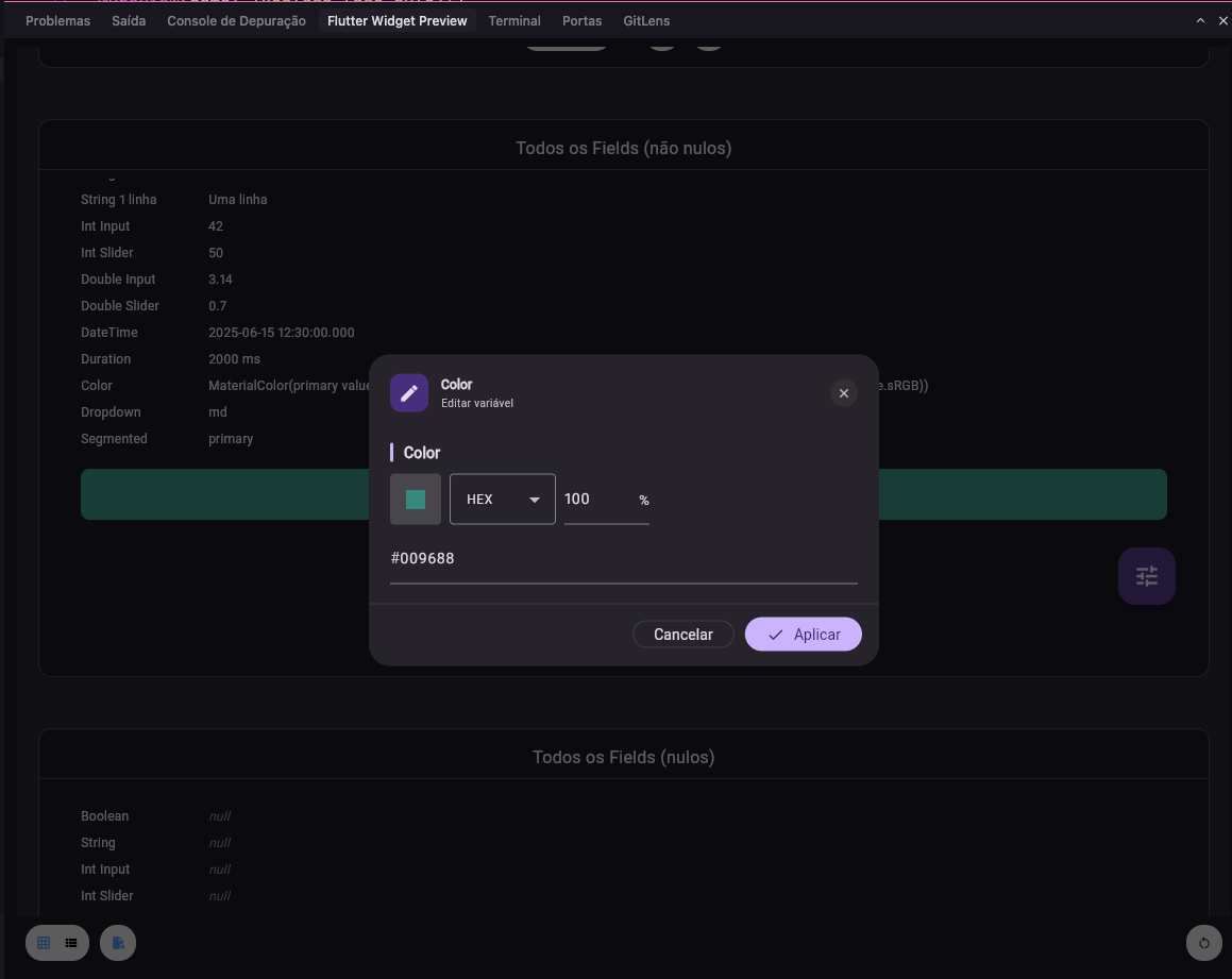
In Flutter Widget Preview, the content appears with a FAB (tune icon) in the corner. Tapping it opens the menu with all fields and their current values.
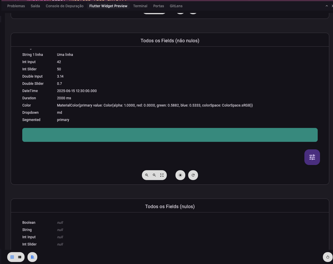
Each menu item shows the field name and a value summary. Choosing one opens the edit dialog.
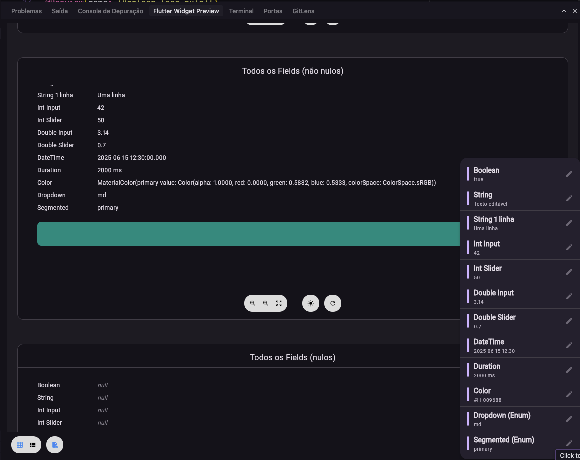
In the dialog you edit the value (by type: text, number, slider, date, color, enum, etc.) and apply — the preview updates instantly. Nullable fields show the NULL button.
Installation #
dependencies:
  preview_helper: ^2.0.0+1
flutter pub get
Quick start #
1. Non-null knob #
Create a typed knob, pass it to PreviewCustom, and use .value in the builder:
import 'package:flutter/material.dart';
import 'package:flutter/widget_previews.dart';
import 'package:preview_helper/preview_helper.dart';

@Preview(name: 'String example')
Widget stringPreview() {
  final title = StringPreviewKnob(name: 'title', value: 'Hello World');

  return PreviewCustom(
    notifiers: [title],
    builder: (context) => Center(
      child: Text(title.value ?? '', style: Theme.of(context).textTheme.headlineMedium),
    ),
  );
}
2. Nullable knob #
Use the Nullable variant of the knob — the dialog gets a "NULL" button:
@Preview(name: 'String nullable example')
Widget stringNullablePreview() {
  final title = StringNullablePreviewKnob(
    name: 'title',
    value: null,
    defaultValue: 'Default text',
  );

  return PreviewCustom(
    notifiers: [title],
    builder: (context) => Center(
      child: Text(title.value ?? '(null)'),
    ),
  );
}
3. Multiple knobs together #
@Preview(name: 'Design System Card')
Widget designSystemCardPreview() {
  final title = StringPreviewKnob(name: 'title', value: 'Title');
  final count = IntInputPreviewKnob(name: 'count', value: 3);
  final rating = DoubleSliderPreviewKnob(name: 'rating', value: 4.5, min: 0, max: 5, precision: 1);
  final enabled = BooleanPreviewKnob(name: 'enabled', value: true);
  final accent = ColorPreviewKnob(name: 'accent', value: Colors.deepPurple);

  return PreviewCustom(
    notifiers: [title, count, rating, enabled, accent],
    builder: (context) => MyCard(
      title: title.value ?? '',
      count: count.value ?? 0,
      rating: rating.value ?? 4.5,
      enabled: enabled.value ?? false,
      accentColor: accent.value ?? Colors.deepPurple,
    ),
  );
}
Knob catalog #
Each knob has a non-null and a nullable version:
| Type | Knob | Nullable Knob |
|---|---|---|
bool |
BooleanPreviewKnob |
BooleanNullablePreviewKnob |
String |
StringPreviewKnob |
StringNullablePreviewKnob |
int (input) |
IntInputPreviewKnob |
IntInputNullablePreviewKnob |
int (slider) |
IntSliderPreviewKnob |
IntSliderNullablePreviewKnob |
double (input) |
DoubleInputPreviewKnob |
DoubleInputNullablePreviewKnob |
double (slider) |
DoubleSliderPreviewKnob |
DoubleSliderNullablePreviewKnob |
DateTime |
DateTimePreviewKnob |
DateTimeNullablePreviewKnob |
Duration |
DurationPreviewKnob |
DurationNullablePreviewKnob |
Color |
ColorPreviewKnob |
ColorNullablePreviewKnob |
Enum (dropdown) |
ObjectDropdownPreviewKnob<T> |
ObjectDropdownNullablePreviewKnob<T> |
Enum (segmented) |
ObjectSegmentedPreviewKnob<T> |
ObjectSegmentedNullablePreviewKnob<T> |
Common parameters #
| Parameter | Required | Description |
|---|---|---|
name |
yes | Name shown in the menu and dialog. |
value |
yes | Initial value (can be null for nullable). |
defaultValue |
nullable | Default value when null (required for nullable). |
min / max |
sliders | Slider bounds. |
divisions |
sliders | Number of slider divisions. |
precision |
double slider | Decimal places displayed. |
maxLines |
string | Max lines for the text field (default: 3). |
start / end |
datetime | Date picker bounds. |
options |
dropdown/segmented | List of options (List<T>). |
labelBuilder |
dropdown/segmented | String Function(T) to display the option label. |
Main API #
| Class | Description |
|---|---|
PreviewCustom |
Widget that wraps the preview + FAB + menu + dialogs. Takes notifiers and builder. |
ValueNotifierPreview<T> |
Non-null base. Extend or use the concrete knobs. |
ValueNotifierPreviewNullable<T> |
Nullable base. Extend or use the concrete knobs. |
PreviewEditDialog<T> |
Edit dialog (used internally; can be used directly). |
PreviewEditorParams<T> |
Parameters passed into the editor (name, value, notifier, callbacks). |
PreviewEditorBuilder |
Widget? Function(BuildContext, PreviewEditorParams) for custom editor. |
Custom editor #
To use your own edit widget for a field, pass editorBuilder on the knob. If it returns null, the package uses the default editor.
final special = StringNullablePreviewKnob(
  name: 'Hex color',
  value: '#FF0000',
  defaultValue: '#000000',
  editorBuilder: (context, params) {
    return Padding(
      padding: const EdgeInsets.all(16),
      child: TextField(
        controller: params.textController,
        decoration: InputDecoration(
          labelText: params.fieldName,
          hintText: 'e.g. #FF0000',
          errorText: params.parseError ? 'Invalid color' : null,
        ),
        onChanged: (text) {
          params.onValueChanged(text);
        },
      ),
    );
  },
);
Full example #
See the example/ folder with previews for all 12 types, in both non-null and nullable variants, plus an aggregated example (Design System Card).
To run:
cd example
flutter run
Requirements #
- SDK: Dart ^3.10.7
- Flutter: >=1.17.0
License #
Apache 2.0. See LICENSE.
Repository and author #
- Repository: github.com/rod-moraes/preview_helper
- Homepage: rodmoraes.com.br
If you find bugs or have suggestions, open an issue on GitHub.
Tutorial em português
preview_helper #
Pacote Flutter para preview editável em tempo real. Um FAB abre um menu de variáveis tipadas (knobs), cada uma abre um diálogo de edição, e o preview atualiza na hora — tudo sem recompilar.
Funciona com o Flutter Widget Preview (@Preview) e qualquer ValueNotifier.
Recursos #
- 12 tipos de knob prontos:
bool,String,int(input e slider),double(input e slider),DateTime,Duration,Color,Enum(dropdown e segmented). - Versão nullable de cada tipo — com botão "NULL" no diálogo.
- Menu estilizado com barra de acento, resumo do valor atual e ícone de edição.
- Diálogo moderno com header, editor do campo e ações (Cancelar / Aplicar / NULL).
- Layout consistente nos campos:
InputDecorationpadronizado, badge de valor nos sliders, switch inline no boolean. - Editor customizado por campo via
editorBuilder. - Zero dependências além do Flutter SDK.
Como fica na prática #
No Flutter Widget Preview, o conteúdo aparece com um FAB (ícone de tune) no canto. Ao tocar, abre o menu com todos os campos e seus valores atuais.
Cada item do menu mostra o nome do campo e um resumo do valor. Ao escolher um, abre o diálogo de edição.
No diálogo você edita o valor (por tipo: texto, número, slider, data, cor, enum etc.) e aplica — o preview atualiza na hora. Campos nullable exibem o botão NULL.
Instalação #
dependencies:
  preview_helper: ^2.0.0+1
flutter pub get
Uso rápido #
1. Knob não-nulo #
Crie um knob tipado, passe para PreviewCustom e use .value no builder:
import 'package:flutter/material.dart';
import 'package:flutter/widget_previews.dart';
import 'package:preview_helper/preview_helper.dart';

@Preview(name: 'Exemplo String')
Widget stringPreview() {
  final title = StringPreviewKnob(name: 'title', value: 'Hello World');

  return PreviewCustom(
    notifiers: [title],
    builder: (context) => Center(
      child: Text(title.value ?? '', style: Theme.of(context).textTheme.headlineMedium),
    ),
  );
}
2. Knob nullable #
Use a versão Nullable do knob — o diálogo ganha o botão "NULL":
@Preview(name: 'Exemplo String Nullable')
Widget stringNullablePreview() {
  final title = StringNullablePreviewKnob(
    name: 'title',
    value: null,
    defaultValue: 'Texto padrão',
  );

  return PreviewCustom(
    notifiers: [title],
    builder: (context) => Center(
      child: Text(title.value ?? '(null)'),
    ),
  );
}
3. Vários knobs juntos #
@Preview(name: 'Design System Card')
Widget designSystemCardPreview() {
  final title = StringPreviewKnob(name: 'title', value: 'Title');
  final count = IntInputPreviewKnob(name: 'count', value: 3);
  final rating = DoubleSliderPreviewKnob(name: 'rating', value: 4.5, min: 0, max: 5, precision: 1);
  final enabled = BooleanPreviewKnob(name: 'enabled', value: true);
  final accent = ColorPreviewKnob(name: 'accent', value: Colors.deepPurple);

  return PreviewCustom(
    notifiers: [title, count, rating, enabled, accent],
    builder: (context) => MyCard(
      title: title.value ?? '',
      count: count.value ?? 0,
      rating: rating.value ?? 4.5,
      enabled: enabled.value ?? false,
      accentColor: accent.value ?? Colors.deepPurple,
    ),
  );
}
Catálogo de knobs #
Cada knob tem uma versão não-nula e uma nullable:
| Tipo | Knob | Knob Nullable |
|---|---|---|
bool |
BooleanPreviewKnob |
BooleanNullablePreviewKnob |
String |
StringPreviewKnob |
StringNullablePreviewKnob |
int (input) |
IntInputPreviewKnob |
IntInputNullablePreviewKnob |
int (slider) |
IntSliderPreviewKnob |
IntSliderNullablePreviewKnob |
double (input) |
DoubleInputPreviewKnob |
DoubleInputNullablePreviewKnob |
double (slider) |
DoubleSliderPreviewKnob |
DoubleSliderNullablePreviewKnob |
DateTime |
DateTimePreviewKnob |
DateTimeNullablePreviewKnob |
Duration |
DurationPreviewKnob |
DurationNullablePreviewKnob |
Color |
ColorPreviewKnob |
ColorNullablePreviewKnob |
Enum (dropdown) |
ObjectDropdownPreviewKnob<T> |
ObjectDropdownNullablePreviewKnob<T> |
Enum (segmented) |
ObjectSegmentedPreviewKnob<T> |
ObjectSegmentedNullablePreviewKnob<T> |
Parâmetros comuns #
| Parâmetro | Obrigatório | Descrição |
|---|---|---|
name |
sim | Nome exibido no menu e no diálogo. |
value |
sim | Valor inicial (pode ser null nos nullable). |
defaultValue |
nullable | Valor padrão quando nulo (obrigatório nos nullable). |
min / max |
sliders | Limites do slider. |
divisions |
sliders | Número de divisões do slider. |
precision |
double slider | Casas decimais exibidas. |
maxLines |
string | Número máximo de linhas do campo de texto (padrão: 3). |
start / end |
datetime | Limites do date picker. |
options |
dropdown/segmented | Lista de opções (List<T>). |
labelBuilder |
dropdown/segmented | Função String Function(T) para exibir o label da opção. |
API principal #
| Classe | Descrição |
|---|---|
PreviewCustom |
Widget que envolve o preview + FAB + menu + diálogos. Recebe notifiers e builder. |
ValueNotifierPreview<T> |
Base não-nula. Estenda ou use os knobs concretos. |
ValueNotifierPreviewNullable<T> |
Base nullable. Estenda ou use os knobs concretos. |
PreviewEditDialog<T> |
Diálogo de edição (usado internamente; pode ser usado direto). |
PreviewEditorParams<T> |
Parâmetros injetados no editor (nome, valor, notifier, callbacks). |
PreviewEditorBuilder |
Widget? Function(BuildContext, PreviewEditorParams) para editor customizado. |
Editor customizado #
Se quiser um widget de edição próprio para um campo, passe editorBuilder no knob. Se retornar null, o pacote usa o editor padrão.
final special = StringNullablePreviewKnob(
  name: 'Cor hex',
  value: '#FF0000',
  defaultValue: '#000000',
  editorBuilder: (context, params) {
    return Padding(
      padding: const EdgeInsets.all(16),
      child: TextField(
        controller: params.textController,
        decoration: InputDecoration(
          labelText: params.fieldName,
          hintText: 'Ex: #FF0000',
          errorText: params.parseError ? 'Cor inválida' : null,
        ),
        onChanged: (text) {
          params.onValueChanged(text);
        },
      ),
    );
  },
);
Exemplo completo #
Veja a pasta example/ com previews para todos os 12 tipos, em versão não-nula e nullable, além de um exemplo agregado (Design System Card).
Para rodar:
cd example
flutter run
Requisitos #
- SDK: Dart ^3.10.7
- Flutter: >=1.17.0
Licença #
Apache 2.0. Ver LICENSE.
Repositório e autor #
- Repositório: github.com/rod-moraes/preview_helper
- Homepage: rodmoraes.com.br
Se encontrar bugs ou tiver sugestões, abra uma issue no GitHub.
Metadata
Publisher
Weekly Downloads
Metadata
Preview editável em tempo real para o Flutter: FAB + menu de variáveis + diálogos. Ideal para @Preview com ValueNotifier.
Homepage
Repository (GitHub)
View/report issues
Documentation
License
 Apache-2.0 (license)