pin_code_fields 9.0.0-dev.2  pin_code_fields: ^9.0.0-dev.2 copied to clipboard
 theadar.xyz
A highly customizable PIN/OTP input field for Flutter with Material Design support and headless core for custom UIs.


A highly customizable Flutter package for PIN code and OTP input fields with beautiful design and animations. Now with a headless architecture for complete customization freedom!
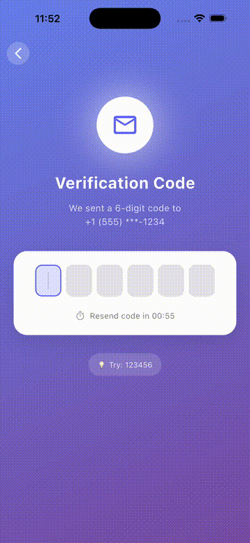
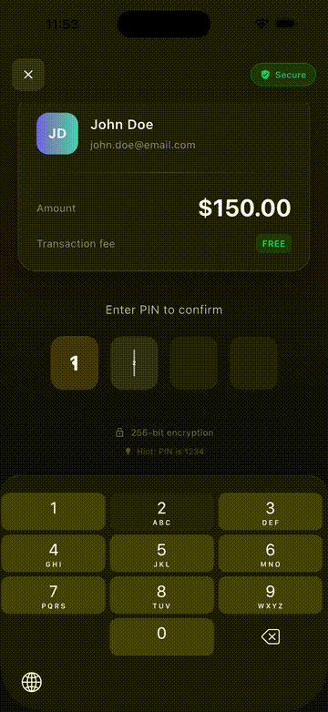
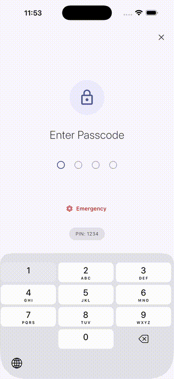
Demos #
| OTP Verification | Payment PIN | App Lock |
 |
 |
 |
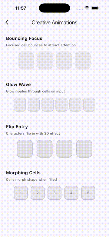
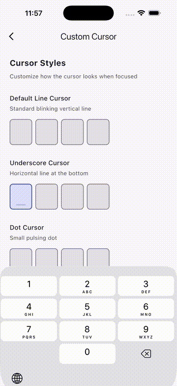
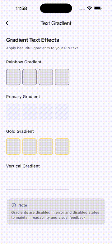
| Creative Animations | Custom Cursors | Text Gradients |
 |
 |
 |
Features #
- Headless Core: Build completely custom PIN UIs with full control
- Material Design Ready: Beautiful, ready-to-use Material Design implementation
- Unified Controller: Single
PinInputControllerfor text, focus, and error management - Multiple Shapes: Outlined, filled, underlined, and circle styles
- Rich Animations: Scale, fade, slide animations for text entry
- Error Handling: Built-in shake animation with programmatic control
- Autofill Support: SMS OTP autofill for iOS and Android
- Haptic Feedback: Configurable haptic feedback on input
- Form Integration: Works seamlessly with Flutter's Form widget
- Paste Support: Long-press to paste from clipboard
- Cursor Support: Animated blinking cursor
- Text Gradient: Apply beautiful gradients to PIN text
- Custom Obscuring: Use any widget for obscured text
Getting Started ⚡️ #
Installation #
Add to your pubspec.yaml:
dependencies:
  pin_code_fields: ^9.0.0
Quick Start - Material Design #
import 'package:pin_code_fields/pin_code_fields.dart';

MaterialPinField(
  length: 6,
  onCompleted: (pin) => print('PIN: $pin'),
  onChanged: (value) => print('Changed: $value'),
  theme: MaterialPinTheme(
    shape: MaterialPinShape.outlined,
    cellSize: Size(56, 64),
    borderRadius: BorderRadius.circular(12),
  ),
)
Custom UI - Headless Core #
For complete control over the UI, use the headless PinInput:
import 'package:pin_code_fields/pin_code_fields.dart';

PinInput(
  length: 4,
  builder: (context, cells) {
    return Row(
      mainAxisAlignment: MainAxisAlignment.center,
      children: cells.map((cell) {
        return Container(
          width: 50,
          height: 50,
          margin: EdgeInsets.symmetric(horizontal: 8),
          decoration: BoxDecoration(
            shape: BoxShape.circle,
            color: cell.isFocused ? Colors.blue : Colors.grey[200],
          ),
          child: Center(
            child: Text(
              cell.character ?? '',
              style: TextStyle(fontSize: 24),
            ),
          ),
        );
      }).toList(),
    );
  },
  onCompleted: (pin) => print('PIN: $pin'),
)
PinInputController 🎮 #
The unified controller for managing PIN input state:
final controller = PinInputController();

MaterialPinField(
  length: 6,
  pinController: controller,
  onCompleted: (pin) {
    if (pin != '123456') {
      controller.triggerError(); // Triggers shake + error state
    }
  },
)

// Text control
controller.setText('1234');
controller.clear();
print(controller.text);

// Error control
controller.triggerError();  // Shake animation + error state
controller.clearError();    // Clear error state
print(controller.hasError);

// Focus control
controller.requestFocus();
controller.unfocus();
print(controller.hasFocus);

// Listen to changes
controller.addListener(() {
  print('State changed');
});
Material Shapes 🎨 #
// Outlined (default)
MaterialPinTheme(shape: MaterialPinShape.outlined)

// Filled
MaterialPinTheme(shape: MaterialPinShape.filled)

// Underlined
MaterialPinTheme(shape: MaterialPinShape.underlined)

// Circle
MaterialPinTheme(shape: MaterialPinShape.circle)
Customization Options ⚙️ #
MaterialPinTheme #
MaterialPinTheme(
  // Shape
  shape: MaterialPinShape.outlined,
  cellSize: Size(56, 64),
  spacing: 8,
  borderRadius: BorderRadius.circular(12),

  // Border
  borderWidth: 1.5,
  focusedBorderWidth: 2.0,
  borderColor: Colors.grey,
  focusedBorderColor: Colors.blue,
  filledBorderColor: Colors.green,
  errorColor: Colors.red,

  // Fill
  fillColor: Colors.grey[100],
  focusedFillColor: Colors.blue[50],
  filledFillColor: Colors.green[50],

  // Text
  textStyle: TextStyle(fontSize: 24, fontWeight: FontWeight.bold),
  textGradient: LinearGradient(colors: [Colors.blue, Colors.purple]),
  obscuringCharacter: '●',

  // Cursor
  showCursor: true,
  cursorColor: Colors.blue,
  cursorWidth: 2,
  animateCursor: true,

  // Animation
  entryAnimation: MaterialPinAnimation.scale,
  animationDuration: Duration(milliseconds: 150),
  animationCurve: Curves.easeOut,

  // Error
  enableErrorShake: true,
  errorAnimationDuration: Duration(milliseconds: 500),
)
Obscure Text #
// With character
MaterialPinField(
  length: 4,
  obscureText: true,
  blinkWhenObscuring: true,
  blinkDuration: Duration(milliseconds: 500),
  theme: MaterialPinTheme(obscuringCharacter: '●'),
)

// With custom widget
MaterialPinField(
  length: 4,
  obscureText: true,
  obscuringWidget: Icon(Icons.lock, size: 16),
)
Autofill Support #
MaterialPinField(
  length: 6,
  enableAutofill: true,
  autofillHints: [AutofillHints.oneTimeCode],
)
Form Integration #
Form(
  child: PinInputFormField(
    length: 6,
    builder: (context, cells) => /* your UI */,
    validator: (value) {
      if (value == null || value.length < 6) {
        return 'Please enter all 6 digits';
      }
      return null;
    },
    onSaved: (value) => print('Saved: $value'),
  ),
)
Cell Data (Headless) 📦 #
When using PinInput, the builder receives a list of PinCellData:
PinCellData(
  index: 0,           // Cell position (0-based)
  character: '1',     // Entered character (null if empty)
  isFilled: true,     // Has a character
  isFocused: false,   // Is the current input position
  isError: false,     // Error state active
  isDisabled: false,  // Read-only state
  isBlinking: false,  // Showing real char before obscure
)
Migration from v8.x 🔄 #
Upgrading from v8.x? Here's a quick reference:
| v8.x | v9.0.0 |
|---|---|
PinCodeTextField |
MaterialPinField |
appContext: context |
(removed) |
controller + focusNode |
pinController: PinInputController() |
pinTheme: PinTheme() |
theme: MaterialPinTheme() |
PinCodeFieldShape.box |
MaterialPinShape.outlined |
fieldWidth + fieldHeight |
cellSize: Size(w, h) |
errorAnimationController.add(...) |
controller.triggerError() |
📖 Full migration guide: migration/9.0.0/MIGRATION_GUIDE.md
Contributing #
Contributions are welcome! Please feel free to submit a Pull Request.
License #
MIT License - see LICENSE for details.
Metadata

Publisher
Weekly Downloads
Metadata
A highly customizable PIN/OTP input field for Flutter with Material Design support and headless core for custom UIs.
Repository (GitHub)
View/report issues
Topics
#ui #widget #pin-code #otp #input
License
 MIT (license)