onboardly 2.0.0  onboardly: ^2.0.0 copied to clipboard
A Flutter package for creating beautiful and customizable onboarding experiences with spotlight effects and interactive tooltips.
Onboardly #
A Flutter package for creating beautiful and customizable onboarding experiences with spotlight effects and interactive tooltips.
Features #
- ✅ Spotlight Effect - Highlight specific UI elements with customizable overlays
- ✅ Interactive Tooltips - Show descriptive tooltips with customizable positioning
- ✅ Step-by-step Onboarding - Guide users through multiple steps
- ✅ State Management Agnostic - Works with any state management solution or none at all
- ✅ Fully Customizable - Custom styles, colors, animations, and layouts
- ✅ Skip Confirmation - Built-in bottom sheet for skip confirmation
- ✅ Callbacks - Track onboarding progress with callbacks
- ✅ Zero External Dependencies - Only uses Flutter SDK
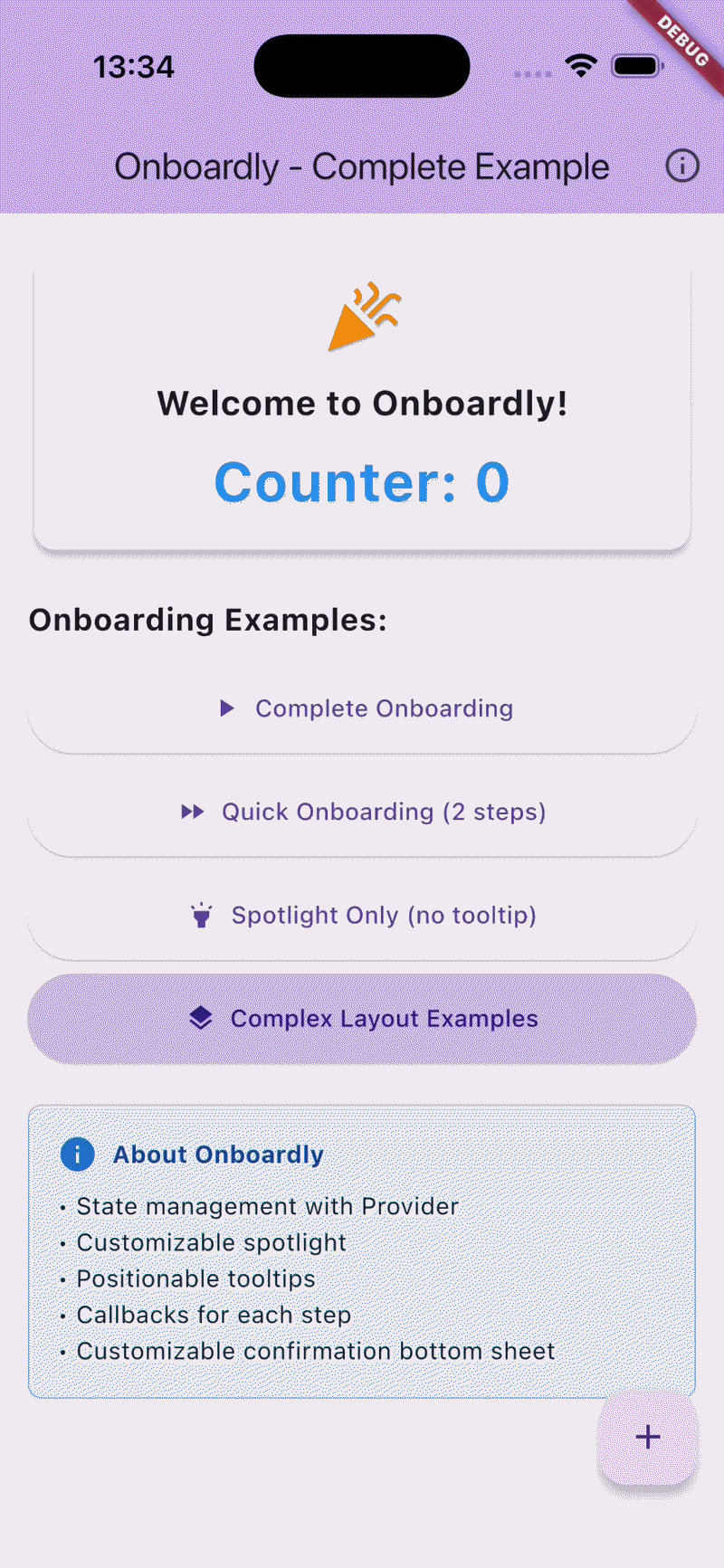
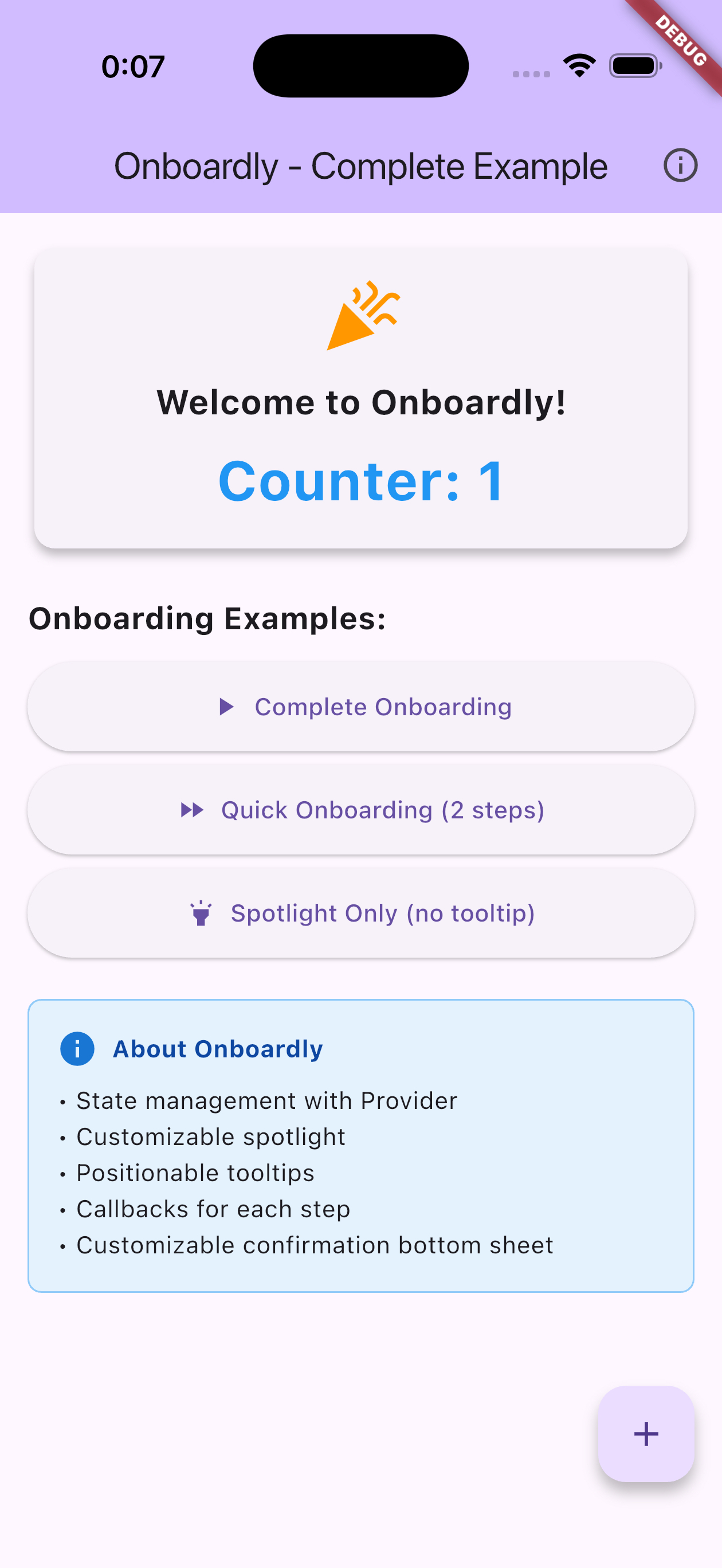
Demo #
Installation #
Add this to your package's pubspec.yaml file:
dependencies:
  onboardly: ^2.0.0
Getting Started #
1. Create Services #
Create instances of SpotlightService and OnboardingService in your widget state:
import 'package:onboardly/onboardly.dart';

class MyScreen extends StatefulWidget {
  @override
  State<MyScreen> createState() => _MyScreenState();
}

class _MyScreenState extends State<MyScreen> {
  // Create services
  late final SpotlightService _spotlightService;
  late final OnboardingService _onboardingService;

  // Create GlobalKeys for the widgets you want to highlight
  final GlobalKey _buttonKey = GlobalKey();
  final GlobalKey _titleKey = GlobalKey();

  @override
  void initState() {
    super.initState();
    _spotlightService = SpotlightService();
    _onboardingService = OnboardingService(_spotlightService);
  }

  // ... rest of your code
}
2. Start Onboarding #
void _startOnboarding() {
  final steps = [
    OnboardingStep(
      targetKey: _titleKey,
      description: 'This is the app title!',
      position: OnboardingTooltipPosition.below,
    ),
    OnboardingStep(
      targetKey: _buttonKey,
      description: 'Click here to continue.',
      position: OnboardingTooltipPosition.above,
    ),
  ];

  _onboardingService.start(
    context,
    steps,
    onFinish: () => print('Onboarding finished!'),
    onSkip: () => print('Onboarding skipped!'),
  );
}
Usage #
Basic Onboarding #
import 'package:onboardly/onboardly.dart';

final steps = [
  OnboardingStep(
    targetKey: _myWidgetKey,
    description: 'Welcome to our app!',
    position: OnboardingTooltipPosition.below,
  ),
];

_onboardingService.start(context, steps);
With Callbacks #
_onboardingService.start(
  context,
  steps,
  onStepChanged: (index) {
    print('Current step: $index');
  },
  onFinish: () {
    print('User completed the onboarding');
  },
  onSkip: () {
    print('User skipped the onboarding');
  },
);
Spotlight Only (without tooltips) #
final targets = [
  SpotlightTarget.fromKey(
    _myWidgetKey,
    padding: EdgeInsets.all(8),
    borderRadius: 12,
  ),
];

await _spotlightService.show(
  context,
  targets: targets,
  style: SpotlightStyle(
    scrimColor: Color.fromRGBO(0, 0, 0, 0.8),
    blurSigma: 3,
  ),
);
Custom Skip Sheet #
You can customize the skip confirmation sheet texts directly when starting the onboarding:
_onboardingService.start(
  context,
  steps,
  skipSheetTitle: 'Are you sure you want to skip?',
  skipSheetContinueButtonText: 'Continue tutorial',
  skipSheetSkipButtonText: 'Skip tutorial',
);
Or provide custom widgets by creating your own skip sheet:
// In your own skip sheet widget
OnboardingSkipSheet(
  titleWidget: MyCustomTitle(),
  continueButtonWidget: MyCustomButton(),
  skipButtonWidget: MyCustomButton(),
)
State Management #
Onboardly is completely state-management agnostic. You can use it with:
- Local state (StatefulWidget) - Simplest approach, recommended for most cases
- InheritedWidget - For sharing services across multiple widgets
- Provider, Riverpod, Bloc, GetIt - Any dependency injection or state management solution
- No state management - Just create instances where needed
The services are simple Dart classes with imperative APIs (start(), next(), finish(), etc.) and callbacks. They don't require any specific state management setup.
Example with GetIt #
// Register services
getIt.registerSingleton(SpotlightService());
getIt.registerSingleton(OnboardingService(getIt<SpotlightService>()));

// Use anywhere
final onboarding = getIt<OnboardingService>();
onboarding.start(context, steps);
Example with Riverpod #
final spotlightProvider = Provider((ref) => SpotlightService());
final onboardingProvider = Provider((ref) =>
  OnboardingService(ref.read(spotlightProvider))
);

// Use in widgets
final onboarding = ref.read(onboardingProvider);
onboarding.start(context, steps);
API Reference #
OnboardingService #
Main service for managing onboarding flows.
Methods:
start(BuildContext, List<OnboardingStep>, {...})- Start the onboardingonStepChanged: (int index) => void- Callback when step changesonFinish: () => void- Callback when onboarding finishesonSkip: () => void- Callback when onboarding is skippeddefaultSpotlightHorizontalPadding: double- Default horizontal padding for spotlightskipSheetTitle: String?- Custom title for skip confirmation sheetskipSheetContinueButtonText: String?- Custom text for continue buttonskipSheetSkipButtonText: String?- Custom text for skip buttonnextText: String- Text for the next/confirm button (default:'OK')skipText: String- Text for the skip button (default:'Skip')finishText: String- Text for the finish button on last step (default:'Finish')
next()- Move to next stepskip()- Skip onboarding with confirmationfinish()- Complete onboardingdismissSilently()- Dismiss without callbacks
Properties:
isActive- Whether onboarding is currently activecurrentIndex- Current step indexcurrentStep- Current OnboardingStep
SpotlightService #
Service for showing spotlight effects.
Methods:
show(BuildContext, {targets, extraHoles, style})- Show spotlighthide()- Hide spotlight
Properties:
isShowing- Whether spotlight is currently visible
OnboardingStep #
Configuration for each onboarding step.
OnboardingStep(
  targetKey: GlobalKey,
  description: String?,
  descriptionWidget: Widget?,
  position: OnboardingTooltipPosition,
  showNext: bool,
  showSkip: bool,
)
Note: Either
descriptionordescriptionWidgetmust be provided. OnlytargetKeyis required.
Tooltip Positions:
OnboardingTooltipPosition.auto(default)OnboardingTooltipPosition.aboveOnboardingTooltipPosition.belowOnboardingTooltipPosition.center
SpotlightTarget #
Configuration for spotlight targets.
SpotlightTarget.fromKey(
  GlobalKey,                    // Required: Widget to highlight
  padding: EdgeInsets,         // Optional: Padding around target
  borderRadius: double,        // Optional: Border radius
  customBorderRadius: BorderRadius?, // Optional: Custom border radius
  customPath: Path?,           // Optional: Custom shape path
  maxHeight: double?,          // Optional: Maximum height
  customWidth: double?,        // Optional: Custom width
  allowTouchThrough: bool,     // Optional: Allow touches through (default: true)
)
SpotlightStyle #
Customize the spotlight appearance.
SpotlightStyle(
  blurSigma: 2.0,                           // Blur intensity
  scrimColor: Color.fromARGB(60, 0, 0, 0), // Overlay color
  animationDuration: Duration(milliseconds: 300), // Animation duration
)
Localization / Custom Texts #
All button texts default to English and can be customized:
_onboardingService.start(
  context,
  steps,
  nextText: 'Próximo',
  skipText: 'Pular',
  finishText: 'Finalizar',
  skipSheetTitle: 'Deseja pular o tutorial?',
  skipSheetContinueButtonText: 'Continuar tutorial',
  skipSheetSkipButtonText: 'Pular tutorial',
);
Examples #
Check the example folder for a complete working example with:
- Full onboarding flow with 6 steps
- Quick onboarding with 2 steps
- Spotlight-only mode
- Custom callbacks and styling
Contributing #
Contributions are welcome! Please feel free to submit a Pull Request.
License #
This project is licensed under the MIT License - see the LICENSE file for details.
Metadata
Publisher
unverified uploader
Weekly Downloads
Metadata
A Flutter package for creating beautiful and customizable onboarding experiences with spotlight effects and interactive tooltips.
Repository (GitHub)
View/report issues
Topics
#onboarding #spotlight #tutorial #tooltip #user-experience
Documentation
License
 MIT (license)