om_data_grid 0.0.16  om_data_grid: ^0.0.16 copied to clipboard
 omarx.net
A powerful, customizable, and high-performance data grid for Flutter apps, with support for advanced filtering, sorting, grouping, and charting.
om_data_grid #
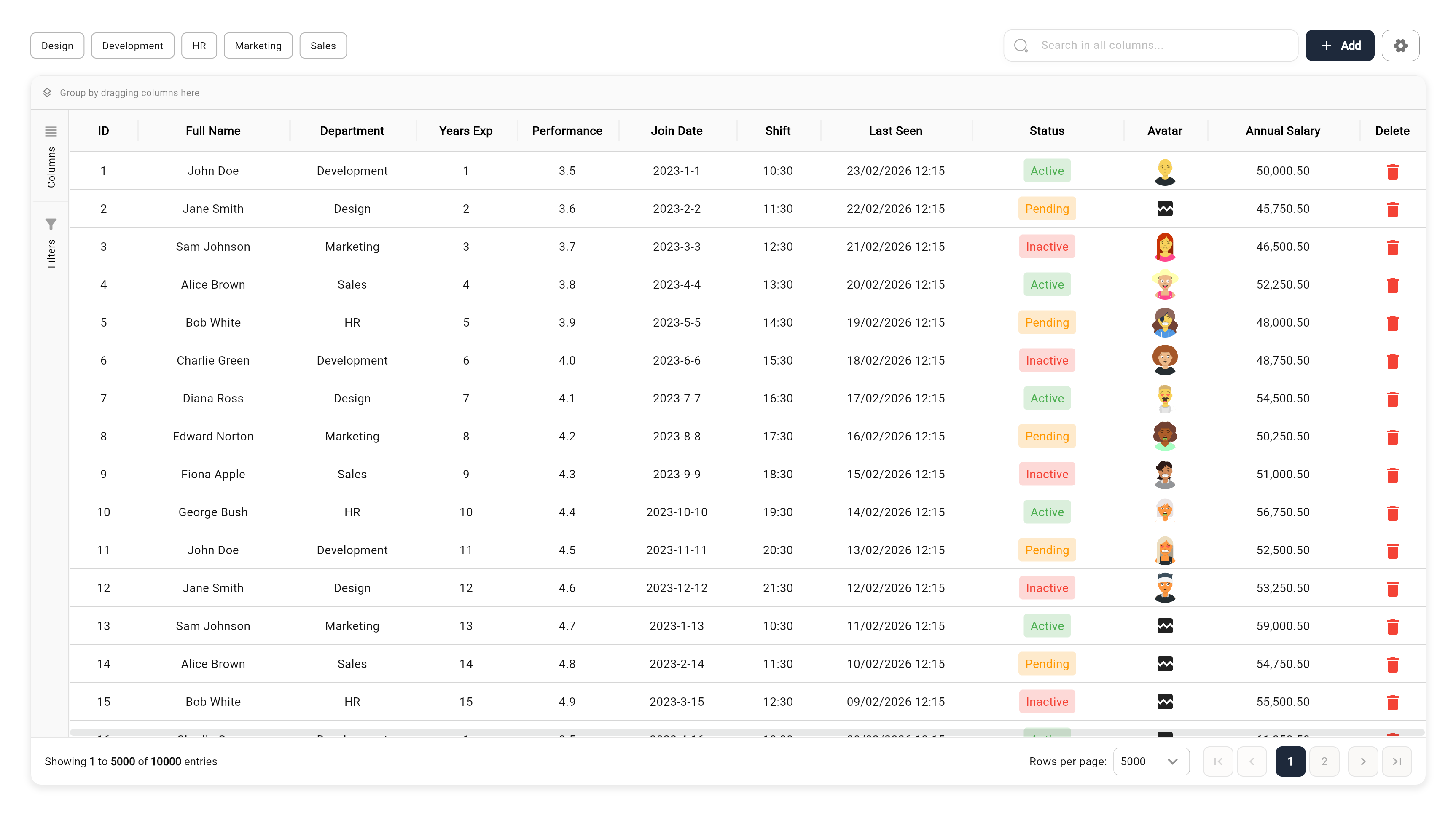
A high-performance, feature-rich, and fully customizable DataGrid for Flutter. Designed to handle large datasets with ease while providing enterprise-grade features like advanced filtering, multi-level grouping, and built-in visualization.

🌐 Live Demo #
Check out the interactive demo: Live Web Demo
📑 Table of Contents #
- 🚀 Key Features
- 🌐 Live Demo
- 🛠 Installation
- 📖 Quick Start
- 🧩 Advanced Usage
- 📊 Grid Features in Depth
- 🛠 API Reference
- 🤝 Contributing
- 📄 License
🚀 Key Features #
- ⚡ Enterprise-Grade Performance: Built with row and column virtualization to smoothly handle 100,000+ records.
- 🔍 Advanced Filtering System:
- Global search with substring highlighting.
- Quick filter bar for rapid data slicing.
- Advanced UI filtering per column (Contains, Equals, Starts With, Numeric ranges, etc.).
- 📊 Integrated Data Visualization: Built-in support for 15+ chart types including Column, Bar, Line, Area, Pie, Doughnut, and more (using Syncfusion).
- 📁 Grouping & Hierarchical Views:
- Drag and drop columns to group data dynamically.
- Multi-level grouping supports nested data exploration.
- 🔢 Aggregations & Summaries: Automatic calculations in footer rows (Sum, Average, Count, Min, Max, First, Last).
- 📝 Rich Content Support: Built-in editors for Dates, Checkboxes, Switches, Images, and Files (including Multi-Image/File support).
- 📍 Pinning & Reordering:
- Freeze columns/rows to the left, right, top, or bottom.
- Intuitive drag-and-drop for column and row reordering.
- 💾 Professional Exporting: Seamlessly export current or filtered views to Excel (.xlsx) and PDF.
🛠 Installation #
Add om_data_grid to your pubspec.yaml:
dependencies:
  om_data_grid: ^0.0.14
Then run:
flutter pub get
📖 Quick Start #
1. Simple Data Structure #
final List<Map<String, dynamic>> myData = [
  {"id": 1, "name": "John Doe", "role": "Developer", "salary": 75000},
  {"id": 2, "name": "Jane Smith", "role": "Designer", "salary": 82000},
];
2. Configure Your Columns #
final List<OmGridColumn> columns = [
  OmGridColumn(key: 'id', title: 'ID', width: 80, type: OmGridRowTypeEnum.number),
  OmGridColumn(key: 'name', title: 'Name', width: 150, type: OmGridRowTypeEnum.text),
  OmGridColumn(key: 'role', title: 'Role', width: 120, type: OmGridRowTypeEnum.comboBox),
  OmGridColumn(key: 'salary', title: 'Salary', width: 130, type: OmGridRowTypeEnum.double),
];
3. Initialize Controller & Widget #
final controller = OmDataGridController(
  data: myData,
  columnModels: columns.map((c) => OmGridColumnModel(column: c)).toList(),
  configuration: OmDataGridConfiguration(
    primaryColor: Colors.teal,
    allowPagination: true,
  ),
);

// In your build method
OmDataGrid(controller: controller)
🧩 Advanced Usage #
Column Types #
om_data_grid handles much more than just text:
OmGridRowTypeEnum.image: URL/Asset image display.OmGridRowTypeEnum.multiImage: Carousel for multiple images.OmGridRowTypeEnum.iosSwitch: Interactive boolean toggle.OmGridRowTypeEnum.date: Date picker integration with customizable formatting.OmGridRowTypeEnum.state: Conditional status indicators with icons.
Calculated Columns (Formulas) #
Create columns that perform live calculations:
OmGridColumn(
  key: 'total_comp',
  title: 'Total Comp',
  // Formula using other column keys
  formula: 'salary + bonus',
  type: OmGridRowTypeEnum.number,
)
Custom Aggregations #
Show summaries at the grid or group level:
OmGridColumn(
  key: 'salary',
  title: 'Salary',
  // Options: sum, avg, count, min, max, first, last
  aggregationType: OmAggregationType.avg,
)
Theming & UI #
The grid supports a powerful Seed-Based Theming System. Instead of setting over 80 color properties manually, you can use OmDataGridTheme to derive a full palette from just a few base colors.
1. Using Presets (Recommended)
Quickly switch between pre-defined styles for Light, Dark, or Accented themes:
OmDataGridConfiguration.fromTheme(
  theme: OmDataGridTheme.dark(), // Options: .light(), .dark(), .blue(), .green(), .rose(), .purple()
  allowPagination: true,
)
2. Seed-Based Custom Theme
Provide a custom primary color, and the grid will calculate complementary colors for selections, hover states, and input fields:
OmDataGridConfiguration.fromTheme(
  theme: OmDataGridTheme(
    primaryColor: Colors.teal,
    backgroundColor: Colors.white,
    foregroundColor: Color(0xFF2D3748),
  ),
  rowHeight: 48,
)
3. Granular Overrides
You can still override any specific property while letting the theme handle the rest:
OmDataGridConfiguration.fromTheme(
  theme: OmDataGridTheme.light(),
  headerBackgroundColor: Colors.blueGrey, // Override specific theme colors
  headerHeight: 60.0,
  gridFontFamily: 'Roboto',
)
Context Menus #
Add custom actions to rows or columns:
OmGridColumn(
  key: 'name',
  title: 'Name',
  contextMenuOptions: [
    OmRowContextMenuItem(
      label: 'Send Email',
      icon: Icons.email,
      onTap: (row) => print('Emailing ${row['name']}'),
    ),
  ],
)
Side Panel Customization #
Add your own tools to the grid's side panel:
OmDataGridController(
  additionalSidePanelTabs: [
    OmGridSidePanelTab(
      id: 'custom_reports',
      icon: Icons.analytics,
      label: 'Reports',
      builder: (context, controller) => MyCustomReportWidget(controller: controller),
    ),
  ],
)
📊 Grid Features in Depth #
Data Visualization #
The grid isn't just a list; it's an analysis tool. Built-in "Visualize" actions allow users to instantly turn any filtered dataset into a dashboard of charts (Pie, Bar, Column, Area, etc.) with customizable axes and sorting.
Exporting & Sharing #
- Excel: Full support for
.xlsxexport, including calculated columns and current filtering state. - PDF: Cleanly formatted PDF reports of your data grid.
Editing & Input #
When isEditing is true, cells become interactive:
- Text/Number: Standard input.
- ComboBox: Single and multi-selection dropdowns.
- Switches: Instant boolean updates.
- Images/Files: Integrated
image_pickerandfile_pickersupport.
🛠 API Reference #
OmDataGrid Props #
| Property | Type | Description |
|---|---|---|
controller |
OmDataGridController |
Required. Manages data, state, and event handling. |
onRowTap |
Function(Map) |
Callback when a row is clicked. |
isEditing |
bool |
Toggles cell editability globally. |
onSelectionChanged |
Function(List<Map>) |
Triggered when row selection changes. |
OmGridColumn Configuration #
| Property | Type | Default | Description |
|---|---|---|---|
key |
String |
- | Unique key identifying the column in the data source. |
title |
String |
- | The title displayed in the column header. |
width |
double? |
null |
Initial width of the column. |
textAlign |
TextAlign? |
TextAlign.center |
Alignment of the text within the cell. |
resizable |
bool |
true |
Whether the column width can be adjusted by the user. |
allowFiltering |
bool |
true |
Enables filtering for this column. |
allowSorting |
bool |
true |
Enables sorting for this column. |
type |
OmGridRowTypeEnum |
OmGridRowTypeEnum.text |
The type of data in the column (e.g., text, number, date, image). |
comboBoxSettings |
OmGridComboBoxSettings? |
null |
Configuration for comboBox column types. |
numberType |
String? |
null |
Specific number formatting type. |
showInChart |
bool |
true |
Whether this column represents data in charts. |
canBeXAxis |
bool |
true |
Whether this column can be used as the X-axis in charts. |
canBeYAxis |
bool |
true |
Whether this column can be used as the Y-axis in charts. |
formula |
String? |
null |
Formula for calculated columns (e.g., "price * quantity"). |
decimalSeparator |
String? |
null |
Character used as decimal separator. |
thousandsSeparator |
String? |
null |
Character used as thousands separator. |
decimalDigits |
int? |
null |
Number of decimal places to display. |
customDateFormat |
String? |
null |
Custom format string for date columns. |
imageBorderRadius |
double? |
null |
Border radius for image cells. |
multiSelect |
bool? |
null |
Enables multi-selection for relevant types. |
displayKey |
String? |
null |
Key to display in the cell (for object-based values). |
valueKey |
String? |
null |
Key for the underlying value (for object-based values). |
readonlyInView |
bool? |
null |
If true, the column cannot be edited in the grid view. |
onDelete |
Future<void> Function(dynamic)? |
null |
Callback triggered when a specialized item (like a file) is deleted. |
stateConfig |
Map<dynamic, OmStateConfig>? |
null |
Configuration for state-based styling (background/text colors based on value). |
contextMenuOptions |
List<OmRowContextMenuItem>? |
null |
Custom context menu options for this column. |
showPlaceholderWhileScrolling |
bool |
true |
Shows a placeholder for performance optimization during scrolling. |
OmDataGridConfiguration #
Defines the global appearance and behavior of the DataGrid.
| Property | Type | Default | Description |
|---|---|---|---|
headerBackgroundColor |
Color |
Color(0xFFE7E7E7) |
Background color of the header row. |
headerForegroundColor |
Color |
Color(0xFF131313) |
Text color of the header row. |
rowBackgroundColor |
Color |
Colors.transparent |
Background color of data rows. |
rowForegroundColor |
Color |
Color(0xFF131313) |
Text color of data rows. |
selectedRowColor |
Color |
Color(0x14398FD4) |
Background color of selected rows. |
rowHoverColor |
Color |
Color(0x0A000000) |
Background color when hovering over a row. |
selectedRowForegroundColor |
Color |
Color(0xFF131313) |
Text color of selected rows. |
headerBorderColor |
Color |
Color(0xFFE5E5E5) |
Color of the header borders. |
headerBorderWidth |
double |
0.5 |
Width of the header borders. |
rowBorderColor |
Color |
Color(0xFFE5E5E5) |
Color of the row borders. |
rowBorderWidth |
double |
0.5 |
Width of the row borders. |
headerBorderVisibility |
OmGridBorderVisibility |
both |
Visibility of header borders. |
rowBorderVisibility |
OmGridBorderVisibility |
both |
Visibility of row borders. |
headerTextStyle |
TextStyle? |
null |
Custom text style for the header. |
rowTextStyle |
TextStyle? |
null |
Custom text style for rows. |
selectedRowTextStyle |
TextStyle? |
null |
Custom text style for selected rows. |
resizeHandleColor |
Color |
Colors.transparent |
Color of the column resize handle. |
resizeHandleWidth |
double |
4 |
Width of the resize handle area. |
paginationBackgroundColor |
Color |
Color(0xFFFFFFFF) |
Background color of the pagination footer. |
paginationSelectedBackgroundColor |
Color |
Color(0xFF398FD4) |
Background color of selected page button. |
paginationSelectedForegroundColor |
Color |
Color(0xFFFFFFFF) |
Text color of selected page button. |
paginationUnselectedBackgroundColor |
Color |
Color(0xFFFAF9F7) |
Background color of unselected page buttons. |
paginationUnselectedForegroundColor |
Color |
Color(0xFFABABAB) |
Text color of unselected page buttons. |
paginationTextColor |
Color |
Color(0xFF131313) |
Text color of pagination info. |
gridBackgroundColor |
Color |
Color(0xFFFFFFFF) |
Background color of the entire grid area. |
gridBorderColor |
Color |
Color(0xFFE5E5E5) |
Color of the outer grid border. |
filterIconColor |
Color |
Color(0xFF131313) |
Color of the filter icon in headers. |
sortIconColor |
Color |
Color(0xFF131313) |
Color of the sort icon in headers. |
filterPopupBackgroundColor |
Color |
Color(0xFFFFFFFF) |
Background color of the filter popup. |
keyboardHideButtonBackgroundColor |
Color |
Color(0xFF131313) |
Background color of keyboard hide button. |
keyboardHideButtonForegroundColor |
Color |
Color(0xFFFFFFFF) |
Icon color of keyboard hide button. |
primaryColor |
Color |
Color(0xFF398FD4) |
Primary accent color (focus, selection). |
errorColor |
Color |
Color(0xFFF44242) |
Color used for error states. |
inputFillColor |
Color |
Colors.white |
Fill color for input fields. |
inputBorderColor |
Color |
Color(0xFFB5B5B5) |
Border color for input fields. |
inputFocusBorderColor |
Color |
Color(0xFF398FD4) |
Focused border color for inputs. |
secondaryTextColor |
Color |
Color(0xFF929292) |
Secondary text color. |
primaryForegroundColor |
Color |
Colors.white |
Foreground color on primary background. |
minColumnWidth |
double |
120 |
Minimum width for columns. |
rowHeight |
double |
40.0 |
Height of each data row. |
headerHeight |
double |
50.0 |
Height of the header row. |
cacheExtent |
double |
250.0 |
Cache extent for scrolling performance. |
columnWidthMode |
OmColumnWidthMode |
fill |
Strategy for calculating column widths. |
allowPagination |
bool |
true |
Enables pagination footer. |
rowsPerPage |
int |
250 |
Default number of rows per page. |
paginationMode |
OmPaginationMode |
pages |
Style of pagination (pages vs simple). |
allowSorting |
bool |
true |
Globally enables sorting. |
allowColumnReordering |
bool |
true |
Allows dragging to reorder columns. |
allowRowReordering |
bool |
false |
Allows dragging to reorder rows. |
selectionMode |
OmSelectionMode |
none |
Row selection mode. |
rowsPerPageOptions |
List<int>? |
null |
Options for rows per page dropdown. |
quickFilters |
List<OmQuickFilterConfig>? |
null |
Configuration for quick filter buttons. |
showSettingsButton |
bool |
true |
Shows settings button in toolbar. |
showClearFiltersButton |
bool |
true |
Shows clear filters button. |
showAddButton |
bool |
false |
Shows 'Add' button in toolbar. |
addButtonText |
String? |
'Add' |
Text for the add button. |
addButtonIcon |
Widget |
Icon(Icons.add...) |
Icon for the add button. |
addButtonBackgroundColor |
Color? |
null |
Background color of add button. |
addButtonForegroundColor |
Color? |
null |
Text/Icon color of add button. |
addButtonBorderColor |
Color? |
null |
Border color of add button. |
addButtonFontSize |
double? |
null |
Font size of add button text. |
addButtonFontWeight |
FontWeight? |
null |
Font weight of add button text. |
addButtonPadding |
EdgeInsetsGeometry? |
vertical: 8 |
Padding for add button. |
addButtonBorderRadius |
BorderRadiusDirectional? |
circular(8) |
Border radius of add button. |
showFilterOnHover |
bool |
true |
Shows filter icon only on hover. |
showSortOnHover |
bool |
true |
Shows sort icon only on hover. |
enableGrouping |
bool |
false |
Enables grouping features. |
allowGrouping |
bool |
true |
Allows user to group by columns. |
showGroupingPanel |
bool |
false |
Shows the drop target for grouping. |
groupPanelBackgroundColor |
Color? |
null |
Background color of group panel. |
groupPanelBorderColor |
Color? |
null |
Border color of group panel. |
groupPanelBorderWidth |
double? |
null |
Border width of group panel. |
groupPanelHeight |
double? |
null |
Height of group panel. |
groupPanelTextStyle |
TextStyle? |
null |
Text style in group panel. |
groupPanelIconColor |
Color? |
null |
Icon color in group panel. |
groupPanelClearIconColor |
Color? |
null |
Clear icon color in group panel. |
groupPanelItemBackgroundColor |
Color? |
null |
Background of grouped items. |
groupPanelItemBorderColor |
Color? |
null |
Border color of grouped items. |
groupPanelItemTextStyle |
TextStyle? |
null |
Text style of grouped items. |
columnSearchBorderColor |
Color? |
0xFFE0E0E0 |
Border color of column search box. |
columnSearchIconColor |
Color? |
0xFF9E9E9E |
Icon color of column search box. |
dragFeedbackOutsideBackgroundColor |
Color? |
0xFFF44336 |
Drag feedback background (invalid). |
dragFeedbackInsideBackgroundColor |
Color? |
0xFFFFFFFF |
Drag feedback background (valid). |
dragFeedbackOutsideBorderColor |
Color? |
0xFFF44336 |
Drag feedback border (invalid). |
dragFeedbackInsideBorderColor |
Color? |
0xFFE0E0E0 |
Drag feedback border (valid). |
dragFeedbackOutsideTextColor |
Color? |
0xFFFFFFFF |
Drag feedback text (invalid). |
dragFeedbackInsideTextColor |
Color? |
0xFF000000 |
Drag feedback text (valid). |
dragFeedbackIconColor |
Color? |
0xFFFFFFFF |
Drag feedback icon color. |
dragFeedbackShadowColor |
Color? |
0x1A000000 |
Drag feedback shadow. |
columnDragIndicatorColor |
Color? |
0xFF9E9E9E |
Color of placement indicator. |
columnFunctionIconColor |
Color? |
0xFF2196F3 |
Color of function icons. |
bottomPanelSectionBorderColor |
Color? |
0xFFE0E0E0 |
Border color in bottom panel. |
bottomPanelDragTargetColor |
Color? |
null |
Color of drag target in bottom panel. |
bottomPanelDragTargetInactiveColor |
Color? |
0xFFEEEEEE |
Inactive drag target color. |
bottomPanelIconColor |
Color? |
0xFFBDBDBD |
Icon color in bottom panel. |
menuBackgroundColor |
Color? |
0xFFFFFFFF |
Background color of menus. |
menuSurfaceTintColor |
Color? |
0xFFFFFFFF |
Surface tint of menus. |
menuTextColor |
Color? |
0xFF9E9E9E |
Text color in menus. |
dialogBackgroundColor |
Color? |
0xFFFFFFFF |
Background of dialogs. |
dialogSurfaceTintColor |
Color? |
0xFFFFFFFF |
Surface tint of dialogs. |
dialogTextColor |
Color? |
0xFF757575 |
Text color in dialogs. |
contextMenuItems |
List<...>? |
null |
Custom context menu items. |
useDefaultContextMenuItems |
bool |
true |
Whether to include default menu items. |
showCopyMenuItem |
bool |
true |
Show 'Copy' in context menu. |
showCopyHeaderMenuItem |
bool |
true |
Show 'Copy Header' in context menu. |
showEquationMenuItem |
bool |
true |
Show 'Equation' in context menu. |
showSortMenuItem |
bool |
true |
Show 'Sort' in context menu. |
showFilterBySelectionMenuItem |
bool |
true |
Show 'Filter by Selection'. |
showChartsMenuItem |
bool |
true |
Show 'Visualize' in context menu. |
sidePanelConfiguration |
OmSidePanelConfiguration |
const... |
Side panel configuration. |
showColumnsTab |
bool |
true |
Show 'Columns' tab in side panel. |
showFiltersTab |
bool |
true |
Show 'Filters' tab in side panel. |
showQuickSearch |
bool |
false |
Show quick search toolbar. |
showGlobalSearch |
bool |
false |
Show global search toolbar. |
frozenColumnCount |
int |
0 |
Number of columns frozen on the left. |
footerFrozenColumnCount |
int |
0 |
Number of columns frozen on the right. |
frozenRowCount |
int |
0 |
Number of rows frozen at the top. |
footerFrozenRowCount |
int |
0 |
Number of rows frozen at the bottom. |
showPlaceholderWhileScrolling |
bool |
true |
Optimizes scrolling performance. |
shrinkWrapRows |
bool |
false |
Shrink wrap vertical sizing. |
shrinkWrapColumns |
bool |
false |
Shrink wrap horizontal sizing. |
frozenPaneElevation |
double |
0.0 |
Elevation shadow for frozen panes. |
frozenPaneBorderSide |
BorderSide? |
Color(0xFFE5E5E5) |
Border for frozen panes. |
frozenPaneScrollMode |
OmFrozenPaneScrollMode |
sticky |
Scroll behavior (sticky vs fixed). |
filterTabItemBackgroundColor |
Color? |
0xFFFFFFFF |
Background of filter items. |
filterTabItemBorderColor |
Color? |
0xFFEEEEEE |
Border of filter items. |
filterTabItemParamsColor |
Color? |
0xDD000000 |
Text color of filter params. |
filterTabItemIconColor |
Color? |
0xFF757575 |
Icon color of filter items. |
chartPopupBackgroundColor |
Color? |
0xFFFFFFFF |
Background of chart popup. |
chartPopupBorderColor |
Color? |
0xFFBDBDBD |
Border of chart popup. |
chartPopupLoadingBackgroundColor |
Color? |
0xFF000000 |
Loading background for charts. |
chartPopupLoadingTextColor |
Color? |
0xFF000000 |
Loading text color for charts. |
chartPopupResizeHandleColor |
Color? |
0xFF9E9E9E |
Resize handle for chart popup. |
mobileSettingsBackgroundColor |
Color? |
0xFFFFFFFF |
Background for mobile settings. |
mobileSettingsHeaderColor |
Color? |
null |
Header color for mobile settings. |
mobileSettingsIconColor |
Color? |
null |
Icon color for mobile settings. |
chartTitleColor |
Color? |
0xFFFFFFFF |
Title color in charts. |
chartIconColor |
Color? |
0xFFFFFFFF |
Icon color in charts. |
fullScreenButtonColor |
Color? |
0xFFFFFFFF |
Fullscreen button color. |
closeButtonColor |
Color? |
0xFFFFFFFF |
Close button color. |
chartSettingsSidebarBackgroundColor |
Color? |
null |
Chart settings sidebar background. |
contextMenuIconColor |
Color? |
0xFF616161 |
Icon color in context menu. |
contextMenuTextColor |
Color? |
0xDD000000 |
Text color in context menu. |
contextMenuDestructiveColor |
Color? |
0xFFF44336 |
Color for destructive actions. |
contextMenuSectionHeaderColor |
Color? |
null |
Section header color in menu. |
contextMenuItemIconBackgroundColor |
Color? |
null |
Background for menu item icons. |
contextMenuSortIconColor |
Color? |
null |
Specific icon color for sort. |
contextMenuPinIconColor |
Color? |
null |
Specific icon color for pin. |
contextMenuGroupIconColor |
Color? |
null |
Specific icon color for group. |
contextMenuAggregationIconColor |
Color? |
null |
Specific icon color for aggregation. |
contextMenuLayoutIconColor |
Color? |
null |
Specific icon color for layout. |
(Note: OmDataGridConfiguration contains many more color and style properties for fine-grained customization of menus, dialogs, and inputs not listed above.)
OmSidePanelConfiguration #
Controls the look and feel of the expandable side panel.
| Property | Type | Default | Description |
|---|---|---|---|
backgroundColor |
Color? |
Color(0xFFF9F9F9) |
Background color of the side panel. |
activeTabColor |
Color? |
Colors.white |
Background color of the active tab. |
inactiveTabColor |
Color? |
Colors.transparent |
Background color of inactive tabs. |
activeIconColor |
Color? |
Colors.black |
Icon color for the active tab. |
inactiveIconColor |
Color? |
Colors.grey |
Icon color for inactive tabs. |
collapsedWidth |
double |
45.0 |
Width of the panel when collapsed. |
expandedWidth |
double |
250.0 |
Width of the panel when expanded. |
animationDuration |
Duration |
200ms |
Duration of the expand/collapse animation. |
🤝 Contributing #
Contributions are welcome! Please feel free to submit a Pull Request or open an issue on GitHub.
📄 License #
This project is licensed under the MIT License - see the LICENSE file for details.
Metadata
Publisher
Weekly Downloads
Metadata
A powerful, customizable, and high-performance data grid for Flutter apps, with support for advanced filtering, sorting, grouping, and charting.
Repository (GitHub)
View/report issues
Documentation
License
 MIT (license)
Dependencies
expressions, file_selector, flutter, http, iconsax_flutter, image_picker, intl, path_provider, syncfusion_flutter_charts, syncfusion_flutter_datepicker, syncfusion_flutter_pdf, syncfusion_flutter_xlsio, url_launcher, web