notched_card 0.1.1  notched_card: ^0.1.1 copied to clipboard
A Flutter plugin that provides a `Card` widget with a customizable notch effect on different sides (top, bottom, left, or right). Enhance your UI with unique and modern designs!.
NotchedCard - A Customizable Card with Notch Effect #

A Flutter plugin that provides a Card widget with a customizable notch effect on different sides (top, bottom, left, or right). Enhance your UI with unique and modern designs!
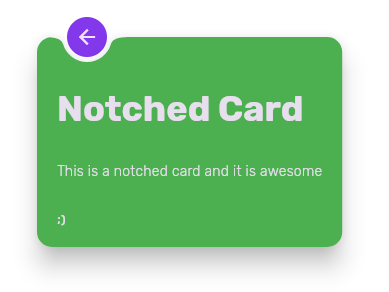
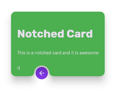
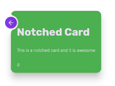
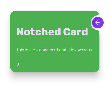
Screenshots #
| Top Notch | Bottom Notch | Left Notch | Right Notch |
|---|---|---|---|
 |
 |
 |
 |
Features #
✅ Supports notch effect on top, bottom, left, and right sides of the card.
✅ Fully customizable card appearance.
✅ Easy integration with existing Flutter projects.
✅ Works with any child widget inside the card.
Installation #
Add this to your pubspec.yaml file:
dependencies:
  notched_card: ^0.1.0
Then, run:
flutter pub get
Usage #
Basic Example #
use final guestKey = GlobalKey(); for addressing the widget that will be guest for Notched Card.
import 'package:flutter/material.dart';
import 'package:notched_card/notched_card.dart';

void main() {
  runApp(MyApp());
}

class MyApp extends StatelessWidget {
  final guestKey = GlobalKey();

  @override
  Widget build(BuildContext context) {
    return MaterialApp(
      home: Scaffold(
        body: Stack(
          fit: StackFit.loose,
          alignment: Alignment.topCenter,
          children: [
            Padding(
              padding: const EdgeInsets.only(top: 0.0, left: 0),
              child: CircleAvatar(
                key: guestKey,
                child: Icon(Icons.arrow_back),
              ),
            ),
            Padding(
              padding: const EdgeInsets.all(10.0),
              child: NotchedCard(
                guestKey: guestKey,
                notchMargin: 5,
                shapeNotch: CircularDirectionalNotchedRectangle(
                    position: NotchCardPosition.top),
                shape: RoundedRectangleBorder(
                    borderRadius: BorderRadius.circular(15.0)),
                clipBehavior: Clip.antiAlias,
                elevation: 20,
                color: Colors.green,
                margin: EdgeInsets.all(10),
                child: Padding(
                  padding: const EdgeInsets.all(20),
                  child: IntrinsicHeight(
                    child: Column(
                      spacing: 30,
                      crossAxisAlignment: CrossAxisAlignment.start,
                      children: [
                        Text('Notched Card',
                            style: Theme.of(context).textTheme.displaySmall),
                        Text('This is a notched card and it is awesome',
                            style: Theme.of(context).textTheme.bodyMedium),
                        Text(';)',
                            style: Theme.of(context).textTheme.labelMedium),
                      ],
                    ),
                  ),
                ),
              ),
            ),
          ],
        ),
      ),
    );
  }
}
NotchPosition Enum #
NotchPosition.topNotchPosition.bottomNotchPosition.leftNotchPosition.right
Contributions #
Contributions are welcome! If you find any issues or have feature requests, feel free to open an issue or submit a pull request.
License #
MIT License. See the LICENSE file for details.
Metadata
Publisher
unverified uploader
Weekly Downloads
Metadata
A Flutter plugin that provides a `Card` widget with a customizable notch effect on different sides (top, bottom, left, or right). Enhance your UI with unique and modern designs!.
Repository (GitHub)
View/report issues
Documentation
License
 MIT (license)