navpages 1.2.3  navpages: ^1.2.3 copied to clipboard
 m3talsmith.com
A flexible Flutter package for creating responsive navigation pages with integrated navigation rails and sidebars.
NavPages #
A flexible Flutter package for creating responsive navigation pages with integrated navigation rails and sidebars. NavPages provides a complete solution for managing multiple pages with built-in navigation controls and responsive design.
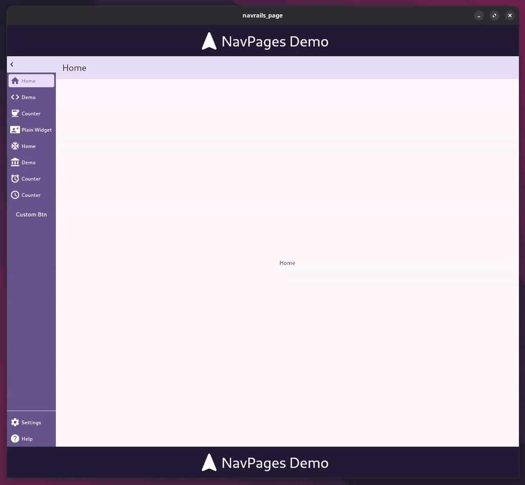
Table of Contents #
- Features
- Installation
- Quick Start
- Basic Usage
- Advanced Usage
- API Reference
- Responsive Behavior
- Customization
- Performance
- Troubleshooting
- Migration Guide
- Examples
- Contributing
- License
Features #
- 🎯 Multi-page Management: Handle multiple pages internally with automatic state management and seamless transitions
- 📱 Responsive Navigation: Provides Navigation Rail/Sidebar that automatically adapts to screen size (vertical on desktop, horizontal on mobile)
- 🔧 Expandable Design: Optional expandable navigation with customizable widths and heights for better space utilization
- 🧭 Navigation Controls: Includes
.of(context)method with Navigator-like methods (pop,canPop,push,pushReplacement) to control page history - 🎨 Customizable Styling: Full control over colors, dimensions, and visual appearance with theme integration
- ⚡ Action Buttons: Support for additional action buttons in the navigation rail with flexible positioning
- 📲 Mobile Optimization: Automatic mobile layout with overflow handling and intuitive menu systems
- 🔄 State Management: Built-in state management using Riverpod for efficient page state handling
- ♿ Accessibility: Full accessibility support with proper semantic labels and keyboard navigation
Installation #
Add NavPages to your pubspec.yaml file:
dependencies:
  navpages: ^1.2.3
Then run:
flutter pub get
Requirements #
- Flutter SDK:
>=1.17.0 - Dart SDK:
^3.9.0
Quick Start #
Create a simple multi-page app with navigation in just a few steps:
import 'package:flutter/material.dart';
import 'package:navpages/navpages.dart';

void main() {
  runApp(const MyApp());
}

class MyApp extends StatelessWidget {
  const MyApp({super.key});

  @override
  Widget build(BuildContext context) {
    return MaterialApp(
      title: 'NavPages Demo',
      theme: ThemeData(
        colorScheme: ColorScheme.fromSeed(seedColor: Colors.deepPurple),
        useMaterial3: true,
      ),
      home: const HomePage(),
    );
  }
}

class HomePage extends StatelessWidget {
  const HomePage({super.key});

  @override
  Widget build(BuildContext context) {
    return Scaffold(
      body: NavPages(
        // Define navigation buttons
        buttons: [
          NavRailButton(
            label: 'Home',
            icon: Icons.home,
          ),
          NavRailButton(
            label: 'Settings',
            icon: Icons.settings,
          ),
        ],
        // Define corresponding pages
        children: [
          NavPage(
            navbar: Navbar(title: 'Home'),
            child: const HomeContent(),
          ),
          NavPage(
            navbar: Navbar(title: 'Settings'),
            child: const SettingsContent(),
          ),
        ],
      ),
    );
  }
}

// Sample page content
class HomeContent extends StatelessWidget {
  const HomeContent({super.key});

  @override
  Widget build(BuildContext context) {
    return const Center(
      child: Column(
        mainAxisAlignment: MainAxisAlignment.center,
        children: [
          Icon(Icons.home, size: 64, color: Colors.deepPurple),
          SizedBox(height: 16),
          Text(
            'Welcome to Home!',
            style: TextStyle(fontSize: 24, fontWeight: FontWeight.bold),
          ),
          SizedBox(height: 8),
          Text('This is your home page content.'),
        ],
      ),
    );
  }
}

class SettingsContent extends StatelessWidget {
  const SettingsContent({super.key});

  @override
  Widget build(BuildContext context) {
    return const Center(
      child: Column(
        mainAxisAlignment: MainAxisAlignment.center,
        children: [
          Icon(Icons.settings, size: 64, color: Colors.deepPurple),
          SizedBox(height: 16),
          Text(
            'Settings',
            style: TextStyle(fontSize: 24, fontWeight: FontWeight.bold),
          ),
          SizedBox(height: 8),
          Text('Configure your app settings here.'),
        ],
      ),
    );
  }
}
Basic Usage #
The basic usage section above shows the simplest way to get started. Here are some additional patterns you might find useful:
Minimal Setup #
For the simplest possible setup, you can omit the navbar:
NavPages(
  buttons: [
    NavRailButton(label: 'Page 1', icon: Icons.pageview),
    NavRailButton(label: 'Page 2', icon: Icons.pages),
  ],
  children: [
    NavPage(child: const Text('Page 1 Content')),
    NavPage(child: const Text('Page 2 Content')),
  ],
)
With Custom Callbacks #
You can add custom tap handlers to navigation buttons:
NavPages(
  buttons: [
    NavRailButton(
      label: 'Home',
      icon: Icons.home,
      onTap: () {
        // Custom logic when home button is tapped
        print('Home button tapped!');
      },
    ),
  ],
  children: [
    NavPage(child: const HomePage()),
  ],
)
Advanced Usage #
Expandable Navigation #
Create a collapsible navigation rail that saves space on smaller screens:
NavPages(
  expandable: true,        // Enable expandable functionality
  expanded: true,          // Start in expanded state
  buttons: [
    NavRailButton(label: 'Dashboard', icon: Icons.dashboard),
    NavRailButton(label: 'Analytics', icon: Icons.analytics),
    NavRailButton(label: 'Reports', icon: Icons.assessment),
    NavRailButton(label: 'Users', icon: Icons.people),
  ],
  children: [
    NavPage(
      navbar: Navbar(title: 'Dashboard'),
      child: const DashboardPage(),
    ),
    NavPage(
      navbar: Navbar(title: 'Analytics'),
      child: const AnalyticsPage(),
    ),
    NavPage(
      navbar: Navbar(title: 'Reports'),
      child: const ReportsPage(),
    ),
    NavPage(
      navbar: Navbar(title: 'Users'),
      child: const UsersPage(),
    ),
  ],
)
Benefits of Expandable Navigation:
- Saves horizontal space when collapsed
- Shows labels when expanded for better UX
- Automatically handles mobile layouts
With Action Buttons #
Separate primary navigation from secondary actions:
NavPages(
  // Primary navigation buttons
  buttons: [
    NavRailButton(label: 'Home', icon: Icons.home),
    NavRailButton(label: 'Profile', icon: Icons.person),
    NavRailButton(label: 'Messages', icon: Icons.message),
  ],
  // Secondary action buttons (appear at bottom on desktop, in menu on mobile)
  actions: [
    NavRailButton(label: 'Settings', icon: Icons.settings),
    NavRailButton(label: 'Help', icon: Icons.help),
    NavRailButton(label: 'Logout', icon: Icons.logout),
  ],
  children: [
    NavPage(navbar: Navbar(title: 'Home'), child: const HomePage()),
    NavPage(navbar: Navbar(title: 'Profile'), child: const ProfilePage()),
    NavPage(navbar: Navbar(title: 'Messages'), child: const MessagesPage()),
  ],
)
Custom Styling #
Customize colors, dimensions, and appearance:
NavPages(
  buttons: [
    NavRailButton(
      label: 'Custom',
      icon: Icons.star,
      // Custom colors for selected state
      selectedColor: Colors.amber,
      selectedBackgroundColor: Colors.amber.withOpacity(0.2),
      // Custom colors for unselected state
      unselectedColor: Colors.grey,
      unselectedBackgroundColor: Colors.transparent,
      // Custom dimensions
      width: 80,
      height: 60,
    ),
  ],
  children: [
    NavPage(
      navbar: Navbar(
        title: 'Custom Page',
        backgroundColor: Colors.blue,
        foregroundColor: Colors.white,
        height: 80, // Custom navbar height
        actions: [
          IconButton(
            icon: const Icon(Icons.more_vert),
            onPressed: () {},
          ),
        ],
      ),
      child: const CustomPage(),
    ),
  ],
)
Navigation Control #
Programmatically control navigation between pages:
class NavigationExample extends StatelessWidget {
  const NavigationExample({super.key});

  @override
  Widget build(BuildContext context) {
    return Scaffold(
      body: Column(
        mainAxisAlignment: MainAxisAlignment.center,
        children: [
          ElevatedButton(
            onPressed: () {
              // Push a new page onto the stack
              NavPages.push(context, const DetailPage());
            },
            child: const Text('Go to Detail Page'),
          ),
          const SizedBox(height: 16),
          ElevatedButton(
            onPressed: () {
              // Replace current page with a new one
              NavPages.pushReplacement(context, const ReplacementPage());
            },
            child: const Text('Replace Current Page'),
          ),
          const SizedBox(height: 16),
          ElevatedButton(
            onPressed: () {
              // Check if we can go back before popping
              if (NavPages.canPop(context)) {
                NavPages.pop(context);
              } else {
                ScaffoldMessenger.of(context).showSnackBar(
                  const SnackBar(content: Text('Cannot go back')),
                );
              }
            },
            child: const Text('Go Back'),
          ),
        ],
      ),
    );
  }
}
Dynamic Navigation #
Create navigation that responds to user interactions:
class DynamicNavigationExample extends StatefulWidget {
  const DynamicNavigationExample({super.key});

  @override
  State<DynamicNavigationExample> createState() => _DynamicNavigationExampleState();
}

class _DynamicNavigationExampleState extends State<DynamicNavigationExample> {
  int _currentIndex = 0;
  final List<String> _tabs = ['Home', 'Profile', 'Settings'];

  @override
  Widget build(BuildContext context) {
    return NavPages(
      buttons: _tabs.asMap().entries.map((entry) {
        int index = entry.key;
        String label = entry.value;
        return NavRailButton(
          label: label,
          icon: _getIconForTab(label),
          selected: index == _currentIndex,
          onTap: () {
            setState(() {
              _currentIndex = index;
            });
          },
        );
      }).toList(),
      children: _tabs.map((tab) {
        return NavPage(
          navbar: Navbar(title: tab),
          child: _buildTabContent(tab),
        );
      }).toList(),
    );
  }

  IconData _getIconForTab(String tab) {
    switch (tab) {
      case 'Home': return Icons.home;
      case 'Profile': return Icons.person;
      case 'Settings': return Icons.settings;
      default: return Icons.help;
    }
  }

  Widget _buildTabContent(String tab) {
    return Center(
      child: Text('Content for $tab'),
    );
  }
}
API Reference #
NavPages #
The main widget that manages multiple pages and navigation. This is the core component that orchestrates the entire navigation system.
Constructor Properties
| Property | Type | Default | Description |
|---|---|---|---|
children |
List<NavPage> |
[] |
List of pages to display. Each page corresponds to a navigation button |
buttons |
List<NavRailButton> |
[] |
Navigation buttons for the rail. Must match the order of children |
actions |
List<NavRailButton>? |
null |
Optional action buttons (appear at bottom on desktop, in menu on mobile) |
direction |
NavPagesDirection |
NavPagesDirection.vertical |
Layout direction (horizontal/vertical) |
expandable |
bool |
false |
Whether the navigation can be expanded/collapsed |
expanded |
bool |
false |
Initial expanded state (only applies when expandable is true) |
minWidth |
double? |
null |
Minimum width of the navigation rail |
maxWidth |
double? |
null |
Maximum width of the navigation rail |
minHeight |
double? |
null |
Minimum height of the navigation rail |
maxHeight |
double? |
null |
Maximum height of the navigation rail |
Static Methods
| Method | Description | Parameters | Returns |
|---|---|---|---|
NavPages.of(BuildContext context) |
Get the NavPagesState instance for the current context | context - BuildContext |
NavPagesState? |
NavPages.pop(BuildContext context) |
Pop the current page from the navigation stack | context - BuildContext |
void |
NavPages.push(BuildContext context, Widget page) |
Push a new page onto the navigation stack | context - BuildContextpage - Widget to push |
void |
NavPages.canPop(BuildContext context) |
Check if navigation can pop (has previous pages) | context - BuildContext |
bool |
NavPages.pushReplacement(BuildContext context, Widget page) |
Replace current page with a new one | context - BuildContextpage - Widget to replace with |
void |
Example Usage
// Basic usage
NavPages(
  buttons: [
    NavRailButton(label: 'Home', icon: Icons.home),
    NavRailButton(label: 'Profile', icon: Icons.person),
  ],
  children: [
    NavPage(child: const HomePage()),
    NavPage(child: const ProfilePage()),
  ],
)

// With expandable navigation
NavPages(
  expandable: true,
  expanded: true,
  buttons: [/* ... */],
  children: [/* ... */],
)

// Programmatic navigation
void navigateToDetail(BuildContext context) {
  NavPages.push(context, const DetailPage());
}

void goBack(BuildContext context) {
  if (NavPages.canPop(context)) {
    NavPages.pop(context);
  }
}
NavPage #
Represents a single page within the NavPages widget. Each NavPage corresponds to one navigation button.
Constructor Properties
| Property | Type | Default | Description |
|---|---|---|---|
navbar |
Navbar? |
null |
Optional navigation bar for the page |
child |
Widget? |
null |
The main content widget for this page |
key |
Key? |
null |
Widget key for identification |
Example Usage
// Simple page without navbar
NavPage(
  child: const Center(
    child: Text('Simple Page Content'),
  ),
)

// Page with navbar
NavPage(
  navbar: Navbar(
    title: 'My Page',
    actions: [
      IconButton(
        icon: const Icon(Icons.settings),
        onPressed: () {},
      ),
    ],
  ),
  child: const MyPageContent(),
)
NavRailButton #
A button component for the navigation rail. Provides customizable appearance and behavior.
Constructor Properties
| Property | Type | Default | Description |
|---|---|---|---|
label |
String? |
null |
Button label text (shown when expanded) |
icon |
IconData? |
null |
Button icon |
onTap |
Function()? |
null |
Tap callback function |
expanded |
bool |
false |
Whether the button is in expanded state |
selected |
bool |
false |
Whether the button is currently selected |
width |
double? |
null |
Custom width override |
height |
double? |
null |
Custom height override |
selectedColor |
Color? |
null |
Color when selected (uses theme if null) |
selectedBackgroundColor |
Color? |
null |
Background color when selected |
unselectedColor |
Color? |
null |
Color when not selected (uses theme if null) |
unselectedBackgroundColor |
Color? |
null |
Background color when not selected |
labelPosition |
NavRailButtonLabelPosition |
NavRailButtonLabelPosition.right |
Position of label relative to icon |
Example Usage
// Basic button
NavRailButton(
  label: 'Home',
  icon: Icons.home,
)

// Custom styled button
NavRailButton(
  label: 'Custom',
  icon: Icons.star,
  selectedColor: Colors.amber,
  selectedBackgroundColor: Colors.amber.withOpacity(0.2),
  width: 80,
  height: 60,
  onTap: () {
    print('Custom button tapped!');
  },
)

// Button with custom label position
NavRailButton(
  label: 'Settings',
  icon: Icons.settings,
  labelPosition: NavRailButtonLabelPosition.bottom,
)
Navbar #
A customizable navigation bar widget that appears at the top of each page.
Constructor Properties
| Property | Type | Default | Description |
|---|---|---|---|
title |
String |
Required | Title text displayed in the navbar |
actions |
List<Widget>? |
null |
Optional action widgets (typically IconButtons) |
backgroundColor |
Color? |
null |
Background color (uses theme if null) |
foregroundColor |
Color? |
null |
Text and icon color (uses theme if null) |
height |
double |
56.0 |
Height of the navbar |
leading |
Widget? |
null |
Optional leading widget (typically back button) |
centerTitle |
bool |
true |
Whether to center the title |
Example Usage
// Simple navbar
Navbar(title: 'My Page')

// Navbar with actions
Navbar(
  title: 'Dashboard',
  actions: [
    IconButton(
      icon: const Icon(Icons.notifications),
      onPressed: () {},
    ),
    IconButton(
      icon: const Icon(Icons.search),
      onPressed: () {},
    ),
  ],
)

// Custom styled navbar
Navbar(
  title: 'Custom Page',
  backgroundColor: Colors.blue,
  foregroundColor: Colors.white,
  height: 80,
  actions: [
    IconButton(
      icon: const Icon(Icons.more_vert),
      onPressed: () {},
    ),
  ],
)
NavRail #
The navigation rail component (used internally by NavPages). Can be used standalone for custom implementations.
Constructor Properties
| Property | Type | Default | Description |
|---|---|---|---|
buttons |
List<NavRailButton> |
[] |
Navigation buttons |
actions |
List<NavRailButton>? |
null |
Action buttons |
direction |
NavRailDirection |
NavRailDirection.vertical |
Layout direction |
expandable |
bool |
false |
Whether expandable |
expanded |
bool |
false |
Expanded state |
minWidth |
double |
72.0 |
Minimum width |
maxWidth |
double |
256.0 |
Maximum width |
minHeight |
double |
72.0 |
Minimum height |
maxHeight |
double |
256.0 |
Maximum height |
labelPosition |
NavRailButtonLabelPosition? |
null |
Label position override |
backgroundColor |
Color? |
null |
Background color |
selectedColor |
Color? |
null |
Selected button color |
unselectedColor |
Color? |
null |
Unselected button color |
selectedBackgroundColor |
Color? |
null |
Selected button background |
unselectedBackgroundColor |
Color? |
null |
Unselected button background |
Example Usage
// Standalone navigation rail
NavRail(
  buttons: [
    NavRailButton(label: 'Home', icon: Icons.home),
    NavRailButton(label: 'Profile', icon: Icons.person),
  ],
  expandable: true,
  expanded: true,
)
Enums #
NavPagesDirection
NavPagesDirection.vertical- Vertical layout (default)NavPagesDirection.horizontal- Horizontal layout
NavRailDirection
NavRailDirection.vertical- Vertical rail (default)NavRailDirection.horizontal- Horizontal rail
NavRailButtonLabelPosition
NavRailButtonLabelPosition.right- Label to the right of icon (default)NavRailButtonLabelPosition.bottom- Label below iconNavRailButtonLabelPosition.left- Label to the left of iconNavRailButtonLabelPosition.top- Label above icon
Responsive Behavior #
NavPages automatically adapts to different screen sizes and orientations, providing an optimal user experience across all devices.
Breakpoints and Layouts #
| Screen Size | Layout | Navigation Position | Behavior |
|---|---|---|---|
| Desktop (>768px) | Vertical | Left side | Full navigation rail with labels |
| Tablet (768px - 1024px) | Vertical | Left side | Collapsible rail, labels on hover |
| Mobile (<768px) | Horizontal | Top | Compact horizontal bar with overflow menu |
Desktop Layout (>768px) #
┌─────────────────────────────────────────┐
│ [🏠] Home    │  ┌─────────────────────┐  │
│ [👤] Profile │  │                     │  │
│ [⚙️] Settings│  │     Page Content     │  │
│ [❓] Help    │  │                     │  │
│              │  │                     │  │
│              │  │                     │  │
└─────────────────────────────────────────┘
Features:
- Vertical navigation rail on the left
- Full labels visible when expanded
- Smooth expand/collapse animations
- Action buttons at the bottom of the rail
Mobile Layout (<768px) #
┌─────────────────────────────────────────┐
│ [🏠] [👤] [⚙️] [⋯] More                │
├─────────────────────────────────────────┤
│                                         │
│           Page Content                  │
│                                         │
│                                         │
└─────────────────────────────────────────┘
Features:
- Horizontal navigation bar at the top
- Overflow buttons moved to "More" menu
- Action buttons accessible via menu
- Touch-optimized button sizes
Responsive Configuration #
NavPages(
  // Automatically responsive - no configuration needed
  buttons: [
    NavRailButton(label: 'Home', icon: Icons.home),
    NavRailButton(label: 'Profile', icon: Icons.person),
    NavRailButton(label: 'Settings', icon: Icons.settings),
    NavRailButton(label: 'Help', icon: Icons.help),
    NavRailButton(label: 'About', icon: Icons.info),
  ],
  actions: [
    NavRailButton(label: 'Logout', icon: Icons.logout),
  ],
  children: [
    // Your pages here
  ],
)
Custom Responsive Behavior #
You can customize the responsive behavior by wrapping NavPages in a LayoutBuilder:
LayoutBuilder(
  builder: (context, constraints) {
    bool isMobile = constraints.maxWidth < 768;

    return NavPages(
      expandable: !isMobile, // Only expandable on desktop
      expanded: !isMobile,   // Start expanded on desktop
      buttons: [
        NavRailButton(
          label: 'Home',
          icon: Icons.home,
          // Smaller buttons on mobile
          width: isMobile ? 48 : null,
          height: isMobile ? 48 : null,
        ),
        // ... other buttons
      ],
      children: [
        // Your pages
      ],
    );
  },
)
Orientation Changes #
NavPages handles orientation changes gracefully:
- Portrait: Optimized for vertical scrolling
- Landscape: Maximizes horizontal space usage
- Automatic: Transitions smoothly between orientations
Performance #
NavPages is optimized for performance and provides several features to ensure smooth operation.
Built-in Optimizations #
- Lazy Loading: Pages are only built when they become active
- State Management: Efficient state management using Riverpod
- Memory Management: Automatic cleanup of unused page states
- Animation Optimization: Hardware-accelerated animations
- Widget Reuse: Efficient widget recycling for better performance
Best Practices #
1. Optimize Page Content
// ✅ Good: Use const constructors where possible
NavPage(
  child: const MyPageContent(), // const constructor
)

// ❌ Avoid: Rebuilding unnecessary widgets
NavPage(
  child: MyPageContent(), // Will rebuild on every navigation
)
2. Minimize Navigation Buttons
// ✅ Good: Reasonable number of buttons
NavPages(
  buttons: [
    NavRailButton(label: 'Home', icon: Icons.home),
    NavRailButton(label: 'Profile', icon: Icons.person),
    NavRailButton(label: 'Settings', icon: Icons.settings),
  ],
  children: [/* ... */],
)

// ❌ Avoid: Too many buttons (consider using actions)
NavPages(
  buttons: [
    // 10+ buttons can impact performance
  ],
)
3. Use Actions for Secondary Navigation
// ✅ Good: Separate primary and secondary actions
NavPages(
  buttons: [
    NavRailButton(label: 'Home', icon: Icons.home),
    NavRailButton(label: 'Profile', icon: Icons.person),
  ],
  actions: [
    NavRailButton(label: 'Settings', icon: Icons.settings),
    NavRailButton(label: 'Help', icon: Icons.help),
  ],
  children: [/* ... */],
)
4. Optimize Page Content
// ✅ Good: Use ListView.builder for large lists
class OptimizedPage extends StatelessWidget {
  @override
  Widget build(BuildContext context) {
    return ListView.builder(
      itemCount: 1000,
      itemBuilder: (context, index) {
        return ListTile(title: Text('Item $index'));
      },
    );
  }
}

// ❌ Avoid: Creating all items at once
class UnoptimizedPage extends StatelessWidget {
  @override
  Widget build(BuildContext context) {
    return Column(
      children: List.generate(1000, (index) {
        return ListTile(title: Text('Item $index'));
      }),
    );
  }
}
Performance Monitoring #
Monitor your app's performance using Flutter's built-in tools:
// Enable performance overlay in debug mode
void main() {
  runApp(
    MaterialApp(
      home: const MyApp(),
      debugShowPerformanceOverlay: true, // Debug only
    ),
  );
}
Memory Usage #
NavPages automatically manages memory by:
- Page Lifecycle: Pages are disposed when not in use
- State Cleanup: Automatic cleanup of page states
- Widget Disposal: Proper disposal of widgets and controllers
Animation Performance #
All animations are optimized for 60fps:
- Hardware Acceleration: Uses GPU for smooth animations
- Efficient Transitions: Optimized page transition animations
- Reduced Jank: Minimized frame drops during navigation
Customization #
Colors #
All color properties support theme integration and can be customized:
NavPages(
  // Custom colors will be applied to NavRail
  children: [
    NavPage(
      navbar: Navbar(
        title: 'Custom',
        backgroundColor: Colors.deepPurple,
        foregroundColor: Colors.white,
      ),
      child: MyPage(),
    ),
  ],
)
Dimensions #
Control the size of navigation elements:
NavRailButton(
  width: 60,
  height: 60,
  label: 'Custom Size',
  icon: Icons.star,
)
Troubleshooting #
Here are solutions to common issues you might encounter when using NavPages.
Common Issues #
1. Navigation Buttons Not Working
Problem: Tapping navigation buttons doesn't switch pages.
Solution: Ensure the number of buttons matches the number of children:
// ✅ Correct: Same number of buttons and children
NavPages(
  buttons: [
    NavRailButton(label: 'Home', icon: Icons.home),
    NavRailButton(label: 'Profile', icon: Icons.person),
  ],
  children: [
    NavPage(child: const HomePage()),
    NavPage(child: const ProfilePage()),
  ],
)

// ❌ Incorrect: Mismatched counts
NavPages(
  buttons: [
    NavRailButton(label: 'Home', icon: Icons.home),
    NavRailButton(label: 'Profile', icon: Icons.person),
  ],
  children: [
    NavPage(child: const HomePage()),
    // Missing second page!
  ],
)
2. Pages Not Displaying Correctly
Problem: Pages appear blank or don't render properly.
Solution: Check that your page widgets are properly constructed:
// ✅ Good: Proper widget structure
NavPage(
  child: const Center(
    child: Text('Page Content'),
  ),
)

// ❌ Avoid: Null or invalid child
NavPage(
  child: null, // This will cause issues
)
3. Navigation State Not Persisting
Problem: Navigation state resets when the widget rebuilds.
Solution: Use keys to maintain state:
NavPages(
  key: const ValueKey('main_navigation'), // Add a key
  buttons: [/* ... */],
  children: [/* ... */],
)
4. Mobile Layout Issues
Problem: Navigation doesn't adapt properly on mobile devices.
Solution: Ensure you're not overriding responsive behavior:
// ✅ Good: Let NavPages handle responsiveness
NavPages(
  buttons: [/* ... */],
  children: [/* ... */],
)

// ❌ Avoid: Forcing desktop layout on mobile
NavPages(
  expandable: true,
  expanded: true, // This might cause issues on mobile
  buttons: [/* ... */],
  children: [/* ... */],
)
5. Performance Issues
Problem: App becomes slow with many pages or complex content.
Solutions:
- Use
constconstructors where possible - Implement lazy loading for heavy content
- Limit the number of navigation buttons (use actions for secondary items)
// ✅ Good: Optimized page content
class OptimizedPage extends StatelessWidget {
  const OptimizedPage({super.key}); // const constructor

  @override
  Widget build(BuildContext context) {
    return const Center(
      child: Text('Optimized Content'),
    );
  }
}

// ❌ Avoid: Rebuilding on every navigation
class UnoptimizedPage extends StatelessWidget {
  UnoptimizedPage({super.key}); // No const constructor

  @override
  Widget build(BuildContext context) {
    return Center(
      child: Text('Content'), // Will rebuild unnecessarily
    );
  }
}
Debug Mode #
Enable debug mode to see additional information:
NavPages(
  // Add debug information
  buttons: [/* ... */],
  children: [/* ... */],
  // Enable debug mode in development
  // debugMode: true, // If available in your version
)
Getting Help #
If you're still experiencing issues:
- Check the example app: Run the example in the
example/directory - Review the API documentation: Ensure you're using the correct properties
- Check Flutter version: Ensure you're using a compatible Flutter version
- File an issue: Report bugs on the GitHub repository
Migration Guide #
This guide helps you migrate between different versions of NavPages.
Migrating to v1.2.x #
Breaking Changes
- Riverpod Integration: NavPages now uses Riverpod for state management.
Before (v1.1.x):
// No additional dependencies needed
After (v1.2.x):
dependencies:
  navpages: ^1.2.3
  flutter_riverpod: ^2.6.1
  riverpod: ^2.6.1
- ProviderScope Required: Wrap your app with ProviderScope.
Before:
void main() {
  runApp(const MyApp());
}
After:
void main() {
  runApp(
    ProviderScope(
      child: const MyApp(),
    ),
  );
}
New Features
- Enhanced State Management: Better performance and state persistence
- Improved Responsive Behavior: Better mobile adaptation
- Additional Customization Options: More styling and behavior options
Migrating to v1.1.x #
Breaking Changes
- API Changes: Some method signatures have changed.
Before (v1.0.x):
NavPages(
  pages: [/* ... */], // Old property name
  navigationButtons: [/* ... */], // Old property name
)
After (v1.1.x):
NavPages(
  children: [/* ... */], // New property name
  buttons: [/* ... */], // New property name
)
Migration Steps
-
Update Property Names:
pages→childrennavigationButtons→buttons
-
Update Method Calls:
- Check for any custom method calls that might have changed
-
Test Thoroughly:
- Test all navigation functionality
- Verify responsive behavior
- Check custom styling
Migrating from Other Navigation Packages #
From BottomNavigationBar
Before:
BottomNavigationBar(
  currentIndex: _currentIndex,
  onTap: (index) {
    setState(() {
      _currentIndex = index;
    });
  },
  items: [
    BottomNavigationBarItem(icon: Icon(Icons.home), label: 'Home'),
    BottomNavigationBarItem(icon: Icon(Icons.person), label: 'Profile'),
  ],
)
After:
NavPages(
  buttons: [
    NavRailButton(label: 'Home', icon: Icons.home),
    NavRailButton(label: 'Profile', icon: Icons.person),
  ],
  children: [
    NavPage(child: const HomePage()),
    NavPage(child: const ProfilePage()),
  ],
)
From NavigationRail
Before:
NavigationRail(
  selectedIndex: _selectedIndex,
  onDestinationSelected: (index) {
    setState(() {
      _selectedIndex = index;
    });
  },
  destinations: [
    NavigationRailDestination(icon: Icon(Icons.home), label: Text('Home')),
    NavigationRailDestination(icon: Icon(Icons.person), label: Text('Profile')),
  ],
)
After:
NavPages(
  buttons: [
    NavRailButton(label: 'Home', icon: Icons.home),
    NavRailButton(label: 'Profile', icon: Icons.person),
  ],
  children: [
    NavPage(child: const HomePage()),
    NavPage(child: const ProfilePage()),
  ],
)
Version Compatibility #
| NavPages Version | Flutter Version | Dart Version |
|---|---|---|
| 1.2.x | >=1.17.0 | ^3.9.0 |
| 1.1.x | >=1.17.0 | ^3.0.0 |
| 1.0.x | >=1.17.0 | ^2.17.0 |
Examples #
Check out the example/ directory for complete sample applications demonstrating various use cases.
Running the Example #
-
Clone the repository:
git clone https://github.com/sidekick-dojo/navpages.git cd navpages -
Navigate to the example directory:
cd example -
Get dependencies:
flutter pub get -
Run the example:
flutter run
Example Features Demonstrated #
- Basic Navigation: Simple multi-page setup
- Expandable Navigation: Collapsible navigation rail
- Action Buttons: Secondary actions in navigation
- Custom Styling: Themed navigation bars and buttons
- Programmatic Navigation: Using
NavPages.push()andNavPages.pop() - Responsive Design: Automatic adaptation to screen sizes
Contributing #
We welcome contributions to NavPages! Here's how you can help improve the package.
Ways to Contribute #
- 🐛 Report Bugs: Found a bug? Please file an issue with detailed information
- 💡 Suggest Features: Have an idea? Open a feature request issue
- 📝 Improve Documentation: Help others by improving docs and examples
- 🔧 Submit Code: Fix bugs or add new features via pull requests
- 🧪 Test: Help test new features and report issues
Development Setup #
-
Fork the repository on GitHub
-
Clone your fork:
git clone https://github.com/YOUR_USERNAME/navpages.git cd navpages -
Create a branch for your changes:
git checkout -b feature/your-feature-name -
Install dependencies:
flutter pub get -
Run tests:
flutter test -
Run the example to test your changes:
cd example
flutter run
Code Style Guidelines #
- Follow the existing code style and formatting
- Use meaningful variable and function names
- Add comments for complex logic
- Ensure all tests pass
- Update documentation for new features
Pull Request Process #
- Ensure your code works: Test thoroughly on different screen sizes
- Update documentation: Update README.md and API docs if needed
- Add tests: Include tests for new functionality
- Update CHANGELOG.md: Document your changes
- Submit PR: Create a pull request with a clear description
Pull Request Template #
When submitting a pull request, please include:
## Description
Brief description of changes

## Type of Change
- [ ] Bug fix
- [ ] New feature
- [ ] Breaking change
- [ ] Documentation update

## Testing
- [ ] Tests pass
- [ ] Tested on multiple screen sizes
- [ ] Tested on different platforms

## Checklist
- [ ] Code follows style guidelines
- [ ] Self-review completed
- [ ] Documentation updated
- [ ] CHANGELOG.md updated
Issue Guidelines #
When reporting issues, please include:
- Flutter version:
flutter --version - Package version: Current version of navpages
- Platform: iOS, Android, Web, Desktop
- Steps to reproduce: Clear steps to reproduce the issue
- Expected behavior: What should happen
- Actual behavior: What actually happens
- Screenshots: If applicable
- Code sample: Minimal code that reproduces the issue
Feature Request Guidelines #
When requesting features, please include:
- Use case: Why is this feature needed?
- Proposed solution: How should it work?
- Alternatives: Other ways to solve the problem
- Additional context: Any other relevant information
Community Guidelines #
- Be respectful and inclusive
- Help others learn and grow
- Provide constructive feedback
- Follow the Code of Conduct
Recognition #
Contributors will be recognized in:
- README.md contributors section
- Release notes
- Package documentation
Thank you for contributing to NavPages! 🎉
License #
This project is licensed under the MIT License - see the LICENSE file for details.
Additional Information #
For more information about this package, visit:
To contribute to the package, file issues, or get support, please visit our GitHub repository.
Metadata
Publisher
Weekly Downloads
Metadata
A flexible Flutter package for creating responsive navigation pages with integrated navigation rails and sidebars.
Repository (GitHub)
View/report issues
License
 unknown (license)