m3e_dropdown_menu 0.0.1  m3e_dropdown_menu: ^0.0.1 copied to clipboard
 muditpurohit.tech
A Flutter package providing Material 3 Expressive Dropdown Menu with spring physics and extensive customization options.
M3E Dropdown Menu #
A comprehensive Flutter package providing an expressive, Material 3 dropdown menu with spring physics and extensive customization options. It offers single and multi-selection, fuzzy search, async loading, and animated chip tags—all featuring expressive M3 styling and neighbour animations.
It automatically calculates and draws the corners to fit exactly the Material 3 Expressive spec for interactive elements. It provides deep control over styling, custom haptic feedback, and highly tunable spring stiffness and damping for animations.
🚀 Features #
- Dynamic border radius: Fluid transitions between field states with animated borders.
- Rich Interaction: Spring-driven physics for expanding and collapsing the dropdown menu.
- Chips & Search: Built-in multi-selection chip support and fuzzy search input.
- Form Integration: Fully compatible with Flutter's standard
Formand validation APIs. - Highly Customizable: Complete control over haptics, splash ripples, border colors, radii, padding, and animations.
📦 Installation #
dependencies:
  m3e_dropdown_menu: ^0.1.0
import 'package:m3e_dropdown_menu/m3e_dropdown_menu.dart';
🧩 Usage #
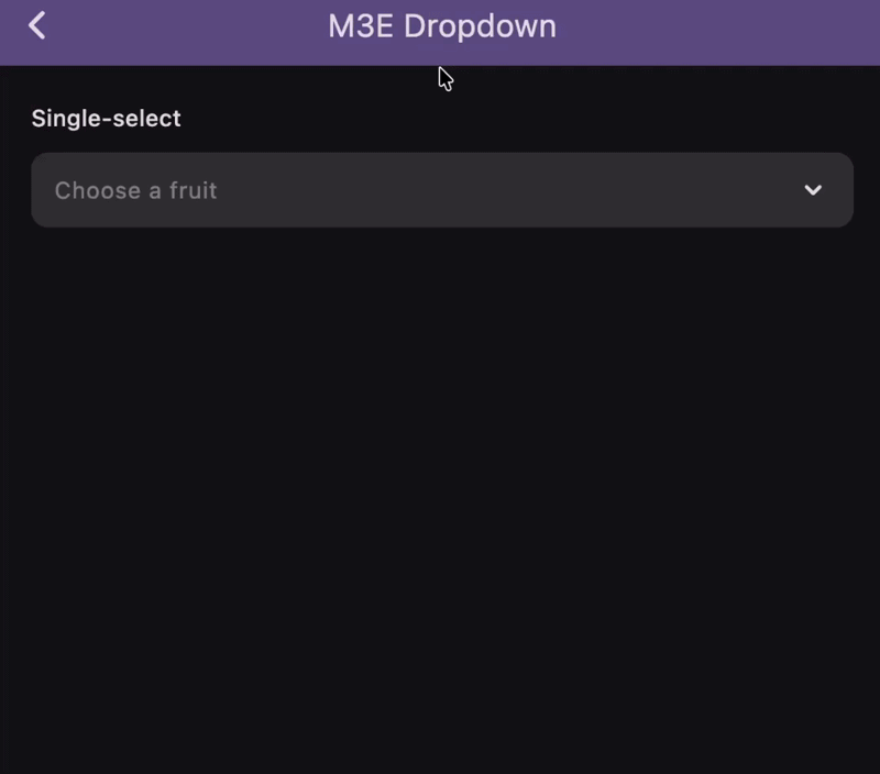
🔴 M3E Dropdown (With expandedBorderRadius) #
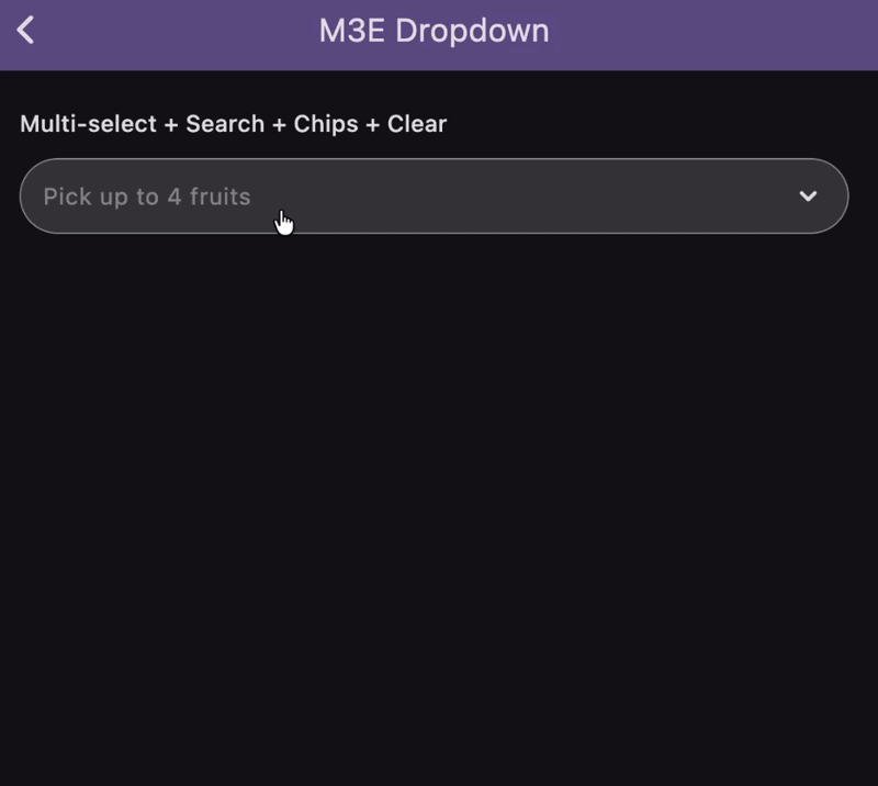
🔴 M3E Dropdown (Without expandedBorderRadius, With Chips) #
Single-select #
A basic dropdown selecting one item, with an animated border radius transition.
M3EDropdownMenu<String>(
  items: [
    M3EDropdownItem(label: 'Apple', value: 'apple'),
    M3EDropdownItem(label: 'Banana', value: 'banana'),
    M3EDropdownItem(label: 'Cherry', value: 'cherry'),
  ],
  singleSelect: true,
  stiffness: 400,
  damping: 0.6,
  fieldDecoration: M3EDropdownFieldDecoration(
    hintText: 'Choose a fruit',
    borderRadius: BorderRadius.circular(12),
    expandedBorderRadius: BorderRadius.circular(28),
  ),
  dropdownDecoration: const M3EDropdownDecoration(containerRadius: 18),
  itemDecoration: const M3EDropdownItemDecoration(outerRadius: 18, innerRadius: 6),
  onSelectionChanged: (items) => print(items),
)
Multi-select + Search + Chips + Clear #
Provides a search bar, animated chip display, and a clear-all icon.
M3EDropdownMenu<String>(
  items: fruitItems,
  searchEnabled: true,
  showChipAnimation: true,
  maxSelections: 7,
  fieldDecoration: M3EDropdownFieldDecoration(
    hintText: 'Pick up to 7 fruits',
    border: BorderSide(color: Theme.of(context).colorScheme.outline),
    showClearIcon: true,
  ),
  chipDecoration: M3EChipDecoration(
    maxDisplayCount: 3,
    borderRadius: BorderRadius.circular(33),
    openStiffness: 600,
    openDamping: 0.7,
    closeStiffness: 700,
    closeDamping: 0.4,
  ),
  searchDecoration: M3ESearchDecoration(
    hintText: 'Search fruits…',
    filled: true,
    borderRadius: BorderRadius.circular(24),
  ),
  itemDecoration: M3EDropdownItemDecoration(
    outerRadius: 24,
    innerRadius: 8,
    selectedIcon: Icon(Icons.check_rounded, color: Theme.of(context).colorScheme.primary, size: 18),
  ),
  onSelectionChanged: (items) => print(items),
)
With Form Validation #
Integrates seamlessly with Flutter's standard Form and validations.
Form(
  child: Column(
    children: [
      M3EDropdownMenu<String>(
        items: fruitItems,
        singleSelect: true,
        validator: (selected) {
          if (selected == null || selected.isEmpty) return 'Required';
          return null;
        },
        autovalidateMode: AutovalidateMode.onUserInteraction,
        fieldDecoration: M3EDropdownFieldDecoration(
          hintText: 'Required fruit',
          borderRadius: BorderRadius.circular(12),
          expandedBorderRadius: BorderRadius.circular(28),
        ),
        dropdownDecoration: const M3EDropdownDecoration(
          containerRadius: 24,
          header: Text("Pick a fruit"),
          footer: Text("Swipe to see more"),
        ),
        itemDecoration: const M3EDropdownItemDecoration(
          outerRadius: 24,
          selectedBorderRadius: 24,
          itemPadding: EdgeInsets.all(14),
        ),
        onSelectionChanged: (items) => print(items),
      ),
      ElevatedButton(
        onPressed: () => formKey.currentState!.validate(),
        child: const Text('Submit'),
      ),
    ],
  ),
)
Custom Selected Item Builder #
Build custom chip-like representations for selected items.
M3EDropdownMenu<String>(
  items: fruitItems,
  showChipAnimation: true,
  haptic: 1,
  selectedItemBuilder: (item) {
    return Chip(
      avatar: Icon(Icons.check_circle, color: Theme.of(context).colorScheme.primary, size: 18),
      label: Text(item.label),
      backgroundColor: Theme.of(context).colorScheme.primaryContainer,
    );
  },
  chipDecoration: const M3EChipDecoration(
    openStiffness: 600,
    openDamping: 0.7,
    closeStiffness: 700,
    closeDamping: 0.4,
  ),
  onSelectionChanged: (items) => print(items),
)
Async Data Loading #
Loads dropdown items asynchronously via a Future.
M3EDropdownMenu<int>.future(
  future: () async {
    await Future.delayed(const Duration(seconds: 2));
    return List.generate(
      10,
      (i) => M3EDropdownItem(label: 'User ${i + 1}', value: i + 1),
    );
  },
  singleSelect: true,
  fieldDecoration: const M3EDropdownFieldDecoration(
    hintText: 'Loading users…',
  ),
  onSelectionChanged: (items) => print(items),
)
Constructor Parameters:
| Parameter | Type | Default | Description |
|---|---|---|---|
items |
List<M3EDropdownItem<T>> |
Required | List of dropdown items. |
future |
M3EDropdownFutureRequest<T>? |
null |
Async item provider (use .future() constructor). |
singleSelect |
bool |
false |
Limits to a single choice if true. |
searchEnabled |
bool |
false |
Displays a search bar inside the overlay. |
showChipAnimation |
bool |
true |
Chips slide / pop when selections change. |
maxSelections |
int |
0 (Unlimited) |
Maximum allowed selections. |
onSelectionChanged |
ValueChanged<List<M3EDropdownItem<T>>>? |
null |
Called whenever the selection changes. |
onSearchChanged |
ValueChanged<String>? |
null |
Called when the search text changes. |
controller |
M3EDropdownController<T>? |
null |
Optional programmatic controller. |
enabled |
bool |
true |
Whether the dropdown is enabled. |
containerRadius |
double |
28.0 |
Radius for the dropdown panel and field (when no field radius is set). |
fieldDecoration |
M3EDropdownFieldDecoration |
const |
Stylize the field placeholder, background, hint text, and icons. |
dropdownDecoration |
M3EDropdownDecoration |
const |
Stylize the overlay panel height, colors, and shadow. |
chipDecoration |
M3EChipDecoration |
const |
Stylize the chips, spacing, and pop animations. |
searchDecoration |
M3ESearchDecoration |
const |
Stylize the search field inside the dropdown. |
itemDecoration |
M3EDropdownItemDecoration |
const |
Stylize individual dropdown items. |
itemBuilder |
M3EDropdownItemBuilder<T>? |
null |
Custom builder for each dropdown item. |
selectedItemBuilder |
Widget Function(M3EDropdownItem<T>)? |
null |
Custom builder for selected items in the field. |
itemSeparator |
Widget? |
null |
Widget placed between dropdown items. |
validator |
String? Function(List?)? |
null |
Form validation callback. |
autovalidateMode |
AutovalidateMode |
disabled |
Autovalidate mode for form integration. |
focusNode |
FocusNode? |
null |
Focus node for the dropdown field. |
closeOnBackButton |
bool |
false |
Close the dropdown on system back button press. |
stiffness |
double |
380 |
Spring stiffness for expand/collapse animation. |
damping |
double |
0.8 |
Spring damping for expand/collapse animation. |
splashFactory |
InteractiveInkFeatureFactory? |
NoSplash.splashFactory |
Splash factory for tap feedback. |
haptic |
int |
0 |
Haptic feedback level on tap (0=none, 1=light, 2=medium, 3=heavy). |
M3EDropdownFieldDecoration Parameters:
| Parameter | Type | Default | Description |
|---|---|---|---|
hintText / hintStyle |
String? / TextStyle? |
- | Placeholder text and its style. |
selectedTextStyle |
TextStyle? |
- | Style for the selected value text (single-select). |
prefixIcon / suffixIcon |
Widget? |
- | Optional leading/trailing widgets. |
backgroundColor / foregroundColor |
Color? |
- | Colors for the field. |
padding / margin |
EdgeInsetsGeometry |
- | Inner content padding and outer margin. |
border / focusedBorder |
BorderSide? |
- | Resting and focused borders. |
borderRadius / expandedBorderRadius |
BorderRadius? |
- | Resting radius, and animated radius when open. |
showArrow |
bool |
true |
Shows default animated chevron. |
showClearIcon |
bool |
false |
Shows clear-all icon when selections exist. |
animateSuffixIcon |
bool |
true |
Rotates suffix icon when expanded. |
loadingWidget |
Widget? |
CircularProgressIndicator |
Widget shown while async loading. |
M3EDropdownDecoration Parameters:
| Parameter | Type | Default | Description |
|---|---|---|---|
backgroundColor |
Color? |
- | Background color of the dropdown panel. |
elevation |
double |
3 |
Dropdown panel elevation. |
maxHeight |
double |
350 |
Maximum height bounds for the panel. |
marginTop |
double |
4 |
Gap between the field and panel. |
expandDirection |
ExpandDirection |
auto |
Extends up, down, or auto based on screen space. |
containerRadius |
double? |
- | Overrides the menu's containerRadius. |
contentPadding |
EdgeInsetsGeometry |
EdgeInsets.all(8) |
Inner padding for the list items. |
noItemsFoundText |
String |
'No items found' |
Text when search yields nothing. |
header / footer |
Widget? |
- | Widgets placed above/below the items inside the panel. |
M3EChipDecoration Parameters:
| Parameter | Type | Default | Description |
|---|---|---|---|
backgroundColor |
Color? |
- | Chip background color. |
labelStyle |
TextStyle? |
- | Text style for the chip. |
deleteIcon |
Widget? |
- | Custom widget for deletion icon. |
padding |
EdgeInsetsGeometry |
- | Inner chip padding. |
border / borderRadius |
BorderSide? / BorderRadius |
- | Borders and radii (Radius.circular(20)). |
wrap |
bool |
true |
Wraps chips instead of horizontal scroll. |
spacing / runSpacing |
double |
6 |
Horizontal & vertical distance between chips. |
maxDisplayCount |
int? |
- | Shows "+N more" if exceeding max count. |
openStiffness / openDamping |
double |
380 / 0.8 |
Spring mechanics for entry (scale-in). |
closeStiffness / closeDamping |
double |
380 / 0.8 |
Spring mechanics for exit (scale-out). |
M3ESearchDecoration Parameters:
| Parameter | Type | Default | Description |
|---|---|---|---|
hintText |
String |
'Search…' |
Hint text shown in the search field. |
hintStyle |
TextStyle? |
- | Search field hint style. |
textStyle |
TextStyle? |
- | Search field text style. |
fillColor |
Color? |
- | Fill color for the search field. |
filled |
bool |
false |
Whether the search field is filled. |
autofocus |
bool |
false |
Auto-focus the search field when the dropdown opens. |
showClearIcon |
bool |
true |
Whether to show a clear-search icon. |
clearIcon |
Widget? |
- | Custom clear icon widget. |
searchDebounceMs |
int |
0 |
Debounce duration in ms (0 = no debounce). |
borderRadius |
BorderRadius? |
- | Border radius of the search field. |
contentPadding |
EdgeInsetsGeometry |
EdgeInsets.symmetric(horizontal: 12, vertical: 8) |
Content padding inside the search field. |
margin |
EdgeInsetsGeometry |
EdgeInsets.fromLTRB(12, 8, 12, 4) |
Outer margin around the search field. |
M3EDropdownItemDecoration Parameters:
| Parameter | Type | Default | Description |
|---|---|---|---|
backgroundColor |
Color? |
- | Item background color. |
selectedBackgroundColor |
Color? |
- | Background color for selected items. |
disabledBackgroundColor |
Color? |
- | Background color for disabled items. |
textColor |
Color? |
- | Item text color. |
selectedTextColor |
Color? |
- | Text color for selected items. |
disabledTextColor |
Color? |
- | Text color for disabled items. |
textStyle |
TextStyle? |
- | Text style for item labels. |
selectedTextStyle |
TextStyle? |
- | Text style for selected item labels. |
selectedIcon |
Widget? |
Icons.check_rounded |
Icon shown next to selected items. |
outerRadius |
double? |
12.0 |
Outer radius for first/last dropdown item cards. |
innerRadius |
double? |
4.0 |
Inner radius for middle dropdown item cards. |
itemGap |
double? |
3.0 |
Gap between items. |
itemPadding |
EdgeInsetsGeometry |
EdgeInsets.symmetric(horizontal: 16, vertical: 12) |
Inner padding for each dropdown item. |
selectedBorderRadius |
double? |
outerRadius |
Border radius applied to a selected item. |
🎯 Check the Example App for more details. #
🐞 Found a bug? or ✨ You have a Feature Request? #
Feel free to open a Issue or Contribute to the project.
Hope You Love It!
Credits #
- Motor Pub Package for Expressive Animations
- Multi_dropdown Pub Package for Dropdown Menu
- Claude and Gemini for helping me with the code and documentation.
Radhe Radhe 🙏 #
Metadata
Publisher
Weekly Downloads
Metadata
A Flutter package providing Material 3 Expressive Dropdown Menu with spring physics and extensive customization options.
Repository (GitHub)
View/report issues
Documentation
License
 MIT (license)