luckyui 1.1.0  luckyui: ^1.1.0 copied to clipboard
 waveful.com
Official LuckyUI design system for Flutter. Scalable and consistent UI components for modern Flutter applications.
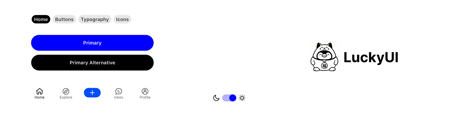
LuckyUI Flutter #
A comprehensive Flutter design system package created by Waveful, providing scalable and consistent UI components for modern Flutter applications.
Overview #
LuckyUI is a complete design system that offers a cohesive set of components, themes, and design tokens to help developers build beautiful and consistent Flutter applications. Built with scalability and maintainability in mind, LuckyUI provides everything you need to create professional-grade mobile and web applications.
Features #
🎨 Design System Foundation #
- Comprehensive Color Palette: Pre-defined color tokens with semantic naming
- Typography System: Consistent text styles and hierarchy
- Spacing & Layout: Standardized spacing tokens and layout utilities
- Theme Support: Light and dark mode support out of the box
🧩 UI Components #
Buttons & Interactions
LuckyButton- Primary, secondary, and variant button stylesLuckyTextButton- Text-based button componentsLuckyIconButton- Icon-only buttons with various sizesLuckySwitch- Customizable toggle switchesLuckyAppBar- Consistent app bar implementationLuckyRadios- Radio button selection componentsLuckySegmentedTabs- Segmented tab selection component
Form & Input Components
LuckyTextField- Text field wrapper with validation supportLuckySearchBar- Search input with built-in functionalityLuckyListItems- Standardized list item components
Navigation & Layout
LuckyNavBar- Bottom navigation bar componentLuckyTabBar- Tab navigation implementationLuckyModal- Modal dialog systemLuckyBottomSheet- Bottom sheet componentsLuckyFilters- Filter and selection componentsLuckyCard- Card container component
Indicators & Feedback
LuckyBadge- Notification badges and labelsLuckyProgressBar- Progress indicatorsLuckyRedDot- Notification dotsLuckyIcons- Icon system integrationLuckyToast- Toast notification systemLuckyAvatar- Avatar component with image or letter supportLuckyLoading- Loading indicator componentLuckyPullToRefresh- Pull-to-refresh wrapper component
Typography
LuckyHeading- Heading text componentsLuckyBody- Body text componentsLuckySmallBody- Small text componentsLuckyMarkdown- Markdown text rendering component
Utilities
LuckyDivider- Consistent divider components
🎭 Animations #
LuckyTapAnimation- Interactive tap animations
Getting Started #
Basic Usage #
Import the package in your Dart file:
import 'package:luckyui/luckyui.dart';
Quick Start Example #
import 'package:flutter/material.dart';
import 'package:luckyui/luckyui.dart';

class MyApp extends StatelessWidget {
  @override
  Widget build(BuildContext context) {
    return MaterialApp(
      title: 'LuckyUI Demo',
      theme: LuckyTheme.light,
      home: Scaffold(
        appBar: LuckyAppBar(
          title: 'My App',
          actions: [
            LuckyIconButton(
              nativeIcon: Icons.search,
              onTap: () {},
            ),
          ],
        ),
        body: Column(
          children: [
            LuckyHeading(text: 'Welcome to LuckyUI'),
            LuckyBody(text: 'This is a sample app using LuckyUI components.'),
            LuckyButton(
              text: 'Get Started',
              onTap: () {},
            ),
          ],
        ),
      ),
    );
  }
}
Component Examples #
Buttons #
// Primary button
LuckyButton(
  text: 'Primary Action',
  onTap: () {},
)

// Secondary button
LuckyButton(
  text: 'Secondary Action',
  style: LuckyButtonStyleEnum.secondary,
  onTap: () {},
)

// Text button
LuckyTextButton(
  text: 'Text Action',
  onTap: () {},
)
Fields #
LuckyTextField(
  controller: TextEditingController(),
  heading: "Username",
  description: "Enter your username",
  hintText: "@username",
  style: LuckyTextFieldStyleEnum.standard,
)
Navigation #
final navBarController = LuckyNavBarController();

LuckyNavBar(
  controller: navBarController,
  items: [
    LuckyNavBarItemData(
      icon: LuckyStrokeIcons.home01,
      selectedIcon: LuckyStrokeIcons.home01,
      text: 'Home',
      onTap: () {},
    ),
    LuckyNavBarItemData(
      icon: LuckyStrokeIcons.search01,
      selectedIcon: LuckyStrokeIcons.search01,
      text: 'Search',
      onTap: () {},
    ),
    LuckyNavBarItemData(
      icon: LuckyStrokeIcons.user01,
      selectedIcon: LuckyStrokeIcons.user01,
      text: 'Profile',
      onTap: () {},
    ),
  ],
)
Theming #
LuckyUI provides a comprehensive theming system:
// Light theme
MaterialApp(
  theme: LuckyTheme.light,
  home: MyHomePage(),
)

// Dark theme
MaterialApp(
  theme: LuckyTheme.dark,
  home: MyHomePage(),
)

// Custom theme
MaterialApp(
  theme: LuckyTheme.light.copyWith(
    // Customize theme properties
  ),
  home: MyHomePage(),
)
Design Tokens #
LuckyUI includes a comprehensive set of design tokens:
- Colors: Semantic color system with light/dark variants
- Typography: Consistent text styles and hierarchy
- Spacing: Standardized spacing values
- Border Radius: Consistent corner radius values
Showcase #
The package includes a comprehensive showcase (LuckyShowcasePage) that demonstrates all available components and their variations. This is perfect for:
- Exploring component capabilities
- Understanding component APIs
- Testing different themes and configurations
Requirements #
- Flutter >= 1.17.0
- Dart SDK >= 3.9.2
Dependencies #
hugeicons: ^1.1.1- For comprehensive icon support.
Please note that Hugeicons has its own license listed here. We both support their custom icon format, and Flutter's standard one. By default, we only import stroke icons. Use 'LuckyStrokeIcons' to reference them.
Contributing #
We welcome contributions to LuckyUI! Please feel free to submit issues, feature requests, or pull requests.
License #
This project is licensed under the terms specified in the LICENSE file.
Support #
For support, questions, or feature requests, please visit our GitHub repository or contact the Waveful team.
Made with ❤️ by Waveful
Metadata
Publisher
Weekly Downloads
Metadata
Official LuckyUI design system for Flutter. Scalable and consistent UI components for modern Flutter applications.
Homepage
Repository (GitHub)
View/report issues
Documentation
License
 Apache-2.0 (license)
Dependencies
flutter, hugeicons, markdown_widget