hyper_snackbar 0.8.0  hyper_snackbar: ^0.8.0 copied to clipboard
A highly customizable and animated snackbar package for Flutter.


HyperSnackbar 🚀 #
A highly customizable, animated, and powerful snackbar package for Flutter. Designed to be "Hyper" flexible — supports Stack/Queue modes, custom animations (Scale, Slide, Fade), progress bars, and highly interactive actions.
Now with Presets and GetX-style aliases for easier migration!
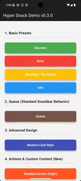
👉 Try the Interactive Playground!
✨ Features #
- Flexible Positioning: Top or Bottom.
- Display Modes: Stack (overlay) or Queue (sequential).
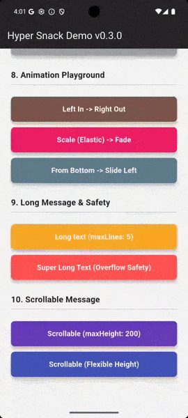
- Rich Animations: Slide, Fade, and New! Scale (Elastic Zoom).
- Presets System: Define reusable styles and inherit/override them easily.
- Progress Bar: Line or Wipe effects.
- Interactive: Tap callbacks, Action buttons, and Dismissible swipes.
- GetX Migration Aids: Supports parameters like
duration,snackPosition, andcolorText. - No Context Required: Uses
NavigatorKeyfor easy calling from anywhere.
🚀 Installation #
Add this to your package's pubspec.yaml file:
dependencies:
  hyper_snackbar: ^0.8.0
🛠 Setup #
Register the navigatorKey in your MaterialApp to show snackbars without a BuildContext.
import 'package:hyper_snackbar/hyper_snackbar.dart';

void main() {
  runApp(const MyApp());
}

class MyApp extends StatelessWidget {
  const MyApp({super.key});

  @override
  Widget build(BuildContext context) {
    return MaterialApp(
      // Important: Register the key here to show snackbars without BuildContext
      navigatorKey: HyperSnackbar.navigatorKey,
      home: const HomePage(),
    );
  }
}
📖 Usage #
Basic Usage #
The simplest way to show a message.
HyperSnackbar.show(
  title: 'Hello World',
  message: 'This is the simplest usage.',
);
Built-in Presets #
Quickly show styled messages for common scenarios.
// Success
HyperSnackbar.showSuccess(
  title: 'Success!',
  message: 'Operation completed successfully.',
);

// Error
HyperSnackbar.showError(
  title: 'Error',
  message: 'Something went wrong.',
);

// Warning & Info
HyperSnackbar.showWarning(title: 'Low Storage');
HyperSnackbar.showInfo(title: 'New Message');
🎨 Creating Custom Presets (New!) #
Stop repeating yourself! Define reusable styles using HyperSnackbar.preset and reuse them across your app.
// 1. Define a base preset (e.g., in your constants file)
static final myBrandPreset = HyperSnackbar.preset(
  backgroundColor: Colors.deepPurple,
  icon: Icon(Icons.star, color: Colors.amber),
  borderRadius: 16,
  animationType: HyperSnackAnimationType.scale, // Sets both enter & exit
);

// 2. Use it anywhere
HyperSnackbar.show(
  title: 'Welcome!',
  preset: myBrandPreset,
);

// 3. Override specific properties on the fly
HyperSnackbar.show(
  title: 'Welcome!',
  preset: myBrandPreset,
  backgroundColor: Colors.red, // Overrides the purple color
);
You can even inherit and extend presets using copyWith:
final darkPreset = myBrandPreset.copyWith(
  backgroundColor: Colors.black,
  textColor: Colors.white,
);
🖥️ Web & Desktop Layout (New!) #
The default full-width design is perfect for mobile, but it can stretch too far on large screens. You can now easily constrain the width and align the snackbar for Web and Desktop layouts.
HyperSnackbar.show(
  message: 'This is a compact notification.',
  maxWidth: 400.0, // Prevents stretching on large screens
  alignment: Alignment.centerRight, // Aligns to the right side of the window
  showCloseButton: false, // Optional: create a clean, message-only toast
);
By keeping the type as AlignmentGeometry, it fully supports center, centerLeft, centerRight, and even RTL (Right-to-Left) layouts using AlignmentDirectional.
⚡ GetX Migration Guide #
Coming from GetX? HyperSnackbar now supports familiar parameter aliases to assist with migration.
| HyperSnackbar Param | GetX Alias |
|---|---|
displayDuration |
duration |
position |
snackPosition |
textColor |
colorText |
enter/exitAnimationDuration |
animationDuration |
// You can use GetX-style parameters directly:
HyperSnackbar.show(
  title: 'Familiar?',
  message: 'It works just like you expect.',
  snackPosition: HyperSnackPosition.bottom, // Alias for position
  duration: Duration(seconds: 3),           // Alias for displayDuration
  colorText: Colors.white,                  // Alias for textColor
);
Advanced Features #
Progress Bar Effects
Visualize the remaining duration.
HyperSnackbar.show(
  title: 'Loading...',
  progressBarWidth: 4.0, // Line effect
  // progressBarWidth: 0.0, // Wipe effect (background fill)
  displayDuration: const Duration(seconds: 5),
);
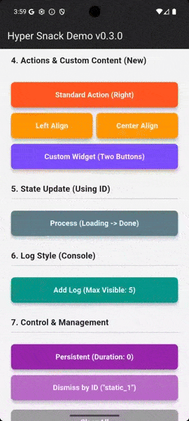
Action Button & Custom Content
Add interactive buttons or fully custom widgets.
HyperSnackbar.show(
  title: 'Item Deleted',
  action: HyperSnackAction(
    label: 'UNDO',
    onPressed: () => undoAction(),
  ),
);

// Or use a custom widget
HyperSnackbar.show(
  title: 'Cart Updated',
  content: Row(
    children: [
      TextButton(onPressed: () {}, child: Text('View Cart')),
      TextButton(onPressed: () {}, child: Text('Checkout')),
    ],
  ),
);
Overlay Control (Embedded Mode)
By default, snackbars render on the root overlay (covering modals). Set useLocalOverlay: true to render inside the nearest active Navigator (e.g., inside a tab or bottom sheet).
HyperSnackbar.show(
  title: 'Embedded Message',
  useLocalOverlay: true,
  backgroundColor: Colors.indigo,
);
📚 API Reference #
HyperSnackbar Methods #
All methods are static and can be called from anywhere.
| Method | Description |
|---|---|
show(...) |
Displays a fully customizable snackbar. |
preset(...) |
(New) Creates a reusable configuration object. |
showSuccess(...) |
Preset: Green background, Check icon. |
showError(...) |
Preset: Red background, Error icon. |
showWarning(...) |
Preset: Orange background, Warning icon. |
showInfo(...) |
Preset: Blue background, Info icon. |
dismissById(id) |
Dismisses a specific snackbar by its ID. |
clearAll({animated}) |
Dismisses all currently visible snackbars. |
isSnackbarOpen |
Returns true if any snackbar is visible. |
isSnackbarOpenById(id) |
Returns true if the specific snackbar is visible. |
⚙️ Configuration Parameters #
HyperSnackbar is highly customizable. You can configure it using the HyperConfig object, HyperSnackbar.preset, or directly via parameters in HyperSnackbar.show.
🎨 General & Appearance #
| Parameter | Type | Default | Description |
|---|---|---|---|
preset |
HyperConfig? |
null |
(New) Base configuration to apply/override. |
title |
String? |
null |
The title of the snackbar. |
message |
String? |
null |
The main message body. |
icon |
Widget? |
null |
Custom icon widget displayed on the left. |
useAdaptiveLoader |
bool |
false |
If true, displays a platform-adaptive loading indicator instead of the icon. |
backgroundColor |
Color? |
null |
Background color (defaults to dark grey). |
textColor |
Color? |
null |
Color for title and message text (alias: colorText). |
borderRadius |
double |
12.0 |
Corner radius of the snackbar. |
elevation |
double |
4.0 |
Shadow elevation. |
border |
BoxBorder? |
null |
Custom border for the snackbar container. |
margin |
EdgeInsetsGeometry |
zero |
Margin around the snackbar. |
padding |
EdgeInsetsGeometry |
16, 12 |
Internal padding. |
useLocalOverlay |
bool |
false |
If false, renders on the root overlay. If true, renders on the nearest overlay. |
maxWidth |
double? |
null |
(New) Maximum width of the snackbar. Ideal for Web/Desktop. |
alignment |
AlignmentGeometry |
.center |
(New) Alignment of the snackbar when maxWidth is constrained. |
👆 Actions & Interaction #
| Parameter | Type | Default | Description |
|---|---|---|---|
action |
HyperSnackAction? |
null |
Action button configuration (label, callback, colors). |
actionAlignment |
MainAxisAlignment |
.end |
Alignment of the action button (e.g., .start, .center). |
content |
Widget? |
null |
Custom widget to replace the action button area. |
onTap |
VoidCallback? |
null |
Callback when the snackbar itself is tapped. |
showCloseButton |
bool |
true |
Whether to show the "X" close button. |
enableSwipe |
bool |
true |
Allow dismissing the snackbar by swiping horizontally. |
⏱️ Behavior & Positioning #
| Parameter | Type | Default | Description |
|---|---|---|---|
id |
String? |
null |
Unique ID. Updating a snackbar with the same ID modifies the existing one. |
displayDuration |
Duration? |
4s |
How long the snackbar stays visible (alias: duration). null means persistent. |
position |
HyperSnackPosition |
.top |
Vertical position (alias: snackPosition). |
displayMode |
HyperSnackDisplayMode |
.stack |
.stack (overlays on top) or .queue (shows one by one). |
newestOnTop |
bool |
true |
(Stack mode) If true, new snackbars appear on top of the stack. |
maxVisibleCount |
int |
3 |
Maximum number of snackbars visible at once (Stack mode). |
📝 Text Handling #
| Parameter | Type | Default | Description |
|---|---|---|---|
titleStyle |
TextStyle? |
null |
Custom style for the title text. |
messageStyle |
TextStyle? |
null |
Custom style for the message text. |
maxLines |
int? |
5 |
Maximum lines for the message text. |
scrollable |
bool |
false |
If true, the message becomes scrollable within constraints. |
messageMaxHeight |
double? |
null |
Max height for the scrollable message area. |
✨ Animation #
| Parameter | Type | Default | Description |
|---|---|---|---|
animationType |
HyperSnackAnimationType? |
null |
(New) Sets both enter and exit animation types simultaneously. |
enterAnimationType |
HyperSnackAnimationType |
.top |
Animation style for entry (scale, fade, left, etc.). |
exitAnimationType |
HyperSnackAnimationType |
.left |
Animation style for exit. |
animationDuration |
Duration? |
null |
(New) Sets both enter and exit durations simultaneously. |
enterAnimationDuration |
Duration |
300ms |
Duration of entry animation. |
exitAnimationDuration |
Duration |
500ms |
Duration of exit animation. |
enterCurve |
Curve |
easeOutQuart |
Animation curve for entry. |
exitCurve |
Curve |
easeOut |
Animation curve for exit. |
📊 Progress Bar #
| Parameter | Type | Default | Description |
|---|---|---|---|
progressBarWidth |
double? |
null |
Height of the progress bar. 0.0 creates a background "wipe" effect. null disables it. |
progressBarColor |
Color? |
null |
Color of the progress bar. Defaults to a semi-transparent contrast color. |
📄 License #
MIT License
Metadata

Publisher
unverified uploader
Weekly Downloads
Metadata
A highly customizable and animated snackbar package for Flutter.
Repository (GitHub)
View/report issues
Documentation
License
 MIT (license)