growable 0.0.2  growable: ^0.0.2 copied to clipboard
 percula.dev
A growable (expandable) widget
Growable #
A Flutter widget that can be expanded or collapsed by the user.
Forked from Expandable. Expandable was unfortunately no longer being maintained. One key difference in the libraries is that Growable includes collapsed when expanded. There is no need to include collapsed in your expanded widget.
Introduction #
This library helps implement "growable" (expandable) behavior as prescribed by Material Design:
Growable should not be confused with
ExpansionPanel.
ExpansionPanel, which is a part of
Flutter material library, is designed to work only within ExpansionPanelList and cannot be used
for making other widgets, for example, growable Card widgets.
Usage #
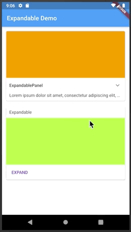
The easiest way to make a growable widget is to use GrowablePanel:
class ArticleWidget extends StatelessWidget {

  final Article article;

  ArticleWidget(this.article);

  @override
  Widget build(BuildContext context) {
    return GrowablePanel(
      header: Text(article.title),
      collapsed: Text(article.body, softWrap: true, maxLines: 2, overflow: TextOverflow.ellipsis,),
      expanded: Text(article.body, softWrap: true, ),
      tapHeaderToExpand: true,
      hasIcon: true,
    );
  }
}
GrowablePanel has a number of properties to customize its behavior, but it's restricted by
having a title at the top and an expand icon shown as a down arrow (on the right or on the left).
If that's not enough, you can implement custom growable widgets by using a combination of Growable,
GrowableNotifier, and GrowableButton:
class EventPhotos extends StatelessWidget {

  @override
  Widget build(BuildContext context) {
    return GrowableNotifier(  // <-- Provides GrowableController to its children
      child: Column(
        children: [
          Growable(           // <-- Driven by GrowableController from GrowableNotifier
            collapsed: GrowableButton(  // <-- Expands when tapped on the cover photo
              child: buildCoverPhoto(),
            ),
            expanded: Column(
              children: [
                buildAllPhotos(),
                GrowableButton(       // <-- Collapses when tapped on
                  child: Text("Back"),
                ),
              ]
            ),
          ),
        ],
      ),
    );
  }
}
Automatic Scrolling #
Growable widgets are often used within a scroll view. When the user expands a widget, be it
an GrowablePanel or an Growable with a custom control, they expect the expanded
widget to fit within the viewable area (if possible). For example, if you show a list of
articles with a summary of each article, and the user expands an article to read it, they
expect the expanded article to occupy as much screen space as possible. The Growable
package contains a widget to help implement this behavior, ScrollOnExpand.
Here's how to use it:
   GrowableNotifier(      // <-- This is where your controller lives
     //...
     ScrollOnExpand(        // <-- Wraps the widget to scroll
      //...
        GrowablePanel(    // <-- Your Growable or GrowablePanel
          //...
        )
     )
  )
Why a separate widget, you might ask? Because generally you might want to show not just
the expanded widget but its container, for example a Card that contains it.
See the example app for more details on the usage of ScrollOnExpand.
Themes #
Themes greatly simplify visual customization and as well as future extensibility. Each growable widget can get its theme data directly via the constructor or from the nearest GrowableTheme widget:
  GrowableTheme(
    data: GrowableThemeData(
        iconColor: Colors.red,
        animationDuration: const Duration(milliseconds: 500)
    ),
      // ...
      Growable(  // 500 milliseconds animation duration
      ),

      // ...
      GrowablePanel(  // <-- Blue icon color, 500 milliseconds animation duration
        theme: GrowableThemeData(iconColor: Colors.blue),

      ),
  )
GrowableTheme widgets can be nested, in which case inner definitions override outer definitions.
There is a default theme with fallback values defined in GrowableThemeData.defaults.
Prior to version 4.0, theme parameters were passed to widget constructors directly. These parameters are now deprecated and will be removed in the next release.
Icon Customization #
There are several theme properties that help customize the expand/collapse icon:
hasIcon- should the icon be shown in the header of [GrowablePanel];iconSize- icon size;iconColor- icon color;iconPadding- icon padding;iconPlacement- icon placement in the header;iconRotationAngle- the angle to which to rotate the icon;expandIcon- icon face to use in the collapsed state;collapseIcon- icon face to use in the expanded state.
When specifying a custom icon, you have the option to use the same icon for expand/collapse or
to use two different icons. If using the same icon, specify the same value for expandIcon and collapseIcon, and
that icon will be shown as-is in the collapsed state and upside-down in the expanded state.
Metadata
Publisher
Weekly Downloads
Metadata
A growable (expandable) widget
Documentation
License
 MIT (license)