flutter_page_scaffold 0.2.1  flutter_page_scaffold: ^0.2.1 copied to clipboard
A reusable main content area template widget with page titles, section headers, and theme-aware styling.
flutter_page_scaffold #
A reusable Flutter widget package for consistent, theme-aware main content area layouts. Provides structured page templates with bold titles, section headers with accent bars, and grouped content cards.
Features #
- MainAreaTemplate -- Page-level wrapper with large title, description, icon, and action buttons
- MainAreaSection -- Grouped content card with accent-bar section headers
- Fully theme-aware -- All colors derived from
Theme.of(context), works with anyThemeData - Zero dependencies -- Only requires Flutter SDK
Installation #
Add to your pubspec.yaml:
dependencies:
  flutter_page_scaffold: ^0.1.0
Then run:
flutter pub get
Usage #
Basic page layout #
import 'package:flutter_page_scaffold/flutter_page_scaffold.dart';
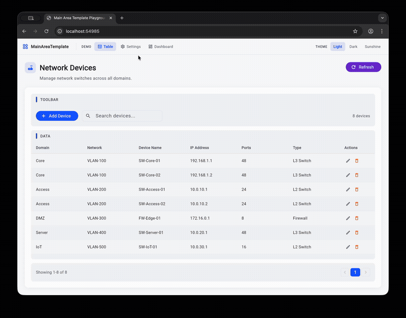
MainAreaTemplate(
title: 'Network Devices',
description: 'Manage network switches across all domains.',
icon: Icons.router,
actions: [
FilledButton.icon(
onPressed: () {},
icon: const Icon(Icons.add),
label: const Text('Add'),
),
],
child: Column(
children: [
MainAreaSection(
label: 'TOOLBAR',
child: Row(children: [/* toolbar content */]),
),
const SizedBox(height: 12),
MainAreaSection(
label: 'DATA',
expanded: true,
child: MyDataTable(),
),
],
),
)
Settings page layout #
MainAreaTemplate(
  title: 'Log Settings',
  description: 'Configure log storage and retention policies.',
  icon: Icons.settings_outlined,
  child: Column(
    children: [
      MainAreaSection(
        label: 'STORAGE LIMITS',
        child: MyFormFields(),
      ),
      const SizedBox(height: 16),
      MainAreaSection(
        label: 'STATUS',
        child: MyStatusWidget(),
      ),
    ],
  ),
)
Tabbed page layout #
MainAreaTemplate(
  title: 'Network Manager',
  description: 'Manage network infrastructure.',
  icon: Icons.router,
  tabs: [
    PageTab(
      label: 'Devices',
      icon: Icons.table_chart_outlined,
      child: Column(children: [/* device list content */]),
    ),
    PageTab(
      label: 'Settings',
      icon: Icons.settings_outlined,
      child: Column(children: [/* settings content */]),
    ),
  ],
  onTabChanged: (index) => print('Switched to tab $index'),
)
Tabs without title (compact mode) #
MainAreaTemplate(
  title: 'Manager',        // still required but hidden
  showTitle: false,
  tabs: [
    PageTab(label: 'Tab A', child: ContentA()),
    PageTab(label: 'Tab B', child: ContentB()),
  ],
)
API Reference #
MainAreaTemplate #
| Property | Type | Required | Description |
|---|---|---|---|
title |
String |
Yes | Large bold page title |
description |
String? |
No | Subtle muted subtitle below the title |
icon |
IconData? |
No | Icon displayed before the title in a tinted container |
actions |
List<Widget>? |
No | Action buttons displayed to the right of the title |
child |
Widget? |
No* | Main content, typically a Column of MainAreaSection widgets |
outerPadding |
EdgeInsetsGeometry? |
No | Padding around the template (default: 24) |
cardPadding |
EdgeInsetsGeometry? |
No | Padding inside the content card (default: 20) |
tabs |
List<PageTab>? |
No | Tab definitions for multi-page navigation. When null, uses child |
showTitle |
bool |
No | Show/hide the title row (default: true) |
showTabs |
bool |
No | Show/hide the tab bar (default: true, only when tabs is provided) |
initialTabIndex |
int |
No | Starting tab index (default: 0) |
onTabChanged |
ValueChanged<int>? |
No | Callback when selected tab changes |
* Required when tabs is null.
PageTab #
| Property | Type | Required | Description |
|---|---|---|---|
label |
String |
Yes | Tab label displayed in the tab bar |
icon |
IconData? |
No | Icon displayed before the label |
child |
Widget |
Yes | Content widget shown when this tab is selected |
MainAreaSection #
| Property | Type | Required | Description |
|---|---|---|---|
label |
String? |
No | Uppercase section header with accent bar. Hidden if null |
child |
Widget |
Yes | Section content |
padding |
EdgeInsetsGeometry? |
No | Padding around content (default: 16) |
expanded |
bool |
No | If true, fills remaining space in a Column (default: false) |
Theme Integration #
All colors are pulled from Theme.of(context).colorScheme:
| Widget element | Color token |
|---|---|
| Page background | scaffoldBackgroundColor |
| Content card | surface |
| Section background | surfaceContainerHighest |
| Accent bar | primary |
| Title text | onSurface |
| Description text | onSurfaceVariant |
| Section header text | onSurfaceVariant |
| Card shadow | shadow (6% opacity) |
Works out of the box with light, dark, or any custom ThemeData.
Example #
A playground app is included in example/. Run it with:
cd example
flutter run -d chrome
The playground demonstrates three page layouts (table, settings, dashboard) with a theme switcher to preview light, dark, and sunshine themes.
License #
MIT
Metadata
Publisher
unverified uploader
Weekly Downloads
Metadata
A reusable main content area template widget with page titles, section headers, and theme-aware styling.
Repository (GitHub)
View/report issues
Topics
License
 unknown (license)