flutter_feature_hint 0.0.8  flutter_feature_hint: ^0.0.8 copied to clipboard
Create interactive feature tutorials with gesture-driven overlays. Users must perform actual gestures on your UI to dismiss hints - perfect for onboarding.
flutter_feature_hint #
A beautiful, production-ready Flutter package for creating smooth, auto-playing feature hint overlays with animated gestures. Perfect for onboarding, feature discovery, and user education.
✨ Features #
🎯 Core Features #
- Full-Screen Overlays: Cover the entire screen while highlighting the target widget
- Bounded Overlays ⭐ NEW: Constrain overlay to specific widget bounds (no full-screen dimming)
- Auto-Playing Animations: No user interaction required - animations play automatically
- 6 Gesture Types: Swipe (left, right, up, down), Tap, Long-press
- Smooth Fade Animations: Professional fade in/out transitions (300ms)
🎨 Customization & Control #
- Highly Customizable: Control colors, duration, message widgets, custom icons
- Optional Messages ⭐ NEW: Display custom message widgets or show animation only
- Widget-Based Icons ⭐ NEW: Pass any Widget as custom gesture indicator (not just IconData)
- Lottie & Custom Animations ⭐ NEW: Use Lottie animations or any custom widgets as icons
- Auto Icon Detection: Gesture-appropriate icons are auto-selected if no custom icon provided
- Flexible Positioning: Message alignment control (top, center, bottom, etc.)
- Play Once in Lifetime ⭐: Show animations only once per unique key with persistent storage
- Responsive Design: Works with widgets of any size
- Overflow Protection: Smart positioning prevents off-screen rendering
🆕 What's New in v0.2.0+ #
1. Bounded Overlay Feature ⭐ #
The new limitToChildBounds parameter allows you to constrain the entire overlay (background, message, and animation) to the bounds of the wrapped widget.
Use Cases:
- Highlight specific components without full-screen dimming
- Create focused tutorials on UI sections
- Prevent overlay spillover on complex layouts
- Highlight cards, buttons, or form sections
FeatureHintOverlay(
  uniqueKey: 'button_hint',
  limitToChildBounds: true, // ⭐ NEW: Constrain to child widget bounds
  gesture: GestureType.tap,
  message: Text('Tap this button'),
  child: YourButton(),
)
2. Play Once in Lifetime Feature ⭐ #
Show animations only once per unique key using persistent storage! The playOnceInLifetime parameter combined with uniqueKey ensures animations play only once, even across app restarts.
FeatureHintOverlay(
  uniqueKey: 'onboarding_welcome', // ⭐ Unique identifier
  playOnceInLifetime: true,         // ⭐ Play only once ever!
  gesture: GestureType.tap,
  message: const Text('Welcome to the app!'),
  child: YourWidget(),
)
How it works:
- Once played, the animation won't show again (even after app restart)
- Perfect for onboarding sequences that shouldn't repeat
- State persists across app sessions
- Can be reset programmatically with
AnimationStateManager.resetAnimation('key')
⚠️ Important Tip: Only enable playOnceInLifetime: true after you've finalized the UI and fixed all bugs. Once the animation plays, it won't display again unless reset. Use playOnceInLifetime: false (default) during development until dev-side testing or ui issues fixed.
3. Required uniqueKey ⭐ #
The uniqueKey is now mandatory, enabling proper state tracking for playOnceInLifetime and better animation management.
FeatureHintOverlay(
  uniqueKey: 'delete_action_hint', // ⭐ REQUIRED - must be unique
  gesture: GestureType.swipeLeft,
  message: const Text('Swipe left to delete'),
  child: YourWidget(),
)
4. Optional Message ⭐ #
The message parameter is now optional. Show just the animation if you prefer!
FeatureHintOverlay(
  uniqueKey: 'swipe_hint',
  gesture: GestureType.swipeRight,
  // No message - just the animation!
  duration: const Duration(seconds: 3),
  child: YourWidget(),
)
5. Widget-Based Custom Icons ⭐ #
customIcon now accepts any Widget instead of just IconData. More flexible and powerful!
// Before (v0.0.2):
// customIcon: Icons.favorite (IconData)

// After (v0.2.0):
customIcon: Icon(
  Icons.favorite,
  size: 48,
  color: Colors.red,
)

// Or any widget:
customIcon: Badge(
  label: const Text('2'),
  child: Icon(Icons.notifications, size: 48),
)

// Or Lottie animation:
customIcon: Lottie.asset(
  'assets/animations/hand_swipe.json',
  width: 100,
  height: 100,
)
6. Memory Leak Fixes ⭐ #
- Fixed untracked Future.delayed causing memory leaks
- Proper Timer cancellation on widget disposal
- Safe frame callback management
Other Improvements ⭐ #
- Auto-detection of icons based on GestureType
- Enhanced overflow protection
- Better error messages in debug mode
- Improved documentation and examples
Gesture Demonstrations #
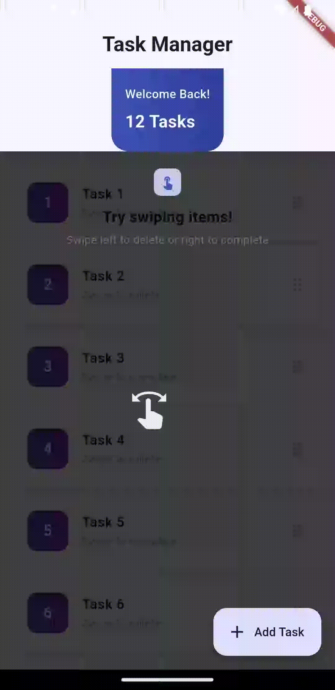
Swipe Left |
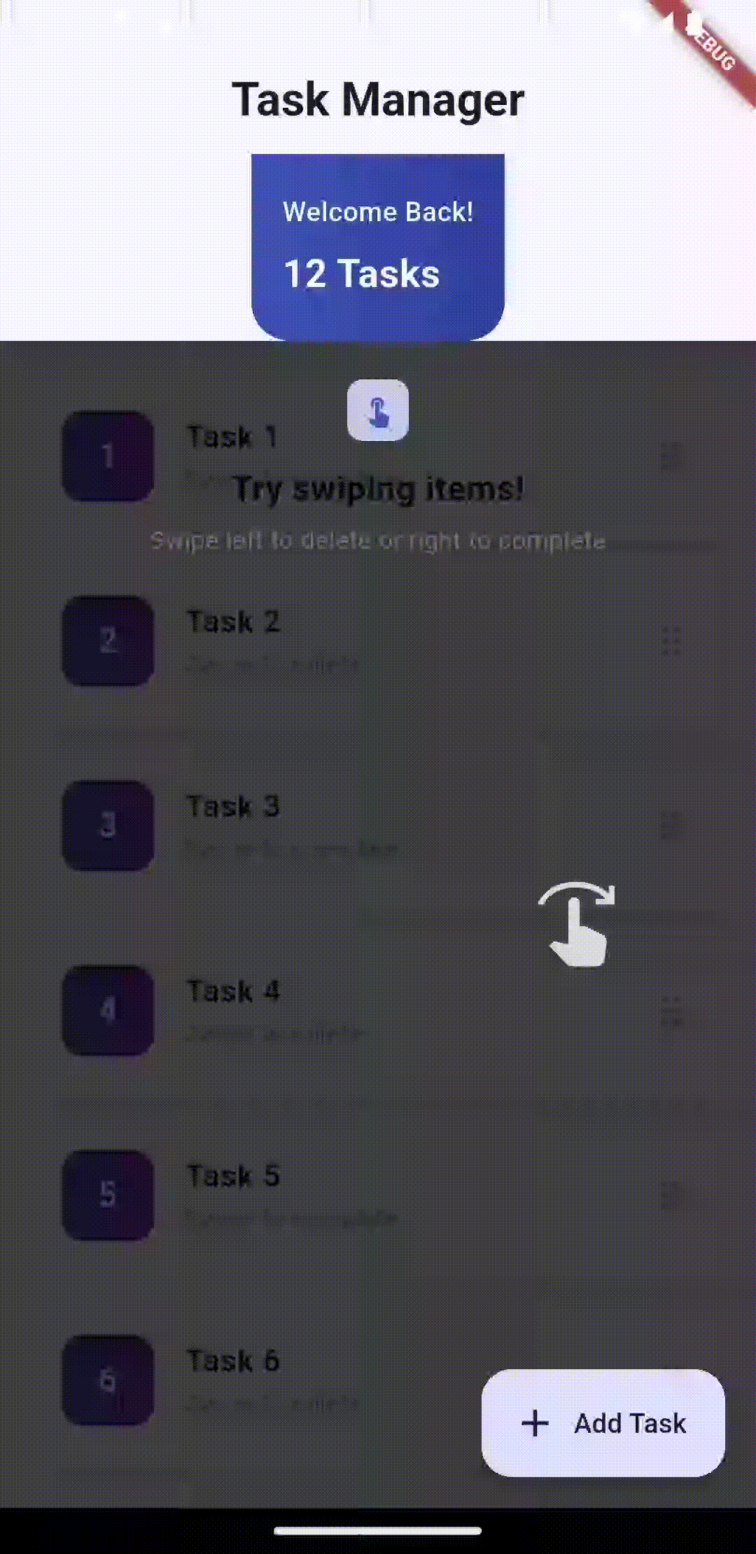
Swipe Right |
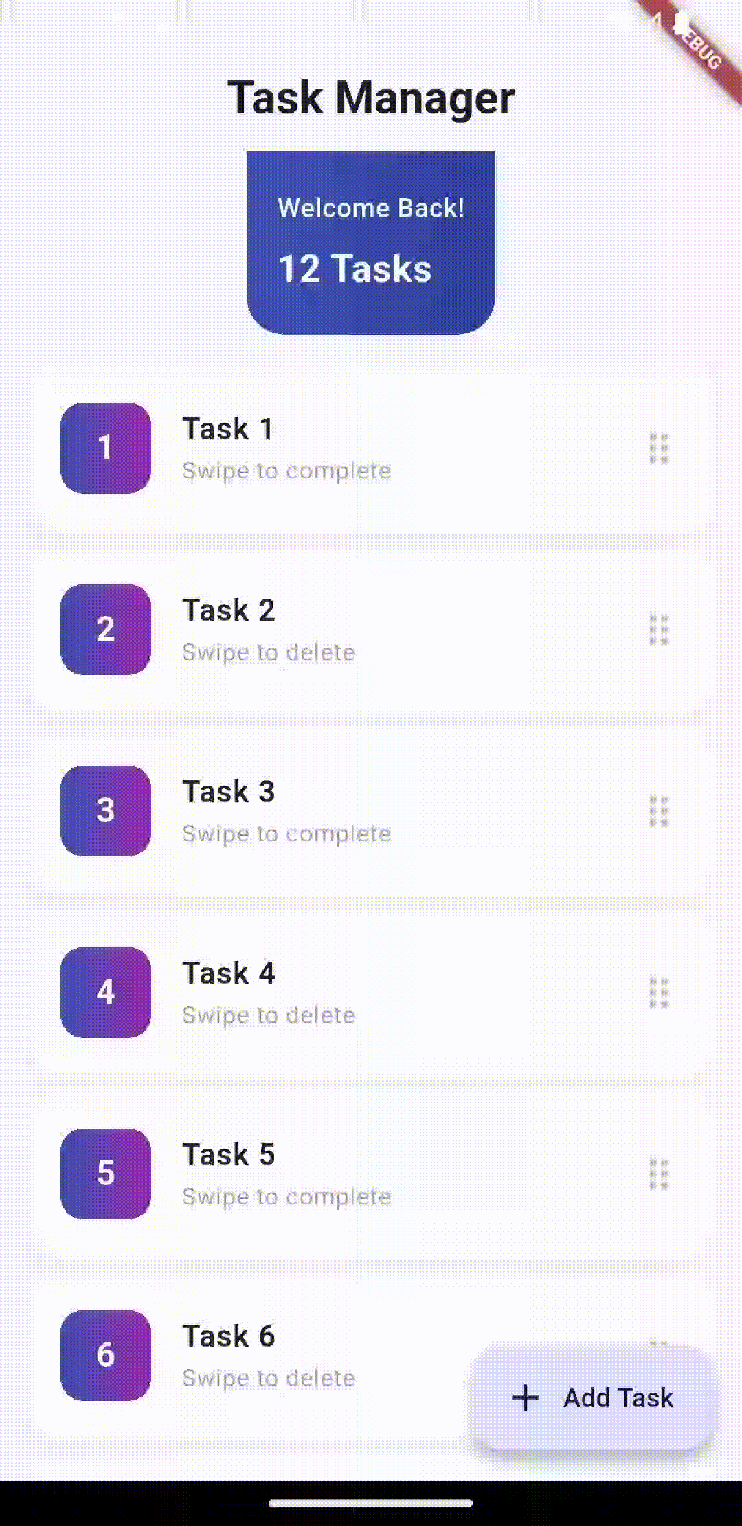
Swipe Up |
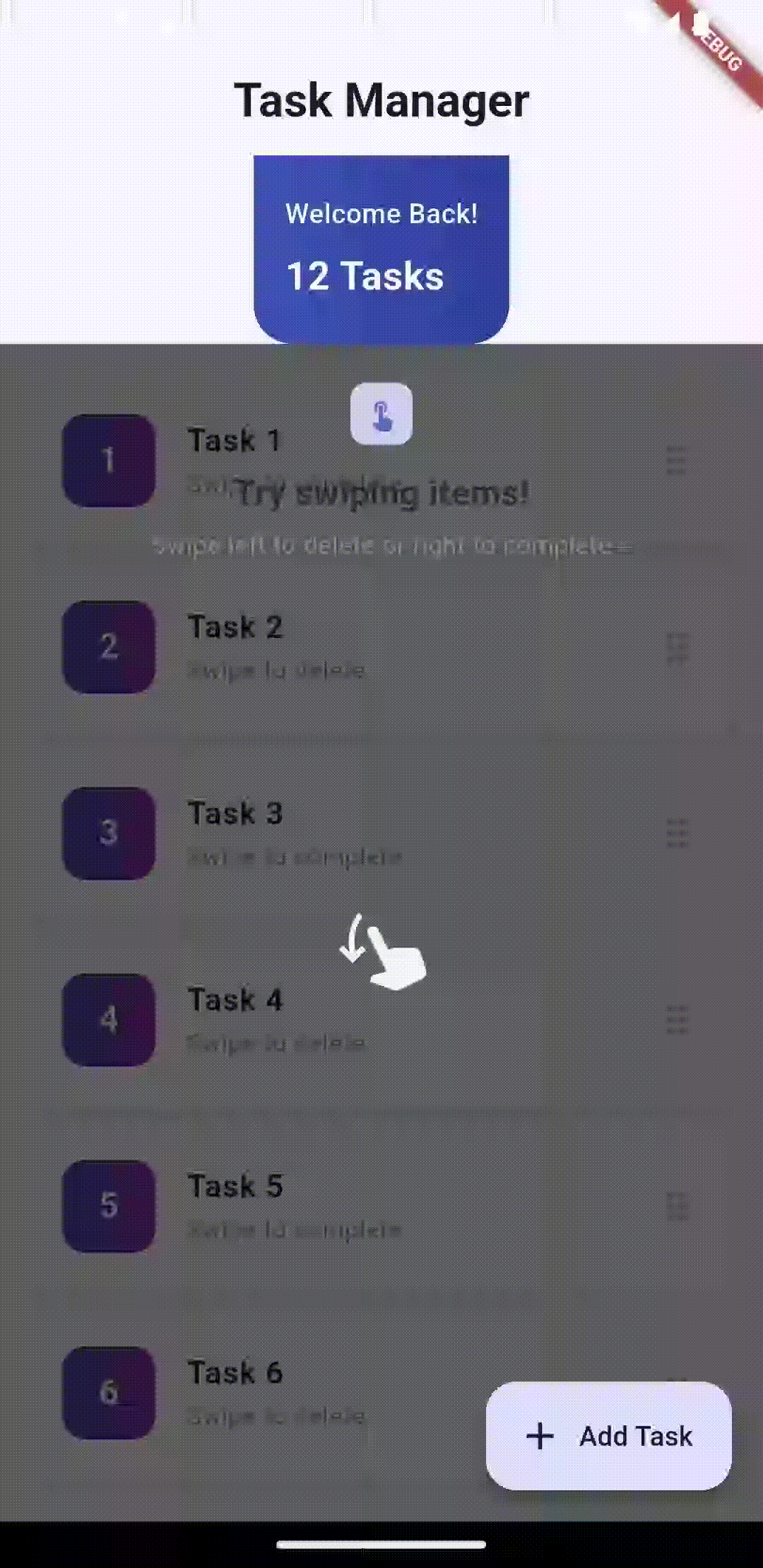
Swipe Down |
Tap |
Long Press |
🚀 Installation #
Add this to your pubspec.yaml:
dependencies:
  flutter_feature_hint: ^0.2.0
Then run:
flutter pub get
📖 Quick Start #
1. Basic Full-Screen Overlay #
import 'package:flutter_feature_hint/flutter_feature_hint.dart';

FeatureHintOverlay(
  uniqueKey: 'delete_action_hint',
  message: const Text('Swipe left to delete'),
  gesture: GestureType.swipeLeft,
  duration: const Duration(seconds: 5),
  playOnceInLifetime: true,
  child: YourWidget(),
)
2. Bounded Overlay - Constrain to Widget ⭐ #
FeatureHintOverlay(
  uniqueKey: 'card_action_hint',
  limitToChildBounds: true, // ⭐ NEW: Constrain overlay to this widget
  gesture: GestureType.tap,
  message: Container(
    padding: const EdgeInsets.all(12),
    decoration: BoxDecoration(
      color: Colors.blue.shade700,
      borderRadius: BorderRadius.circular(8),
    ),
    child: const Text(
      'Tap this card',
      style: TextStyle(color: Colors.white),
    ),
  ),
  child: Container(
    padding: const EdgeInsets.all(16),
    decoration: BoxDecoration(
      color: Colors.blue.shade50,
      border: Border.all(color: Colors.blue.shade200),
      borderRadius: BorderRadius.circular(12),
    ),
    child: const Text('Interactive Card'),
  ),
)
3. Animation Only (No Message) ⭐ #
FeatureHintOverlay(
  uniqueKey: 'swipe_hint',
  // No message parameter - just show the animation!
  gesture: GestureType.swipeRight,
  duration: const Duration(seconds: 3),
  child: YourWidget(),
)
4. Play Once in Lifetime ⭐ #
FeatureHintOverlay(
  uniqueKey: 'onboarding_welcome',
  playOnceInLifetime: true, // ⭐ Show only once ever!
  gesture: GestureType.tap,
  message: const Text('Welcome! Tap to get started'),
  duration: const Duration(seconds: 4),
  child: YourWidget(),
)
💡 Tip: Set playOnceInLifetime: false during testing, switch to true only when UI is finalized.
5. Custom Widget Icon ⭐ #
FeatureHintOverlay(
  uniqueKey: 'custom_icon_hint',
  gesture: GestureType.tap,
  customIcon: Icon(
    Icons.favorite,
    size: 48,
    color: Colors.red,
  ),
  message: const Text('Like this'),
  child: YourWidget(),
)
6. Lottie Animation Icon ⭐ #
FeatureHintOverlay(
  uniqueKey: 'lottie_hint',
  gesture: GestureType.swipeLeft,
  customIcon: Lottie.asset(
    'assets/animations/hand_swipe.json',
    width: 100,
    height: 100,
  ),
  message: const Text('Swipe to delete'),
  child: YourWidget(),
)
7. With Styled Message #
FeatureHintOverlay(
  uniqueKey: 'styled_hint',
  gesture: GestureType.swipeLeft,
  duration: const Duration(seconds: 4),
  message: Container(
    padding: const EdgeInsets.symmetric(horizontal: 16, vertical: 12),
    decoration: BoxDecoration(
      color: Colors.deepPurple,
      borderRadius: BorderRadius.circular(8),
      boxShadow: [
        BoxShadow(
          color: Colors.black.withOpacity(0.3),
          blurRadius: 8,
          offset: const Offset(0, 2),
        ),
      ],
    ),
    child: Column(
      mainAxisSize: MainAxisSize.min,
      children: [
        const Icon(Icons.delete_outline, color: Colors.white),
        const SizedBox(height: 8),
        const Text(
          'Swipe to delete',
          style: TextStyle(
            color: Colors.white,
            fontSize: 14,
            fontWeight: FontWeight.w600,
          ),
        ),
      ],
    ),
  ),
  child: YourWidget(),
)
📋 Complete Parameters #
FeatureHintOverlay(
  // REQUIRED
  child: Widget,                          // Widget to wrap with overlay
  gesture: GestureType,                   // Gesture to animate
  uniqueKey: String,                      // Unique identifier for state tracking

  // OPTIONAL - Message & Icons
  message: Widget?,                       // Custom message widget (optional!)
  customIcon: Widget?,                    // Custom icon widget

  // OPTIONAL - Behavior
  duration: Duration,                     // How long to show overlay (default: 4s)
  shouldPlay: bool,                       // Whether to show overlay (default: true)
  playOnceInLifetime: bool,              // Show only once (default: false)
  limitToChildBounds: bool,               // ⭐ Constrain to child bounds (default: false)

  // OPTIONAL - Styling
  overlayColor: Color,                    // Background color (default: semi-transparent black)
  messageAlignment: AlignmentGeometry,    // Message position (default: topCenter)

  // OPTIONAL - Behavior
  showHandAnimation: bool,                // Show gesture animation (default: true)
  onCompleted: VoidCallback?,            // Callback when animation finishes
)
🎯 Use Cases #
1. Onboarding Tutorials #
Show new users how to interact with your app's key features.
FeatureHintOverlay(
  uniqueKey: 'onboarding_swipe',
  playOnceInLifetime: true,
  gesture: GestureType.swipeLeft,
  message: const Text('Swipe to explore'),
  child: yourFirstFeature,
)
2. Feature Discovery #
Highlight new features or updates.
FeatureHintOverlay(
  uniqueKey: 'new_feature_tap',
  gesture: GestureType.tap,
  message: const Text('Tap to try our new feature!'),
  limitToChildBounds: true, // Only highlight the button
  child: newFeatureButton,
)
3. Focused UI Tutorials #
Guide users through specific UI sections without full-screen overlay.
FeatureHintOverlay(
  uniqueKey: 'form_section_hint',
  limitToChildBounds: true,
  gesture: GestureType.tap,
  message: const Text('Complete this section'),
  child: formCard,
)
🔄 State Management #
Play Once in Lifetime #
When playOnceInLifetime: true, animations play only once per app session and across restarts.
FeatureHintOverlay(
  uniqueKey: 'welcome_hint',    // Must be unique
  playOnceInLifetime: true,      // Play only once
  gesture: GestureType.tap,
  message: const Text('Welcome!'),
  child: welcomeButton,
)
⚠️ Development Tip: Use playOnceInLifetime: false during development so you can test the animation multiple times. Enable playOnceInLifetime: true only in production after all UI/bugs are fixed.
Reset Animations Programmatically #
import 'package:flutter_feature_hint/flutter_feature_hint.dart';

// Reset a single animation
await AnimationStateManager.resetAnimation('welcome_hint');

// Reset all animations
await AnimationStateManager.resetAllAnimations();
🎬 Gesture Types #
enum GestureType {
  swipeLeft,    // Swipe from right to left
  swipeRight,   // Swipe from left to right
  swipeUp,      // Swipe from bottom to top
  swipeDown,    // Swipe from top to bottom
  tap,          // Single tap
  longPress,    // Long press (2 seconds)
}
� Custom Icons & Animations #
Using Custom Widgets #
The customIcon parameter accepts any Widget, giving you unlimited customization:
// Simple icon with color
customIcon: Icon(Icons.favorite, size: 48, color: Colors.red)

// Badge with icon
customIcon: Badge(
  label: const Text('2'),
  child: Icon(Icons.notifications, size: 48),
)

// Complex widget
customIcon: Container(
  width: 60,
  height: 60,
  decoration: BoxDecoration(
    color: Colors.blue.shade100,
    borderRadius: BorderRadius.circular(12),
  ),
  child: const Icon(Icons.touch_app),
)
Using Lottie Animations ⭐ #
You can use Lottie for beautiful, smooth animations instead of static icons:
// Add lottie to pubspec.yaml
// dependencies:
//   lottie: ^3.0.0

FeatureHintOverlay(
  uniqueKey: 'swipe_animation',
  gesture: GestureType.swipeLeft,
  customIcon: Lottie.asset(
    'assets/animations/swipe_gesture.json',
    width: 100,
    height: 100,
  ),
  message: const Text('Swipe to delete'),
  child: YourWidget(),
)
Using Custom Painted Widgets #
customIcon: CustomPaint(
  painter: GestureIconPainter(),
  size: const Size(60, 60),
)
Note: Custom icons are automatically constrained to a maximum of 120x120 pixels and clipped to prevent overflow.
- FeatureHintOverlay: Main widget that wraps your UI with the overlay
- AnimatedHandGesture: Renders gesture-specific animations
- AnimationStateManager: Manages persistent animation state across app restarts
- GestureType: Enum defining supported gestures
How It Works #
- Initialization: Wraps your widget in a Stack
- Layout: Waits for the first frame to calculate child widget bounds
- Overlay Display: Shows semi-transparent background with fade-in animation
- Gesture Animation: Positions and animates gesture icon over your widget
- Auto-Dismiss: Fades out after specified duration
- State Persistence: Remembers played animations across app sessions (if
playOnceInLifetime: true)
🚨 Error Handling #
The package handles:
- ✅ Storage unavailable → Falls back to in-memory tracking
- ✅ Widget disposal during animation → Checks
mountedbefore setState - ✅ Navigation away → Proper cleanup in dispose()
- ✅ Rapid rebuilds → Prevents race conditions with state locks
- ✅ Render box unavailable → Centers animation as fallback
📦 Dependencies #
flutter(built-in)shared_preferences: ^2.2.0(for persistent state)
That's it! Zero other external dependencies.
🎨 Example App #
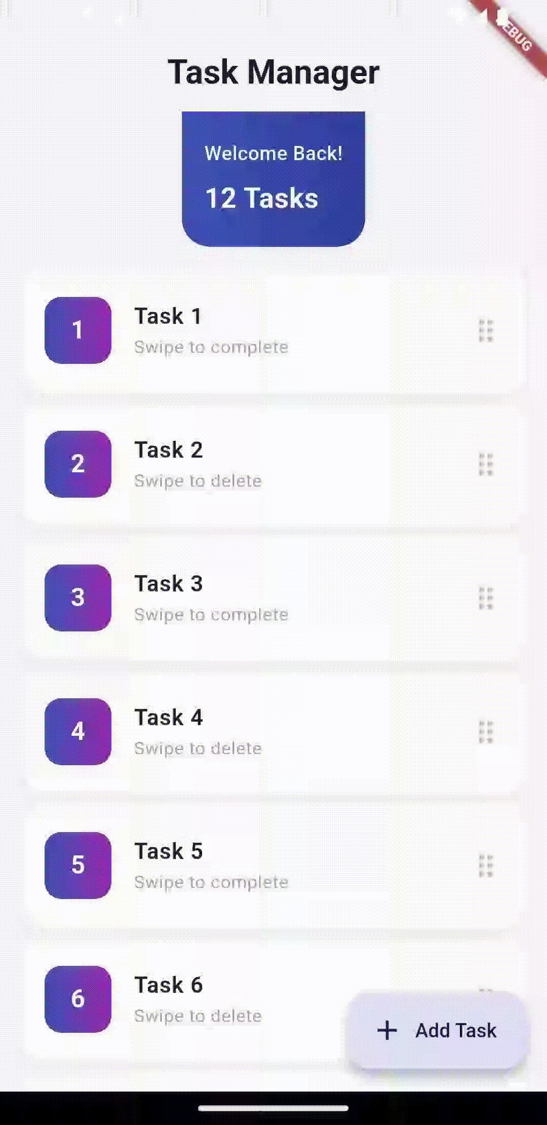
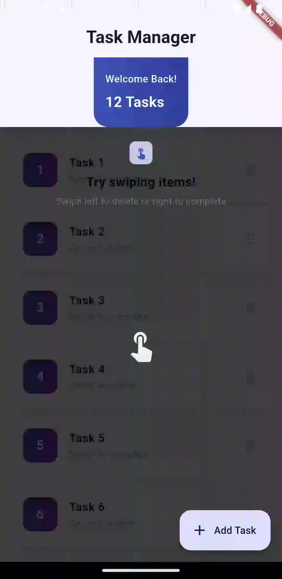
The included example app demonstrates:
- Task manager UI with dismissible items
- Full-screen overlay with message
- Bounded overlay (new feature!)
- Material 3 design
- Smooth animations and transitions
Run it with:
cd example
flutter run
📄 License #
MIT License - see LICENSE file for details
🤝 Contributing #
Found a bug? Have a feature request? Issues and PRs welcome!
📚 More Info #
- CHANGELOG: See CHANGELOG_NEW.md for version history
- API Docs: Full API documentation in lib/src/feature_hint_overlay.dart
- Features Guide: Check FEATURES.md for detailed feature documentation
- Migration Guide: See MIGRATION_GUIDE.md if upgrading from v0.0.2
- Quick Start: Check QUICK_START.md
- Documentation Index: Browse all docs in DOCUMENTATION_INDEX.md
Made with ❤️ for beautiful user experiences
Metadata
Publisher
unverified uploader
Weekly Downloads
Metadata
Create interactive feature tutorials with gesture-driven overlays. Users must perform actual gestures on your UI to dismiss hints - perfect for onboarding.
Repository (GitHub)
View/report issues
Documentation
License
 MIT (license)