flow_box_popup 1.0.0  flow_box_popup: ^1.0.0 copied to clipboard
A smooth popup box with fluid animations. It auto-adjusts its height to fit content and slides up gracefully when the virtual keyboard appears.
🌀 FlowBoxPopup #
FlowBoxPopup is a custom Flutter widget that displays a smooth expanding popup from a child widget.
It provides elegant transitions, flexible decoration customization (radius, border, shadow, color, padding), and seamless keyboard handling.
Demo #
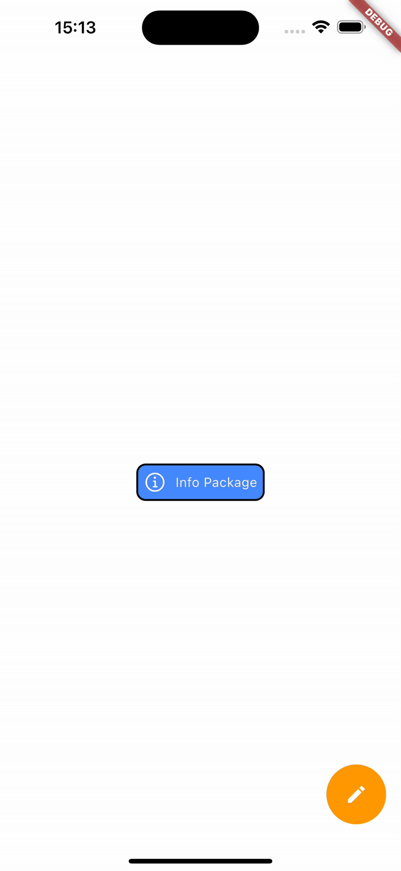
Auto-loop demo animation
🚀 Features #
✅ Smooth popup transition from a source widget (child).
✅ Fully customizable appearance: radius, shadow, border, padding, background color.
✅ Automatically centers popup on screen.
✅ Supports closing via back button.
✅ Measures popup content size dynamically before showing.
✅ Handles keyboard visibility gracefully.
📦 Class Overview #
FlowBoxPopup #
The main widget that manages the popup display and animation.
Parameters
| Name | Type | Description |
|---|---|---|
child |
Widget |
The base widget that triggers the popup when tapped. |
popBuilder |
Widget Function(BuildContext) |
Builder for the popup content. |
childDecoration |
FlowPopupDecoration? |
Custom style for the child widget. |
popDecoration |
FlowPopupDecoration? |
Custom style for the popup window. |
duration |
Duration |
Duration of the show/hide animation. |
curve |
Curve? |
Curve used for the forward animation. |
reverseCurve |
Curve? |
Curve used for the reverse animation. |
FlowPopupDecoration #
Defines the visual styling for both the popup and the trigger widget.
Parameters
| Name | Type | Description |
|---|---|---|
color |
Color? |
Background color. |
border |
Border? |
Optional border. |
boxShadows |
BoxShadow |
Shadow applied to the container. |
radius |
BorderRadius |
Corner radius. |
padding |
EdgeInsetsGeometry |
Inner padding. |
💡 Example Usage #
Scaffold(
        backgroundColor: Colors.white,
        body: Column(
          children: [
            SizedBox(height: 100),
            Center(
              child: FlowBoxPopup(
                childDecoration: FlowPopupDecoration(color: Colors.black),
                popDecoration: FlowPopupDecoration(color: Colors.white, radius: BorderRadius.circular(20)),
                popBuilder: (context) {
                  return Text("A smooth animated popup that automatically expands based on its content and adjusts its position when the keyboard appears.");
                },
                child: Row(mainAxisSize: MainAxisSize.min, children: [
                  Icon(CupertinoIcons.info, color: Colors.white),
                  const SizedBox(width: 10),
                  Text("Info Package", style: TextStyle(color: Colors.white))
                ]),
              ),
            ),

          ],
        ),
      )
Metadata
Publisher
unverified uploader
Weekly Downloads
Metadata
A smooth popup box with fluid animations. It auto-adjusts its height to fit content and slides up gracefully when the virtual keyboard appears.
Repository (GitHub)
View/report issues
Documentation
License
 unknown (license)