floating_menu_expendable 1.0.0  floating_menu_expendable: ^1.0.0 copied to clipboard
 alheekmahlib.com
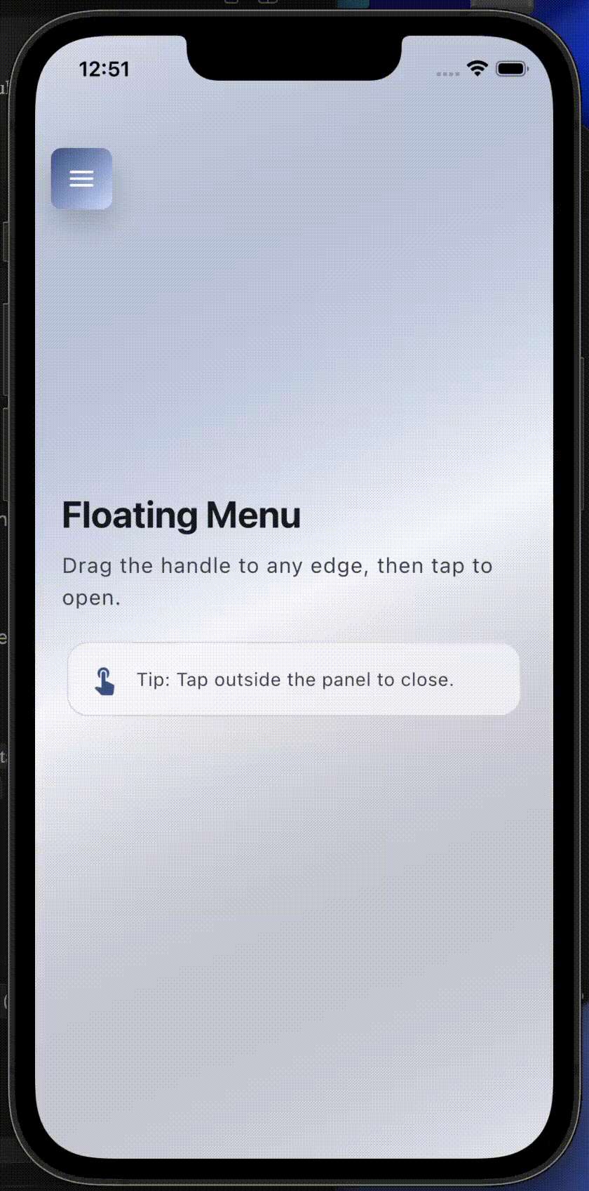
A draggable floating handle that opens a customizable panel (side or vertical).
Floating Menu Expendable #
A draggable floating handle that opens a customizable panel (side or vertical).
Designed for:
- Quick actions / shortcuts
- Floating toolbars
- Chat / support / menu buttons
Features #
- Draggable and snaps to the nearest screen edge
- Two open modes:
FloatingMenuExpendableOpenMode.side: panel opens horizontally next to the handleFloatingMenuExpendableOpenMode.vertical: panel opens below the handle (or above if near bottom)
- Background barrier with blur + color, dismissible on tap
- UI customization via
FloatingMenuExpendableStyle FloatingMenuExpendableControllerfor open/close/toggle and side tracking
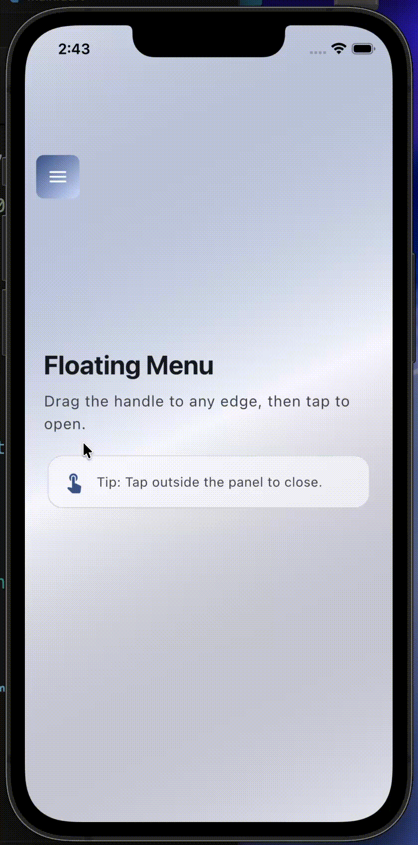
New:
- Expand from the handle (unified handle + panel) using
expandPanelFromHandle - Switch handle content while open using
handleOpenChild(defaults to a close icon) - Anchored overlay for grid/list items using
FloatingMenuAnchoredOverlay(does not affect layout)
Preview #
Note: pub.dev does not reliably render relative image paths. Use GitHub raw URLs for previews.
Default behavior:
Expand-from-handle behavior:
Anchored overlay behavior:
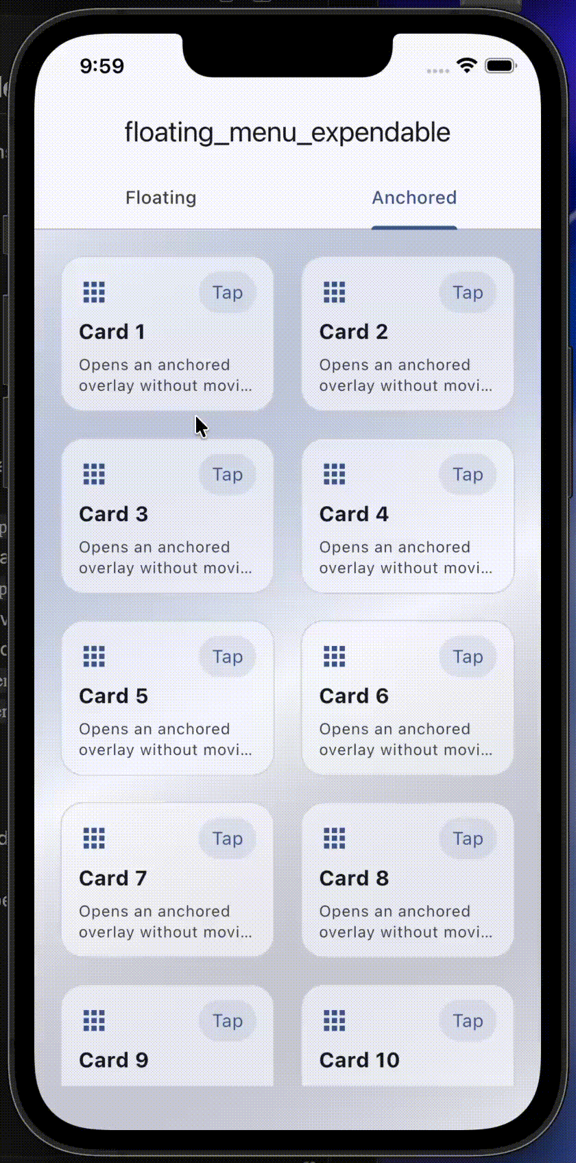
Anchored overlay (new) #
If you want a widget (like a Grid/List item) to open a panel without changing layout,
use FloatingMenuAnchoredOverlay.
- The panel is rendered in an
Overlayand stays anchored to the child. - If you want the visual effect of "the item expands", set
expandFromAnchor: true. - The rest of the UI is dimmed/blurred using a barrier.
- When
closeOnScroll: true, a scroll/pan gesture on the barrier will close the overlay.
final anchoredController = FloatingMenuAnchoredOverlayController();

FloatingMenuAnchoredOverlay(
	controller: anchoredController,
	expandFromAnchor: true,
	closeOnScroll: true,
	panelBuilder: (context) {
		return Material(
			color: Colors.white,
			borderRadius: const BorderRadius.all(Radius.circular(16)),
			child: SizedBox(
				width: 220,
				child: Padding(
					padding: const EdgeInsets.all(12),
					child: Column(
						mainAxisSize: MainAxisSize.min,
						crossAxisAlignment: CrossAxisAlignment.start,
						children: [
							const Text('Actions'),
							const SizedBox(height: 8),
							TextButton(
								onPressed: anchoredController.close,
								child: const Text('Close'),
							),
						],
					),
				),
			),
		);
	},
	child: GestureDetector(
		onTap: anchoredController.toggle,
		child: const Card(child: SizedBox(height: 120)),
	),
)
Installation #
Add the package to your pubspec.yaml.
Import #
import 'package:floating_menu_expendable/floating_menu_expendable.dart';
Quick usage #
final controller = FloatingMenuExpendableController();

Stack(
	children: [
		FloatingMenuExpendable(
			controller: controller,
			panelWidth: 320,
			panelHeight: 240,
			handleChild: const Icon(Icons.menu),
			panelChild: const ColoredBox(color: Colors.white),
		),
	],
)
Expand from handle (new) #
If you want the panel to expand from the same handle (so it looks like one widget),
enable expandPanelFromHandle.
FloatingMenuExpendable(
	controller: controller,
	panelWidth: 320,
	panelHeight: 240,
	expandPanelFromHandle: true,
	// Optional: what to show inside the handle when open.
	handleOpenChild: const Icon(Icons.close_rounded),
	handleChild: const Icon(Icons.menu),
	panelChild: const ColoredBox(color: Colors.white),
)
Customize the UI (Style) #
Use FloatingMenuExpendableStyle to customize blur, barrier color, panel radius, and handle ink effects.
FloatingMenuExpendable(
	controller: controller,
	panelWidth: 320,
	panelHeight: 240,
	handleChild: const Icon(Icons.menu),
	panelChild: const ColoredBox(color: Colors.white),
	style: const FloatingMenuExpendableStyle(
		// Background barrier
		showBarrierWhenOpen: true,
		barrierDismissible: true,
		barrierColor: Color(0x66000000),
		barrierBlurSigmaX: 10,
		barrierBlurSigmaY: 10,

		// Panel
		panelBorderRadius: BorderRadius.all(Radius.circular(18)),
	),
)
Controller #
controller.open();
controller.close();
controller.toggle();
You can also listen to where the handle is docked:
controller.physicalSide(left / right)controller.verticalSide(top / bottom) when using vertical mode
Example app #
See the runnable Flutter demo in the example/ folder.
Notes #
- The widget is intended to be used inside a
Stack. - Provide your own
panelChildandhandleChildto match your app UI.
Metadata
Publisher
Weekly Downloads
Metadata
A draggable floating handle that opens a customizable panel (side or vertical).
Repository (GitHub)
View/report issues
Topics
#overlay #menu #draggable #floating-action #ui
Documentation
License
 MIT (license)