easy_in_app_notify 1.0.1  easy_in_app_notify: ^1.0.1 copied to clipboard
 momaher.dev
A beautiful Flutter package for displaying notifications as in-app overlays with smooth animations, progress indicators, and customizable styling.
Easy In-App Notify 📱🔥 #
A beautiful and customizable Flutter package for displaying notifications as in-app overlays with smooth animations, progress indicators, and intuitive user interactions.
Perfect for showing notifications when your app is in the foreground!
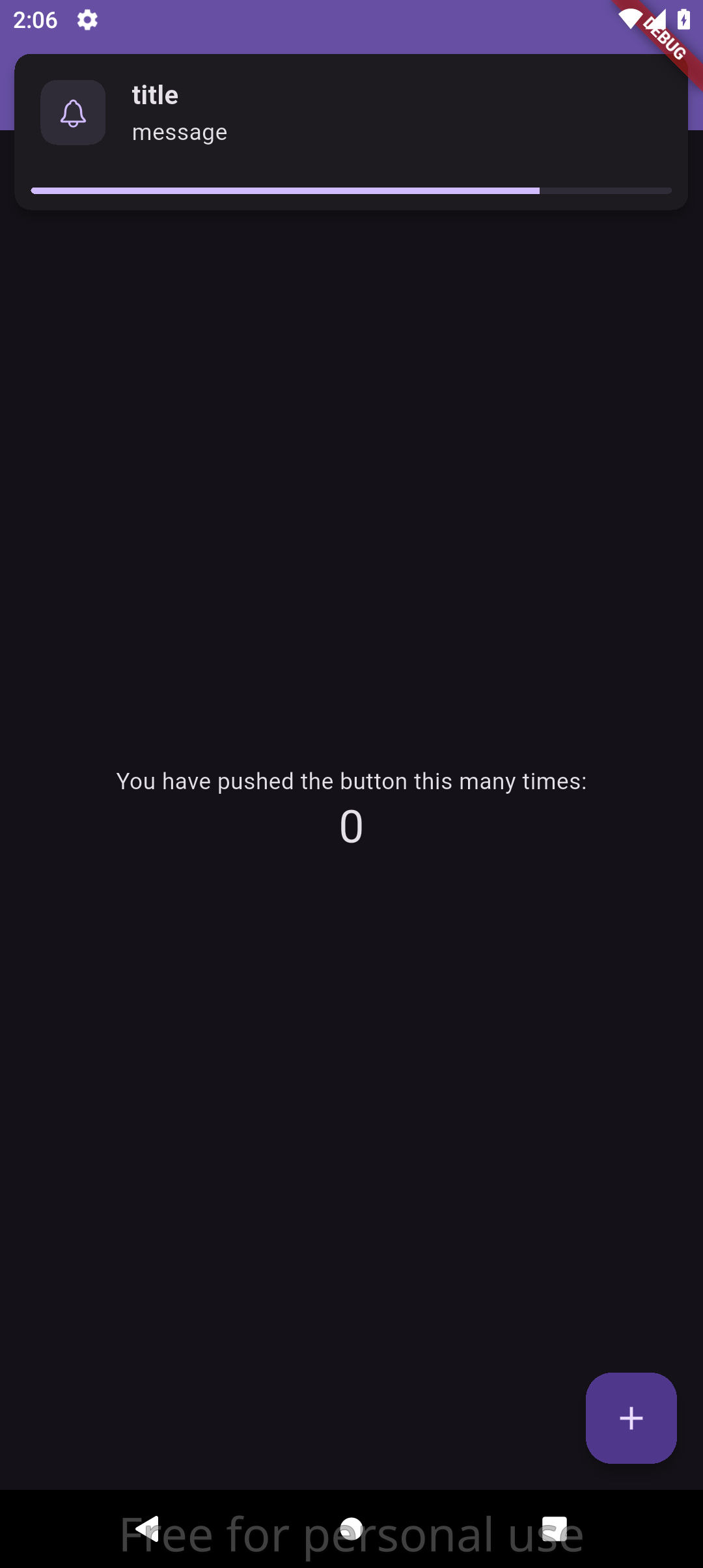
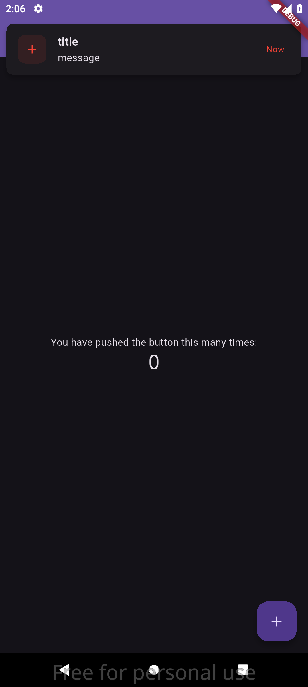
📷 Screenshots #
✨ Features #
- 🎯 Overlay Notifications - Non-blocking notifications that appear over your app content
- 📱 Foreground Notifications - Show notifications when app is active/foreground
- 🎨 Fully Customizable - Colors, spacing, dimensions, and visual styling
- ⏱️ Auto-Dismiss - Configurable duration with visual countdown progress bar
- 👆 Swipe to Dismiss - Users can swipe notifications away manually
- 🎭 Smooth Animations - Slide-in/slide-out transitions with easing curves
- 🔊 Sound Support - Optional notification sounds for audio feedback (Android & iOS only)
- 🎯 Material Design - Follows Material Design principles and theming
- 📱 Safe Area Aware - Respects device safe areas and notches
- 🌐 RTL Support - Full right-to-left language support
- 🚀 Lightweight - Minimal dependencies and optimized performance
📦 Installation #
Run this command to add the package to your project:
flutter pub add easy_in_app_notify
Or manually add to your pubspec.yaml:
dependencies:
  easy_in_app_notify: # Latest version from pub.dev
🚀 Quick Start #
1. Initialize the Package #
Initialize the notification service in a StatefulWidget that comes AFTER MaterialApp:
import 'package:easy_in_app_notify/easy_in_app_notify.dart';
import 'package:flutter/material.dart';

class MyApp extends StatelessWidget {
  @override
  Widget build(BuildContext context) {
    return MaterialApp(
      home: MyHomePage(), // StatefulWidget AFTER MaterialApp
    );
  }
}

class MyHomePage extends StatefulWidget {
  @override
  _MyHomePageState createState() => _MyHomePageState();
}

class _MyHomePageState extends State<MyHomePage> {
  @override
  void initState() {
    super.initState();
    // Initialize AFTER MaterialApp is built
    WidgetsBinding.instance.addPostFrameCallback((_) {
      EasyInAppNotify.init(context);
    });
  }

  @override
  Widget build(BuildContext context) {
    return Scaffold(
      appBar: AppBar(title: Text('My App')),
      body: Center(
        child: ElevatedButton(
          onPressed: () {
            EasyInAppNotify.show(
              content: EasyInAppNotifyContent(
                title: "Hello!",
                message: "Welcome to the app.",
              ),
            );
          },
          child: Text('Show Notification'),
        ),
      ),
    );
  }
}
Important Notes:
- The
initmethod must be called ininitStateof a StatefulWidget that is AFTER MaterialApp - Use
addPostFrameCallbackto ensure the widget tree is fully built - The context must be from within the MaterialApp widget tree (like home widget)
2. Show Notifications #
Display notifications anywhere in your app:
EasyInAppNotify.show(
  content: EasyInAppNotifyContent(
    title: "Success!",
    message: "Your changes have been saved successfully.",
  ),
);
📖 Usage Examples #
Basic Notification #
EasyInAppNotify.show(
  content: EasyInAppNotifyContent(
    title: "Welcome!",
    message: "Thanks for using our app.",
  ),
);
Notification with Custom Icon #
EasyInAppNotify.show(
  content: EasyInAppNotifyContent(
    title: "Download Complete",
    message: "Your file has been downloaded successfully.",
    icon: Icons.download_done,
    trailingText: "2m ago",
  ),
);
Customized Notification #
EasyInAppNotify.show(
  content: EasyInAppNotifyContent(
    title: "Error Occurred",
    message: "Failed to save your changes. Please try again.",
    icon: Icons.error,
    trailingText: "Retry",
  ),
  option: EasyInAppNotifyOption(
    duration: 8, // Show for 8 seconds
    showProgressBar: true,
    swipeToDismiss: true,
  ),
  theme: EasyInAppNotifyTheme(
    color: Colors.red,
    elevation: 10,
    radius: 15,
    margin: 10,
  ),
);
Different Notification Types #
// Success notification
EasyInAppNotify.show(
  content: EasyInAppNotifyContent(
    title: "Success",
    message: "Operation completed successfully!",
    icon: Icons.check_circle,
  ),
  theme: EasyInAppNotifyTheme(color: Colors.green),
);

// Warning notification
EasyInAppNotify.show(
  content: EasyInAppNotifyContent(
    title: "Warning",
    message: "Please check your internet connection.",
    icon: Icons.warning,
  ),
  theme: EasyInAppNotifyTheme(color: Colors.orange),
);

// Info notification
EasyInAppNotify.show(
  content: EasyInAppNotifyContent(
    title: "Info",
    message: "New features are available in settings.",
    icon: Icons.info,
  ),
  theme: EasyInAppNotifyTheme(color: Colors.blue),
);
🎛️ Configuration #
EasyInAppNotifyContent #
Configure the notification content:
| Property | Type | Description | Default |
|---|---|---|---|
title |
String |
Main notification title (required) | - |
message |
String |
Notification message (required) | - |
icon |
IconData? |
Optional icon to display | CupertinoIcons.bell |
trailingText |
String? |
Optional trailing text (e.g., timestamp) | null |
EasyInAppNotifyOption #
Configure notification behavior:
| Property | Type | Description | Default |
|---|---|---|---|
duration |
int |
Auto-dismiss duration in seconds | 5 |
showProgressBar |
bool |
Show countdown progress bar | true |
swipeToDismiss |
bool |
Enable swipe-to-dismiss | true |
EasyInAppNotifyTheme #
Configure visual appearance:
| Property | Type | Description | Default |
|---|---|---|---|
color |
Color? |
Primary accent color | App's primary color |
margin |
double |
Margin from screen edges | 5.0 |
padding |
double |
Internal padding | 10.0 |
radius |
double |
Border radius | 10.0 |
elevation |
double |
Card elevation/shadow | 5.0 |
iconSize |
double |
Icon size | 20.0 |
🎨 Theming #
Using App Theme Colors #
The package automatically uses your app's theme colors when no custom colors are specified:
EasyInAppNotify.show(
  content: EasyInAppNotifyContent(
    title: "Themed Notification",
    message: "This uses your app's primary color!",
  ),
  // No theme specified - uses app's primary color
);
Custom Theme #
EasyInAppNotify.show(
  content: EasyInAppNotifyContent(
    title: "Custom Theme",
    message: "This notification has custom styling.",
  ),
  theme: EasyInAppNotifyTheme(
    color: Color(0xFF6366F1), // Custom purple color
    elevation: 12,
    radius: 20,
    margin: 15,
    padding: 15,
    iconSize: 24,
  ),
);
🔧 Advanced Usage #
Conditional Progress Bar #
EasyInAppNotify.show(
  content: EasyInAppNotifyContent(
    title: "Processing...",
    message: "Please wait while we process your request.",
  ),
  option: EasyInAppNotifyOption(
    duration: 10,
    showProgressBar: true, // Show progress for long operations
    swipeToDismiss: false, // Prevent dismissal during processing
  ),
);
Quick Notification Helper #
Create helper methods for common notification types:
class NotificationHelper {
  static void showSuccess(String title, String message) {
    EasyInAppNotify.show(
      content: EasyInAppNotifyContent(
        title: title,
        message: message,
        icon: Icons.check_circle,
      ),
      theme: EasyInAppNotifyTheme(color: Colors.green),
      option: EasyInAppNotifyOption(duration: 3),
    );
  }

  static void showError(String title, String message) {
    EasyInAppNotify.show(
      content: EasyInAppNotifyContent(
        title: title,
        message: message,
        icon: Icons.error,
      ),
      theme: EasyInAppNotifyTheme(color: Colors.red),
      option: EasyInAppNotifyOption(duration: 6),
    );
  }
}

// Usage
NotificationHelper.showSuccess("Saved!", "Your profile has been updated.");
NotificationHelper.showError("Error", "Failed to connect to server.");
📱 Platform Support #
- ✅ Android
- ✅ iOS
- ✅ Web
- ✅ macOS
- ✅ Windows
- ✅ Linux
Note: Sound notifications are only supported on Android and iOS platforms. On other platforms, notifications will display without sound.
🤝 Contributing #
Contributions are welcome! Please feel free to submit a Pull Request. For major changes, please open an issue first to discuss what you would like to change.
Development Setup #
- Fork the repository
- Clone your fork:
git clone https://github.com/mohamedmaher-dev/easy_in_app_notify.git - Create a feature branch:
git checkout -b feature/amazing-feature - Make your changes and add tests
- Commit your changes:
git commit -m 'Add amazing feature' - Push to the branch:
git push origin feature/amazing-feature - Open a Pull Request
🐛 Issues #
If you encounter any issues or have feature requests, please file them on the GitHub Issues page.
📄 License #
This project is licensed under the MIT License - see the LICENSE file for details.
🙏 Acknowledgments #
- Flutter team for the amazing framework
- Material Design for the design guidelines
- The Flutter community for inspiration and feedback
Made with ❤️ for the Flutter community
Metadata
Publisher
Weekly Downloads
Metadata
A beautiful Flutter package for displaying notifications as in-app overlays with smooth animations, progress indicators, and customizable styling.
Repository (GitHub)
View/report issues
Topics
#notifications #in-app #overlay #animations #material-design
Documentation
License
 MIT (license)
Dependencies
flutter, flutter_ringtone_player, provider