dynamic_stack_card_swiper 1.2.0  dynamic_stack_card_swiper: ^1.2.0 copied to clipboard
 l10.be
The awesome fully customisable Tinder Card Swiper provided by Appinio's team, now supporting dynamic cards adding.
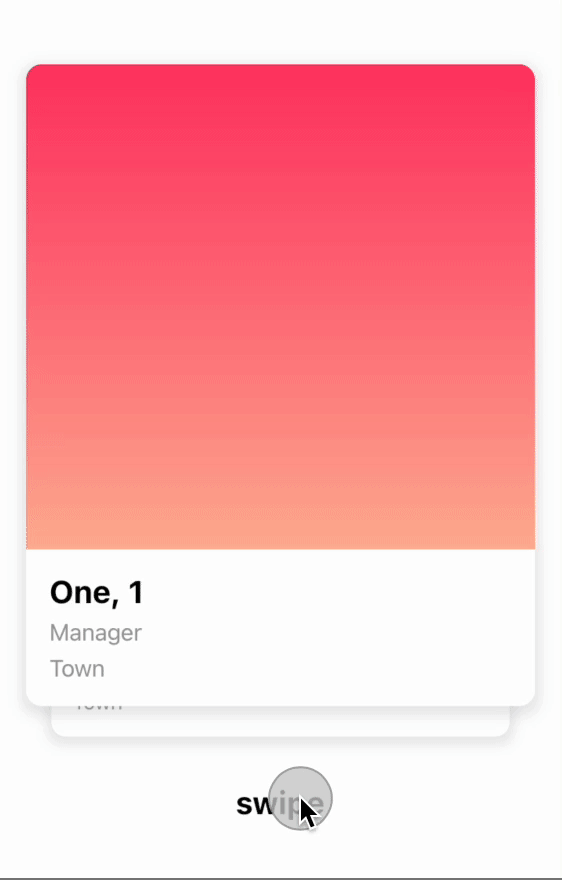
dynamic_stack_card_swiper is a Flutter package for a dynamic Tinder Card Swiper, based on appinio_swiper.
As for appinio_swiper, it allows swiping in all directions with any Custom Widget (Stateless or Stateful) with very smooth animations supporting Android, iOS & WebApp. The difference is you can now also dynamically add new item(s) on top of the existing stack.
Why? #
I built this package because I wanted to be able to add new cards on top of the existing stack, even after user already swiped a few items, or even already emptied the stack. It had a cost: indeed, I had to remove some features from the original package (such as unswipe), but it can obviously be re-coded outside of the plugin (by adding on top of the stack the items you kept in some place).
How to use it? #
Add an item on top of the stack #
Now you can add an item on top of the stack using DynamicStackCardSwiperController<MyModel>.addCardOnTop(modelItem, direction) (direction being an AxisDirection allowing you to choose from which side of the screen the item will come from to join the stack).
Prevent a specific item from being swiped (>= 1.1.0) #
Now you can specify an isItemLocked check in the definition of the DynamicStackCardSwiper, based on the current item being given as a parameter.
Access the current stack from the controller (>= 1.2.0) #
Now you can access the stack for any reason of yours, including the insertion of new items anywhere (without animation, though!).
AppinioSwiper's original Show Cases #

Trigger swipe right and swipe left however you want...

Customize the angle...

Customize the threshold of the swiper, when the card should slide away...

Installation #
Create a new project with the command
flutter create MyApp
Add
dynamic_stack_card_swiper: ...
to your pubspec.yaml of your flutter project.
OR
run
flutter pub add dynamic_stack_card_swiper
in your project's root directory.
In your library add the following import:
import 'package:dynamic_stack_card_swiper/dynamic_stack_card_swiper.dart';
For help getting started with Flutter, view the online documentation.
Usage #
You can place your DynamicStackCardSwiper inside of a Scaffold or CupertinoPageScaffold like you would with Appinio's version. Optional
parameters can be defined to enable different features. See the following example..
import 'package:dynamic_stack_card_swiper/dynamic_stack_card_swiper.dart';
import 'package:flutter/cupertino.dart';

class Example extends StatelessWidget {

  @override
  Widget build(BuildContext context) {
    return CupertinoPageScaffold(
      child: SizedBox(
        height: MediaQuery.of(context).size.height * 0.75,
        child: DynamicStackCardSwiper<String>(
          cardsBuilder: (BuildContext context, String item) {
            return Container(
              alignment: Alignment.center,
              child: Text(item),
              color: CupertinoColors.activeBlue,
            );
          },
        ),
      ),
    );
  }
}
Constructor #
Basic
| Parameter | Default | Description | Required |
|---|---|---|---|
| backgroundCardCount | 1 | Number of cards you want to render in background. | false |
| backgroundCardScale | .9 | Scale factor for the background card. | false |
| backgroundCardOffset | - | Offset for the background card. | false |
| cardBuilder | - | Callback of the type CardsBuilder. | true |
| swipeOptions | - | value of type AppinioSwipeOptions to restrict swipes. | false |
| invertAngleOnBottomDrag | true | Sets whether the card should angle in the opposite direction when it is dragged from the bottom half. | false |
| controller | - | Trigger swipe, unSwipe and animateTo. | false |
| padding | EdgeInsets.symmetric(horizontal: 20, vertical: 25) | Control swiper padding | false |
| duration | 200 milliseconds | The duration that every animation should last | false |
| cardsSpacing | 40 | The spacing between background cards. | false |
| maxAngle | 30 | Maximum angle the card reaches while swiping | false |
| threshold | 50 | Threshold from which the card is swiped away | false |
| isDisabled | false | Set to true if swiping should be disabled, has no impact when triggered from the outside |
false |
| onTapDisabled | - | Function that get triggered when the swiper is disabled | false |
| onSwipeBegin | - | Called when user starts to swipe a card. | false |
| onSwipeEnd | - | Called swipe action completes. | false |
| onCardPositionChanged | - | Called when card position changes. | false |
| onEnd | - | Called when there is no Widget left to be swiped away | false |
| defaultDirection | right | Direction in which the card is swiped away when triggered from the outside | false |
| onSwipeCancelled | - | Gets called when the user leaves the card before the threshold is reached | false |
| isItemLocked | - | Gets called when the user tries to move a card (manually or programmatically) | false |
Controller
The Controller is used to control the swipeDefault, swipeLeft, swipeRight, swipeUp
, swipeDown , addCardOnTop and animateTo function of the swiper from outside of the widget. You can create a controller
called DynamicStackCardSwiperController and save the instance for further usage. Please have a closer look to our Example
for the usage.
| Method | Description |
|---|---|
| swipe | Swipes the card in your selected direction and removes it from the stack. |
| swipeLeft | Swipes the card to the left side and removes it from the stack. |
| swipeRight | Swipes the card to the right side and removes it from the stack. |
| swipeUp | Swipes the card to the up side and removes it from the stack. |
| swipeDown | Swipes the card to the down side and removes it from the stack. |
| addCardOnTop | Adds a new card to the top of the stack. |
| animateTo | Animates the current offset of the card on top to the required Offset in a given duration. |
You can also use it to access the current stack, aiming to check any item, or even to add new ones (without any animation, though!).
Made with ❤ by Lionel Mennig (L10.be) based on work kindly provided by the Flutter team at Appinio GmbH
Metadata
Publisher
Weekly Downloads
Metadata
The awesome fully customisable Tinder Card Swiper provided by Appinio's team, now supporting dynamic cards adding.
Homepage
Repository (GitHub)
View/report issues
Documentation
License
 MIT (license)