draggable_menu 3.0.2  draggable_menu: ^3.0.2 copied to clipboard
 emresoysuren.com
Create Draggable Menus like some popular apps like Instagram, Snapchat, Facebook, Twitter, Youtube etc. You can even make your Draggable Menus look identical to them.
Flutter Draggable Menu (draggable_menu) #
With draggable_menu, create Draggable Menus as you want and make your app look way better and more convenient.
Create Draggable Menus like some popular apps like Instagram, Snapchat, Facebook, Twitter, Youtube etc. You can even make your Draggable Menus look identical to them.
draggable_menu also allows you to customize the UI and the animations. You can use one of the default themes or create your custom UI from scratch.
Features #
- Fully customizable UI
- Fully customizable levels
- Fully customizable animations
- Compatible with the scrollable usage
- Fast Drag Gestures
- Has multiple listeners to listen to its values
- You can use it without any configurations
- Contains pre-build UIs
| Classic UI | Modern UI (with Scrollable) | Soft Modern UI (with Status) |
|---|---|---|
 |
 |
 |
Quick Start #
To start as fast as possible, you need to know how to create, open and close it.
Create the Draggable Menu #
Create a Draggable Menu widget with a child.
DraggableMenu(
  child: child, // Optional
)
Open the Draggable Menu #
Open the menu by calling Draggable Menu's static open method.
DraggableMenu.open(
  context,
  DraggableMenu(
    child: child, // Optional
  ),
)
You can use the Draggable Menu inside of another widget, and give it to the open method. Like this:
DraggableMenu.open(
  context,
  MyCustomDraggableMenu(),
)
Note: The DraggableMenu.open() shouldn't be in the same place as the MaterialApp widget.
If you want to close the menu programmatically close it by calling the Navigator's pop method.
Navigator.pop(context);
Parameters of DraggableMenu #
| Category | Parameters | Description |
|---|---|---|
| Usage | double? defaultHeight | It specifies the default height (Level 0) of the Draggable Menu. By default, it is 240 (Unlike the defaultHeight parameter, your widget's height can pass this value.), but if you use an expandable feature, you must provide a value. If the levels parameter's set but the defaultHeight isn't, it will throw an error. |
| Usage | bool? allowToShrink | If it is true, the widget will be at its minimum height. By default, it is false. |
| Usage | List<DraggableMenuLevel>? levels | This is the parameter to use the expand feature. Provide DraggableMenuLevel objects inside of it to create a level and customize its height. And you must also provide the defaultHeight parameter to use it. If you don't set the defaultHeight parameter, it'll throw an error. The lowest object you pass will be used as Level 1 of the Draggable Menu's level. |
| Usage | double? closeThreshold | Specifies the Close Threshold of the Draggable Menu. Takes a value between 0 and 1. |
| Usage | double? expandThreshold | Specifies the Expand Threshold of the Draggable Menu. Takes a value between 0 and 1. |
| Usage | double? minimizeThreshold | Specifies the Minimize Threshold of the Draggable Menu. Takes a value between 0 and 1. |
| Usage | double? fixedCloseThreshold | Specifies the Close Threshold of the Draggable Menu by giving it a fixed value. |
| Usage | double? fixedExpandThreshold | Specifies the Expand Threshold of the Draggable Menu by giving it a fixed value. |
| Usage | double? fixedMinimizeThreshold | Specifies the Minimize Threshold of the Draggable Menu by giving it a fixed value. |
| Usage | bool? blockMenuClosing | It specifies whether the Draggable Menu can close itself by dragging down and taping outside of the Menu or not. |
| Usage | bool? fastDrag | It specifies whether the Draggable Menu will run fast drag gestures when fast-dragged. By default, it is true. |
| Usage | double? fastDragVelocity | Specifies the Fast Drag Velocity of the Draggable Menu. That means it defines how many velocities will be the threshold to run fast-drag gestures. Takes a value above 0. If the value is negative, it will throw an error. |
| Usage | bool? fastDragClose | It specifies whether the Draggable Menu will close itself when it has been fast-dragged. By default, it is true. |
| Usage | bool? fastDragMinimize | It specifies whether the Draggable Menu will minimize itself when it has been fast-dragged and it's expanded. By default, it is true. |
| Usage | bool? fastDragExpand | It specifies whether the Draggable Menu will expand when it has been fast-dragged and can be expandable. By default, it is true. |
| Usage | bool? minimizeBeforeFastDrag | It specifies whether the Draggable Menu will be minimized when it has been dragged too fast or not when it's expanded. By default, it is false. |
| UI | (required) Widget child | Adds a child inside the Draggable Menu's UI. |
| UI | CustomDraggableMenu? ui | Overrides the Classic Draggable Menu UI. |
| UI | Widget? customUi | Overrides the Draggable Menu's UI and uses the given widget. If used, the child parameter of the DraggableMenu widget won't work. |
| Listener | Function(DraggableMenuStatus status, int level)? addStatusListener | Adds a listener to listen to its Status. |
| Listener | Function(double menuValue, double? raw, double levelValue)? addValueListener | Adds a listener to listen to its Menu Value. |
| Animation | Duration? animationDuration | Specifies the duration of the Draggable Menu's animations. |
| Animation | Curve? curve | Specifies the curve of the Draggable Menu's animations. |
How To Use #
Create a Draggable Menu and Open it #
You can create a Draggable Menu by just using this:
DraggableMenu(
  child: child,
)
After that, you will probably want to push the Draggable Menu to the screen. To do that, use Navigator's methods (e.g. push) or the Draggable Menu's open or openReplacement methods. They are the same with just a little difference. The openReplacement method replaces the previous root (e.g. Navigator.pushReplacement).
DraggableMenu.open(
  context,
  DraggableMenu(
    child: child,
  ),
  barrier: barrier, // Optional. If it's true use a root with a barrier.
  barrierColor: barrierColor, // Optional. Changes the barrier's color.
  animationDuration: animationDuration, // Optional. Specifies its animation's duration.
  curve: animationDuration, // Optional. Specifies its animation's curve.
)
You can make it return a value. Do it in the same way you do it with the Navigator's push method.
final returnValue = await DraggableMenu.open<T>(
  context,
  DraggableMenu(
    child: child,
  ),
);
or do it using Future instead of using async
DraggableMenu.open<T>(
  context,
  DraggableMenu(
    child: child,
  ),
).then((value) => null); // Add something to do
How to Close #
If you want to close the menu programmatically close it by calling the Navigator's pop method.
Navigator.pop(context);
You can also return a value with it.
Navigator.pop<T>(context, value);
Use the Levels (Expandable Draggable Menu) #
First, provide the defaultHeight parameter to set its Level 0 height. And then, give DraggableMenuLevel objects to the levels parameter to define the DraggableMenu's levels.
Define the levels' height in the DraggableMenuLevel's height parameter.
If the defaultHeight parameter isn't provided, it'll throw an error.
DraggableMenu(
  defaultHeight: defaultHeight, // Provide a height value for Level 0
  levels: [
    DraggableMenuLevel(height: height),
    ]
  allowToShrink: allowToShrink, // Optional. Allows you to minimize your widget at Level 0
  child: child,
)
Use Different UIs #
You can use different UIs rather than the default one. You can use pre-made UIs or create your own UI.
For creating your own UI, check out the Create your custom UI section at the end of this file. If you don't want to create your own UI, you can use one of the pre-made UIs.
Choose one of the pre-made UIs and pass it to the ui parameter of the DraggableMenu widget.
Pre-Made UIs:
ClassicDraggableMenuModernDraggableMenuSoftModernDraggableMenu
Note: You can change some features of the pre-made UIs by using their parameters.
DraggableMenu(
  ui: SoftModernDraggableMenu();
  child: child,
)
Using Scrollables #
While using scrollable with a Draggable Menu you need to add the ScrollableManager widget above the scrollable you want to control Draggable with and set the physics of the Scrollable (e.g. ListView) to NeverScrollableScrollPhysics. The ScrollableManager widget must be under a DraggableMenu widget. You can do it by just simply using your widgets under its child or ui parameters.
DraggableMenu(
  child: ScrollableManager(
    child: ListView(
      physics: const NeverScrollableScrollPhysics(),
    ), // You can use any scrollable widget
  ),
)
Use the ScrollableManager widget with one scrollable widget under it. If you want to control the Draggable Menu with multiple Scrollables, use the ScrollableManager widget above each scrollable you want to control the Draggable Menu with.
Do not give a ScrollController to the scrollable widget under the ScrollableManager widget. If you want to use ScrollController, use the ScrollController under the ScrollableManager widget's controller parameter instead.
DraggableMenu(
  child: ScrollableManager(
    controller: ScrollController(), // Use the scroll controller here
    child: ListView(
      // Do not use the scroll controller here
      physics: const NeverScrollableScrollPhysics(),
    ), // You can use any scrollable widget
  ),
)
In short, do not forget to use ScrollableManager and set the physics of the scrollable you want to NeverScrollableScrollPhysics.
Extra: Check out the ScrollableManager's enableExpandedScroll parameter.
Using the Status Listener #
Use the addStatusListener parameter to listen to the Draggable Menu's status.
Dragable Menu's status are: #
- Closing
- Will Close
- May Close
- Canceling
- Minimized
- Minimizing
- May Expand
- Will Expand
- Will Minimize
- May Minimize
- Expanding
- Expanded
You can point them out with DraggableMenuStatus like:
DraggableMenu(
  addStatusListener: (status, level) {
    if (status == DraggableMenuStatus.mayExpand) {
      // Add something to do when its status is mayExpand
    }
    // Add something to do when its status change
  }
  child: child,
)
Using the Value Listener #
Use the addValueListener parameter to listen to the Draggable Menu's Menu Value.
It takes a double value between -1 and 1.
DraggableMenu(
  addValueListener: (menuValue, raw, levelValue) {
    // Add something to do when its value change
  }
  child: child,
)
The menuValue value takes a value between -1 and 1.
The levelValue value takes a value between -1 and ∞.
For the menuValue value: #
- The
1value stands for the Menu'sexpandedposition. - The
0value stands for the Menu'sminimizedposition. - The
-1value stands for the Menu'sclosedposition.
For the levelValue value: #
- The whole numbers stand for the
DraggableMenu's levels. (For example, the3value stands for theLevel 3.) - The
-1value stands for the Menu'sclosedposition.
Create your custom UI #
Create your own Draggable Menu UIs using the ui parameter of the DraggableMenu. The ui parameter allows you to override the DraggableMenu's Classic Ui.
First, create a class that extends the CustomDraggableMenu class and override its buildUi method. After that, pass it to the ui parameter.
class YourDraggableMenuUi extends CustomDraggableMenu {
  @override
  Widget buildUi(
    BuildContext context,
    Widget child,
    DraggableMenuStatus status,
    int level,
    double menuValue,
    double? raw,
    double levelValue,
    Duration animationDuration,
    Curve curve,
  ) {
    // Return Your Ui
    return YourUi(
      child: child, // Pass the `child` value to use the child passed the `DraggableMenu` widget.
    );
  }
}
DraggableMenu(
  ui: ui, // Pass the class you created
  child: child,
)
Or you can use pre-made UIs instead of creating from scratch.
Pre-Made UIs:
ClassicDraggableMenuModernDraggableMenuSoftModernDraggableMenu
Note: You can change some features of the pre-made UIs by using their parameters.
DraggableMenu(
  ui: SoftModernDraggableMenu();
  child: child,
)
You can use the customUi parameter as well. But it won't let you use the child that passed to the DraggableMenu widget. Its advantage is it is easy to use. Just give a widget, and override the DraggableMenu's UI.
DraggableMenu(
  customUi: yourUi;
  child: child, // That won't work. Add your item inside of the customUi instead.
)
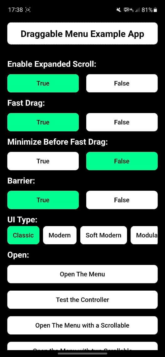
Note: You can find more examples in the Draggable Menu Example app.
For more info, check out the GitHub Repository.
Metadata
Publisher
Weekly Downloads
Metadata
Create Draggable Menus like some popular apps like Instagram, Snapchat, Facebook, Twitter, Youtube etc. You can even make your Draggable Menus look identical to them.
Repository (GitHub)
View/report issues
Documentation
License
 MIT (license)