customize_search_dropdown 0.0.4  customize_search_dropdown: ^0.0.4 copied to clipboard
A customizable search dropdown widget for Flutter.
Customize Search Dropdown #
Preview #
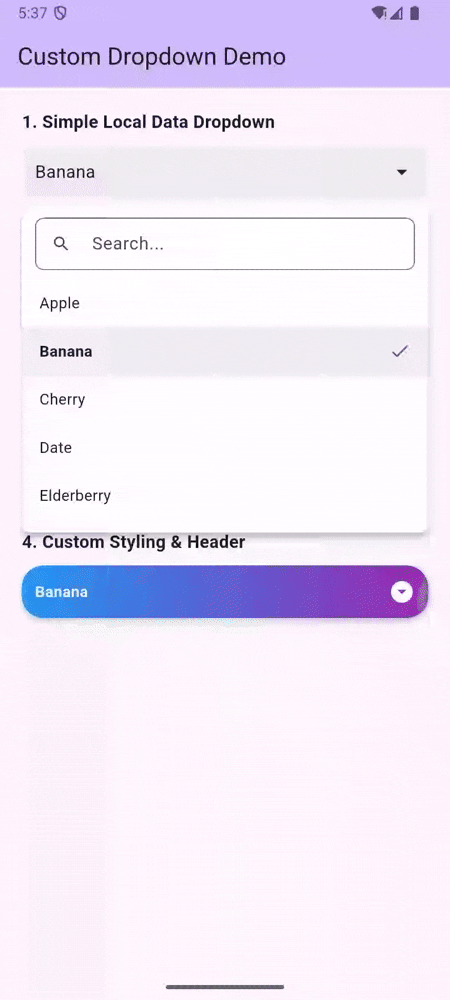
A fully customizable Flutter Dropdown widget with support for:
- 🚀 Search (Local and API)
- 📄 Pagination (Lazy loading)
- ☑️ Multi-Selection
- 🎨 Fully Customizable Styling (Headers, List items, Decorations)
- ↕️ Smart Positioning (Auto-flips based on screen space)
- ✨ Animations (Smooth entrance)
- 🔌 Async Data Loading
- 🛠 Custom Builders for ultimate control
Features #
- Generic Type Support: Works with any data model.
- Searchable: Built-in search field with debounce.
- Paginated: Automatically loads more items when scrolling to the bottom (perfect for APIs).
- Multi-Selection: Easily select multiple items with validation.
- Smart Positioning: Automatically calculates space and renders upwards if needed.
- Animated: Smooth scale and fade animations.
- Flexible UI: Customize every aspect of the widget using builders and decoration parameters.
Usage #
1. Simple Local Data #
CustomDropdown<String>(
  hintText: "Select Fruit",
  items: ["Apple", "Banana", "Cherry"],
  selectedItem: selectedFruit,
  onChanged: (value) {
    setState(() => selectedFruit = value);
  },
)
2. Multi-Selection #
CustomDropdown<String>(
  hintText: "Select Fruits",
  items: ["Apple", "Banana", "Cherry"],
  enableMultiSelection: true, // Enable Multi-Select
  selectedItems: selectedFruits, // Use selectedItems instead of selectedItem
  onListChanged: (value) {
    setState(() => selectedFruits = value);
  },
)
3. API Data with Pagination & Search #
CustomDropdown<User>(
  hintText: "Select User",
  searchHintText: "Search users...",
  futureRequest: (page, query) async {
    return await myApiService.getUsers(page: page, search: query);
  },
  itemsPerPage: 10, // Fetch trigger threshold
  itemLabel: (user) => user.name, // Display string
  onChanged: (user) {
    print("Selected: ${user.name}");
  },
)
4. Fully Customized #
CustomDropdown<String>(
  items: items,
  headerBuilder: (context, selectedItem, selectedItems) {
    return Container(
      padding: EdgeInsets.all(12),
      decoration: BoxDecoration(
        color: Colors.blueAccent,
        borderRadius: BorderRadius.circular(8),
      ),
      child: Text(
        selectedItem ?? "Choose",
        style: TextStyle(color: Colors.white)
      ),
    );
  },
  listItemBuilder: (context, item, isSelected, onTap) {
    return ListTile(
      title: Text(item),
      selected: isSelected,
      onTap: onTap,
      leading: Icon(Icons.star),
    );
  },
)
Parameters #
| Parameter | Type | Description |
|---|---|---|
items |
List<T>? |
List of items for local data mode. |
futureRequest |
FutureRequest<T>? |
Function to fetch items asynchronously. |
enableMultiSelection |
bool |
Set to true to enable multi-selection mode. |
selectedItem |
T? |
Selected item for single selection mode. |
selectedItems |
List<T>? |
Selected items for multi-selection mode. |
onChanged |
ValueChanged<T?>? |
Callback for single selection. |
onListChanged |
ValueChanged<List<T>>? |
Callback for multi-selection. |
enabled |
bool |
Enable or disable the dropdown. Default true. |
doneButtonText |
String |
Text for the done button in multi-select mode. |
... |
Many more styling parameters! |
Styled Properties #
headerDecorationheaderTextStyledropdownDecorationlistItemStyleselectedItemDecorationloadingWidgeterrorWidgetnoResultFoundWidget
Metadata
3
likes
150
points
34
downloads
Publisher
unverified uploader
Weekly Downloads
Metadata
A customizable search dropdown widget for Flutter.
Documentation
License
 MIT (license)