collection_picker 2.0.0  collection_picker: ^2.0.0 copied to clipboard
A Package contains selectable listview and gridview widgets with support for single, multi, and radio picker types.
Overview #
A Package contains highly customized selectable listview and gridview widgets with support for single, multi, and radio picker types. Its automatically render selected item and you can easy customized your selected item view.
ListViewPicker #

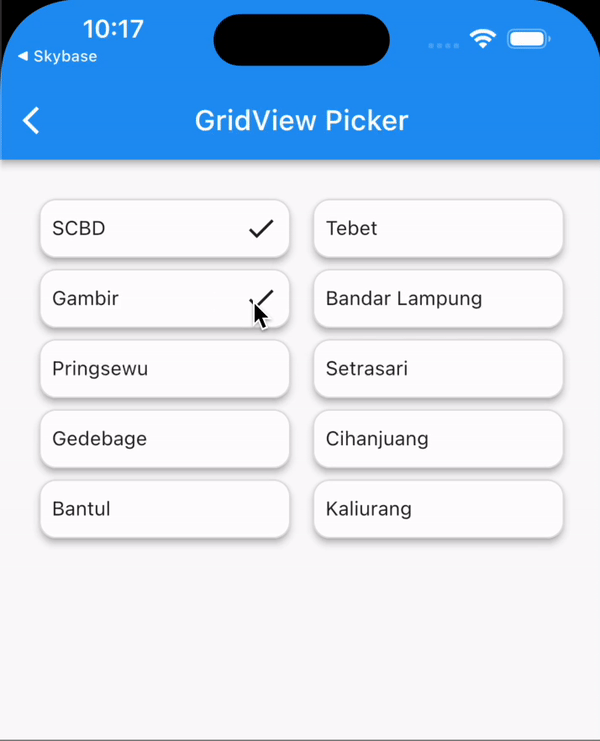
GridViewPicker #
Getting Started #
Add dependency to your pubspec.yaml
dependencies:
  collection_picker : "^version"
Import it in your dart code
import 'package:collection_picker/collection_picker.dart';
Usage #
⚠️ IMPORTANT ⚠️ !!
You should follow this steps to avoid unexpected behaviors :
- Ensure that your model is extends with Equatable or make your model have equality with operator == and hashCode.
- Always set
InitialValueorInitialValueson your picker widget
Example :
class CityModel {
  final String province;
  final String city;

  const CityModel(this.province, this.city);

  @override
  bool operator ==(Object other) {
    if (identical(this, other)) return true;

    return other is CityModel &&
        other.province == province &&
        other.city == city;
  }

  @override
  int get hashCode => province.hashCode ^ city.hashCode;

  @override
  String toString() => 'CityModel(province: $province, city: $city)';
}
And sample dummy data list below :
List<CityModel> dataCity = [
  CityModel('Jakarta', 'Menteng'),
  CityModel('Jakarta', 'Tebet'),
  CityModel('Jakarta', 'Gambir'),
  CityModel('Lampung', 'Bandar Lampung'),
  CityModel('Lampung', 'Pringsewu'),
  CityModel('Bandung', 'Setrasari'),
  CityModel('Bandung', 'Gedebage'),
  CityModel('Bandung', 'Cihanjuang'),
  CityModel('Yogyakarta', 'Bantul'),
  CityModel('Yogyakarta', 'Sleman'),
];
ListViewPicker #
ListViewPicker<CityModel>(
  type: PickerType.single,
  shrinkWrap: true,
  physics: const NeverScrollableScrollPhysics(),
  separator: (BuildContext context, int index) =>
    const Divider(thickness: 1, height: 0),
  initialValue: dataCity.first,
  data: dataCity,
  onChanged: (BuildContext context, int index, CityModel? selectedItem, List<CityModel> selectedItems) {
    // when the type is single/radio, you should use this
    debugPrint('Selected item = ${selectedItem.city}');

    /// when the type is multiple, you should use this
    debugPrint('All selected item = ${selectedListItem.map((e) => e.city)}');
  },
  itemBuilder: (BuildContext context, int index, PickerWrapper<CityModel> item) {
    return SizedBox(
      height: 40,
      child: Row(
        mainAxisAlignment: MainAxisAlignment.spaceBetween,
        children: [
          Text('${item.data?.city}'),
          (item.isSelected)
              ? const Icon(Icons.check)
              : const SizedBox.shrink()
        ],
      ),
    );
  },
)
GridViewPicker #
Actually is same as Picker ListView but it is serves as GridView.
GridViewPicker(
  type: PickerType.multiple,
  shrinkWrap: true,
  initialValue: dataCity.first,
  data: dataCity,
  gridDelegate: SliverGridDelegateWithMaxCrossAxisExtent(
    maxCrossAxisExtent: 200,
    mainAxisExtent: 50,
    crossAxisSpacing: 8,
    mainAxisSpacing: 8,
  ),
  onChanged: (BuildContext context, int index, CityModel? selectedItem, List<CityModel> selectedItems) {
    // when the type is single/radio, you should use this
    debugPrint('selected item = ${selectedItem?.city}');

    /// when the type is multiple, you should use this
    debugPrint('All selected item = ${selectedListItem.map((e) => e.city)}');
  },
  itemBuilder: (BuildContext context, int index, PickerWrapper<CityModel> item) {
    return Container(
      padding: const EdgeInsets.all(8),
      decoration: BoxDecoration(
        borderRadius: BorderRadius.circular(12),
        border: Border.all(color: Colors.grey.shade300),
      ),
      child: Container(
        padding: const EdgeInsets.all(8),
        decoration: BoxDecoration(
          borderRadius: BorderRadius.circular(12),
          border: Border.all(color: Colors.grey.shade300),
        ),
        child: Row(
          mainAxisAlignment: MainAxisAlignment.spaceBetween,
          children: [
            Text(item.data.city),
            if (item.isSelected) const Icon(Icons.check),
          ],
        ),
      ),
    );
  },
)
WrapPicker #
Actually is same as Picker ListView & GridView but it is serves as Wrap so the width is dynamic (not fixed).
WrapPicker<CityModel>(
  type: PickerType.multiple,
  initialValue: dataCity.first,
  data: dataCity,
  onChanged: (BuildContext context, int index, CityModel? selectedItem, List<CityModel> selectedItems) {
    // when the type is single/radio, you should use this
    debugPrint('selected item = ${selectedItem?.city}');

    /// when the type is multiple, you should use this
    debugPrint(
      'All selected item = ${selectedListItem.map((e) => e.city)}',
    );
  },
  itemBuilder: (BuildContext context, int index, PickerWrapper<CityModel> item) {
    return Container(
      padding: const EdgeInsets.all(8),
      decoration: BoxDecoration(
        borderRadius: BorderRadius.circular(12),
        border: Border.all(color: Colors.grey.shade300),
      ),
      child: Wrap(
        spacing: 4,
        children: [
          Text(item.data.city),
          if (item.isSelected) const Icon(Icons.check, size: 18),
        ],
      ),
    );
  },
),
Additional information #
Thank you. Hope this package can help you. Happy coding..
Metadata
Publisher
unverified uploader
Weekly Downloads
Metadata
A Package contains selectable listview and gridview widgets with support for single, multi, and radio picker types.
Repository (GitHub)
View/report issues
Documentation
License
 MIT (license)