chat_group_avatar 0.1.0  chat_group_avatar: ^0.1.0 copied to clipboard
A Flutter package for displaying group chat avatars with adaptive overlapping layouts. Perfect for chat apps like KakaoTalk, WhatsApp, and Telegram.
Group Avatar #
A Flutter package for displaying group chat avatars with adaptive overlapping layouts. Perfect for chat applications like KakaoTalk, WhatsApp, and Telegram.
Features #
- 🎨 Adaptive Layout: Automatically adjusts layout based on member count
- 1 member: Single circle avatar
- 2 members: Two diagonal overlapped circles (top-right & bottom-left)
- 3 members: Triangular pattern (top-center, bottom-left, bottom-right)
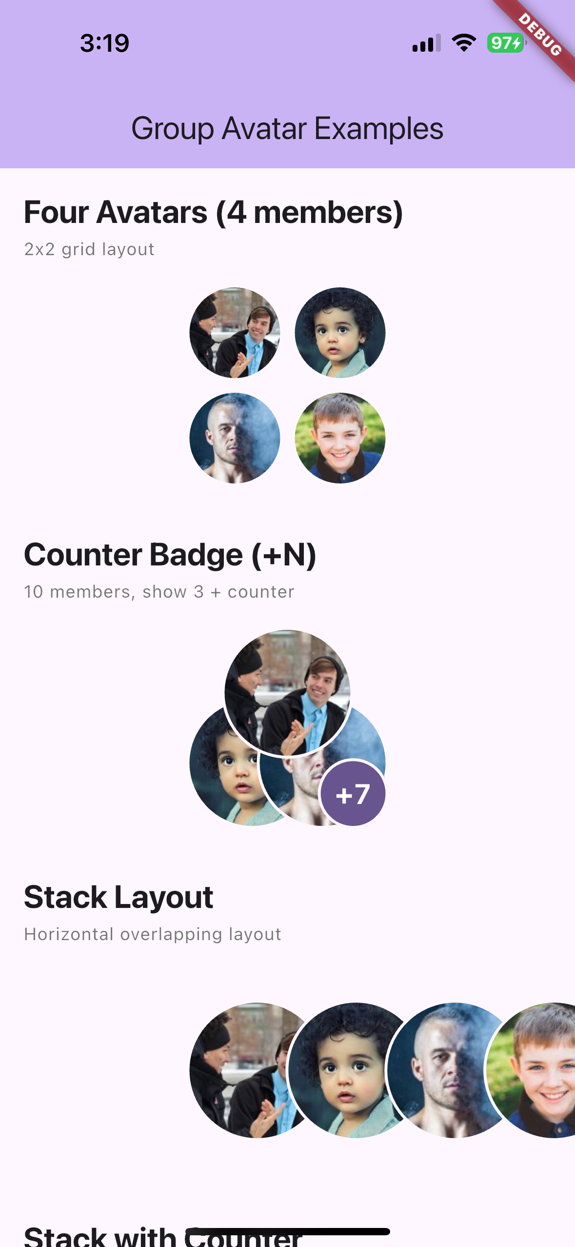
- 4+ members: 2x2 grid layout (shows first 4 members)
- Stack layout: Horizontal overlapping layout (left to right)
- 🖼️ Cached Network Images: Uses
cached_network_imagefor efficient image loading - 🎯 Customizable: Size, border color, border width, placeholder icon, and avatar shape
- 🎭 Placeholder Support: Shows placeholder icons for missing or failed images
- 📱 Theme Aware: Automatically adapts to your app's theme
- 🔢 Counter Badge: Show remaining member count with "+N" badge
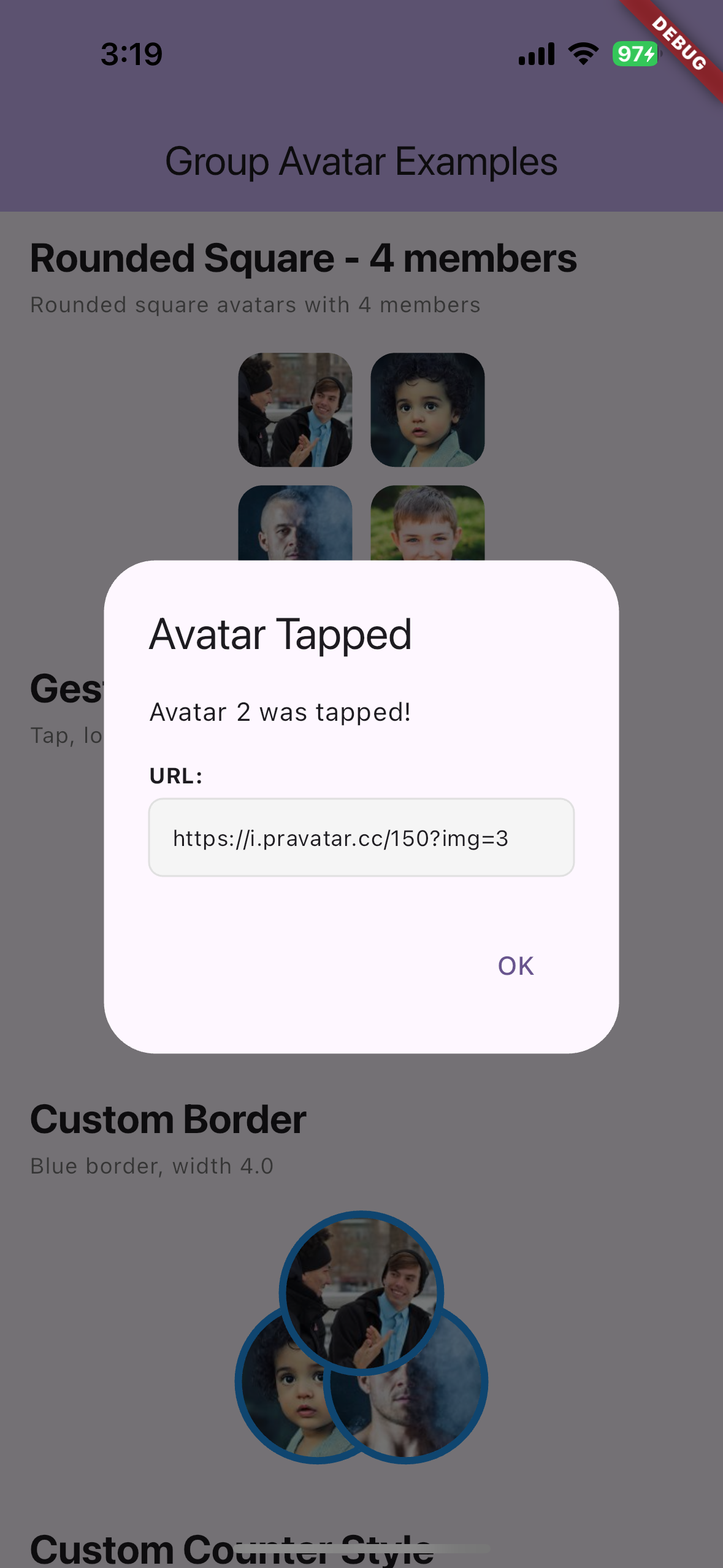
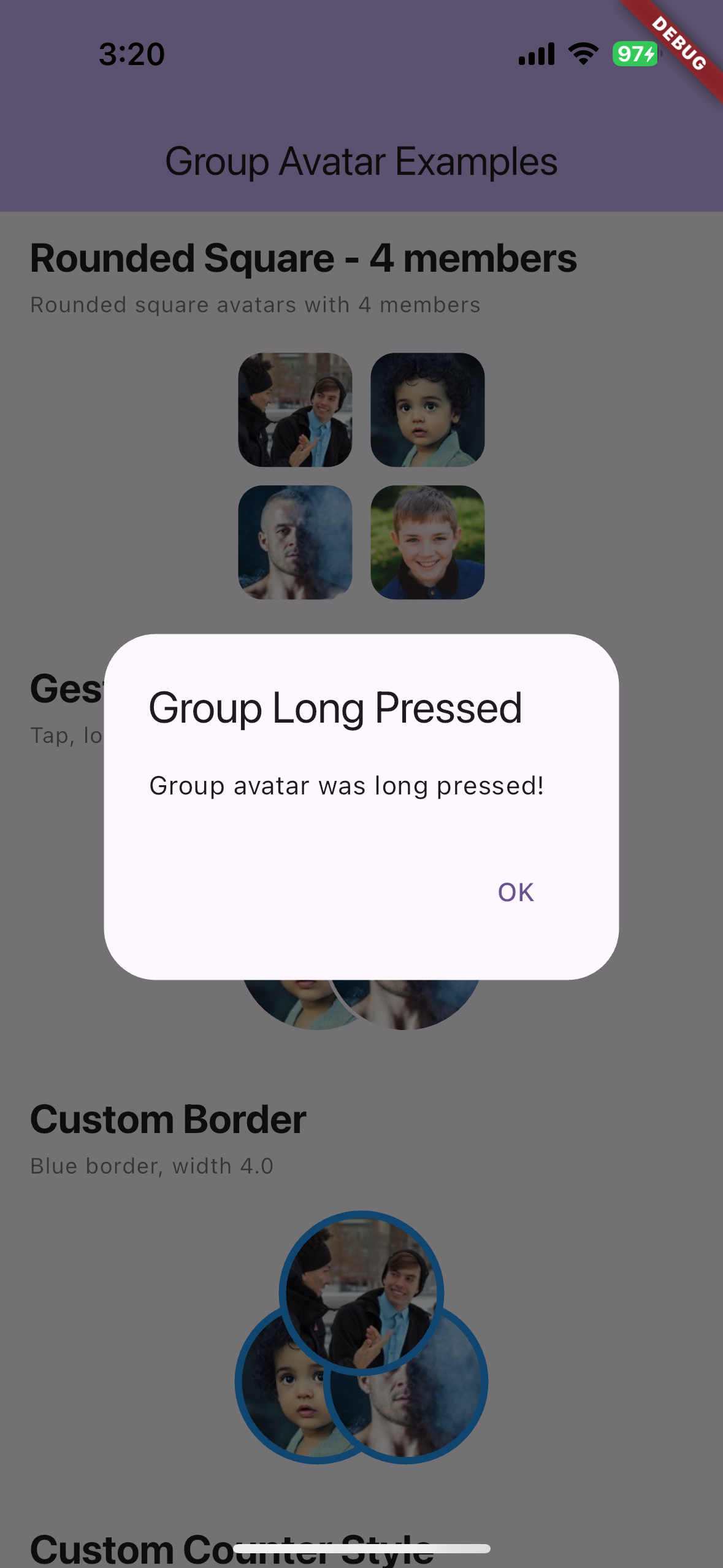
- 👆 Gesture Support: Tap, long press, and individual avatar tap callbacks
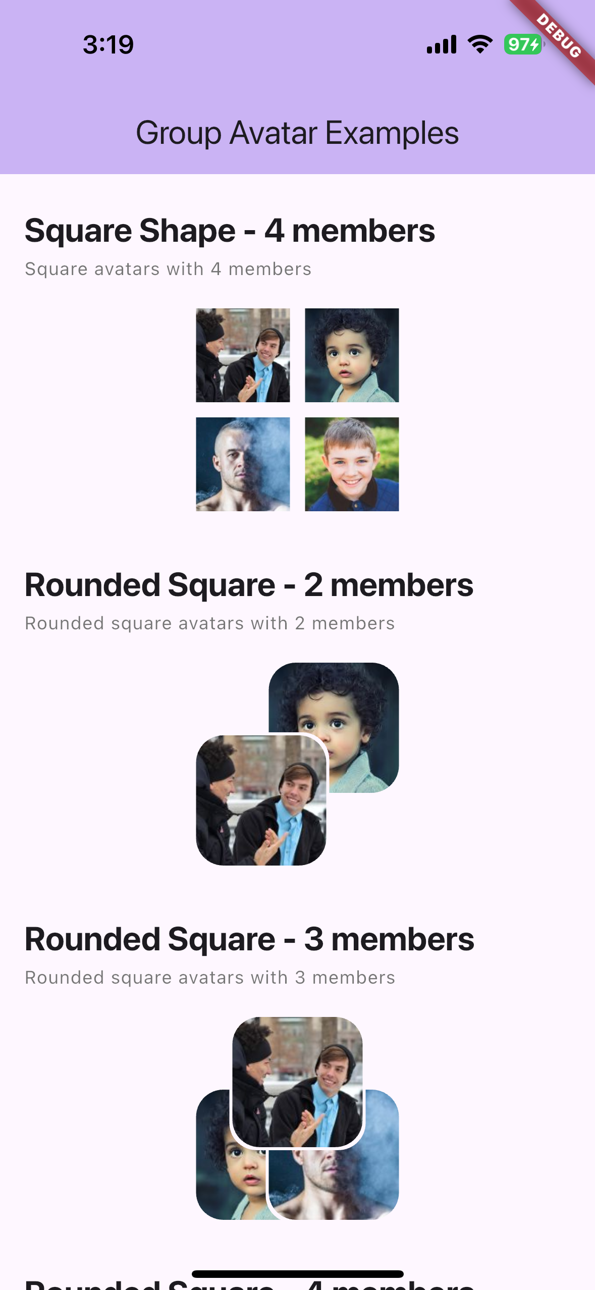
- 🔲 Multiple Shapes: Circle, square, rounded square
- 📐 Flexible Layouts: Auto (adaptive) or stack (horizontal/vertical overlapping)
- 🎚️ Customizable Overlap: Adjustable overlap ratio for stack layout (0.0 to 1.0)
Installation #
Add this to your package's pubspec.yaml file:
dependencies:
  chat_group_avatar: ^0.1.0
Then run:
flutter pub get
Usage #
Basic Usage #
import 'package:chat_group_avatar/group_avatar.dart';

GroupAvatar(
  imageUrls: [
    'https://example.com/avatar1.jpg',
    'https://example.com/avatar2.jpg',
    'https://example.com/avatar3.jpg',
  ],
  size: 138,
)
With Customization #
GroupAvatar(
  imageUrls: [
    'https://example.com/avatar1.jpg',
    'https://example.com/avatar2.jpg',
  ],
  size: 100,
  borderColor: Colors.blue,
  borderWidth: 3.0,
  backgroundColor: Colors.grey[200],
  placeholderIcon: Icon(Icons.account_circle),
)
Different Member Counts #
// Single member
GroupAvatar(
  imageUrls: ['https://example.com/avatar1.jpg'],
  size: 138,
)

// Two members (diagonal overlap)
GroupAvatar(
  imageUrls: [
    'https://example.com/avatar1.jpg',
    'https://example.com/avatar2.jpg',
  ],
  size: 138,
)

// Three members (triangular)
GroupAvatar(
  imageUrls: [
    'https://example.com/avatar1.jpg',
    'https://example.com/avatar2.jpg',
    'https://example.com/avatar3.jpg',
  ],
  size: 138,
)

// Four or more members (2x2 grid)
GroupAvatar(
  imageUrls: [
    'https://example.com/avatar1.jpg',
    'https://example.com/avatar2.jpg',
    'https://example.com/avatar3.jpg',
    'https://example.com/avatar4.jpg',
    'https://example.com/avatar5.jpg', // Only first 4 are shown
  ],
  size: 138,
)

// With counter badge (show +N for remaining members)
GroupAvatar(
  imageUrls: List.generate(10, (i) => 'https://example.com/avatar$i.jpg'),
  size: 138,
  maxVisible: 3,
  showCounter: true,
)

// Stack layout (horizontal overlapping)
GroupAvatar(
  imageUrls: [
    'https://example.com/avatar1.jpg',
    'https://example.com/avatar2.jpg',
    'https://example.com/avatar3.jpg',
  ],
  size: 138,
  layout: GroupAvatarLayout.stack,
  showCounter: true,
)

// Vertical stack layout
GroupAvatar(
  imageUrls: [
    'https://example.com/avatar1.jpg',
    'https://example.com/avatar2.jpg',
    'https://example.com/avatar3.jpg',
  ],
  size: 138,
  layout: GroupAvatarLayout.stack,
  stackDirection: Axis.vertical,
)

// Custom overlap ratio
GroupAvatar(
  imageUrls: [
    'https://example.com/avatar1.jpg',
    'https://example.com/avatar2.jpg',
    'https://example.com/avatar3.jpg',
  ],
  size: 138,
  layout: GroupAvatarLayout.stack,
  overlapRatio: 0.5, // 50% overlap
)

// Stack with different shapes
GroupAvatar(
  imageUrls: [
    'https://example.com/avatar1.jpg',
    'https://example.com/avatar2.jpg',
  ],
  size: 138,
  layout: GroupAvatarLayout.stack,
  shape: AvatarShape.roundedSquare,
)

// With gesture callbacks
GroupAvatar(
  imageUrls: [
    'https://example.com/avatar1.jpg',
    'https://example.com/avatar2.jpg',
  ],
  size: 138,
  onTap: () => print('Group tapped'),
  onLongPress: () => print('Group long pressed'),
  onAvatarTap: (index, url) => print('Avatar $index tapped: $url'),
)

// Different shapes
GroupAvatar(
  imageUrls: ['https://example.com/avatar1.jpg'],
  size: 138,
  shape: AvatarShape.square, // or roundedSquare
)
Parameters #
| Parameter | Type | Default | Description |
|---|---|---|---|
imageUrls |
List<String?> |
required | List of image URLs to display |
size |
double |
138 |
Size of the bounding box |
borderColor |
Color? |
null |
Border color (defaults to theme's surface color) |
borderWidth |
double |
2.0 |
Border width |
placeholderIcon |
Widget? |
null |
Custom placeholder icon (defaults to Icons.person) |
backgroundColor |
Color? |
null |
Background color for avatars (defaults to theme's surface color) |
shape |
AvatarShape |
AvatarShape.circle |
Avatar shape: circle, square, or roundedSquare |
layout |
GroupAvatarLayout |
GroupAvatarLayout.auto |
Layout mode: auto (adaptive) or stack (overlapping) |
maxVisible |
int? |
null |
Maximum number of avatars to display (default: 4 for auto, all for stack) |
showCounter |
bool |
false |
Show counter badge for remaining members |
counterStyle |
TextStyle? |
null |
Style for the counter text |
counterBackgroundColor |
Color? |
null |
Background color for the counter badge |
overlapRatio |
double |
0.3 |
Overlap ratio for stack layout (0.0 to 1.0) |
stackDirection |
Axis |
Axis.horizontal |
Stack direction: Axis.horizontal or Axis.vertical |
onTap |
VoidCallback? |
null |
Callback when the group avatar is tapped |
onLongPress |
VoidCallback? |
null |
Callback when the group avatar is long pressed |
onAvatarTap |
void Function(int index, String? url)? |
null |
Callback when an individual avatar is tapped |
Layout Details #
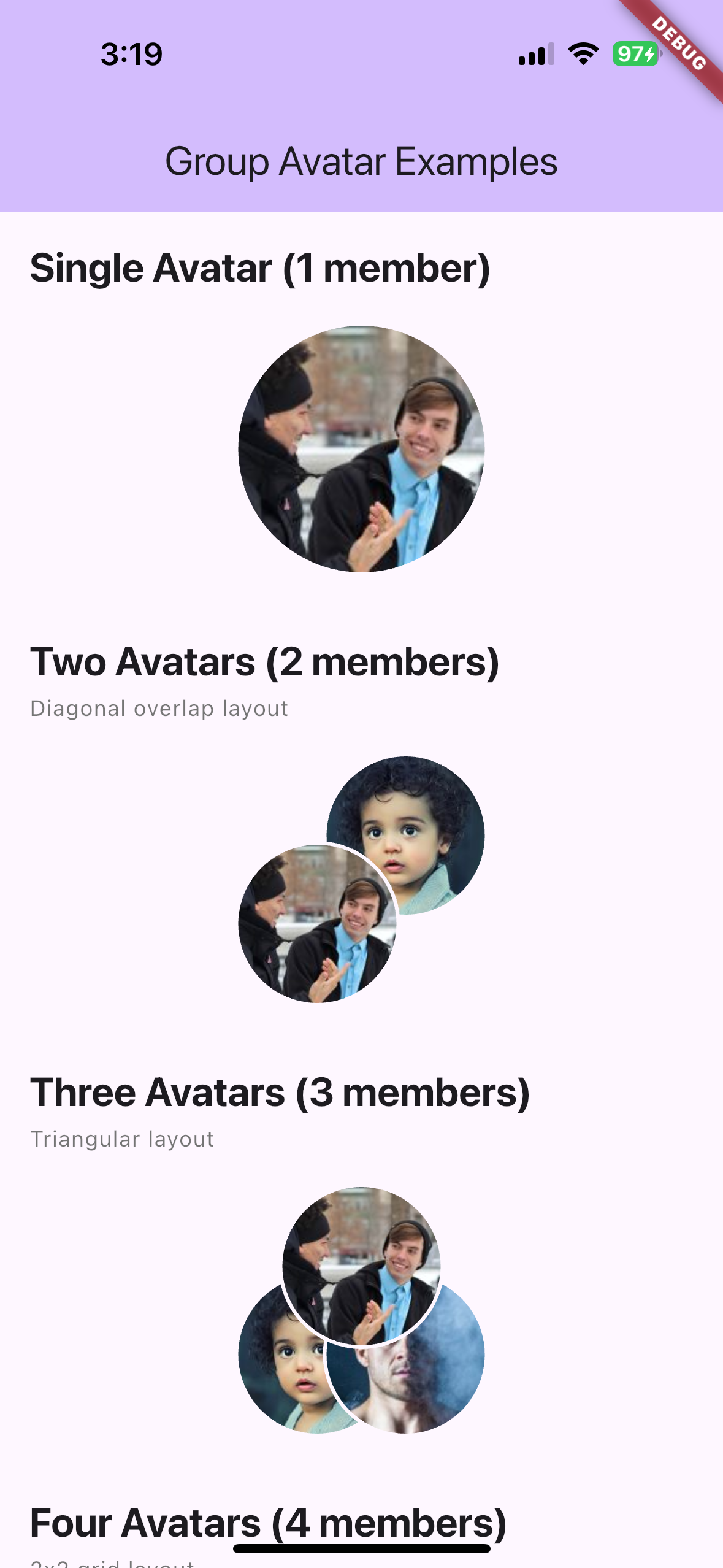
Single Avatar (1 member) #
- Displays a single circular avatar at full size
Two Avatars (2 members) #
- Two avatars arranged diagonally
- Bottom-left avatar appears on top
- Top-right avatar appears underneath
- Each avatar is 90/138 of the total size
Three Avatars (3 members) #
- Triangular arrangement
- Top-center, bottom-left, bottom-right positions
- Each avatar is 90/138 of the total size
Four or More Avatars (4+ members) #
- 2x2 grid layout
- No overlap between avatars
- Only the first 4 avatars are displayed (or
maxVisibleif specified) - Each cell is 66/138 of the total size
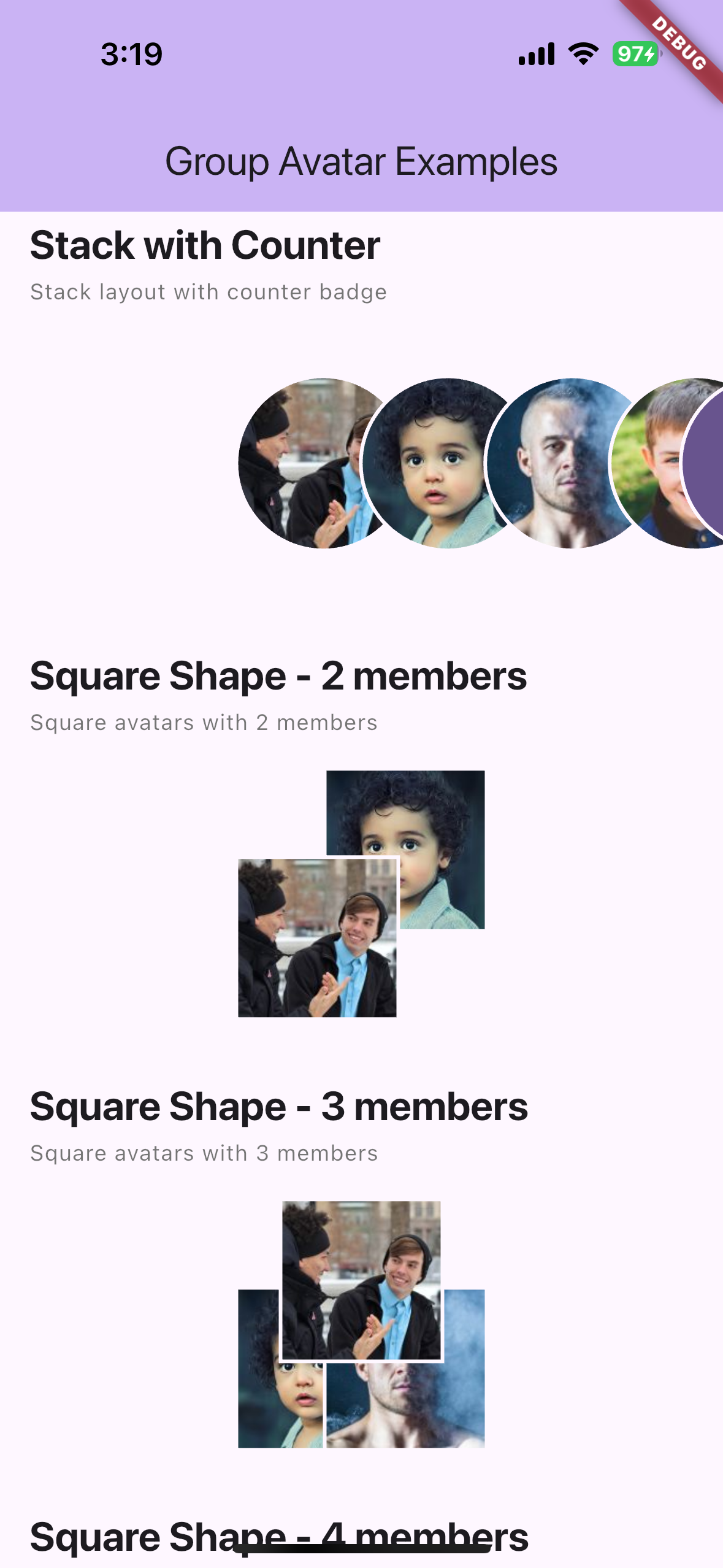
Stack Layout #
- Horizontal overlapping layout (left to right)
- Avatars overlap by 30% of their size
- Useful for member lists or horizontal displays
- Can show counter badge for remaining members
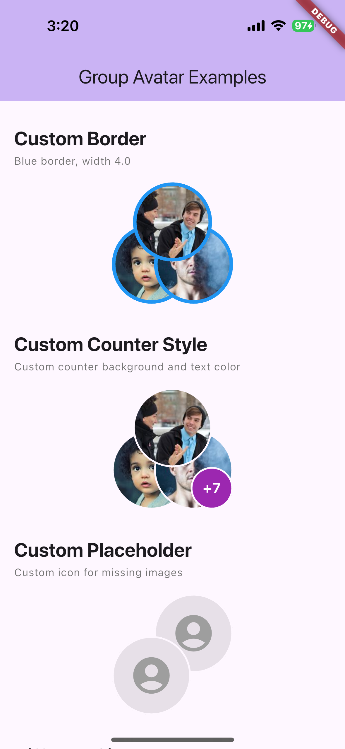
Counter Badge #
- Shows "+N" badge when
showCounteris true and there are more members thanmaxVisible - Positioned at bottom-right (or right for stack layout)
- Customizable style and background color
Example #
See the example/ directory for a complete example app.
Screenshots #
Basic Layouts (1, 2, 3, 4 members) #
Custom Border & Custom Counter & Custom Placeholder #
Stack Counter & Square (2, 3, 4 members) #
Rounded Square (2, 3 members) #
Gesture Events (Long Press & Tap) #
Rounded Square 4, Custom Counter, Stack #
Vertical Stack & Custom Overlap & Different Shapes #
Contributing #
Contributions are welcome! Please feel free to submit a Pull Request.
License #
This project is licensed under the MIT License - see the LICENSE file for details.
Related Packages #
- avatar_stack - Horizontal overlapping avatars
- cached_network_image - Image caching (used internally)
Support #
If you encounter any issues or have feature requests, please file an issue on the GitHub repository.
Metadata
Publisher
unverified uploader
Weekly Downloads
Metadata
A Flutter package for displaying group chat avatars with adaptive overlapping layouts. Perfect for chat apps like KakaoTalk, WhatsApp, and Telegram.
Repository (GitHub)
View/report issues
Documentation
License
 MIT (license)