button_kit 1.0.2  button_kit: ^1.0.2 copied to clipboard
A simple, beautiful, and customizable button library for Flutter.
ButtonKit #
 A simple, beautiful, customizable button library for Flutter.
ButtonKit provides modern Flutter buttons with:
A simple, beautiful, customizable button library for Flutter.
ButtonKit provides modern Flutter buttons with:
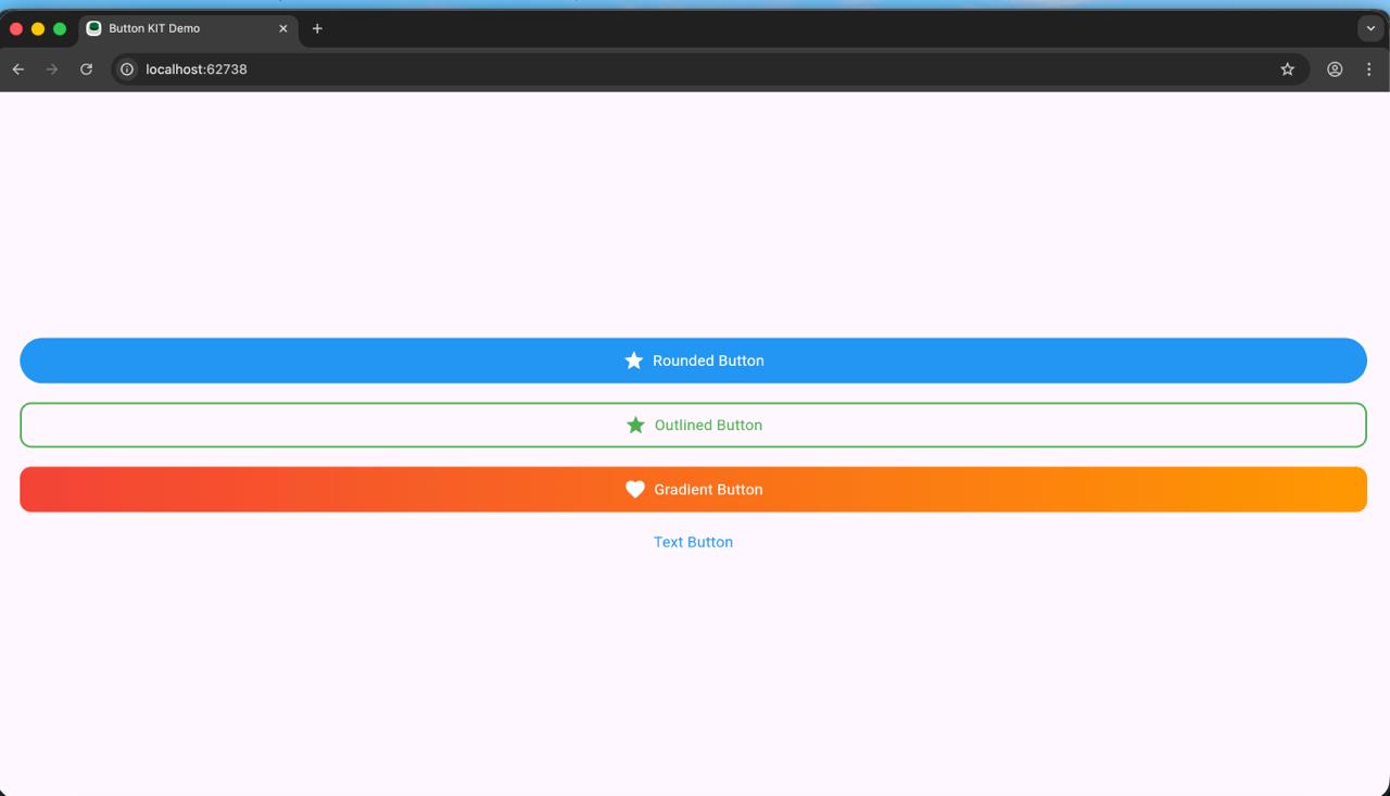
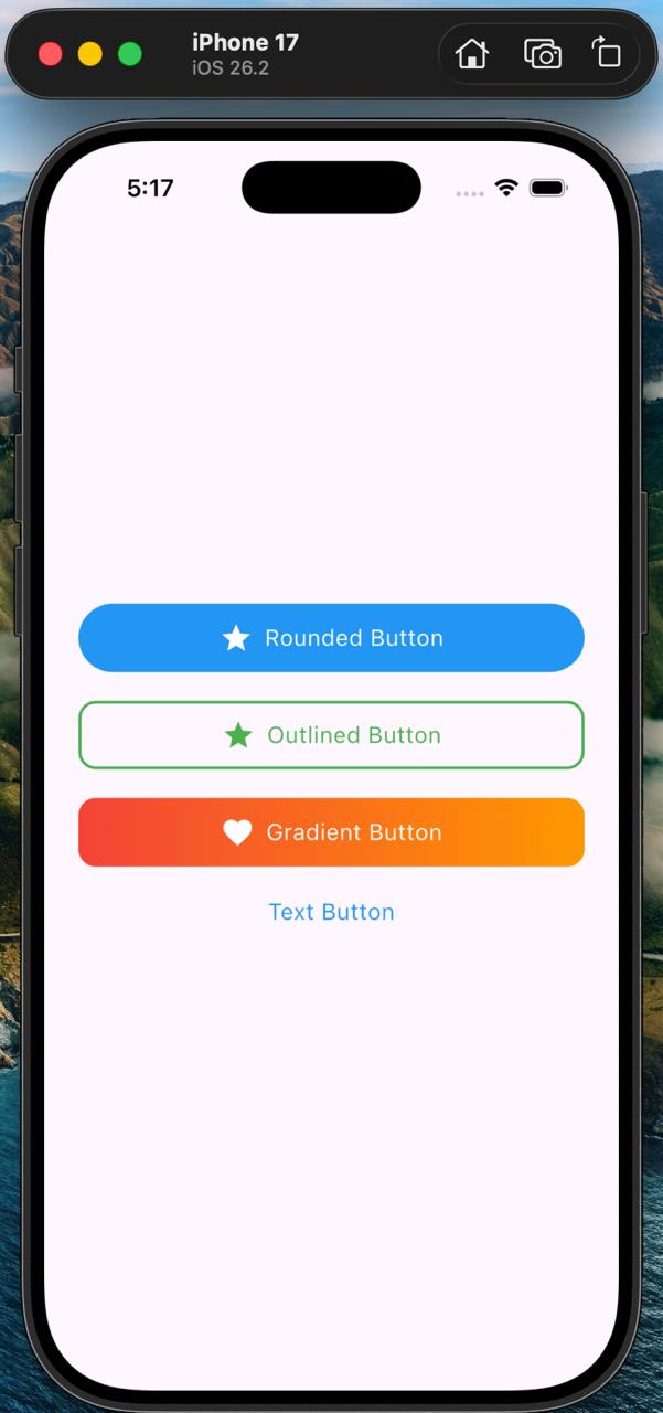
  - Rounded Button
  - Outlined Button
  - Gradient Button
  - Text Button
  - ButtonKit Button (single widget for all types)
  - Prefix Icons
  - Tap/Press animation (scale effect)
  - Long text handling with ellipsis
  - Custom colors, gradients, radius & sizes
✨ Features #
🟦 4 Ready-made buttons
  - RoundedButton
  - OutlinedBtn
  - GradientButton
  - SimpleTextButton
🎛 ButtonKit Widget #
One entry point → choose type using ButtonType
Clean & simple API
🎨 Highly customizable
  ->Colors
  ->Text styles
  ->Gradient colors
  ->Border colors
  ->Radius, height, padding
  ->🖼 Prefix icon supported
  ->Asset image
  ->Icon widget
🔥 Built-in press animation #
- Smooth scale effect on tap
📱 Auto text handling #
-
Supports long text
-
Truncates with ellipsis
-
Icon + text stays centered
📥 Installation #
Add this to your pubspec.yaml:
  dependencies:
  button_kit: ^1.0.0
Import in your file:
import 'package:button_kit/button_kit.dart';
🚀 Usage #
🔥 Universal Button (Recommended)
Use one single widget for all button types:
  ButtonKit(
  type: ButtonType.rounded,
  title: "Click Me",
  prefixIcon: Icon(Icons.touch_app, color: Colors.white),
  onTap: () {},
  );
Supported types: #
  enum ButtonType {
        rounded,
        outlined,
        gradient,
        text,
  }
💡 Example UI Page #
  class ButtonDemo extends StatelessWidget {
  const ButtonDemo({super.key});
  @override
  Widget build(BuildContext context) {
  return Scaffold(
  body: Center(
  child: Column(
  mainAxisAlignment: MainAxisAlignment.center,
  children: [

        ButtonKit(
          type: ButtonType.rounded,
          title: "Rounded Button",
          onTap: () {},
        ),

        const SizedBox(height: 20),

        ButtonKit(
          type: ButtonType.outlined,
          title: "Outlined Button",
          prefixIcon: Icon(Icons.star, color: Colors.blue),
          onTap: () {},
        ),

        const SizedBox(height: 20),

        ButtonKit(
          type: ButtonType.gradient,
          title: "Gradient Button",
          gradientColors: [Colors.purple, Colors.blue],
          prefixIcon: Icon(Icons.favorite, color: Colors.white),
          onTap: () {},
        ),

        const SizedBox(height: 20),

        ButtonKit(
          type: ButtonType.text,
          title: "Text Button",
          onTap: () {},
        ),
      ],
    ),
  ),
);
} }
⚙️ Customization Options #
     Property	    |    (Description)
     ===============================
     title:	           (Button text)
     prefixIcon:       (Widget)
     onTap:	           (Tap callback)
     color:	           (Solid color button)
     textColor:	       (Text color)
     borderColor:      (Border color)
     gradientColors:   (For gradient button)
     radius:           (Button corner radius)
     height:           (Button height)
🧩 Tap Animation #
All buttons use a PressEffect widget:
-
Press down → scales to 0.95
-
Release → scales back to 1.0
-
Smooth 120ms animation
📄 License #
MIT License Feel free to use in personal and commercial projects.
❤️ Support #
  If you like this package, please ⭐ star it on pub.dev and GitHub!
  Your encouragement helps this project grow and reach more developers.
☕ Buy Me a Coffee #
If this package has helped you or saved you development time, please consider supporting my open-source work.
Your support motivates me to continue improving this package and building more useful Flutter tools.
Metadata
Publisher
unverified uploader
Weekly Downloads
Metadata
A simple, beautiful, and customizable button library for Flutter.
Repository (GitHub)
View/report issues
Topics
#button #widget #ui #components #design
Documentation
License
 MIT (license)