built_tab_navigator 0.1.5  built_tab_navigator: ^0.1.5 copied to clipboard
Creates a Tab Style UI with Navigation capabilities.
built_tab_navigator #
Creates a Tab Style UI with Navigation capabilities.
This Plugin is intended to be used in conjuntion with built_value & built_collection since some of the API properties expect EnumClass objects.
💻 Installation #
In the dependencies: section of your pubspec.yaml, add the following line:
dependencies:
  built_tab_navigator: <latest version>
❔ Usage #
Import this class #
import 'package:built_tab_navigator/built_tab_navigator.dart';
Default Tav #
BuiltTabNavigator(
        tabs: {
          ExampleTabs.example1: TabRoutesDefinition(
            initialRoute: Example1Routes.root,
            routes: example1Routes,
            tabTitle: "Example 1",
            tabIcon: Icons.ac_unit,
          ),
          ExampleTabs.example2: TabRoutesDefinition(
            initialRoute: Example2Routes.root,
            routes: example2Routes,
            tabTitle: "Example 2",
            tabIcon: Icons.accessibility_new,
          ),
          ExampleTabs.example3: TabRoutesDefinition(
            initialRoute: Example2Routes.root,
            routes: example3Routes,
            tabTitle: "Example 3",
            tabIcon: Icons.adb,
          ),
        },
      )
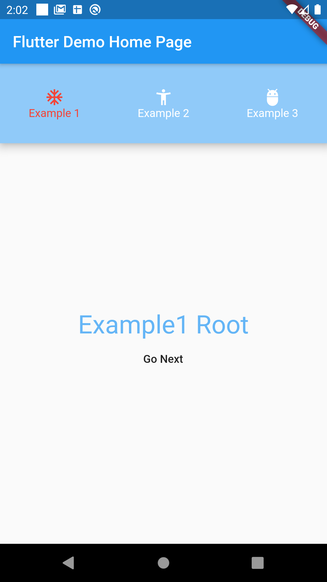
Try Custom Builders #
BuiltTabNavigator(
    iconBuilder: (context, tab, definition, selected) {
        return Container(
        padding: EdgeInsets.all(4),
        decoration: BoxDecoration(
            color: Colors.purple,
            borderRadius: BorderRadius.circular(20),
        ),
        child: Icon(definition.tabIcon, color: selected? Colors.white : Colors.black,),
        );
    },
    titleBuilder: (context, tab, definition, selected) {
        return Text(definition.tabTitle, style: TextStyle(fontSize: 20, color: selected? Colors.purple : Colors.grey),);
    },
    tabs: {
        ExampleTabs.example1: TabRoutesDefinition(
        initialRoute: Example1Routes.root,
        routes: example1Routes,
        tabTitle: "Example 1",
        tabIcon: Icons.ac_unit,
        ),
        ExampleTabs.example2: TabRoutesDefinition(
        initialRoute: Example2Routes.root,
        routes: example2Routes,
        tabTitle: "Example 2",
        tabIcon: Icons.accessibility_new,
        ),
        ExampleTabs.example3: TabRoutesDefinition(
        initialRoute: Example2Routes.root,
        routes: example3Routes,
        tabTitle: "Example 3",
        tabIcon: Icons.adb,
        ),
    },
)
Changing Layout is super easy! #
BuiltTabNavigator(
    activeTabColor: Colors.red,
    inactiveTabColor: Colors.white,
    bodyBuilder: (context, tabs, tabView) {
        return Column(
        children: <Widget>[
            Material(
            elevation: 9,
            color: Colors.blue[200],
            child: Container(
                height: 100,
                child: Row(
                children: tabs,
                ),
            ),
            ),
            Expanded(
            child: tabView,
            ),
        ],
        );
    },
    tabs: {
        ExampleTabs.example1: TabRoutesDefinition(
        initialRoute: Example1Routes.root,
        routes: example1Routes,
        tabTitle: "Example 1",
        tabIcon: Icons.ac_unit,
        ),
        ExampleTabs.example2: TabRoutesDefinition(
        initialRoute: Example2Routes.root,
        routes: example2Routes,
        tabTitle: "Example 2",
        tabIcon: Icons.accessibility_new,
        ),
        ExampleTabs.example3: TabRoutesDefinition(
        initialRoute: Example2Routes.root,
        routes: example3Routes,
        tabTitle: "Example 3",
        tabIcon: Icons.adb,
        ),
    },
)
Available API Options #
  /// Defines [Color] used for the tab [title] and [icon] when [tab] is active
  final Color activeTabColor;

  /// Defines [Color] used for the tab [title] and [icon] when [tab] is inactive
  final Color inactiveTabColor;

  /// Defines a tap handler when a [tab]
  final Function(T) tabTap;

  /// Builds a custom [title] [Widget]
  final Widget Function(
    BuildContext context,
    T tab,
    TabRoutesDefinition definition,
    bool isSelected,
  ) titleBuilder;

  /// Builds a custom [icon] [Widget]
  final Widget Function(
    BuildContext context,
    T tab,
    TabRoutesDefinition definition,
    bool isSelected,
  ) iconBuilder;

  /// Called everytime a route is being generated, it passes the actual [RouteSettings], the [T] tab who owns that navigator, and the actual route used to produce the page
  final Function(RouteSettings routeSettings, T tab, EnumClass route)
      onGenerateRoute;

  /// Set [activetab], if not defined will default to the firs [tab] key defined at [tabs]
  final T activeTab;

  /// Change defaults tab container background
  final Color tabContainerBackgroundColor;

  /// [didPop] navigationObserver callback
  final void Function(T tab, Route route, Route previousRoute) didPop;

  /// [didPush] navigationObserver callback
  final void Function(T tab, Route route, Route previousRoute) didPush;

  /// [didRemove] navigationObserver callback
  final void Function(T tab, Route route, Route previousRoute) didRemove;

  /// [didReplace] navigationObserver callback
  final void Function(T tab, Route newRoute, Route oldRoute) didReplace;
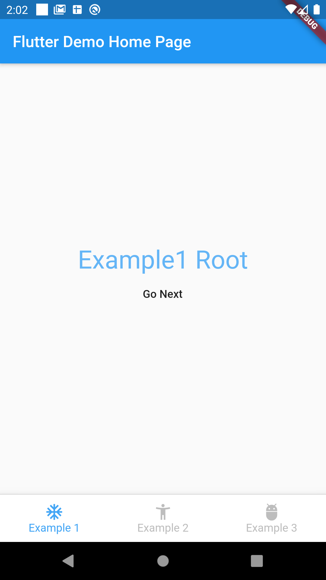
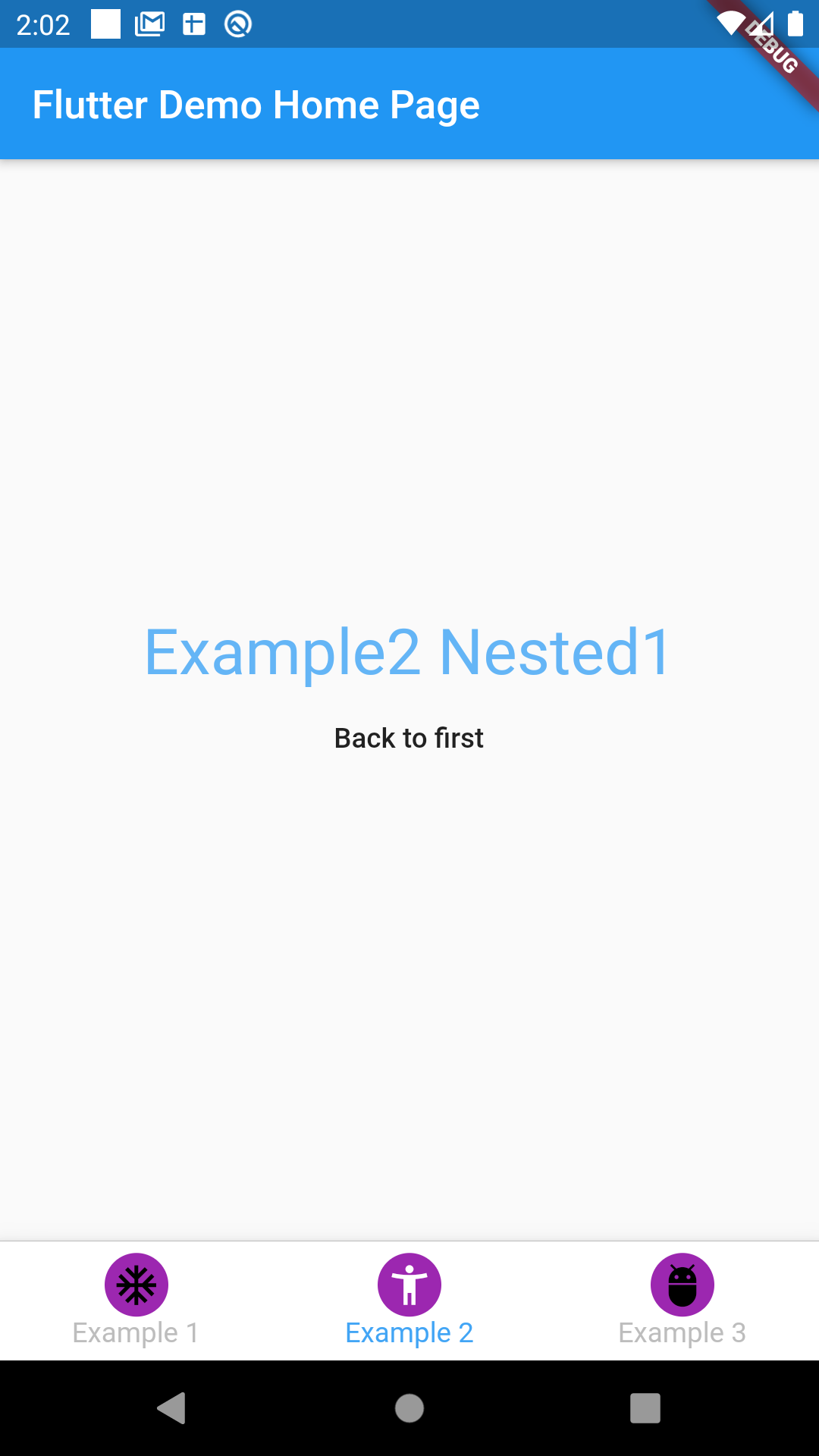
Screenshots #
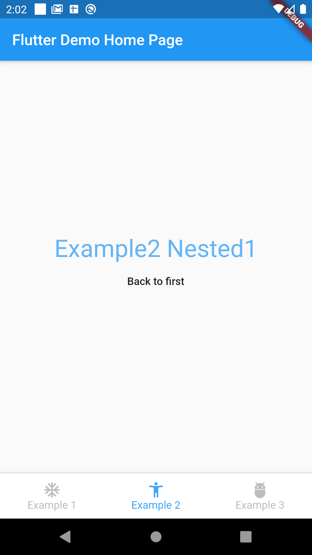
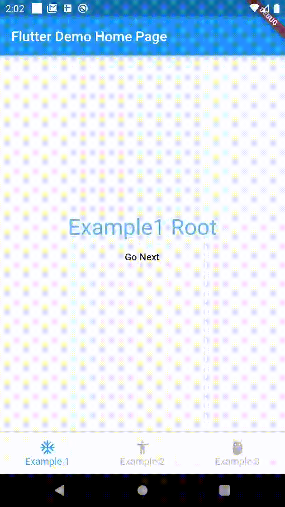
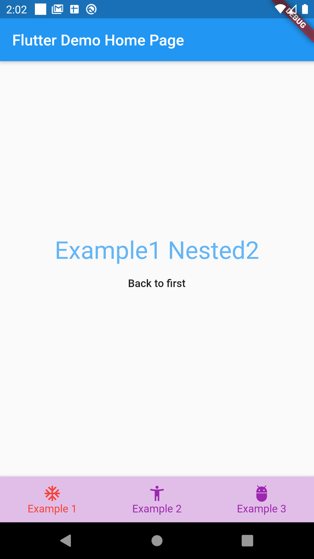
You can try the example
Getting Started #
This project is a starting point for a Dart package, a library module containing code that can be shared easily across multiple Flutter or Dart projects.
For help getting started with Flutter, view our online documentation, which offers tutorials, samples, guidance on mobile development, and a full API reference.
Metadata
Publisher
unverified uploader
Weekly Downloads
Metadata
Creates a Tab Style UI with Navigation capabilities.
Repository (GitHub)
View/report issues
License
 unknown (license)
Dependencies
built_collection, built_value, flutter