
awesome_stepper 1.1.0  awesome_stepper: ^1.1.0 copied to clipboard
Published 11 days ago •  monsware.com
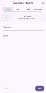
Beautiful, customizable Flutter stepper with animated progress headers, step validation, a controller and foldable-ready large-screen layout.
1.1.0 #
- Every public member is documented (
public_member_api_docsis on), so hovering any field or method in your IDE says what it does. - Vertical stepper:
layout: AwesomeStepperLayout.verticallists every step and opens the active one in place. AwesomeStepIndicator: the step progress indicator on its own (circle, bar, dots, numbered), without pages or buttons. Easy move fromstep_progress_indicator.- Optional steps:
AwesomeStepperItem(optional: true)shows a Skip button (skipLabel). - Line styles:
lineStyle: solid / dotted / dashedfor numbered and vertical steps. - Transitions:
transition: slide / fade / scale / none. - Completed screen:
completedBuildershows a summary after the last step;controller.back()returns. - State restoration:
restorationIdkeeps the active step when the app is killed and reopened. - Theme:
AwesomeStepperTheme(aThemeExtension) sets colors, text styles and button height app-wide. allowHeaderJump: turn off jumping forward from the header (going back still works).- A
canContinuethat throws (e.g. a failed request) counts as "not valid" and is reported; the buttons no longer stay disabled. AwesomeStepIndicator: followstotalStepschanges,semanticsLabelfor your language.- Enter in a multi-line text field types a new line instead of moving to the next step.
- Dots on tablets: from 600 px the dots header becomes full-width segments with step names you can tap.
- Enter goes to the next step on web, desktop and hardware keyboards.
- Fixed: self-sized pages (for example a
Columnform) were centered vertically; they now start at the top. - Fixed: on wide windows (tablets, desktop, open foldables) the
baranddotsheaders were replaced by the side list. They now look the same at every width; onlycircleandnumberedturn into the side list. - Fixed: the
numberedheader measured the screen instead of its own width, so it could overflow inside a pane. - Tablet layout: the page, the buttons and the header content stay in a centered 720 px column (
contentMaxWidth) instead of stretching edge to edge. Phones are unchanged. - New logo.
1.0.0 #
- New design: Material 3 colors from the theme, dark mode, sliding pages, cross-fading title, rounded progress.
- Header styles:
circle(classic, default),bar,dots,numbered. canContinueper step (sync or async) for form validation; error state on failure.- Step states: completed, error, locked (
enabled: falsesteps are skipped). AwesomeStepperController:next(),back(),jumpTo(),currentStep.onCompleted, Finish label on the last step, Back disabled on the first.- Side-by-side layout from 840 px; follows the vertical fold on foldables.
- Accessibility: screen reader step announcements, 48 px buttons, RTL, arrow keys, swipe, haptics.
- Translatable labels:
nextLabel,backLabel,finishLabel,semanticsLabel. - Dart 3 (SDK
^3.8.0); no dependencies besides Flutter (mobx removed). - Fixed: crash on Next at the last step / Back at the first step; crash when disposed during the intro animation.
0.2.0 (not published, merged into 1.0.0) #
- Dart 3 / current Flutter support (SDK
^3.8.0). - Removed the
mobx,flutter_mobxandmobx_codegendependencies; the package has no dependencies besides Flutter now. - Fixed a crash when tapping Next on the last step or Back on the first step.
- Fixed a crash when the stepper is disposed before its first progress animation.
onStepChangedis nowValueChanged<int>,controlBuilderreceivesVoidCallbacks.AwesomeStepperItemisconst.- Added widget tests; homepage moved to monsware.com.
0.0.1 #
- First initial release
0.0.2 #
- Web Support added
0.0.3 #
- Documents Added
0.1.0 #
- Documents updated
0.1.2 #
- document text added
0.1.3 #
- project formatted
Metadata
63
likes
160
points
178
downloads

Documentation
Publisher
Weekly Downloads
Metadata
Beautiful, customizable Flutter stepper with animated progress headers, step validation, a controller and foldable-ready large-screen layout.
Homepage
Repository (GitHub)
View/report issues
Topics
#stepper #wizard #onboarding #widget
License
 BSD-3-Clause (license)