arc_progress_ring 1.0.1  arc_progress_ring: ^1.0.1 copied to clipboard
 thesanaullah.dev
A highly customizable circular progress indicator with milestone markers, glassmorphic effects, and smooth animations for Flutter.
Arc Progress Ring #
A highly customizable circular progress indicator with milestone markers, glassmorphic effects, and smooth animations for Flutter.


✨ Features #
- 🎯 Circular arc progress with customizable gap
- 🏆 Milestone markers positioned on the arc
- 🪟 Glassmorphic effect with blur and transparency
- 🎨 Fully customizable colors, sizes, and styles
- ⚡ Smooth animations for progress and milestone transitions
- 📱 Responsive design adapts to any container size
- 🎰 Center content slot for any custom widget
- 🔧 Bottom widget slot for chips, buttons, etc.
- 📦 Zero dependencies (only Flutter SDK)
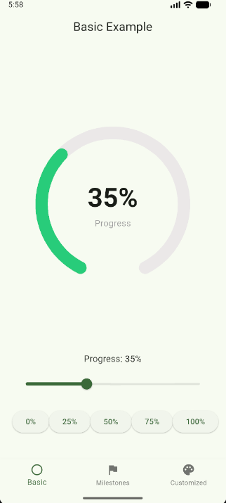
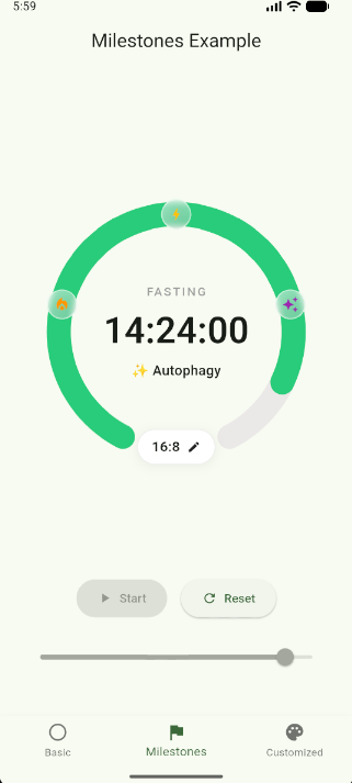
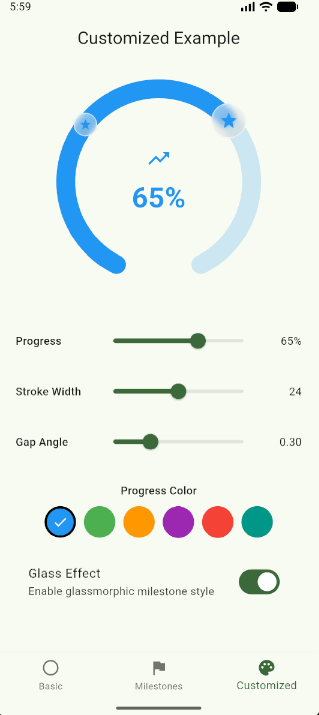
📸 Screenshots #
| Basic | With Milestones | Customized |
|---|---|---|
 |
 |
 |
🚀 Installation #
Add to your pubspec.yaml:
dependencies:
  arc_progress_ring: ^1.0.0
Then run:
flutter pub get
📖 Usage #
Import
import 'package:arc_progress_ring/arc_progress_ring.dart';
Basic Usage
ArcProgressRing(
  progress: 0.65,
  size: 250,
)
With Center Content
ArcProgressRing(
  progress: 0.65,
  size: 250,
  centerBuilder: (context, progress) {
    return Column(
      mainAxisSize: MainAxisSize.min,
      children: [
        Text(
          '${(progress * 100).toInt()}%',
          style: TextStyle(fontSize: 40, fontWeight: FontWeight.bold),
        ),
        Text('Complete', style: TextStyle(color: Colors.grey)),
      ],
    );
  },
)
With Milestones
ArcProgressRing(
  progress: 0.65,
  size: 300,
  milestones: [
    Milestone(
      position: 0.25,
      icon: Icon(Icons.local_fire_department, color: Colors.orange),
      label: 'Fat Burn',
    ),
    Milestone(
      position: 0.50,
      icon: Icon(Icons.bolt, color: Colors.amber),
      label: 'Ketosis',
    ),
    Milestone(
      position: 0.75,
      icon: Icon(Icons.auto_awesome, color: Colors.purple),
      label: 'Autophagy',
    ),
  ],
  milestoneStyle: MilestoneStyle(
    activeSize: 55,
    inactiveSize: 35,
    enableGlassEffect: true,
  ),
  centerBuilder: (context, progress) {
    return Text('${(progress * 100).toInt()}%');
  },
)
With Bottom Widget
ArcProgressRing(
  progress: 0.65,
  size: 250,
  centerBuilder: (context, progress) => Text('${(progress * 100).toInt()}%'),
  bottomWidget: Container(
    padding: EdgeInsets.symmetric(horizontal: 16, vertical: 8),
    decoration: BoxDecoration(
      color: Colors.white,
      borderRadius: BorderRadius.circular(50),
      border: Border.all(color: Colors.grey.shade300),
    ),
    child: Row(
      mainAxisSize: MainAxisSize.min,
      children: [
        Text('16:8', style: TextStyle(fontWeight: FontWeight.w600)),
        SizedBox(width: 8),
        Icon(Icons.edit, size: 16),
      ],
    ),
  ),
)
With Gradient Progress
ArcProgressRing(
  progress: 0.65,
  size: 250,
  progressGradient: LinearGradient(
    colors: [Colors.blue, Colors.purple, Colors.pink],
  ),
)
Fully Customized
ArcProgressRing(
  progress: 0.65,
  size: 300,
  strokeWidth: 28,
  gapAngle: 0.4 * 3.14159,
  backgroundColor: Color(0xFFEBE8E8),
  progressColor: Color(0xFF28CC7A),
  strokeCap: StrokeCap.round,
  animationDuration: Duration(milliseconds: 500),
  animationCurve: Curves.easeOutCubic,
  milestones: [
    Milestone(position: 0.33, icon: Icon(Icons.star)),
    Milestone(position: 0.66, icon: Icon(Icons.star)),
  ],
  milestoneStyle: MilestoneStyle(
    activeSize: 50,
    inactiveSize: 30,
    enableGlassEffect: true,
    blurSigma: 4,
    borderWidth: 1.5,
    iconScale: 0.55,
    animationDuration: Duration(milliseconds: 300),
    animationCurve: Curves.easeOutCubic,
  ),
  centerBuilder: (context, progress) {
    return Text('${(progress * 100).toInt()}%');
  },
  bottomWidget: Text('Custom Widget'),
)
⚙️ Properties #
ArcProgressRing
| Property | Type | Default | Description |
|---|---|---|---|
| progress | double | required | Progress value from 0.0 to 1.0 |
| size | double? | null | Size of the ring. If null, adapts to parent |
| strokeWidth | double? | 8% of size | Width of the arc stroke |
| gapAngle | double | π × 0.3 | Gap angle at bottom in radians |
| backgroundColor | Color | #EBE8E8 | Background arc color |
| progressColor | Color | #28CC7A | Progress arc color |
| progressGradient | Gradient? | null | Optional gradient for progress arc |
| strokeCap | StrokeCap | round | Style of arc ends |
| animationDuration | Duration | 300ms | Animation duration for progress |
| animationCurve | Curve | easeOutCubic | Animation curve |
| milestones | List<Milestone>? | null | List of milestone markers |
| milestoneStyle | MilestoneStyle? | null | Style config for milestones |
| centerBuilder | Widget Function(BuildContext, double)? | null | Builder for center content |
| bottomWidget | Widget? | null | Widget at the bottom of ring |
Milestone
| Property | Type | Default | Description |
|---|---|---|---|
| position | double | required | Position on arc from 0.0 to 1.0 |
| icon | Widget | required | Widget to display (Icon, Image, etc.) |
| label | String? | null | Optional label |
| onTap | VoidCallback? | null | Optional tap callback |
MilestoneStyle
| Property | Type | Default | Description |
|---|---|---|---|
| activeSize | double | 50 | Size when milestone is next target |
| inactiveSize | double | 30 | Size when passed or upcoming |
| enableGlassEffect | bool | true | Enable glassmorphic blur effect |
| blurSigma | double | 4 | Blur intensity |
| backgroundColor | Color? | null | Background color of container |
| borderColor | Color? | null | Border color of container |
| borderWidth | double | 1.5 | Border width |
| animationDuration | Duration | 300ms | Animation duration for size |
| animationCurve | Curve | easeOutCubic | Animation curve |
| iconScale | double | 0.55 | Icon scale relative to container |
💡 Use Cases #
- ⏱️ Fasting trackers — Track fasting progress with stages
- 🏋️ Fitness apps — Display workout completion
- 📊 Goal trackers — Visualize goal progress
- 🧘 Meditation apps — Show session progress
- 📚 Learning apps — Display course completion
- ⏰ Timer displays — Circular countdown timers
- 🎮 Gaming — Achievement progress rings
- 📈 Dashboards — KPI and metric displays
🧮 Math Behind Positioning #
Icons are positioned on the arc using trigonometry:
// Position calculation
x = center + radius × cos(angle)
y = center + radius × sin(angle)

// Angle calculation
angle = startAngle + (sweepAngle × position)
🎨 Customization Examples #
Fitness Theme
ArcProgressRing(
  progress: 0.75,
  size: 280,
  progressColor: Colors.orange,
  backgroundColor: Colors.orange.withOpacity(0.2),
  strokeWidth: 20,
  milestones: [
    Milestone(position: 0.25, icon: Icon(Icons.directions_walk, color: Colors.orange)),
    Milestone(position: 0.50, icon: Icon(Icons.directions_run, color: Colors.orange)),
    Milestone(position: 0.75, icon: Icon(Icons.emoji_events, color: Colors.orange)),
  ],
  centerBuilder: (context, progress) {
    return Column(
      mainAxisSize: MainAxisSize.min,
      children: [
        Text('${(progress * 10000).toInt()}', style: TextStyle(fontSize: 36, fontWeight: FontWeight.bold)),
        Text('steps', style: TextStyle(color: Colors.grey)),
      ],
    );
  },
)
Meditation Theme
ArcProgressRing(
  progress: 0.6,
  size: 260,
  progressGradient: LinearGradient(
    colors: [Colors.purple.shade300, Colors.blue.shade300],
  ),
  backgroundColor: Colors.grey.shade200,
  strokeWidth: 16,
  gapAngle: 0.5 * 3.14159,
  centerBuilder: (context, progress) {
    final minutes = (progress * 30).toInt();
    return Column(
      mainAxisSize: MainAxisSize.min,
      children: [
        Icon(Icons.self_improvement, size: 40, color: Colors.purple),
        SizedBox(height: 8),
        Text('$minutes min', style: TextStyle(fontSize: 28, fontWeight: FontWeight.w600)),
      ],
    );
  },
)
Dark Theme
ArcProgressRing(
  progress: 0.8,
  size: 300,
  progressColor: Colors.cyan,
  backgroundColor: Colors.grey.shade800,
  strokeWidth: 24,
  milestones: [
    Milestone(position: 0.33, icon: Icon(Icons.star, color: Colors.cyan)),
    Milestone(position: 0.66, icon: Icon(Icons.star, color: Colors.cyan)),
  ],
  milestoneStyle: MilestoneStyle(
    enableGlassEffect: true,
    backgroundColor: Colors.grey.shade900.withOpacity(0.5),
    borderColor: Colors.cyan.withOpacity(0.5),
  ),
  centerBuilder: (context, progress) {
    return Text(
      '${(progress * 100).toInt()}%',
      style: TextStyle(fontSize: 48, fontWeight: FontWeight.bold, color: Colors.white),
    );
  },
)
🔧 Advanced Usage #
Animated Progress Updates
class MyWidget extends StatefulWidget {
  @override
  _MyWidgetState createState() => _MyWidgetState();
}

class _MyWidgetState extends State<MyWidget> {
  double _progress = 0.0;

  void _updateProgress(double value) {
    setState(() => _progress = value);
  }

  @override
  Widget build(BuildContext context) {
    return ArcProgressRing(
      progress: _progress,
      size: 250,
      animationDuration: Duration(milliseconds: 500),
      animationCurve: Curves.easeInOut,
    );
  }
}
Responsive Sizing
// Adapts to parent container
SizedBox(
  width: MediaQuery.of(context).size.width * 0.8,
  height: MediaQuery.of(context).size.width * 0.8,
  child: ArcProgressRing(
    progress: 0.65,
    // size is null, so it adapts to parent
  ),
)
Custom Milestone Icons
ArcProgressRing(
  progress: 0.5,
  size: 280,
  milestones: [
    Milestone(
      position: 0.25,
      icon: Image.asset('assets/icons/fire.png', width: 24, height: 24),
    ),
    Milestone(
      position: 0.50,
      icon: Image.network('https://example.com/icon.png', width: 24, height: 24),
    ),
    Milestone(
      position: 0.75,
      icon: Container(
        padding: EdgeInsets.all(4),
        decoration: BoxDecoration(
          color: Colors.amber,
          shape: BoxShape.circle,
        ),
        child: Text('3', style: TextStyle(fontWeight: FontWeight.bold)),
      ),
    ),
  ],
)
🤝 Contributing #
Contributions are welcome! Please feel free to submit a Pull Request.
How to Contribute #
- Fork the repository
- Create your feature branch
git checkout -b feature/amazing - Commit your changes
git commit -m 'Add amazing feature' - Push to the branch
git push origin feature/amazing - Open a Pull Request
Development Setup #
# Clone the repo
git clone https://github.com/Sanaullah49/arc_progress_ring.git
cd arc_progress_ring

# Get dependencies
flutter pub get

# Run tests
flutter test

# Run example app
cd example
flutter run
🐛 Issues #
Found a bug or have a feature request? Please open an issue on GitHub.
When reporting bugs, please include:
- Flutter version (
flutter --version) - Package version
- Minimal code to reproduce the issue
- Expected vs actual behavior
👨💻 Author #
Sana Ullah
- GitHub: @Sanaullah49
- LinkedIn: sanaullah49
- Email: connectsanaullah@gmail.com
- pub.dev:
arc_progress_ring
🙏 Acknowledgments #
- Inspired by modern fitness and health tracking apps
- Thanks to the Flutter community for feedback and suggestions
If this package helped you, please:
- ⭐ Give it a star on GitHub
- 👍 Give it a like on pub.dev
- 🔄 Share it with other Flutter developers
Made with ❤️ by Sana Ullah
Metadata
Publisher
Weekly Downloads
Metadata
A highly customizable circular progress indicator with milestone markers, glassmorphic effects, and smooth animations for Flutter.
Repository (GitHub)
View/report issues
Documentation
License
 MIT (license)