app_snackbar 1.0.3  app_snackbar: ^1.0.3 copied to clipboard
Beautiful, customizable Flutter SnackBar with 4 types, animations, queue, timer bar, action buttons, loading states, and Material 3 support.
app_snackbar #

A beautiful, fully customizable Flutter SnackBar utility with 4 types, action buttons, loading states, queue support, slide/fade animations, top/bottom positioning, countdown timer bar, and global Material 3 theme override.
Demo #
https://github.com/user-attachments/assets/f18edc5d-7538-4c7c-a588-a3fffa58d59f
Screenshots #
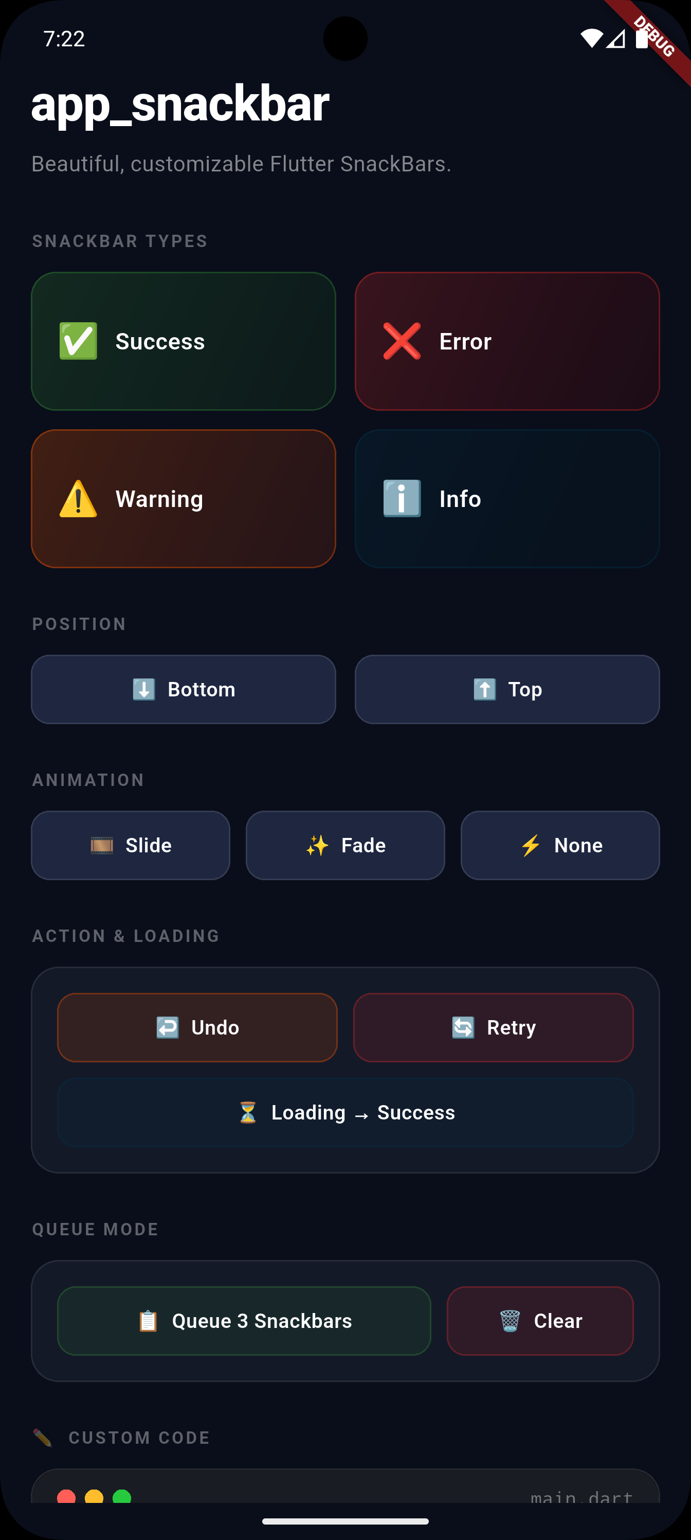
Features #
| Feature | Description |
|---|---|
| 4 types | success 🟢 error 🔴 warning 🟠 info 🔵 |
| Action button | Undo, Retry, View — inline chip |
| Loading | Spinner for async operations |
| Queue | Show one after another |
| Animations | Slide, Fade, or None |
| Position | Top or Bottom |
| Timer bar | Countdown progress bar with custom color |
| Duration control | Per-call or global theme default |
| messengerKey | Visible above bottom sheets |
| Global theme | Override colors, icons, fonts app-wide |
| Per-call overrides | backgroundColor, textStyle, fontSize, borderRadius, elevation |
| Custom widgets | Custom leading & trailing |
| Material 3 | Flutter 3.16+ ready |
Installation #
dependencies:
  app_snackbar: ^1.0.3
import 'package:app_snackbar/app_snackbar.dart';
Setup #
Add scaffoldMessengerKey to your MaterialApp — required for queue and above-bottom-sheet support:
final rootMessengerKey = GlobalKey<ScaffoldMessengerState>();

void main() {
  AppSnackBar.messengerKey = rootMessengerKey; // ✅ register once

  AppSnackBar.theme = const AppSnackBarTheme(  // ✅ optional global theme
    infoColor: Color(0xFF003249),
    defaultAnimation: SnackBarAnimation.fade,
    defaultDuration: Duration(seconds: 4),     // ✅ global duration
    showTimer: true,                            // ✅ enable timer globally
  );

  runApp(MyApp());
}

MaterialApp(
  scaffoldMessengerKey: rootMessengerKey, // ✅ required
  ...
)
Usage #
Basic Types #
AppSnackBar.success(context, 'Profile updated!');
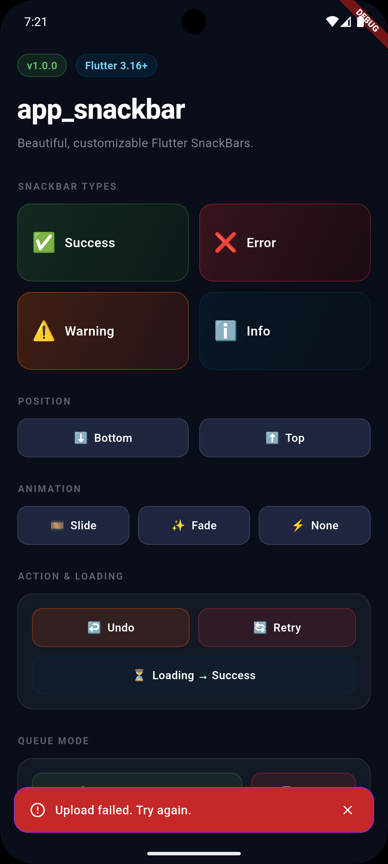
AppSnackBar.error(context, 'Upload failed. Try again.');
AppSnackBar.warning(context, 'Download cancelled.');
AppSnackBar.info(context, 'New version available.');
Position #
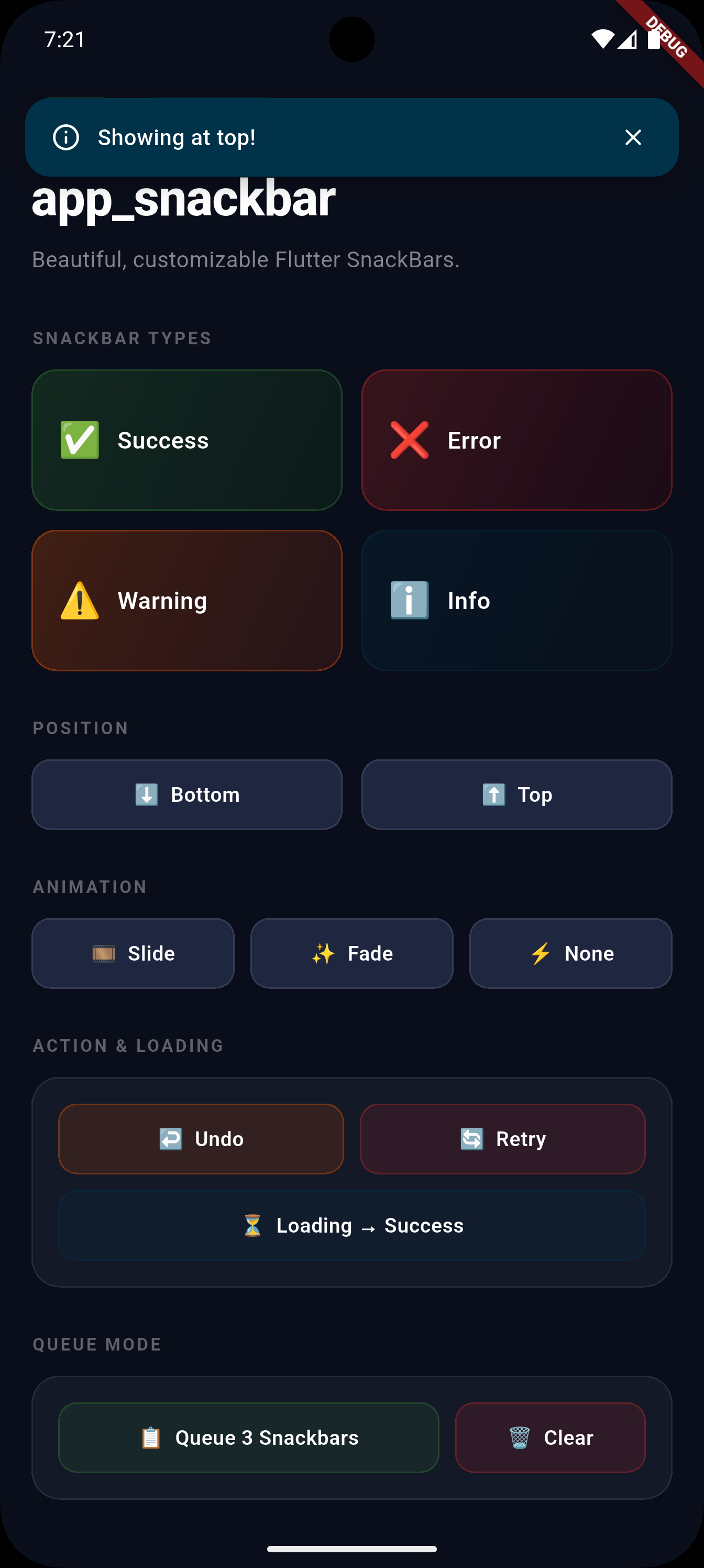
AppSnackBar.success(context, 'Top!',
    position: SnackBarPosition.top);      // ⬆️

AppSnackBar.error(context, 'Bottom!',
    position: SnackBarPosition.bottom);   // ⬇️ default
Animation #
AppSnackBar.info(context, 'Slide in!',
    animation: SnackBarAnimation.slide);  // default

AppSnackBar.info(context, 'Fade in!',
    animation: SnackBarAnimation.fade);

AppSnackBar.info(context, 'Instant!',
    animation: SnackBarAnimation.none);
Duration #
// Per-call duration:
AppSnackBar.success(context, 'Saved!',
    duration: const Duration(seconds: 5));

// Global default via theme (set once in main):
AppSnackBar.theme = const AppSnackBarTheme(
  defaultDuration: Duration(seconds: 4),
);

// Priority: per-call → theme default → built-in default (3s)
Timer Bar #
// Per-call:
AppSnackBar.success(context, 'Saved!',
    showTimer: true);

// With custom color:
AppSnackBar.error(context, 'Failed!',
    showTimer: true,
    timerColor: Colors.redAccent);

// Enable globally via theme:
AppSnackBar.theme = const AppSnackBarTheme(
  showTimer: true,
  timerColor: Colors.white70,
);
With Action Button #
AppSnackBar.showWithAction(
  context,
  'Message deleted.',
  actionLabel: 'Undo',
  type: SnackBarType.warning,
  onAction: () => _restoreMessage(),
);
Loading Snackbar #
AppSnackBar.showLoading(context, 'Uploading photo...');

// Later, replace with result:
AppSnackBar.success(context, 'Upload complete!');

// Or just hide:
AppSnackBar.hide(context);
Queue Mode #
AppSnackBar.useQueue = true;  // enable once

AppSnackBar.success(null, 'Step 1: Data saved ✅');
AppSnackBar.info(null, 'Step 2: Syncing...');
AppSnackBar.success(null, 'Step 3: All done! 🎉');
// Each appears after the previous finishes ✅

AppSnackBar.clearQueue(); // cancel all pending
Above Bottom Sheet #
// Set messengerKey (see Setup above), then:
showModalBottomSheet(context: context, builder: (_) => Column(
  children: [
    ElevatedButton(
      // Pass null — uses messengerKey — shows ABOVE the sheet ✅
      onPressed: () => AppSnackBar.success(null, 'Visible!'),
      child: Text('Show'),
    ),
  ],
));
Per-call Overrides #
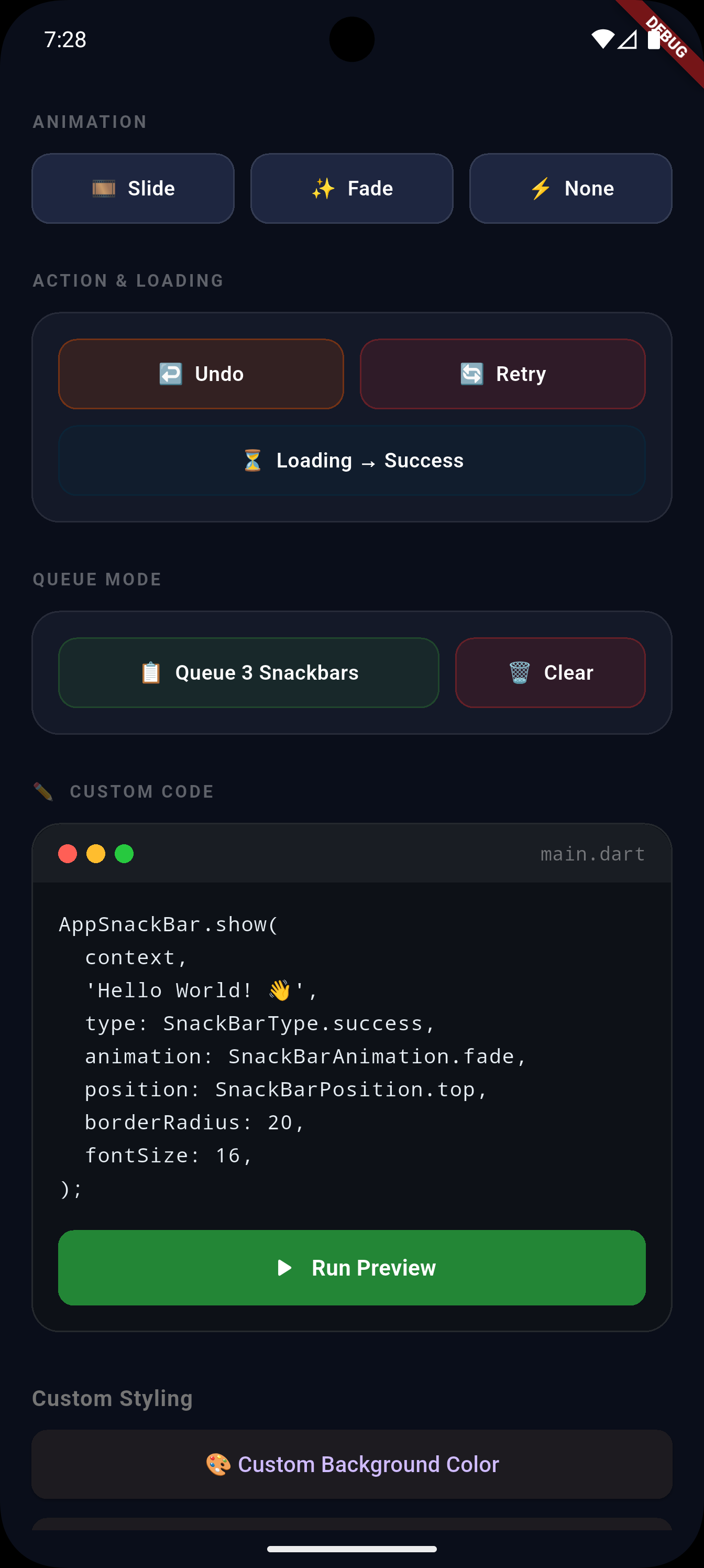
AppSnackBar.show(
  context,
  'Fully custom!',
  type: SnackBarType.error,
  backgroundColor: Colors.deepPurple,   // custom color
  fontSize: 16,                          // bigger text
  borderRadius: 8,                       // sharper corners
  elevation: 12,                         // deeper shadow
  duration: const Duration(seconds: 5),  // custom duration
  position: SnackBarPosition.top,
  animation: SnackBarAnimation.fade,
  showClose: true,
  showTimer: true,                       // countdown bar
  timerColor: Colors.white54,            // timer bar color
  onClose: () => debugPrint('Dismissed'),
);
Custom Leading / Trailing #
// Custom avatar
AppSnackBar.show(context, 'New message from Ali',
  leading: CircleAvatar(radius: 14, child: Text('A')),
);

// Custom action button
AppSnackBar.show(context, 'File ready',
  showClose: false,
  trailing: TextButton(
    onPressed: () => _openFile(),
    child: Text('Open', style: TextStyle(color: Colors.white)),
  ),
);
Global Theme Override #
AppSnackBar.theme = const AppSnackBarTheme(
  // Colors
  successColor: Colors.teal,
  errorColor: Color(0xFFC62828),
  warningColor: Colors.deepOrange,
  infoColor: Color(0xFF003249),

  // Icons
  successIcon: Icons.done_all_rounded,
  errorIcon: Icons.cancel_outlined,

  // Typography
  fontSize: 15,
  textStyle: TextStyle(fontWeight: FontWeight.w600, color: Colors.white),

  // Shape
  borderRadius: 12,
  elevation: 8,

  // Animation
  defaultAnimation: SnackBarAnimation.fade,
  animationDuration: Duration(milliseconds: 250),

  // Duration & Timer
  defaultDuration: Duration(seconds: 4),
  showTimer: true,
  timerColor: Colors.white60,
);
API Reference #
AppSnackBar #
| Method | Description |
|---|---|
success(ctx, msg) |
✅ Green snackbar |
error(ctx, msg) |
❌ Red snackbar |
warning(ctx, msg) |
⚠️ Orange snackbar |
info(ctx, msg) |
ℹ️ Brand-color snackbar |
show(ctx, msg, {...}) |
Full control |
showWithAction(...) |
Action chip (Undo, Retry) |
showLoading(ctx, msg) |
Spinner snackbar |
hide(ctx) |
Dismiss current |
clearQueue() |
Cancel all queued |
queueLength |
Pending queue count |
AppSnackBarTheme #
| Property | Type | Default |
|---|---|---|
successColor |
Color? |
#2E7D32 🟢 |
errorColor |
Color? |
#C62828 🔴 |
warningColor |
Color? |
#E65100 🟠 |
infoColor |
Color? |
#003249 🔵 |
*Icon |
IconData? |
material rounded icons |
textStyle |
TextStyle? |
null |
fontSize |
double |
14 |
borderRadius |
double |
16 |
elevation |
double |
6 |
defaultAnimation |
SnackBarAnimation |
.slide |
animationDuration |
Duration |
300ms |
defaultDuration |
Duration? |
null (3s fallback) |
showTimer |
bool |
false |
timerColor |
Color? |
Colors.white54 |
Per-call Parameters #
| Parameter | Type | Description |
|---|---|---|
type |
SnackBarType |
Snackbar style |
position |
SnackBarPosition |
Top or bottom |
animation |
SnackBarAnimation |
Entrance animation |
duration |
Duration? |
How long to show |
backgroundColor |
Color? |
Custom background |
fontSize |
double? |
Text size override |
textStyle |
TextStyle? |
Full text style override |
borderRadius |
double? |
Corner radius |
elevation |
double? |
Shadow depth |
showClose |
bool |
Show close button |
showTimer |
bool? |
Show countdown bar |
timerColor |
Color? |
Timer bar color |
leading |
Widget? |
Custom leading widget |
trailing |
Widget? |
Custom trailing widget |
onClose |
VoidCallback? |
On dismiss callback |
Enums #
| Enum | Values |
|---|---|
SnackBarType |
success, error, warning, info |
SnackBarPosition |
bottom, top |
SnackBarAnimation |
slide, fade, none |
License #
MIT — see LICENSE
Metadata

Publisher
unverified uploader
Weekly Downloads
Metadata
Beautiful, customizable Flutter SnackBar with 4 types, animations, queue, timer bar, action buttons, loading states, and Material 3 support.
Repository (GitHub)
View/report issues
Topics
#snackbar #ui #notification #material #overlay
Documentation
License
 MIT (license)