animated_digit 3.3.1  animated_digit: ^3.3.1 copied to clipboard
A scroll numbers animation widget, any number that need scroll animation effects and easy to use.


English | 中文简体
animated_digit #
Scroll animation numbers widget, any number that need animation effects and easy to use.
Usage #
🚴🏻 Easy Show
// only show
AnimatedDigitWidget(
  value: 9999
),
🚄 Easy Show & State
// simple state control
int value = 9999;
AnimatedDigitWidget(
  value: value
  textStyle: TextStyle(color: Colors.pink),
),
setState((){
  value = 191919;
});
🎡 Controller
Built-in accuracy calculation
AnimatedDigitController _controller = AnimatedDigitController(10240.987);

AnimatedDigitWidget(
  controller: _controller,
  textStyle: TextStyle(color: Colors.pink),
  fractionDigits: 2, // number of decimal places reserved, not rounded
  enableSeparator: true, // like this 10,240.98
),
// UI Result => 10,240.98

// increment
_controller.addValue(1314);

// minus
_controller.minusValue(1314); // from v3.1.0 added

// times
_controller.timesValue(1314); // from v3.1.0 added

// divide
_controller.divideValue(1314); // from v3.1.0 added

// reset
_controller.resetValue(1314);

// last
_controller.dispose();
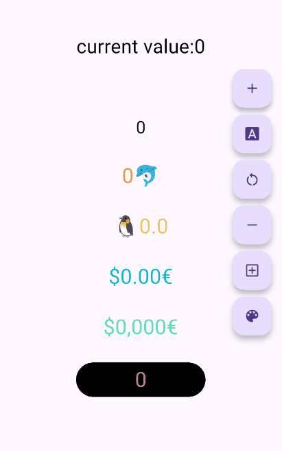
🖼 UI Effect Image & 💻 Code Example #
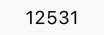
AnimatedDigitWidget(
  value: 12531.98, // or use controller
),
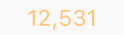
AnimatedDigitWidget(
  value: 12531.98, // or use controller
  enableSeparator: true,
),

AnimatedDigitWidget(
  value: 12531.98, // or use controller
  fractionDigits: 2,
  enableSeparator: true,
),

SingleDigitProvider(
  data: SingleDigitData(
    useTextSize: true,
    builder: (size, value, isNumber, child) {
      return isNumber ? child : FlutterLogo();
    },
  ),
  child: AnimatedDigitWidget(
    value: 12531.98, // or use controller
    textStyle: TextStyle(color: Colors.pink[200], fontSize: 30),
    separateLength: 1,
    separateSymbol: "#",
    enableSeparator: true,
  ),
),

AnimatedDigitWidget(
  value: 12531.98, // or use controller
  textStyle: TextStyle(color: Colors.orangeAccent.shade700, fontSize: 30),
  fractionDigits: 2,
  enableSeparator: true,
  separateSymbol: "·",
  separateLength: 3,
  decimalSeparator: ",",
  prefix: "\$",
  suffix: "€",
),
✌ If you want to change color based on value #
The add a ValueColor object to valueColors, which is an array, you can add more ...,but always take the last eligible
Since version v3.3.1, colors have supported animated transitions instead of abrupt direct color switching, eliminating harsh transitions.
int value = 9999; // or use Controller.value
AnimatedDigitWidget(
  value: value,
  textStyle: TextStyle(
    color: Colors.orange[200],
    fontSize: 30,
  ),
  valueColors: [
    ValueColor(
      //When value <= 0 , the color changes to red
      condition: () => value <= 0,
      color: Colors.red,
    ),
    // you can add more ...,but always take the last eligible.
  ],
),
Disable the initial scroll animation. #
AnimatedDigitWidget(
  ...,
  firstScrollAnimate: false // set false | >= v3.3.1
),
🐳 Widget Params & Documentation #
🚀 Required Params
⚠️
valueandcontrollercannot be bothnull. ⚠️controllerhas higher priority.
-
controller- digit controller, The displayed number can be controlled viaaddValueandresetValue. -
value- the display number.
🍑 TextStyle And BoxStyle Setting
textStyle- the numbers text style.boxDecoration- Use withdecorationofContainer.
🍇 Int Type(default) Or Decimal Type Setting
- fractionDigits - the fraction digits,
int, default0.- 🖌 Example (
1000520.98765): 0=>1000520;1=>1000520.9;2=>1000520.98;3=>1000520.987;N=>1000520.[N];
- 🖌 Example (
The default
0means an integer, when it is a decimal, if the value is less than thefractionDigits, it will be filled with0to the right, and the truncation method is used, so there is no rounding.
🍓 Numbers Free Style Setting
-
decimalSeparator- the decimal separator,can be replaced by other symbols in place of decimal separators, default.. -
enableSeparator- enable digit separator. defaultfalsenot enable, onlytrue,separateLengthandseparateSymbolvalid.- 🖌 Example (
true):1000520=>1,000,520(seealsoseparateLengthorseparateSymbol)
- 🖌 Example (
-
separateSymbol- the numbers separator symbol (only enableSeparator is true), make numbers much easier to read, default,.- 🖌 Example (
1000520): ,=>1,000,520'=>1'000'520-=>1-000-520
- 🖌 Example (
-
separateLength- the numbers separator length (only enableSeparator is true),separateSymbolby separator length insert, default3.- 🖌 Example (
1000520): 1=>1,0,0,0,5,2,02=>1,00,05,203=>1,000,520
- 🖌 Example (
🥝 Scroll Animation Setting
duration- the animate duration, default Duration(milliseconds: 300).curve- the animate curve, default Curves.easeInOut. look animate curve.loop- enable loop scroll animate. default true, always scroll down, not scroll up from 9 -> 0;false, scroll up and down.
🍎 Digital Size Scheme Setting
-
autoSize- the default true is to automatically expand and contract according to the size of the (number/symbol) itself, false, the text size of the number0is used as the container size of each number, which can ensure the same width, but it seems that there is a slight interval between1and other numbers 😊 . -
animateAutoSize- the animation resizing. defaulttrue,falsewill change directly to the size of the number/symbol.
🍒 Number prefix and suffix Setting
prefix- the text to display in front of the counter.suffix- the text to display after the counter.
Thanks #
Metadata
Publisher
unverified uploader
Weekly Downloads
Metadata
A scroll numbers animation widget, any number that need scroll animation effects and easy to use.
Repository (GitHub)
View/report issues
License
 unknown (license)