alive_picker 1.0.2  alive_picker: ^1.0.2 copied to clipboard
A beautiful, animated, and fully customizable date & time picker package for Flutter. Features stunning seasonal animations, smooth transitions, and multi-language support.
🎨 Alive Picker #


A beautiful, animated, and fully customizable date & time picker package for Flutter. Features stunning seasonal animations, smooth transitions, and multi-language support.
✨ Features #
| Feature | Description |
|---|---|
| 🗓️ Modern Date Picker | Step-by-step selection with Year → Month → Day flow |
| ⏰ Animated Time Picker | Beautiful AM/PM toggle with dynamic sky background |
| 🗓️ Seasonal Date Picker | Unique picker with animated 3D seasonal characters |
| 🌍 Localization | Built-in English, Arabic & French support |
| 🎨 Customizable | Full control over colors, sizes, and themes |
| 📱 Responsive | Adapts to any screen size |
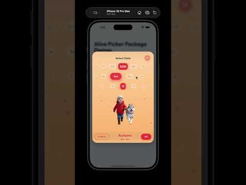
📸 Screenshots #


| Seasonal Date Picker | Time Picker | Modern Date Picker |
|---|---|---|
| Animated 3D characters | Dynamic sky background | Step-by-step selection |
🎬 Demo Video #
📦 Installation #
Add alive_picker to your pubspec.yaml:
dependencies:
  alive_picker: ^1.0.0
Then run:
flutter pub get
🚀 Quick Start #
1. Setup Localization #
Add the localization delegates to your MaterialApp:
import 'package:alive_picker/alive_picker.dart';
import 'package:flutter_localizations/flutter_localizations.dart';

MaterialApp(
  localizationsDelegates: [
    AlivePickerLocalizations.delegate,
    GlobalMaterialLocalizations.delegate,
    GlobalWidgetsLocalizations.delegate,
    GlobalCupertinoLocalizations.delegate,
  ],
  supportedLocales: const [
    Locale('en'),
    Locale('ar'),
    Locale('fr'),
  ],
  // ...
);
2. Use the Pickers #
📅 Modern Date Picker
showDialog(
  context: context,
  builder: (context) => ModernDatePicker(
    onDateSelected: (date) {
      print('Selected: $date');
    },
    startYear: 2020,
    endYear: 2030,
    initialDate: DateTime.now(),
    // Customization
    primaryColor: Colors.purple,
    backgroundColor: Colors.purple.shade50,
    textColor: Colors.purple.shade900,
  ),
);
⏰ Animated Time Picker
showDialog(
  context: context,
  builder: (context) => AnimatedTimePickerDialog(
    initialTime: TimeOfDay.now(),
    onTimeSelected: (time) {
      print('Selected: ${time.format(context)}');
    },
    // Customization
    primaryColor: Colors.orange,
    backgroundColor: Colors.orange.shade50,
    textColor: Colors.brown,
  ),
);
🍃 Seasonal Date Picker
showDialog(
  context: context,
  builder: (context) => SeasonalSelectionDialog(
    startYear: 2023,
    endYear: 2028,
    width: 360,
    height: 600,
  ),
).then((selectedDate) {
  if (selectedDate != null) {
    print('Selected: $selectedDate');
  }
});
🎨 Customization #
ModernDatePicker Options #
| Parameter | Type | Description |
|---|---|---|
onDateSelected |
Function(DateTime) |
Required. Callback when date is selected |
primaryColor |
Color? |
Primary accent color |
backgroundColor |
Color? |
Background color of the picker |
textColor |
Color? |
Text color |
startYear |
int? |
First year in the picker |
endYear |
int? |
Last year in the picker |
initialDate |
DateTime? |
Pre-selected date |
width |
double? |
Custom width |
height |
double? |
Custom height |
AnimatedTimePickerDialog Options #
| Parameter | Type | Description |
|---|---|---|
initialTime |
TimeOfDay |
Required. Initial time value |
onTimeSelected |
Function(TimeOfDay) |
Required. Callback when time is selected |
primaryColor |
Color? |
Primary accent color |
backgroundColor |
Color? |
Background color |
accentColor |
Color? |
Accent highlights color |
textColor |
Color? |
Text color |
width |
double? |
Custom width |
height |
double? |
Custom height |
SeasonalSelectionDialog Options #
| Parameter | Type | Description |
|---|---|---|
startYear |
int? |
First year in the picker |
endYear |
int? |
Last year in the picker |
width |
double? |
Custom width |
height |
double? |
Custom height |
🌍 Localization #
The package includes built-in support for:
| Language | Code | Seasons |
|---|---|---|
| 🇬🇧 English | en |
Winter, Spring, Summer, Autumn |
| 🇸🇦 Arabic | ar |
الشتاء، الربيع، الصيف، الخريف |
| 🇫🇷 French | fr |
Hiver, Printemps, Été, Automne |
🌈 Seasonal Theme Colors #
The Seasonal Picker automatically adapts its UI based on the selected month:
| Season | Months | Primary Color |
|---|---|---|
| ❄️ Winter | Dec - Feb | Blue (#3B82F6) |
| 🌱 Spring | Mar - May | Green (#10B981) |
| ☀️ Summer | Jun - Aug | Amber (#F59E0B) |
| 🍂 Autumn | Sep - Nov | Red (#EF4444) |
📄 License #
This project is licensed under the MIT License - see the LICENSE file for details.
🤝 Contributing #
Contributions are welcome! Feel free to submit issues and pull requests.
💬 Support #
If you find this package helpful, please give it a ⭐ on pub.dev!
Made with ❤️ for the Flutter community
Metadata
Publisher
unverified uploader
Weekly Downloads
Metadata
A beautiful, animated, and fully customizable date & time picker package for Flutter. Features stunning seasonal animations, smooth transitions, and multi-language support.
Topics
#date-picker #time-picker #widget #ui #animations
License
 unknown (license)
Dependencies
flutter, flutter_localizations, google_fonts, intl