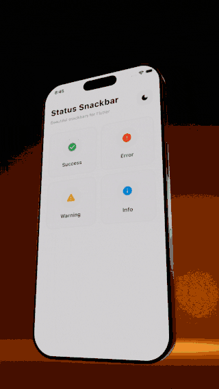
Status Snackbar
Beautiful, customizable snackbars with multiple states for Flutter. Supports success, error, warning, and info states with automatic dark mode support.

Platform Support
| Android | iOS | Web | macOS | Windows | Linux |
|---|---|---|---|---|---|
| ✅ | ✅ | ✅ | ✅ | ✅ | ✅ |
Features
- 4 built-in states: Success, Error, Warning, Info
- Automatic dark mode support
- Optional subtitle for additional details
- Close button to dismiss (can be hidden)
- Context extension for easy access
- Customizable duration
- Custom icons and colors support
- Position control: Show at top or bottom of screen
- Action button: Add interactive buttons with callbacks
- Dismiss callback: Get notified when snackbar closes
- Beautiful, modern design
Preview
Installation
Add this to your pubspec.yaml:
dependencies:
  status_snackbar: ^1.1.0
Then run:
flutter pub get
Usage
Import
import 'package:status_snackbar/status_snackbar.dart';
Using Static Methods
// Success snackbar
StatusSnackbar.showSuccess(context, 'Saved successfully!');

// Error snackbar
StatusSnackbar.showError(context, 'Something went wrong');

// Warning snackbar
StatusSnackbar.showWarning(context, 'Please check your input');

// Info snackbar
StatusSnackbar.showInfo(context, 'New update available');
Using Context Extension
// Success
context.showSuccessSnackbar('Done!');

// Error with subtitle
context.showErrorSnackbar(
  'Failed to save',
  subTitle: 'Please check your connection',
);

// Warning
context.showWarningSnackbar('Low battery');

// Info
context.showInfoSnackbar('Syncing...');
With Subtitle
StatusSnackbar.showError(
  context,
  'Upload failed',
  subTitle: 'File size exceeds 10MB limit',
);
Custom Duration
StatusSnackbar.showSuccess(
  context,
  'Auto-saving...',
  durationSeconds: 5,
);
Position (Top or Bottom)
// Show at top of screen
context.showInfoSnackbar(
  'New message received',
  position: SnackbarPosition.top,
);

// Show at bottom (default)
StatusSnackbar.showSuccess(
  context,
  'Saved!',
  position: SnackbarPosition.bottom,
);
Action Button
// With action button
context.showErrorSnackbar(
  'Item deleted',
  actionLabel: 'Undo',
  onAction: () {
    // Restore the item
    print('Undo pressed!');
  },
);

// Action with dismiss callback
StatusSnackbar.showWarning(
  context,
  'Changes pending',
  actionLabel: 'Save Now',
  onAction: () => saveChanges(),
  onDismiss: () => print('Snackbar closed'),
);
Hide Close Button
// Without close button
context.showInfoSnackbar(
  'Processing...',
  showCloseButton: false,
);
Hide Icon
// Without icon
context.showSuccessSnackbar(
  'Done!',
  showIcon: false,
);
Generic Show Method
StatusSnackbar.show(
  context,
  'Custom message',
  SnackbarState.info,
  subTitle: 'Additional details',
  durationSeconds: 4,
);
Customization
The package uses predefined color schemes that automatically adapt to light/dark themes:
| State | Light Background | Dark Background | Icon |
|---|---|---|---|
| Success | Green 100 | Green 900 | check_circle |
| Error | Red 100 | Red 900 | error |
| Warning | Amber 100 | Amber 900 | warning |
| Info | Blue 100 | Blue 900 | info |
Custom Icons
You can easily customize the icon for any snackbar:
// Custom icon with default colors
context.showSuccessSnackbar(
  'File uploaded!',
  icon: Icons.cloud_done,
);

// Custom icon and color
StatusSnackbar.showError(
  context,
  'No internet connection',
  icon: Icons.wifi_off,
  iconColor: Colors.orange,
);
Fully Custom Snackbar
Create completely custom snackbars with your own configuration:
// Using copyWith to modify defaults
context.showCustomSnackbar(
  'Payment received!',
  config: SnackbarConfigs.success.copyWith(
    icon: Icons.payment,
    iconColor: Colors.teal,
  ),
);

// Fully custom config
StatusSnackbar.showCustom(
  context,
  'Custom notification',
  config: SnackbarConfig(
    lightBackgroundColor: Colors.purple.shade100,
    lightTextColor: Colors.purple.shade900,
    darkBackgroundColor: Colors.purple.shade900,
    darkTextColor: Colors.purple.shade100,
    iconColor: Colors.purple,
    icon: Icons.star,
  ),
);
Example
See the example folder for a complete example app.
import 'package:flutter/material.dart';
import 'package:status_snackbar/status_snackbar.dart';

void main() => runApp(const MyApp());

class MyApp extends StatelessWidget {
  const MyApp({super.key});

  @override
  Widget build(BuildContext context) {
    return MaterialApp(
      home: Scaffold(
        body: Center(
          child: ElevatedButton(
            onPressed: () {
              context.showSuccessSnackbar('Hello, World!');
            },
            child: const Text('Show Snackbar'),
          ),
        ),
      ),
    );
  }
}
License
MIT License - see the LICENSE file for details.
Contributing
Contributions are welcome! Please feel free to submit a Pull Request.
Author
Made with love by Aravinthkannan2002
Libraries
- status_snackbar
- Beautiful, customizable snackbars with multiple states.