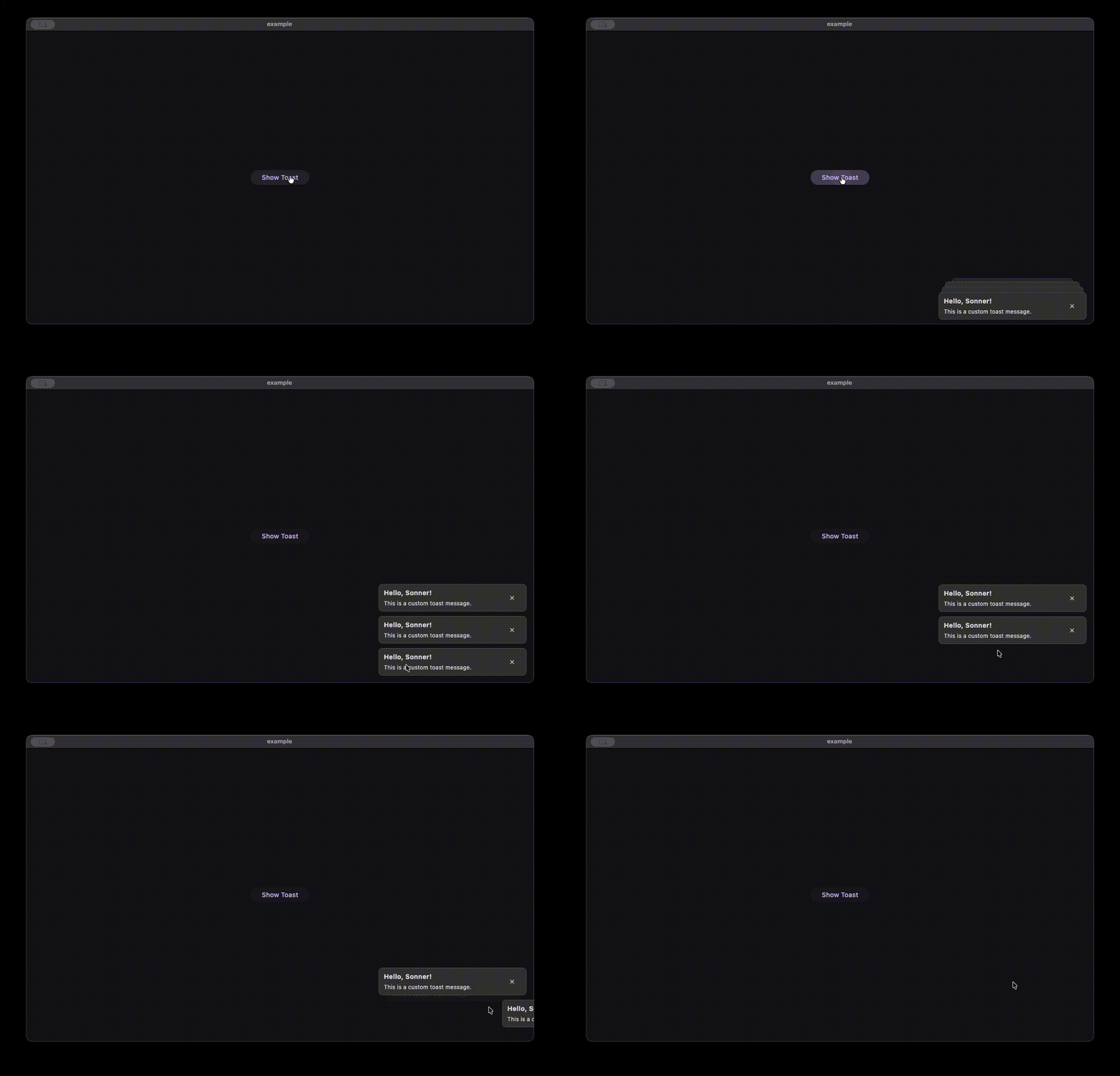
Sonner Toast for Flutter
A customizable, light-weight and animated toast notification system for Flutter, inspired by the Sonner library for React.

Features
- Swipe to Dismiss: Users can swipe toasts away.
- Headless Ui: Use any widget for your toast content.
- Sonner like Animation: Hover to expand toasts, swipe to dismiss.
- Animated: Smooth entry and exit animations.
- Flexible Positioning: Supports
Alignment(top/bottom/left/right) and fixedwidth. - Multiple Instances: Support for global and local toast overlays.
Getting Started
Add the package to your Flutter project.
Usage
1. Global Setup
Wrap your application (or a specific area) with a Stack and place SonnerOverlay inside it.
import 'package:sonner_toast/sonner_toast.dart';

void main() {
  runApp(const MyApp());
}

class MyApp extends StatelessWidget {
  const MyApp({super.key});

  @override
  Widget build(BuildContext context) {
    return MaterialApp(
      builder: (context, child) {
        return Stack(
          children: [
            child!,
            SonnerOverlay(
              key: Sonner.overlayKey,
              config: const SonnerConfig(
                alignment: Alignment.topCenter, // Control position
                width: 350, // Control width
              ),
            ),
          ],
        );
      },
      home: const HomeScreen(),
    );
  }
}
2. Showing a Toast
Call Sonner.toast from anywhere.
Sonner.toast(
  duration: const Duration(seconds: 3),
  builder: (context, dismissToast) {
    // call dismissToast to dismiss the toast
    return Container(
      padding: const EdgeInsets.all(16),
      decoration: BoxDecoration(
        color: Colors.black,
        borderRadius: BorderRadius.circular(8),
      ),
      child: const Text('Hello World!', style: TextStyle(color: Colors.white)),
    );
  },
);
- onDismiss - callback function to be called when the toast is dismissed.
- expandWidth - whether to expand the toast width to the available space (default: true).
- key - key to be used for the toast to show toast in specific overlay, its optional (required if you want to use multiple overlays).
- builder(context, dismissToast) - builder function to build the toast widget.
context- the build context.dismissToast- function to dismiss the toast.
- duration - duration for which the toast will be visible. If null, the toast will persist indefinitely until manually dismissed via
dismissToastor Swipe.
Note: This package provides no default UI. You have complete freedom to build whatever widget you want. You can add buttons, icons, or custom gesture detectors inside your builder.
3. Configuration
You can customize the layout via SonnerConfig.
SonnerConfig(
  // 1. alignment: Controls where the stack appears (e.g. Alignment.bottomLeft)
  alignment: Alignment.bottomRight,

  // 2. variant: 'top' or 'bottom' stacking behavior.
  // If null (default), it's inferred from alignment! (y < 0 is top, y > 0 is bottom)
  variant: null,

  // 3. width: Fixed width for the toast stack. Defaults to double.infinity (full width).
  width: 300,

  // 4. outerPadding: Positioning padding around the stack in the overlay.
  outerPadding: EdgeInsets.all(24),

  // 5. innerPadding: Padding inside the stack container (adds hover area).
  innerPadding: EdgeInsets.symmetric(vertical: 20),

  // 6. maxVisibleToasts: Max number of toasts to show.
  maxVisibleToasts: 3,

  // 7. expandedSpacing: Gap between toasts when hovering (expanded state).
  expandedSpacing: 10.0,

  // 8. collapsedOffset: Visual offset between stacked toasts (non-hover state).
  collapsedOffset: 13.0,
)
4. Dynamic Configuration
You can update the configuration at runtime using static methods.
// Update entire config
Sonner.setConfig(SonnerConfig(
  width: 400,
  alignment: Alignment.center,
));

// Or update specific properties
Sonner.setAlignment(Alignment.topRight);
Sonner.setWidth(350);
Sonner.setMaxVisibleToasts(5);
5. Programmatic Control
Control the toast stack programmatically.
// Temporarily hide all toasts
// Toasts reappear when a new toast is added.
Sonner.hide();

// Permanently dismiss all active toasts
Sonner.dismissAll();

// Check if the stack is currently expanded (hovered)
bool isExpanded = Sonner.isExpanded();
6. Multiple Instances
If you need separate toast areas (e.g., one global, and one specific to a dialog or section), use separate keys.
final dialogToastKey = GlobalKey<SonnerOverlayState>();

// In your dialog/widget:
Stack(
  children: [
    msgContent,
    SonnerOverlay(
      key: dialogToastKey,
      config: SonnerConfig(alignment: Alignment.center),
    ),
  ],
)

// Trigger:
Sonner.toast(
  key: dialogToastKey,
  builder: ...
);

// change configuration:
Sonner.setMaxVisibleToasts(
  5,
  key: dialogToastKey,
)