smooth_page_indicator


Introduction
Page indicators are a crucial part of any app that involves multiple pages. They help users to
understand the number of pages and their current position. SmoothPageIndicator is a Flutter
package that provides a set of animated page indicators with a variety of effects.

Effects
SmoothPageIndicator comes with a set of built-in effects that you can use to animate the active dot,
you can also customize each effect to your liking.
for more specific customization, try the CustomizableEffect which allows for more customization.
| Effect | Preview |
|---|---|
| Worm |  |
Worm style = WormStyle.thin v1.0.0 |
 |
| Expanding Dots |  |
| Jumping dot |  |
Jumping dot with vertical offset v1.0.0 |
 |
| Scrolling Dots |  |
| Slide |  |
| Scale |  |
| Swap |  |
Swap type = SwapType.yRotation v1.0.0 |
 |
Color Transition 0.1.2 |
 |
Customizable demo-1 v1.0.0 |
 |
Customizable demo-2 v1.0.0 |
 |
Customizable demo-3 v1.0.0 |
 |
Customizable demo-4 v1.0.0 |
 |
Usage
SmoothPageIndicator uses the PageController's scroll offset to animate the active dot.
SmoothPageIndicator(
   controller: controller,  // PageController
   count:  6,
   effect:  WormEffect(),  // your preferred effect
   onDotClicked: (index){
  }
)
Usage without a PageController
Unlike SmoothPageIndicator, AnimatedSmoothIndicator is self animated and all it needs is the
active index.
AnimatedSmoothIndicator(
   activeIndex: yourActiveIndex,
   count: 6,
   effect: WormEffect(),
)
Vertical layout support
Smooth page indicator supports both horizontal and vertical layouts.
SmoothPageIndicator(
   controller: controller,  // PageController
   count:  6,
   axisDirection: Axis.vertical,
   effect:  WormEffect(),
)

Scrolling dots effect
Smooth page indicator comes with a shipped it scrolling dots effect, (similar to the one used in instagram), it's useful when you have a large number of pages.
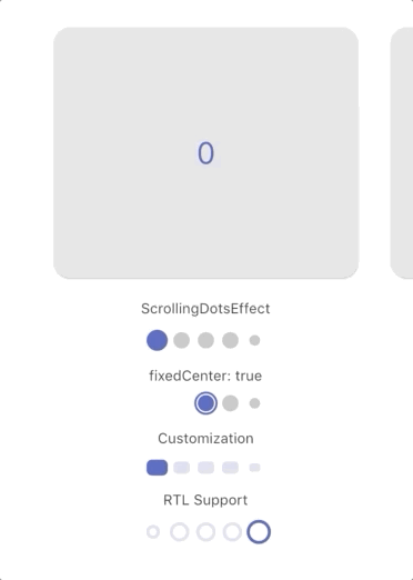
Customization
Each effect comes with its own set of properties that you can customize to your liking.
for example, you can customize direction, width, height, radius, spacing, paint style, color and more... of SlideEffect like follows:
  SmoothPageIndicator(
   controller: controller,
   count:  6,
   axisDirection: Axis.vertical,
   effect:  SlideEffect(
      spacing:  8.0,
      radius:  4.0,
      dotWidth:  24.0,
      dotHeight:  16.0,
      paintStyle:  PaintingStyle.stroke,
      strokeWidth:  1.5,
      dotColor:  Colors.grey,
      activeDotColor:  Colors.indigo
  ),
)
Theme-based Colors
By default, SmoothPageIndicator derives its colors from the app theme:
activeDotColordefaults toTheme.of(context).primaryColordotColordefaults toTheme.of(context).unselectedWidgetColorwith reduced opacity
This means the indicator automatically adapts to your app's color scheme. You can override these by explicitly setting dotColor and activeDotColor in any effect.
SmoothPageIndicatorTheme
You can configure default settings for all SmoothPageIndicator and AnimatedSmoothIndicator widgets app-wide using SmoothPageIndicatorTheme.
MaterialApp(
  theme: ThemeData.light().copyWith(
    extensions: [
      SmoothPageIndicatorTheme(
        effect: ExpandingDotsEffect(), // default effect when none is specified
        defaultColors: DefaultIndicatorColors(
          active: Colors.blue,
          inactive: Colors.grey,
        ),
      ),
    ],
  ),
)
defaultColors: Applies to all indicator effects across the app (unless overridden by the effect itself)effect: The default effect used when no effect is specified in the widget. Colors set within this effect (e.g.,activeDotColor) only apply to this default effect.
This is useful when you want consistent indicator styling across your entire app without repeating the same configuration.
Support the Library
You can support the library by liking it on pub, staring in on Github and reporting any bugs you
encounter.