Sliding Indicator ListView
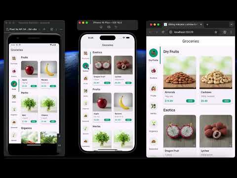
A highly customizable Flutter ListView widget that features a sliding indicator to beautifully highlight the selected item. The indicator smoothly animates between selections and can be synced with a scroll controller to reflect the currently visible content area.
Perfect for category menus, navigation sidebars, and any list where a strong visual cue for the selected item is desired.
Features
- Smooth Animation: The indicator slides gracefully from the previous item to the next.
- Horizontal & Vertical Scrolling: Supports both
Axis.verticalandAxis.horizontallayouts. - Highly Customizable: Control colors, text styles, animation speed, and more.
- Advanced Indicator Styling: Customize the indicator's position (left, right, top, bottom, or full), thickness, and border radius.
- Scroll Controller Sync: Can optionally sync with a
ScrollControllerto update the selected item as the user scrolls through another widget. - Simple API: Easy to integrate with a familiar
itemBuilderpattern.
Getting Started
1. Add the dependency
Add this to your package's pubspec.yaml file:
dependencies:
  sliding_indicator_listview: ^1.0.0 # Replace with the latest version
2. Import the package
import 'package:sliding_indicator_listview/sliding_indicator_listview.dart';
3. Use the widget
SlidingIndicatorListView(
  itemCount: yourCategoryList.length,
  itemExtent: 110,
  selectedIndex: _selectedIndex,
  onItemSelected: _onCategorySelected,
  // Example of customizing the indicator
  indicatorPosition: IndicatorPosition.right,
  indicatorBorderRadius: BorderRadius.circular(24),
  itemBuilder: (context, index, isSelected) {
    return CategoryListItem(
      category: yourCategoryList[index],
      isSelected: isSelected,
    );
  },
)
Customization Properties
| Property | Type | Description |
|---|---|---|
itemCount |
int |
(Required) The number of items in the list. |
itemExtent |
double |
(Required) The fixed height or width of each item. |
selectedIndex |
int |
(Required) The index of the currently selected item. |
onItemSelected |
void Function(int) |
(Required) Callback function when an item is tapped. |
itemBuilder |
Widget Function(BuildContext, int, bool) |
(Required) A builder for the item widget. The bool indicates if the item is currently selected. |
scrollDirection |
Axis |
The scroll direction of the list. Defaults to Axis.vertical. |
indicatorColor |
Color |
The color of the sliding indicator. Defaults to Colors.blue. |
indicatorPosition |
IndicatorPosition |
The position of the indicator. Defaults to IndicatorPosition.left. |
indicatorBorderRadius |
BorderRadiusGeometry |
The border radius of the indicator. Defaults to BorderRadius.circular(16.0). |
indicatorThickness |
double |
The thickness of the indicator. Defaults to 4.0. |
backgroundColor |
Color |
The background color of the entire widget. Defaults to Colors.transparent. |
animationDuration |
Duration |
The duration of the indicator's sliding animation. Defaults to 300ms. |
scrollController |
ScrollController? |
An optional scroll controller for the list. If not provided, the widget manages its own. |
Controlling Scrolling Behavior
The SlidingIndicatorListView has two modes for handling scrolling, depending on whether you provide a scrollController.
Default Behavior (Automatic Scrolling)
If you do not provide a scrollController, the widget manages its own scrolling internally. In this mode, it will automatically animate the list to keep the currently selected item centered in the viewport. This is ideal for simple menus where the list itself is the primary navigation.
Manual Control (Disabling Auto-Scroll)
If you do provide your own scrollController, the automatic centering behavior is disabled.
This gives you full control over the list's scroll position. This is an advanced use case, typically used when you want to synchronize the SlidingIndicatorListView with another scrollable widget. For example, you could have a main content area that, when scrolled, updates the selected item in the SlidingIndicatorListView. In this scenario, you do not want the indicator list to automatically scroll on its own.
Contributing
Contributions are welcome! If you find a bug or have a feature request, please open an issue on the GitHub repository.