Selectable Box


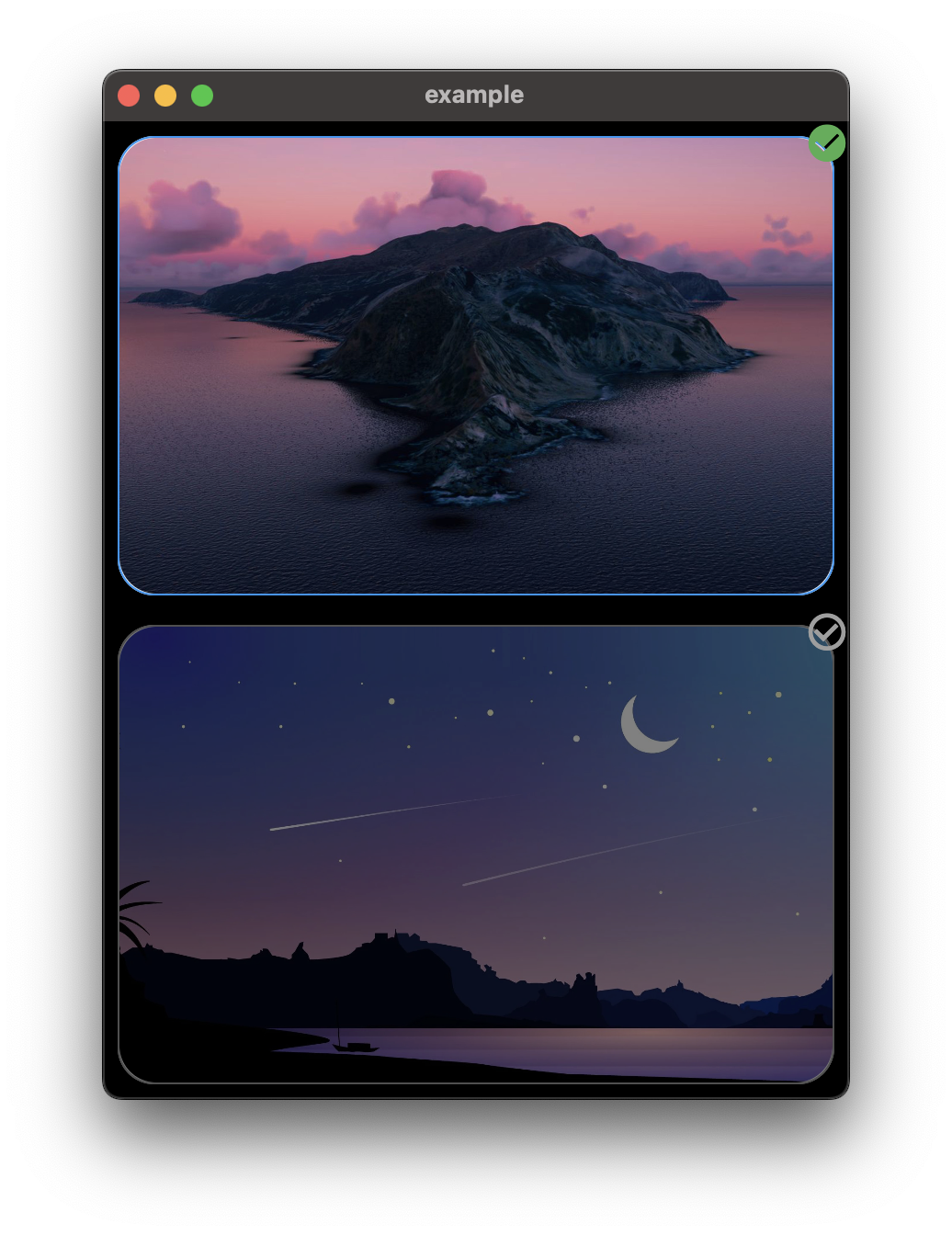
Use SelectableBox to create a selectable box in your flutter app, SelectableBox comes with a lot of customization options mentioned below.
Convert any widget into a selectable box.
Installation
Add selectable_box: ^2.0.0 in your project's pubspec.yaml:
dependencies:
  selectable_box: ^2.0.0
Features
- Smooth border radius (iOS-style squircle corners)
- Multi-selection support with
SelectableBoxController - Long press callback
- Disabled state
- Custom animation curves
- Scale animation on selection
- Haptic feedback
- Gradient border support
- Shadow/elevation
- Badge/counter widget
Usage
Import selectable_box in your dart file:
import 'package:selectable_box/selectable_box.dart';
Basic Usage
bool isSelected = false;

SelectableBox(
  height: 250,
  width: 400,
  isSelected: isSelected,
  onTap: () {
    setState(() {
      isSelected = !isSelected;
    });
  },
  child: const Image(
    image: AssetImage('assets/images/1.jpg'),
    fit: BoxFit.cover,
  ),
),
With All Options
SelectableBox(
  height: 250,
  width: 400,
  color: Colors.white,
  selectedColor: Colors.white,
  borderColor: Colors.grey,
  selectedBorderColor: Colors.blue,
  borderWidth: 1,
  borderRadius: 20,
  padding: const EdgeInsets.all(8),
  animationDuration: const Duration(milliseconds: 200),
  animationCurve: Curves.easeInOut,
  opacity: 0.5,
  selectedOpacity: 1,
  scale: 1.0,
  selectedScale: 1.05,
  checkboxAlignment: Alignment.topRight,
  checkboxPadding: const EdgeInsets.all(0),
  selectedIcon: const Icon(Icons.check_circle, color: Colors.green),
  unSelectedIcon: const Icon(Icons.check_circle_outline, color: Colors.grey),
  showCheckbox: true,
  enabled: true,
  disabledOpacity: 0.4,
  enableHapticFeedback: true,
  hapticFeedbackType: HapticFeedbackType.light,
  elevation: 0,
  selectedElevation: 8,
  shadowColor: Colors.black,
  onTap: () {
    setState(() {
      isSelected = !isSelected;
    });
  },
  onLongPress: () {
    print('Long pressed!');
  },
  isSelected: isSelected,
  child: const Image(
    image: AssetImage('assets/images/1.jpg'),
    fit: BoxFit.cover,
  ),
),
Gradient Border
SelectableBox(
  borderGradient: const LinearGradient(
    colors: [Colors.purple, Colors.blue, Colors.green],
  ),
  selectedBorderGradient: const LinearGradient(
    colors: [Colors.red, Colors.orange, Colors.yellow],
  ),
  borderWidth: 3,
  isSelected: isSelected,
  onTap: () => setState(() => isSelected = !isSelected),
  child: yourWidget,
),
With Badge
SelectableBox(
  showBadge: true,
  badgeText: '3',
  badgeColor: Colors.red,
  badgePosition: BadgePosition.topRight,
  isSelected: isSelected,
  onTap: () => setState(() => isSelected = !isSelected),
  child: yourWidget,
),
Multi-Selection with Controller
final controller = SelectableBoxController(maxSelections: 5);

// In your widget
ListView.builder(
  itemCount: items.length,
  itemBuilder: (context, index) {
    final id = items[index].id;
    return ListenableBuilder(
      listenable: controller,
      builder: (context, _) {
        return SelectableBox(
          isSelected: controller.isSelected(id),
          onTap: () => controller.toggle(id),
          child: YourItemWidget(items[index]),
        );
      },
    );
  },
),

// Get selected items
print('Selected: ${controller.selectedIds}');
print('Count: ${controller.selectedCount}');

// Clear all selections
controller.clearSelection();
Properties
| Property | Type | Default | Description |
|---|---|---|---|
width |
double |
320 |
Width of the box |
height |
double |
200 |
Height of the box |
color |
Color |
Colors.white |
Background color |
selectedColor |
Color? |
Colors.white |
Background color when selected |
borderColor |
Color |
Colors.grey |
Border color |
selectedBorderColor |
Color |
Colors.blue |
Border color when selected |
borderGradient |
Gradient? |
null |
Gradient for border |
selectedBorderGradient |
Gradient? |
null |
Gradient for border when selected |
borderWidth |
double |
1 |
Border width |
borderRadius |
double |
20 |
Border radius |
padding |
EdgeInsetsGeometry |
EdgeInsets.all(8) |
Padding around the box |
animationDuration |
Duration |
200ms |
Animation duration |
animationCurve |
Curve |
Curves.easeInOut |
Animation curve |
opacity |
double |
0.5 |
Opacity when not selected |
selectedOpacity |
double? |
1 |
Opacity when selected |
scale |
double |
1.0 |
Scale when not selected |
selectedScale |
double |
1.0 |
Scale when selected |
checkboxAlignment |
Alignment |
Alignment.topRight |
Checkbox position |
checkboxPadding |
EdgeInsetsGeometry |
EdgeInsets.all(0) |
Checkbox padding |
selectedIcon |
Widget |
Green check icon | Icon when selected |
unSelectedIcon |
Widget |
Grey outline icon | Icon when not selected |
showCheckbox |
bool |
true |
Whether to show checkbox |
onTap |
VoidCallback? |
- | Tap callback |
onLongPress |
VoidCallback? |
null |
Long press callback |
isSelected |
bool |
required | Selection state |
enabled |
bool |
true |
Whether the box is enabled |
disabledOpacity |
double |
0.4 |
Opacity when disabled |
enableHapticFeedback |
bool |
false |
Enable haptic feedback |
hapticFeedbackType |
HapticFeedbackType |
light |
Type of haptic feedback |
elevation |
double |
0 |
Shadow elevation |
selectedElevation |
double |
0 |
Shadow elevation when selected |
shadowColor |
Color |
Colors.black |
Shadow color |
showBadge |
bool |
false |
Whether to show badge |
badgeText |
String? |
null |
Badge text |
badgeColor |
Color |
Colors.red |
Badge background color |
badgeTextStyle |
TextStyle? |
null |
Badge text style |
badgePosition |
BadgePosition |
topRight |
Badge position |
badgePadding |
EdgeInsetsGeometry |
EdgeInsets.all(4) |
Badge padding |
customBadge |
Widget? |
null |
Custom badge widget |
child |
Widget |
required | Child widget |