Mood Theme Changer
A powerful and flexible Flutter package for dynamic theme switching based on user moods. Transform your app's appearance with psychologically-informed color palettes that adapt to emotional states.


✨ Features
- 🎨 8 Pre-built Mood Themes - Psychologically appropriate color palettes
- 🔧 Fully Customizable - Override any mood theme or create your own
- 💾 Persistent Storage - Automatically saves user's mood preference
- 🎭 Flexible Icons - Support for Material Icons, network images, and local assets
- ⚡ Easy Setup - Simple API with
MoodDefinitionfor quick configuration - 🌈 Material 3 Ready - Full support for Material Design 3
- 📱 Production Ready - Null-safe, tested, and optimized
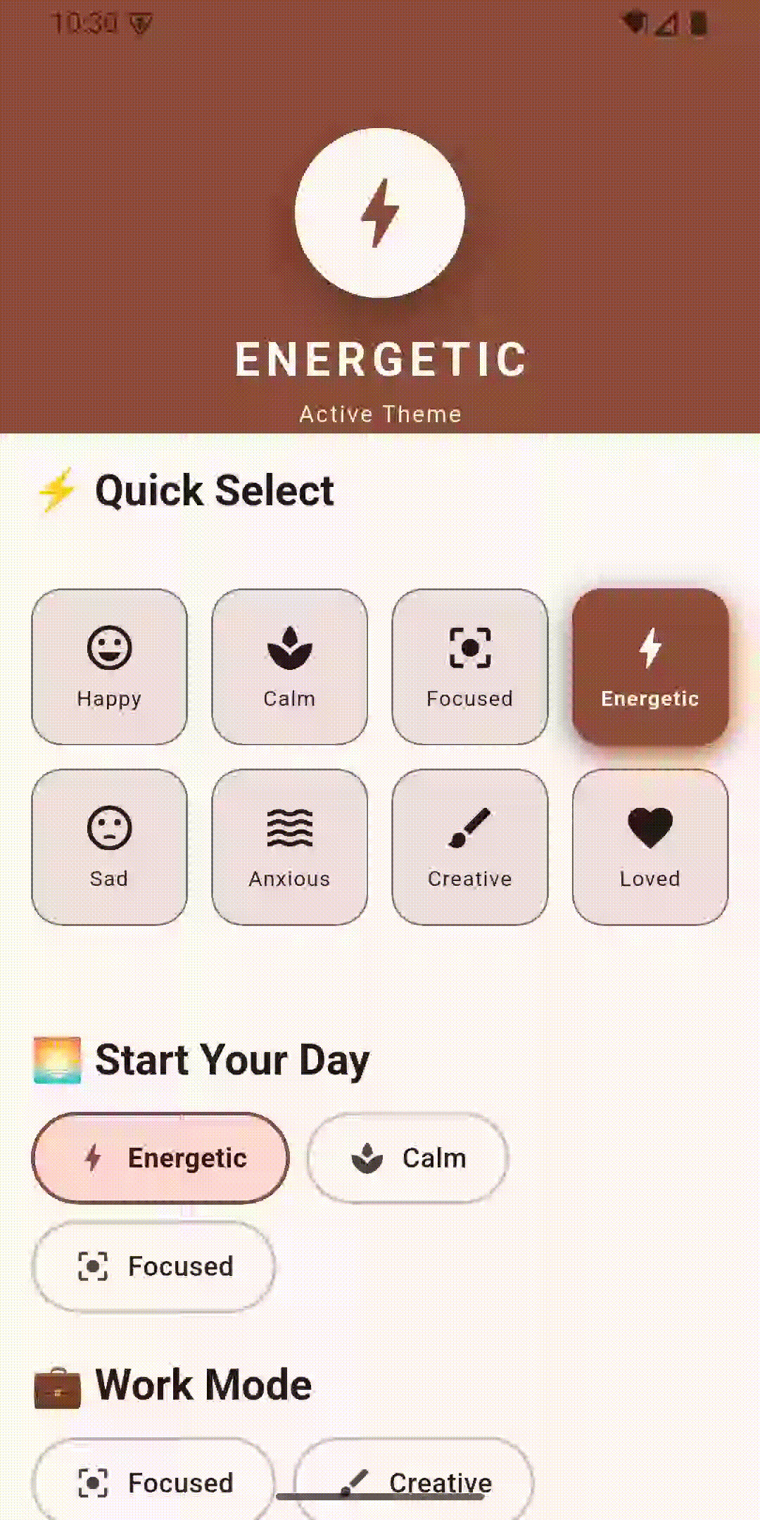
📸 Preview
📦 Installation
Add this to your package's pubspec.yaml file:
dependencies:
  mood_theme_changer: ^latest_version
Then run:
flutter pub get
🚀 Quick Start
1. Wrap your app with MoodThemeProvider
import 'package:flutter/material.dart';
import 'package:mood_theme_changer/mood_theme_changer.dart';

void main() => runApp(const MyApp());

class MyApp extends StatelessWidget {
  const MyApp({super.key});

  @override
  Widget build(BuildContext context) {
    return MoodThemeProvider(
      child: Builder(
        builder: (context) => MaterialApp(
          title: 'My App',
          theme: Theme.of(context), // Auto-updates with mood changes
          home: const HomeScreen(),
        ),
      ),
    );
  }
}
Zero-Flicker Setup (Recommended)
To prevent the default theme from "flashing" for a split second on startup, pass a pre-loaded instance of SharedPreferences:
Future<void> main() async {
  WidgetsFlutterBinding.ensureInitialized();
  final prefs = await SharedPreferences.getInstance();
  runApp(MyApp(prefs: prefs));
}

// In your Widget tree:
MoodThemeProvider(
  savedPrefs: prefs, // Instant, synchronous theme loading
  child: ...
)
What happens if you don't use savedPrefs?
If you omit savedPrefs, the package will fetch the settings asychronously. During that short fetch time (milliseconds), Flutter will render the default initial theme before "snapping" to your custom theme once the data arrives. Using savedPrefs ensures the correct theme is ready on the very first frame.
2. Change moods anywhere in your app
// Get the provider
final provider = MoodThemeProvider.of(context);

// Change mood
provider.setMood(UserMood.calm);

// Get current mood
final currentMood = provider.currentMood;
🎨 Available Moods
| Mood | Color | Brightness | Psychology |
|---|---|---|---|
| Happy | Warm Orange | Light | Joy and optimism |
| Calm | Calming Teal | Light | Tranquility and balance |
| Focused | Professional Blue | Dark | Concentration and productivity |
| Energetic | Energetic Red-Orange | Light | Motivation and action |
| Sad | Soft Blue-Grey | Dark | Melancholy and reflection |
| Anxious | Calming Lavender | Light | Stress relief and comfort |
| Creative | Creative Purple | Dark | Imagination and innovation |
| Loved | Loving Pink | Light | Affection and warmth |
🔧 Advanced Usage
Custom Mood Definitions
Define your moods with custom labels, icons, and themes:
final List<MoodDefinition> myMoods = [
  const MoodDefinition(
    mood: UserMood.happy,
    label: 'Joyful',
    icon: Icons.sentiment_very_satisfied,
  ),
  const MoodDefinition(
    mood: UserMood.calm,
    label: 'Zen Mode',
    icon: Icons.spa,
    themeConfig: MoodThemeConfig(  // Optional: MoodThemeConfig type
      seedColor: Color(0xFF00BCD4),
      brightness: Brightness.light,
      surfaceTintFactor: 0.1,
    ),
  ),
];

MoodThemeProvider(
  definitions: myMoods,
  child: MyApp(),
)
themeConfig accepts MoodThemeConfig type with:
seedColor(Color?) - Base color for Material 3 color schemebrightness(Brightness?) - Light or dark modesurfaceTintFactor(double) - Surface tint intensity (0.0-1.0, default: 0.0)customTheme(ThemeData?) - Complete custom theme (overrides other properties)
Custom Theme Override
Override specific mood themes:
MoodThemeProvider(
  overrides: {
    UserMood.happy: MoodThemeConfig(
      seedColor: Colors.yellow,
      brightness: Brightness.light,
    ),
  },
  child: MyApp(),
)
🎨 Customizing Themes
Provide a complete ThemeData object:
MoodThemeProvider(
  moodThemes: {
    UserMood.focused: MoodThemeConfig(
      customTheme: ThemeData(
        colorScheme: ColorScheme.fromSeed(
          seedColor: Colors.indigo,
          brightness: Brightness.dark,
        ),
        useMaterial3: true,
      ),
    ),
  },
  child: MyApp(),
)
Update Mood Theme
You can update a mood's seed color or brightness at runtime:
final provider = MoodThemeProvider.of(context);

// Change both seed color and brightness
provider.updateMoodTheme(
  UserMood.happy,
  seedColor: Colors.deepPurple,
  brightness: Brightness.dark,
);

// Or just one of them
provider.updateMoodTheme(UserMood.calm, brightness: Brightness.light);
Reset to Defaults
If a user wants to go back to the library's original colors:
provider.resetMoodColor(UserMood.happy);
Using Asset Icons
Support for network images and local assets:
const MoodDefinition(
  mood: UserMood.happy,
  label: 'Happy',
  iconAsset: 'https://example.com/happy-icon.png', // Network image
),

const MoodDefinition(
  mood: UserMood.calm,
  label: 'Calm',
  iconAsset: 'assets/icons/calm.svg', // Local asset
),
Factory Constructors
Quick theme creation:
// From existing ThemeData
MoodThemeConfig.fromTheme(myThemeData)

// From seed color
MoodThemeConfig.fromSeed(
  Colors.purple,
  brightness: Brightness.dark,
)
🔍 API Reference
MoodThemeProvider
Main widget that provides mood theme functionality.
Parameters:
definitions- List ofMoodDefinitionobjectsmoodThemes- Map of custom themes per moodoverrides- Quick overrides for specific moodsinitialMood- Starting mood (default:UserMood.happy)transitionDuration- Theme transition animation durationprefsKey- SharedPreferences key for persistence
MoodThemeConfig
Configuration for a mood's theme.
Parameters:
customTheme- Complete ThemeData (optional)seedColor- Seed color for Material 3 (optional)brightness- Light or dark mode (optional)surfaceTintFactor- Surface tint intensity (0.0-1.0)
MoodDefinition
Defines a mood with its UI representation.
Parameters:
mood- The UserMood enum valuelabel- Display labelicon- Material icon (optional)iconAsset- Asset path or URL (optional)themeConfig- Custom theme for this mood (optional, type:MoodThemeConfig)
🤝 Contributing
Contributions are welcome! Please feel free to submit a Pull Request.
📄 License
This project is licensed under the MIT License - see the LICENSE file for details.
🙏 Acknowledgments
- Color psychology research for mood-color associations
- Material Design 3 guidelines
- Flutter community for inspiration
📧 Contact
For questions or suggestions, please open an issue on GitHub.
Made with ❤️ for the Flutter community